
- Time
- Post link
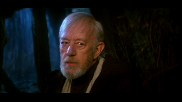
Why is white no longer white in those color-corrected shots?
Why is white no longer white in those color-corrected shots?

ChainsawAsh if your question is directed at me, my answer is I don't know! I have kinda got to the end of my tether with colour correcting through avisynth!
I may give it a go in Final Cut as I am more familiar with Final Cut then I am avisynth.
Original Trilogy in Replica Technicolor Project
Star Wars PAL LaserDisc Project
Yeah, I maintain that a single film-wide color correction in AviSynth will never yield results as good as scene-by-scene work in Avid, FCP, or Color (or any other NLE that has a color-correction function).

Those look way too green.
And in the time of greatest despair, there shall come a savior, and he shall be known as the Son of the Suns.

Dufusyte said:fwiw, film, like painting, is not necessarily realistic.
It would be erroneous to recolor each scene towards realism. Realism might not be the intent of the film maker.
I concur. Trying to color correct scene-by-scene is probably not the answer (and would take a LOT more time). Though perhaps a reel-by-reel effort might not be unreasonable?
On a seperate note, I was just watching this, and perhaps the "ESB is very blue" theory might not be too far off: http://www.youtube.com/watch?v=wMya5Z96VA8
This signature uses Markdown syntax, which makes it easy to add formatting like italics, bold, and lists:
On another seperate note...

...color me surprised... ¬_¬
This signature uses Markdown syntax, which makes it easy to add formatting like italics, bold, and lists:

LeeThorogood: Thanks for posting those. Wow, the Technicolor print looks so bright, vivid and lush by comparison! :)
The Star Wars trilogy. There can be only one.
Forgot to mention before the Technicolor shots are from this webpage:
Dunedain said:
LeeThorogood: Thanks for posting those. Wow, the Technicolor print looks so bright, vivid and lush by comparison! :)
Original Trilogy in Replica Technicolor Project
Star Wars PAL LaserDisc Project

Asaki said:
On another seperate note...
...color me surprised... ¬_¬
Wow..that's awful..I can't believe they would put that in a trailer encouraging people to get the set. Hopefully, the footage is just from the 2004 release and not from the set..after all, I didn't see any new tweaks in the trailer. Although considering our past experiences with Star Wars releases...

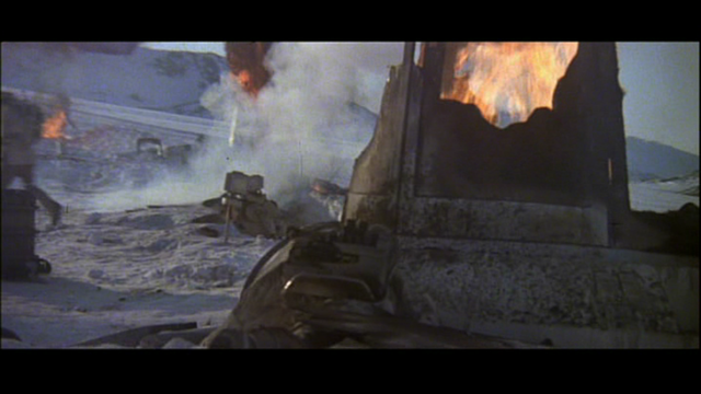
Having just seen the fantastically well-preserved ESB Theatre bootleg, I am amazed at how close the GOUT seems match to it when you crank up its saturation to (or very close to) the levels I have suggested. It's pretty much the exact same thing for most of it, minus the colour-shifting due to print and tape fluxatuation and the occasional exposure wash-out or crush-down. But for example, the blueness of the Hoth and Bespin scenes is pretty much 100% the same as the caps I posted. There is one shot that was compared earlier to the SE trailer, an establishing shot of the Hoth hanger (when Solo first enters), where the SE trailer has much less blue, but in fact the theatrical bootleg has the exact same amount as the enhanced-GOUT I posted. Same with all the Luke-wampa scenes. It seemed pretty consistent that the GOUT enhanced in this way matched close to the bootleg.
This only highlights the dilemma I mentioned earlier: in order to have theatrically-accurate colour/saturation with the GOUT, you have to live with popping and noise and all those artifacts. It looks ugly sometimes, but that's the actual accurate colour level.

I still maintain that if you are going to boost the saturation, you must isolate the red and leave it alone. It's already too strong.
Dr. M
Well, when it comes to the reds, I'm not sure I would agree with that solution. I do get what you are saying in that the red tends to pop more than other colours, but because the GOUT is washed out in general, leaving the reds alone produces an imbalance and gives the image an "improper" look (even if the reds are technically too high by measurement). Something about it just looks dull and "incorrect", I guess, if you can see what I am saying. I'm not sure what the solution to the problem can be, but leaving them alone IMO doesn't quite work. You need the bright reds. You are right though, the reds are already bleeding a bit just in the raw GOUT, but they don't have the vibrancy that pushing them gives them, which matches the rest of the image. It's a weird problem.

I don't think oversaturating the GOUT can help you get a good viewing experience by itself, because it creates a lot of new problems. But it can be a good method to see what the colours should actually look like and then base the colour correction of the SE on it.
While I've never played with it (or understood it completely), Tweak() has a MaxSat and MinSat that can let you cap the range that the Sat option effects. http://avisynth.org/mediawiki/Tweak
I'm thinking that by utilizing those options you could in theory increase the saturation (for all colors including the lower range reds) but avoid making the bleeding any worse.
Is anyone familiar with this?
Dr. M

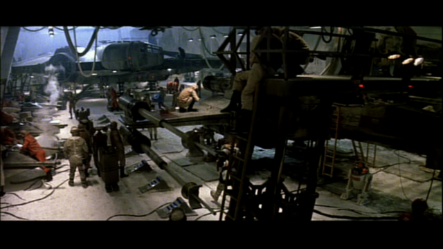
Interesting to compare the alternate takes/angles that JD inserted into "Star Wars Begins". The colouring of the scenes on the Death Star and the Millennium Falcon demonstrate just how muted the GOUT colouring is.
Guidelines for post content and general behaviour: read announcement here
Max. allowable image sizes in signatures: reminder here
Illustrated with pics:

GOUT

Alternate
Anyone know where these alternate takes are sourced from?
Guidelines for post content and general behaviour: read announcement here
Max. allowable image sizes in signatures: reminder here

I'm surprised there hasn't been more comparisons with the old trailers from the SW Bonus DVD, I think it's interesting how vibrant some of the colours are from those:


Moth3r said:
Anyone know where these alternate takes are sourced from?
I believe they come from the documentary "Empire of Dreams".
We want you to be aware that we have no plans—now or in the future—to restore the earlier versions.
Sincerely, Lynne Hale publicity@lucasfilm.com

rockin said:
I'm surprised there hasn't been more comparisons with the old trailers from the SW Bonus DVD, I think it's interesting how vibrant some of the colours are from those:
Neat to see just how not blue Palpy's throne room is. A little on the warm side actually, but that could be from adding the sabers in.
"The other versions will disappear. Even the 35 million tapes of Star Wars out there won’t last more than 30 or 40 years. A hundred years from now, the only version of the movie that anyone will remember will be the DVD version [of the Special Edition], and you’ll be able to project it on a 20’ by 40’ screen with perfect quality. I think it’s the director’s prerogative, not the studio’s to go back and reinvent a movie." - George Lucas
<span> </span>
Doctor M said:
While I've never played with it (or understood it completely), Tweak() has a MaxSat and MinSat that can let you cap the range that the Sat option effects. http://avisynth.org/mediawiki/Tweak
I'm thinking that by utilizing those options you could in theory increase the saturation (for all colors including the lower range reds) but avoid making the bleeding any worse.
Is anyone familiar with this?
Wow, nobody? I guess I'll have to find some time and mess around with it.
Dr. M

Those trailer pics look just right to me, and would make a great reference for future colour correction efforts. That's real photography there, not a photoshopped mockery. Just highlights even more just how wrong the SE renditions can be.
And wow, the GOUT looks really dull compared to that other pic, doesn't it? Jeepers . . .
EyeShotFirst said:
rockin said:
I'm surprised there hasn't been more comparisons with the old trailers from the SW Bonus DVD, I think it's interesting how vibrant some of the colours are from those:
Neat to see just how not blue Palpy's throne room is. A little on the warm side actually, but that could be from adding the sabers in.
The trailers on the DVD unfortunately are missing a lot of the colour in some shots. This is likely because they pre-date the final answer print by many months. That might be why on the trailer the Hoth hanger only has some blue, while in other sources, noteably the (enhanced/restored) GOUT and the theatrical bootleg, it is very blue, as some might have been added by colour timing. As far as the above cap goes, in the final film, the throne room is almost as blue as it is on the 2004 DVD. You can see this on the theatrical bootleg, the GOUT, or any past home video releases. I think publicity stills have it fairly restrained though, so maybe it was shot "neutral" like the above cap from the trailer which uses the raw dailies, and then timed blue in post.
EDIT
That outtake from the dailies on the Falcon looks stunning as far as the colour goes. Such a difference.
zombie84 said:
That outtake from the dailies on the Falcon looks stunning as far as the colour goes. Such a difference.
No kidding. Several times I got confused and thought I was watching poor quality outtakes, when it had actually switched back to the GOUT.
This signature uses Markdown syntax, which makes it easy to add formatting like italics, bold, and lists:

I did a little experiment with RGB filtering instead of YUV (in After Effects) to try and push the GOUT color balance toward what we see on the Technicolor print photos. In comparison, what I see in the GOUT is lack of contrast and lack of deep green/cyan. Also the colors are desaturated but I wanted to see what can be achieved without drastic saturation tweaks.
Flesh colors in the GOUT are not so much redish but purple-ish, so green should shift them in the right direction; also it can move the color of the Death Star corridor walls out of no-color and pure blue.

The big s-shape of the master curve is (supposed to be) the contrast boost; then the whole thing is moved upward (= gamma boost, because now the picture is pretty dark). Also I added a hole at the shoulder to protect highlights somewhat (they are already blown out in many places). The green curve is in a little counter-contrast, so shadows would be shifted toward green in the output.
I did tweaked shadow and highlight saturation, both by less than 30; highlight saturation is actually dialed down. (I think the peaks of the saturation curve you see here is also equivalent to less than +-30.)

There are 3 shifts in the hue curve. The first two is for the droids, I wanted them to look like the first grab of that 8mm print Zombie posted on some other page (which is I think beautiful, color-wise). The third is for (hopefully) spreading the newly added green.
First I tried this setup as a one-light, then added another layer for tweaking the levels for individual scenes, but this was a half-assed attempt. As you can see on the screenshots below, some scenes are still too bright/dark, also some could use a little more/less contrast boost.
Also, check out the second image: that fishy green pattern on the wall is caused by the RGB-curves (appears in some scenes in the first three reels). It also moves, thanks to the color fluctuation -- which is emphasized by the raised contrast. Generally, as Zombie mentioned in regards of the saturation boost, this kind of drastic tweak brings out noise. Worst are the desert scenes with half of the screen being flat blue and the other half flat yellow. By the way the input video was processed with G-Force's script (which is great!), minus anti-aliasing and resize. Maybe the script could help with the emphasized noise (doing the color tweak before the script).


I think these settings might be a good alternative starting point. Unfortunatelly I don't have time to take it any further right now.
Trailers would have been cut from prints that were not color timed yet. That's why a couple of Jedi trailers have Luke with a blue lightsaber - they shots weren't done yet.
I wouldn't trust them for a color reference one bit.