ChainsawAsh said:
As everyone probably guesses, being that those mock-ups were made by me ...
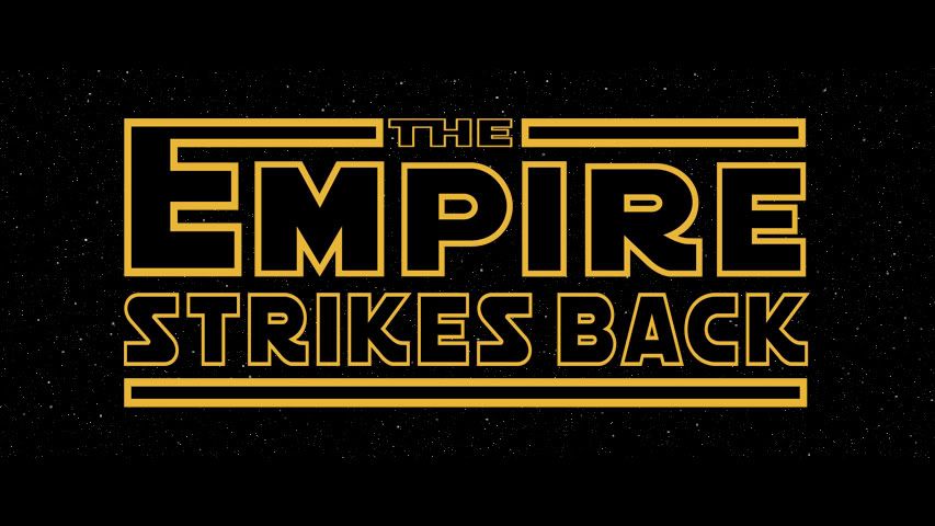
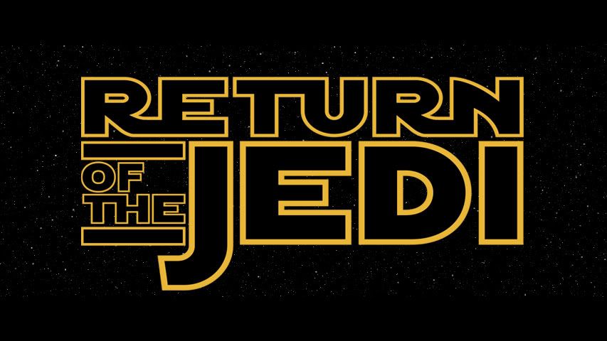
I'm all for ditching the episode numbers, and doing all the crawls like the '77 one, with the "STAR WARS" logo replaced with each movie's title.
It makes it much easier for me to ignore the prequels, and I just like the look of the '77 crawl more than the others.
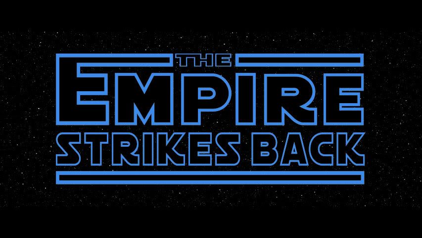
I'm not, however, sold on the different colors thing. But it's true that the Empire script has the crawl in blue, over the backdrop of Hoth - I'd say that's worth a mockup...
I can see your logic that it helps us to ignore the prequels, but isn't this a moot point as, last I heard, Ady's going to be editing the prequels?
Not directed specifically at you ChainsawAsh. There just seems to be a bit of a discussion going on about it for reasons that wouldn't apply to the Revisited saga as it includes the prequels.