Cover ideas have taken up a good part of my harddrive for about 5 years, and I wanna bounce some ideas I've had.
LOGOS
(I had an account before where I showed off some logo designs, but password recovery was being obnoxious).
The original logos, that I put the most work into, were these bold-styled ones based on the video boxes from the 90s, with bevels and weathering based on the 08 Clone Wars logo.

Well, that was back when I had a copy of CS2. Elements 3 doesn't give me as many options. I can make basic bevels, but not with the reflective quality this sample has. I've still got ideas to improve on it, though, namely giving the face more of a brushed metal look.
In the meantime, I've created some simpler logos, based on a combination of the logo used to promote Jedi in 83 and a version of the Phantom logo used on some merchandise, like the playstation game. I plan to use these in one version of the covers I'm designing.


COVERS
I've never quite been able to decide on a good layout for these movies, I just know the official covers don't do anything for me. But I figured I'd let DVD take a rest for a while, seeing as the movies in HD can't be far off. Here are a few low-res concepts for Bluray covers:

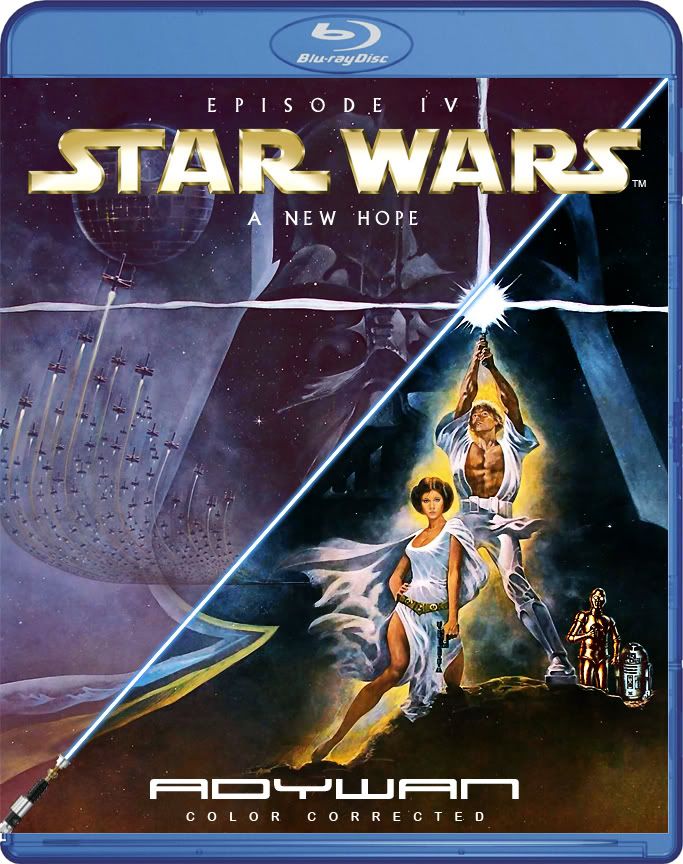
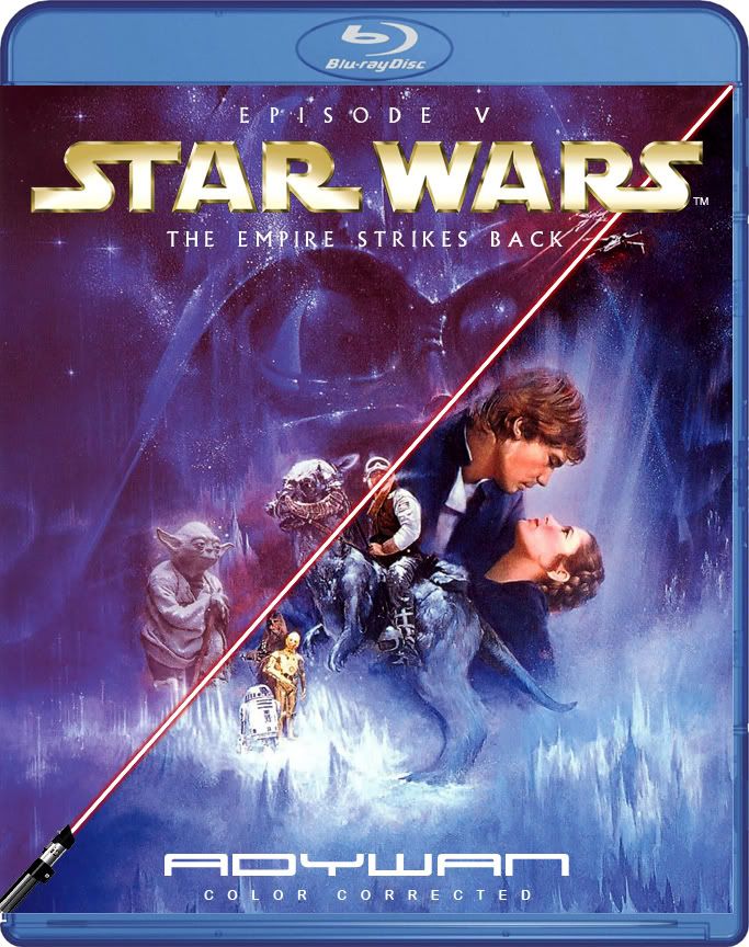
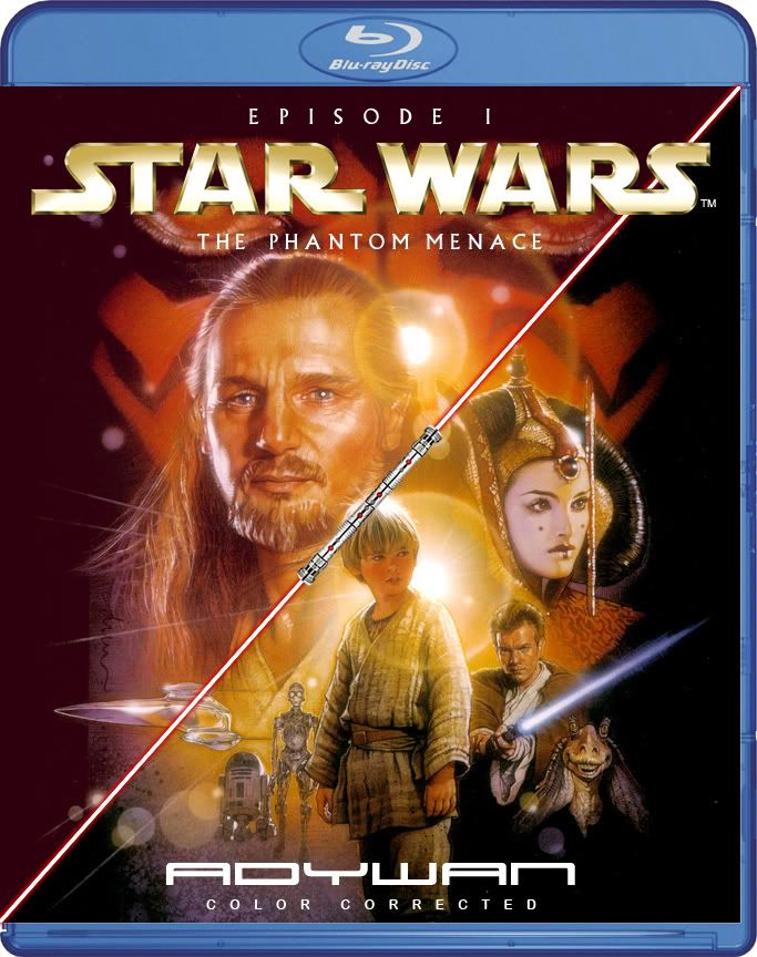
A. I like Struzan's posters fine, but the hassle is always scaling the composition vs. the movie's logo. This version keeps the composition at a good scale, but I feel like the logo will look too small and out of place, especially with the top of a bluray case above it. Also look at my comments for E.
B&C. These two are possibilities for using the 70s/80s poster art, which isn't "framed" the way Struzan's is, and gives me some leeway. I like how the logo stands out in B, but also think that C uses it effectively.
D. This one's really rough, but a possibility for using the classic art with the bold logo. The framing is there so if I find posters with different proportions, I can "cheat" and crop some space off (which is also how I positioned the logo). I'm thinking now, though, that I could scale the art to take up the entire case, then add a beveled border, outside which the composition darkens and fades.
E. Struzan's art + bold logo: I think the logo stands out just enough in this version and the composition still gets a lot of space. It's a matter of having the bold logos work the same way in the prequel posters.
F. Surprisingly, I like how this turned out. I just re-proportioned the 2001 vhs release, with faux-Struzan art (works a lot better than the bright-colored DVD montages). It looks very clean-cut and modern, with every other movie using a white or black background, and the back of the cover split into black and white (which could also allow me to use some ghosted images in the layout). And there's the possibility of different color schemes, like the "face" releases in 95.
G. Again using the faux-Struzan art, but this time without the frame, as in the 2001 VCD(and LD?) releases. The big obstacle in these designs in F&G is finding the artwork in high enough resolution - the highest I can get is a scan of the VHS from CDCovers.
OTHER NOTES
http://theswca.com/images-art/05.11-alvin.jpg
This old John Alvin poster has given me another idea for direction, with its earthy border and choice of colors in the composition and text. Maybe the box cover--?


