
- Time
- Post link

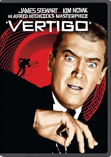
Even worse, the original film got its own release with a great cover:


You have to admit Jimmy Stewart does look like he just saw a mouse or a huge spider. 😉
Where were you in '77?
Even worse, the original film got its own release with a great cover:

Speaking of Vertigo…
And in the time of greatest despair, there shall come a savior, and he shall be known as the Son of the Suns.

Speaking of Vertigo…
Wrong thread.


“Boooring”
-suspiciouscoffee
.
Speaking of Vertigo…
Wrong thread.
No.
And in the time of greatest despair, there shall come a savior, and he shall be known as the Son of the Suns.
Speaking of Vertigo…
Wrong thread.
No.
What’s wrong with it?

It’s ugly. That’s what’s wrong with it.
Army of Darkness: The Medieval Deadit | The Terminator - Color Regrade | The Wrong Trousers - Audio Preservation
SONIC RACES THROUGH THE GREEN FIELDS.
THE SUN RACES THROUGH A BLUE SKY FILLED WITH WHITE CLOUDS.
THE WAYS OF HIS HEART ARE MUCH LIKE THE SUN. SONIC RUNS AND RESTS; THE SUN RISES AND SETS.
DON’T GIVE UP ON THE SUN. DON’T MAKE THE SUN LAUGH AT YOU.
It’s ugly. That’s what’s wrong with it.
Not even a little bit true.
That’s rather mean to say, considering it’s just James Stewart’s face.
Jimmy’s face is great. But the use of color and the flowers and whatnot is not pleasing to the eye. Those bright colors don’t even feel representative of the film at all.
Army of Darkness: The Medieval Deadit | The Terminator - Color Regrade | The Wrong Trousers - Audio Preservation
SONIC RACES THROUGH THE GREEN FIELDS.
THE SUN RACES THROUGH A BLUE SKY FILLED WITH WHITE CLOUDS.
THE WAYS OF HIS HEART ARE MUCH LIKE THE SUN. SONIC RUNS AND RESTS; THE SUN RISES AND SETS.
DON’T GIVE UP ON THE SUN. DON’T MAKE THE SUN LAUGH AT YOU.
Jimmy’s face is great. But the use of color and the flowers and whatnot is not pleasing to the eye. Those bright colors don’t even feel representative of the film at all.
Have you seen the film by any chance?
Yes.
Army of Darkness: The Medieval Deadit | The Terminator - Color Regrade | The Wrong Trousers - Audio Preservation
SONIC RACES THROUGH THE GREEN FIELDS.
THE SUN RACES THROUGH A BLUE SKY FILLED WITH WHITE CLOUDS.
THE WAYS OF HIS HEART ARE MUCH LIKE THE SUN. SONIC RUNS AND RESTS; THE SUN RISES AND SETS.
DON’T GIVE UP ON THE SUN. DON’T MAKE THE SUN LAUGH AT YOU.
The whole film is red and green. Its use of color is one of the things it’s best known for. In fact, that cover is ripped straight from it.
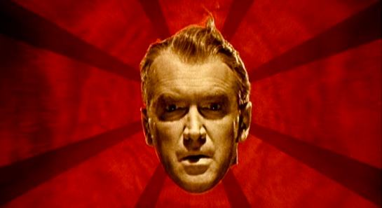
Yeah but the cover doesn’t look like that shot. The flowers are ugly and his face isn’t straight up green in the actual shot. Also the red background isn’t visually compelling without the lines in the shot.
Army of Darkness: The Medieval Deadit | The Terminator - Color Regrade | The Wrong Trousers - Audio Preservation
SONIC RACES THROUGH THE GREEN FIELDS.
THE SUN RACES THROUGH A BLUE SKY FILLED WITH WHITE CLOUDS.
THE WAYS OF HIS HEART ARE MUCH LIKE THE SUN. SONIC RUNS AND RESTS; THE SUN RISES AND SETS.
DON’T GIVE UP ON THE SUN. DON’T MAKE THE SUN LAUGH AT YOU.
Yeah but the cover doesn’t look like that shot. The flowers are ugly and his face isn’t straight up green in the actual shot. Also the red background isn’t visually compelling without the lines in the shot.
The green is much more exaggerated on the cover but his face does turn greenish. The flowers are also from the sequence. The red is fine. You’re very wrong.
His face flashes a greenish yellow but it’s never actually green, and the flowers don’t appear over his face. I find the intensity of the colors and the placement of the objects unpleasant to look at. Putting just his face over a colored and striped background from the sequence and putting the flower bit on the back without that staircase would be a better look.
Army of Darkness: The Medieval Deadit | The Terminator - Color Regrade | The Wrong Trousers - Audio Preservation
SONIC RACES THROUGH THE GREEN FIELDS.
THE SUN RACES THROUGH A BLUE SKY FILLED WITH WHITE CLOUDS.
THE WAYS OF HIS HEART ARE MUCH LIKE THE SUN. SONIC RUNS AND RESTS; THE SUN RISES AND SETS.
DON’T GIVE UP ON THE SUN. DON’T MAKE THE SUN LAUGH AT YOU.

Overall, I do like that Vertigo art. I agree with Dek, though, that the colours are a wee bit too bold.
You can dislike it sure, but terrible/ugly? Nah
His face flashes a greenish yellow but it’s never actually green, and the flowers don’t appear over his face. I find the intensity of the colors and the placement of the objects unpleasant to look at. Putting just his face over a colored and striped background from the sequence and putting the flower bit on the back without that staircase would be a better look.
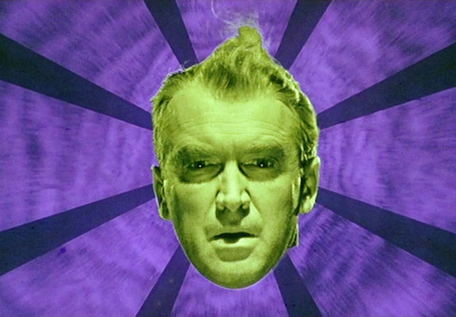
They chose red and green because the entire film revolves around red and green. The cover is just an amalgamation of everything that appears in that dream sequence, which I would argue is the most memorable scene of the film. Definitely the most surreal. However, I can’t argue your personal taste.
They chose red and green because the entire film revolves around red and green.
I’m surprised it wasn’t set around Christmas.
They chose red and green because the entire film revolves around red and green.
I’m surprised it wasn’t set around Christmas.
That’s what Bell, Book and Candle is for.


“Get over violence, madness and death? What else is there?”
Also known as Mr. Liquid Jungle.
You’re very wrong.
LOL
And in the time of greatest despair, there shall come a savior, and he shall be known as the Son of the Suns.

The packaging is pretty awful, too.


And of course, life wouldn’t be complete without terrible Star Wars releases with Vadersionism covers:

Caligula’expanded OST, V2 Released
The Shining’s complete OST
Ghidorah, The Tree-Headed Monster (English dub synched to Toho cut)