logo Sign In

The theatrical colors of the Star Wars trilogy — Page 6

Author
Time
 (Edited)

Swazzy said:

This just further cements the fact that LFL could have fixed every conceivable color issue for the Blu-ray, using the same master, on a budget of zero dollars and zero cents.

But that wouldn’t fit George Lucas’ originally intended artistic view 😄

I really love the latest LUT. It looks a bit modern, but in a good way.
With that said, I also love the more theatrical colours.

Author
Time

Setzer said:

Swazzy said:

This just further cements the fact that LFL could have fixed every conceivable color issue for the Blu-ray, using the same master, on a budget of zero dollars and zero cents.

But that wouldn’t fit George Lucas’ originally intended artistic view 😄

I really love the latest LUT. It looks a bit modern, but in a good way.
With that said, I also love the more theatrical colours.

To be honest, I have a theory that George Lucas no longer remembers his own original intent. It helps to explain why after 1997, high quality official versions of the theatrical versions was NOT an option in any way, shape or form.

Author
Time

Avatar_Emil_Borg said:

To be honest, I have a theory that George Lucas no longer remembers his own original intent. It helps to explain why after 1997, high quality official versions of the theatrical versions was NOT an option in any way, shape or form.

That would not one lick surprise me.

"Right now the coffees are doing their final work." (Airi, Masked Rider Den-o episode 1)

Author
Time
 (Edited)

Yesterday I recieved roughly 500 technicolor frames for Star Wars, and the colors are totally amazing. These frames span many scenes for reels 2 to 6, including but not limited to the Tatooine sunset, the scene where Luke meets Obi-Wan, Obi-Wan’s cabin, the Death Star conference room scene, the Mos Eisley cantina, various Death Star scenes, and many more. If there are green shifts in the print, they are far less apparent than one would expect based on the many discussions we’ve all had on the subject. It’s also pretty clear that most of the regrades we’ve been doing (including my own) are way too contrasty and saturated. Skin tones are very natural, without tending to red or yellow. Also, the colors of the Senator print photos are not very accurate. In reality the colors on the print are much more neutral than those photos would suggest. For example the walls of the Death Star conference room scene are almost a neutral gray with a slight hint of green. However the lights in the room are light blue, creating a sort of mix between blue and greenish gray in some areas. However, one thing is certain: the conference room walls are not blue.

I plan to create a separate thread for these reference frames. I will scan the frames with a calibrated method to ensure their accuracy.

Author
Time
 (Edited)

Swazzy said:

Would you say they’re closer to the results you were getting from using your red-fade correction algorythim?

I don’t have frames from reel 1, so I’m not too sure, but these are also much too contrasty.

Author
Time

DrDre said:

Also, the colors of the Senator print photos are not very accurate. In reality the colors on the print are much more neutral than those photos would suggest.

Thank you …finally, the Senator pics looked odd but up until now no one could prove it.

Author
Time
 (Edited)

Another 500 frames are on their way to my home, so I’ll have 1000 reference frames for roughly 200 shots by next week…

Author
Time
 (Edited)

Here are a few photos of a number of pieces of Star Wars history:

Author
Time
 (Edited)

Another conclusion I can draw from looking at the actual technicolor frames, is that the Mike Verta ColorRef videos, which contain rough corrections to the raw scan of the technicolor print he used as the basis for his Legacy Edition are very inaccurate for many scenes. Most of the Tatooine footage is too red and desaturated.

Author
Time

DrDre said:

Another conclusion I can draw from looking at the actual technicolor frames, is that the Mike Verta ColorRef videos, which contain rough corrections to the raw scan of the technicolor print he used as the basis for his Legacy Edition are very inaccurate for many scenes. Most of the Tatooine footage is too red and desaturated.

Hmmm…Very interesting. It’d be nice to see a comparison shot of that…when time permits, Dre.

Author
Time

It looks like I have quite a few frames from that seller as well, judging from the 5 frame cutting. They’re probably from the same reels. I don’t have any from the first 3 reels, but the preview images showed them to be very yellow, with red highlights. The Ben frames seem to indicate this, and poita’s scan of the burning homestead as well. It would be interesting to see these early frames in more detail.

You probably don’t recognize me because of the red arm.
Episode 9 Rewrite, The Starlight Project (Released!) and ANH Technicolor Project (Released!)

Author
Time
 (Edited)

This is a very rough approximation, and is definitely not an accurate color reference, but the Mike Verta scans look something like this:

…whereas the print itself looks something like this:

Author
Time

NeverarGreat said:

It looks like I have quite a few frames from that seller as well, judging from the 5 frame cutting. They’re probably from the same reels. I don’t have any from the first 3 reels, but the preview images showed them to be very yellow, with red highlights. The Ben frames seem to indicate this, and poita’s scan of the burning homestead as well. It would be interesting to see these early frames in more detail.

He didn’t have reel 1 sadly, but I have roughly 500 frames from all the other reels, with 500 more under way. The photos he posted are not that accurate, and overemphasize the yellow cast. The Tatooine footage looks sort of like this:

A natural yellowish sand color.

Author
Time
 (Edited)

I hope to make some accurate scans of the frames. I’ve ordered some equipment, such that I can calibrate the setup.

Author
Time
 (Edited)

Wow. I just compared that to what I was doing (based on Verta’s scan, but corrected and then applied to the GOUT), and I was so close. The GOUT has some issues and I don’t think I can get that contrast, but the only color correction I had to do was to up the blue channel. Awesome scan, DrDre. I can’t wait to see more. I think you are finally getting this community the accurate color pallet we have been searching for (and largely guessing at). Thanks a million.

Author
Time
 (Edited)

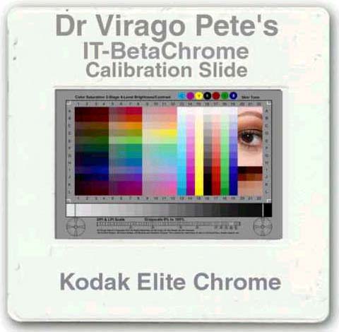
I will be using one of these 35mm color targets to ensure an accurate color representation:

Author
Time

DrDre said:

Those colours are gorgeous.

“It’s a lot of fun… it’s a lot of fun to watch Star Wars.” – Bill Moyers

Author
Time

DrDre said:

This is a very rough approximation, and is definitely not an accurate color reference, but the Mike Verta scans look something like this:

…whereas the print itself looks something like this:

Are these the accurate colors?

Author
Time

Ive never seen such clarity like these two frames. But, I really cant see a difference, other than yours is being more contrasty. Granted Im color-blind, but I asked my GF to tell me the difference and she had trouble seeing a difference as well. Perhaps its my monitor, but what am I looking for? At least so I can tell her and see if she sees it. Super cool none the less.

Author
Time

The difference between different shots of a Technicolor print can vary widely. Some are definitely too red, but some are also very yellow, and I expect that this would vary from print to print. Also, it does look like the overly red highlights are partly a contrast issue. small differences in the highlight color are magnified when the highlights are reduced.

You probably don’t recognize me because of the red arm.
Episode 9 Rewrite, The Starlight Project (Released!) and ANH Technicolor Project (Released!)

Author
Time

jedimasterobiwan said:

DrDre said:

This is a very rough approximation, and is definitely not an accurate color reference, but the Mike Verta scans look something like this:

…whereas the print itself looks something like this:

Are these the accurate colors?

No, this is a fast approximation by eye. I will try to make a few more photos, although these themselves are not yet calibrated and only give you a rough idea of what the colors look like.

Author
Time
 (Edited)

DrDre said:

This is a very rough approximation, and is definitely not an accurate color reference, but the Mike Verta scans look something like this:

…whereas the print itself looks something like this:

On my main monitor the top image looks too red and the bottom image looks too blue, you can see it in the highlights on C3PO. There’s a very noticable difference in colour between those two frames, at least to my eyes. Both are oversaturated as well IMHO.

For those interested in comparing, here’s roughly that frame from the new Star Wars Semi-Specialised Edition V2.6 I just uploaded to tehparadox: