logo Sign In

Neverar's A New Hope Technicolor Recreation (Final Version Released!) — Page 15

Author
Time

DrDre said:

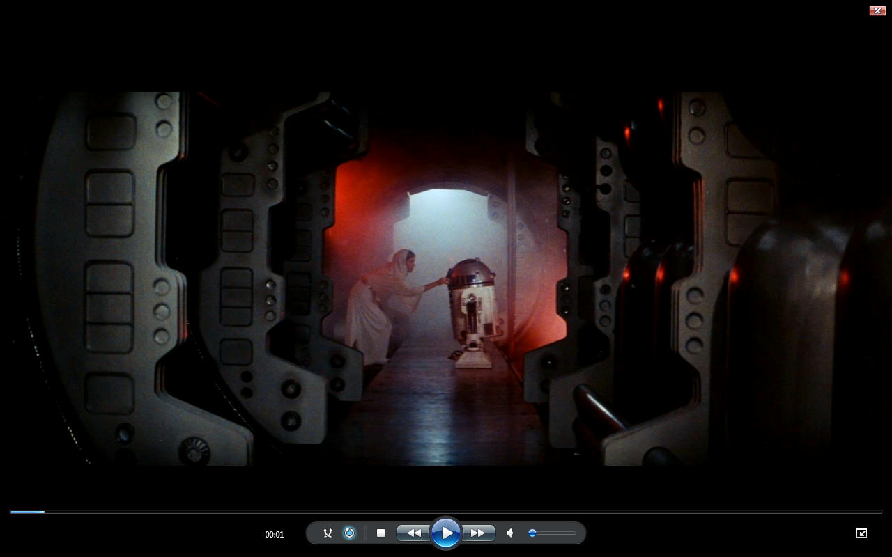
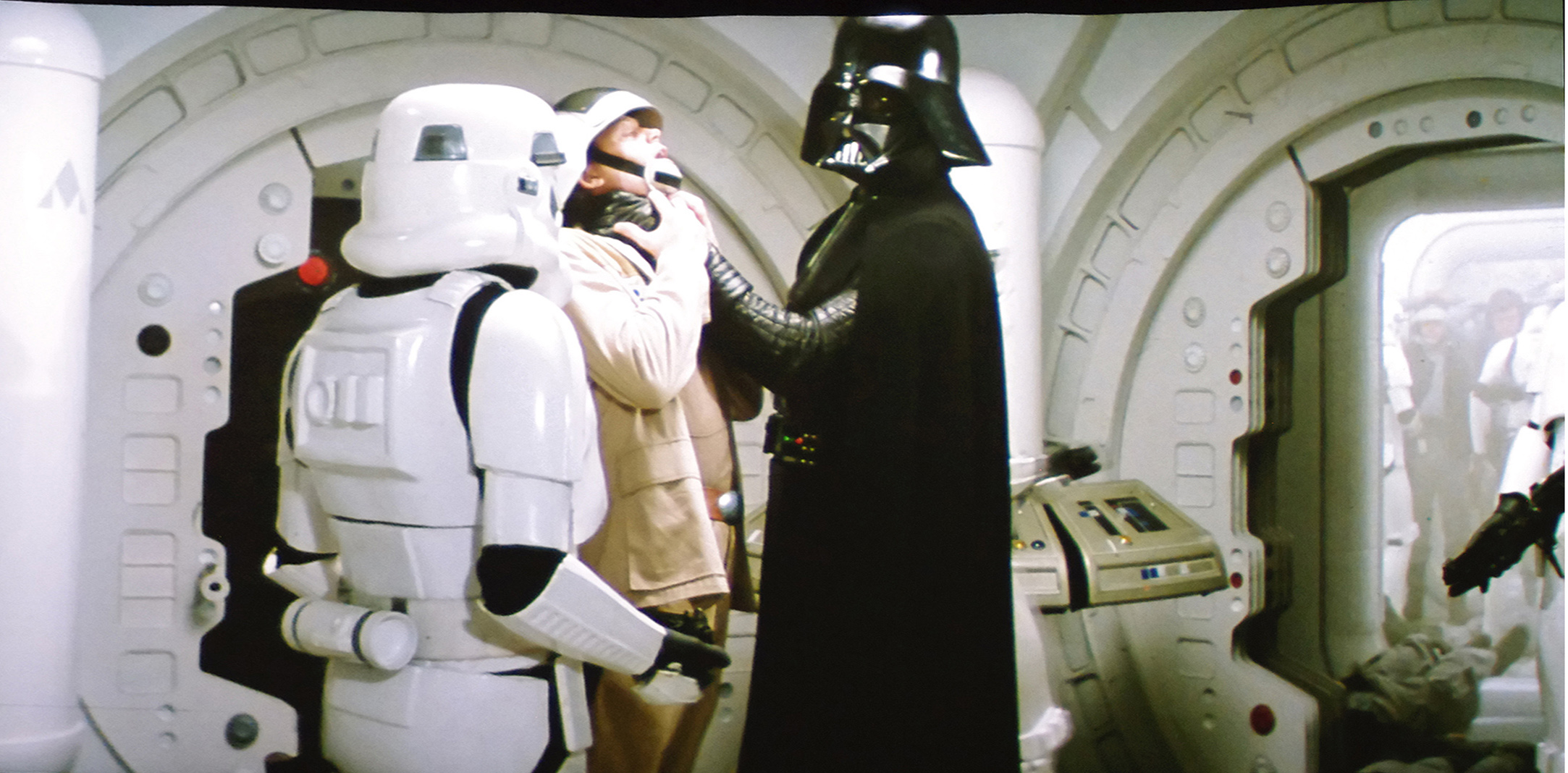
Oke, here we go. Here are four frames of different scenes in close proximity of the raw scan of the LPP used to create the SSE. For those that don’t know this, this is not a technicolor print:

Now, even for the raw scan, that is clearly blue shifted, it is pretty obvious, that the Leia/R2 corridor scene is green. However to make things more clear, I balance the Darth Vader shot (no match to the technicolor print), such that the stormtroopers, and the walls are white, and Darth Vader black (remember Mike Verta maintains the walls are slightly mint colored, so I’m actually overcompensating for any green shifts):

I rest my case. Delibirate or not, the Leia/R2 corridor scene was definitely green for 1977 prints, technicolor or otherwise.

I agree that there should be a green tint. I see that and I see no way to get rid of it while maintaining a correction that is faithful to the original color timing. However, I think it is too green. I’ve tried to color correct that section, paying attention to the black levels of everything around it and when I do, it comes out much less green. Still green, just not as green. It looks more green gray. And from these raw images, I see the same thing. I see the green, but it is only a slight green tint. The previous posts had something much greener.

Author
Time
 (Edited)

For those that are wondering, the bootleg williarob posted is actually in surprisingly good condition. It’s colors are very vibrant, and there are a few surprises:

Green corridor, but no blue R2-D2.

Author
Time

I’m sorry to disagree, perhaps I don’t understand but R2 looks blue to me, at least in this shot.

DrDre said:

For those that are wondering, the bootleg williarob posted is actually a pretty good color reference. It’s colors are very vibrant, and there are a few surprises:

Green corridor, but no blue R2-D2.

Author
Time

Not a big deal but… those shots must be from a Dutch bootleg because the subtitles aren’t Swedish.

Author
Time
 (Edited)

confusedgambler said:

I’m sorry to disagree, perhaps I don’t understand but R2 looks blue to me, at least in this shot.

DrDre said:

For those that are wondering, the bootleg williarob posted is actually a pretty good color reference. It’s colors are very vibrant, and there are a few surprises:

Green corridor, but no blue R2-D2.

I’m not talking about R2’s blue panels, but the fact that some of the print scans show this shot having a strong blue cast.

Author
Time
 (Edited)

Here’s a 2nd generation bootleg from '78, with and without a correction:
http://screenshotcomparison.com/comparison/197780
Original Colors:
Very Green
After taking out as much green as I dare:
Still Green
Notice that R2 is still blue in the escape pod.
For my project, the green levels of the offending shots are in line with the shot of C-3PO in the access hallway, so they are slightly reduced compared to the bootleg.

You probably don’t recognize me because of the red arm.
Episode 9 Rewrite, The Starlight Project (Released!) and ANH Technicolor Project (Released!)

Author
Time
 (Edited)

^ That is right Blue R2-D2 in the Escape pod I think.

This hallway shot It’s all just brightness and contrast issues particularly green contrast being too high not to mention like that technicolor print it’s had a MEGABOOSTER put on it with no Shadow what so ever.

I took a screen grab after looking at the brightness and contrast issues that were very clearly apparent in the old prints small blue push and really this all just boils down to contrast issues.

http://www.mediafire.com/convkey/836c/vyqilt1wqfpu492zg.jpg

This is what I get when adjusting the contrast from Willarobs old screen print which has an acceptable Brightness and Value.

It’s a problem with Green contrast bleeding in to the image. The shot is meant to be a bit more Blue like this at the top end that is all to stop R2-D2 and Leia looking yellowish.

The focus of the shot should be what is lit and the new Versions of Star Wars do a pretty bad job of brightness and Value boosting the image beyond what it was ever intended to be. It’s really that simple. You need Shadows and lit focus and then you get the meaning of the shot composition rather than seeing everything there is to see and being boosted up ruining the light levels.

Author
Time

Ronster said:

^ That is right Blue R2-D2 in the Escape pod I think.

This hallway shot It’s all just brightness and contrast issues particularly green contrast being too high not to mention like that technicolor print it’s had a MEGABOOSTER put on it with no Shadow what so ever.

I took a screen grab after looking at the brightness and contrast issues that were very clearly apparent in the old prints small blue push and really this all just boils down to contrast issues.

This is what I get when adjusting the contrast from Willarobs old screen print which has an acceptable Brightness and Value.

It’s a problem with Green contrast bleeding in to the image. The shot is meant to be a bit more Blue like this at the top end that is all to stop R2-D2 and Leia looking yellowish.

The focus of the shot should be what is lit and the new Versions of Star Wars do a pretty bad job of brightness and Value boosting the image beyond what it was ever intended to be. It’s really that simple. You need Shadows and lit focus and then you get the meaning of the shot composition rather than seeing everything there is to see and being boosted up ruining the light levels.

I’m not sure if you are aware of this, but the frame williarob posted, and which you appear to use, is from the 1997 SE, which does not have the strong green cast, that the 1977 prints have. They altered the color timing for the SE.

Author
Time
 (Edited)

NeverarGreat said:

Here’s a 2nd generation bootleg from '78, with and without a correction:
http://screenshotcomparison.com/comparison/197780
Original Colors:
Very Green
After taking out as much green as I dare:
Still Green
Notice that R2 is still blue in the escape pod.
For my project, the green levels of the offending shots are in line with the shot of C-3PO in the access hallway, so they are slightly reduced compared to the bootleg.

When I match your '78 bootleg to the 1977 bootleg williarob shared (using the Leia frame), I get this:

This looks a lot like the Technicolor colors we’re used to, with an overall warmer and more yellow color timing.

Author
Time

DrDre said:

Ronster said:

^ That is right Blue R2-D2 in the Escape pod I think.

This hallway shot It’s all just brightness and contrast issues particularly green contrast being too high not to mention like that technicolor print it’s had a MEGABOOSTER put on it with no Shadow what so ever.

I took a screen grab after looking at the brightness and contrast issues that were very clearly apparent in the old prints small blue push and really this all just boils down to contrast issues.

This is what I get when adjusting the contrast from Willarobs old screen print which has an acceptable Brightness and Value.

It’s a problem with Green contrast bleeding in to the image. The shot is meant to be a bit more Blue like this at the top end that is all to stop R2-D2 and Leia looking yellowish.

The focus of the shot should be what is lit and the new Versions of Star Wars do a pretty bad job of brightness and Value boosting the image beyond what it was ever intended to be. It’s really that simple. You need Shadows and lit focus and then you get the meaning of the shot composition rather than seeing everything there is to see and being boosted up ruining the light levels.

I’m not sure if you are aware of this, but the frame williarob posted, and which you appear to use, is from the 1997 SE, which does not have the strong green cast, that the 1977 prints have. They altered the color timing for the SE.

It had green contrast increased because it was a problem.

It should definitely be in shadow the walls. It is not lit hardly at all.

This is what I am trying to tell you it has been boosted up destroying the light levels. It is meant to be dark and have shadows. That is the most important thing I am trying to get across to you.

If it had a green contrast issue they decided it was more aesthetically pleasing to irradicate it. And I don’t blame them.

It is not really changing the color but it is changing the contrast for which there was a problem with it.

Author
Time
 (Edited)

The owner of the Technicolor print I’m in contact with has given me permission to share these photos of a test screening of the first reel, that has been cleaned:

The colors are very similar to those of the 1977 bootleg, albeit slightly less yellow. However, both the bootleg and the above photos point to a warmer yellowish tone:

Author
Time

bromeo said:

Not a big deal but… those shots must be from a Dutch bootleg because the subtitles aren’t Swedish.

So I see! I never really looked at them. I was told they were Swedish so that’s what I went with. Sorry!

TheStarWarsTrilogy.com.
The007Dossier.com.
Donations always welcome: Paypal | Bitcoin: bc1qzr9ejyfpzm9ea2dglfegxzt59tys3uwmj26ytj

Author
Time
 (Edited)

Another shot that’s interesting to me is the Mos Eisley entry sequence, which looks like this on the bootleg:

So, the droid seems to be more yellow, and not the deep orange seen on the bluray. Also there’s a far greater color dynamic, than is often assumed.

Author
Time
 (Edited)

…and here’s are the often debated Tarkin shots:

The green in these shots and the general agreement between the 1977 bootleg and the technicolor print suggests the bootleg itself was also filmed during the screening of a technicolor print.

Author
Time

I think one thing is being missed in the discussion of different transfers - the nature and generation of the versions.

GOUT - from a 1985 interpositive
97 SE - from a 1997 interpositive
35 mm - from a print (interpositve to internegative to print)
Tech IB - from a color separation and then a print
DVD and Blu-ray - directly from the faded negative in 2003

Interprositives are orangey. They require a color adjustment to render them into watchable colors. The type and level of orange can vary depending on film stock, though Star Wars should have been a very standard one. I was able to find a frame from each of these and you can see the generational difference in the deatils when the Stormtroopers burn through the Blockade Runner hatch. The 97 SE, DVD, and Blu-ray all have about the same level of detail. The GOUT has the most and the 35 mm the least. With each optical copy, the chance of color errors increases. If we are correcting the 35 mm to match the Tech IB, we are ignoring a generational difference. That could be why when matching some shots, others have come out too green.

But it also means that we have to take each version and its colors differently. We can’t assume that any of them were processed correctly. I don’t know of any transfers from the negative after 1985 that don’t have severe fading issues. The Tech IB is reported to have a green cast to it (likely due to the low budget science fiction nature of the film as well as the end of the Technicolor IB print era). The 35 mm prints are all faded or are copies. The home video transfers all share similar colors so it probably wasn’t an odd color correction for the GOUT - it probably was standard settings for the film stock.

If you are after the 1977 theatrical colors, I think the Tech IB prints are your best bet. The color should not have faded much at all. It probably doesn’t represent the 35 mm or 70 mm prints, but it is the best we have. I am not after the look of the original prints. I’m after the look of a presentation print struck directly off the negative. I want to see the colors as they were timed, not as they turned out on distribution prints. But I’ll take that 77 theatrical look because it is better than the Blu-ray.

Author
Time

Never, I am really enjoying what it is you are doing here. Thank you for sharing the journey with us.

😃

Author
Time
 (Edited)

NeverarGreat said:

DrDre said:

Does the projector use the yellow bulb common in the 70’s?

Also, the tone is consistent with the Senator screening photos, though there is more contrast, the highlights are more blue, and the shadows even more yellow:
Beauty Epitomized

I’m not sure. I will ask him what type of bulb they are using.

Author
Time
 (Edited)

Williarob said:

So I see! I never really looked at them. I was told they were Swedish so that’s what I went with. Sorry!

No sorrys needed, it was just a friendly correction because the Swedish part caught my eye. 😃

Author
Time
 (Edited)

DrDre said:

The colors are very similar to those of the 1977 bootleg, albeit slightly less yellow. However, both the bootleg and the above photos point to a warmer yellowish tone:

Do you think that might be something to do with the actual technology of the time though? Pretty much every film from the 70’s has a yellow tone. That is too much of a coincidence.

I know when I went through Hell with Enter the Dragon with Color and Contrast issues and that is from 1973 and it’s obviously a different film all together but Blues were always quite muted from this era of film and Reds are way up with Greens. It’s like the Blue Color Spectrum did not quite make it to 70’s films.

At which point does Brightness and Contrast get introduced to a film scan?

I have no idea but I can imagine Brightness and Contrast easily being a factor introduced with either different scanning technology and / or better scanning technology. Nobody wants the horrible Contrast of the Old VHS days. The fail safe being Put the contrast and brightness up really high probably to avoid losing information when transferred to tape or simply the transfer technology was awful by today’s standards.

I think whatever analysis you are doing you are very much ignoring Brightness and contrast and are getting a bit confused by Color Bleed from Bad contrast issues. It’s messing your calculations up and you are not taking in to account how bad contrast can screw it all up. If it’s not neutral contrast you will have color Bleed and color that should not be in the image.

Rule of thumb 70’s films yeah Blue is missing in action.

Author
Time

Those debates remind me a question.

The “Technicolor look” is often opposed to “Eastman” or “Home video” looks for preservations here. But how could it actually be defined for Star Wars ? Does it just mean more vivid colors and sometimes little flaws due to complexity of the process and the importance of the human eye to obtain the correctly balanced image ?

In all the cases, Star Wars never look like Gone with the wind, The ten commandments or Singing in the rain. And in all the cases, it was shot on Kodak stock (there’s not three reels and filters in the camera) but processed with a color separation master, right ? So, even printed by the Eastman process, it is a Technicolor film, no ?

So, taking in account the fact that each print is different, what would be - in term of colors, contrast, sharpness etc. - the differences between a british Tech print with correctly aligned chanels and no grading flaws and a non faded Eastman print ?

Author
Time

confusedgambler said:

I’m sorry to disagree, perhaps I don’t understand but R2 looks blue to me, at least in this shot.

DrDre said:

For those that are wondering, the bootleg williarob posted is actually a pretty good color reference. It’s colors are very vibrant, and there are a few surprises:

Green corridor, but no blue R2-D2.

Sorry not trying to steer the conversation away but this shot is Interesting because It’s Clearly not color making it’s way in from Shadows like the Green walls. All of this Color on R2-D2 is coming in from the Middle range and tops that rules out that it’s not contrast issues coloring R2-D2 so vividly.

But it looks quite a turqoise light or Cyan light on him Yes? But when you account for missing Blue and probably having to increase Green and Red Contrast to remove bleed and decrease blue contrast bringing out muted highlights and I am sticking to my guns that this film is missing Blue Push at the top and the middle definitely in my opinion.

He will actually look less Cyan or Turqoise and more blue at least that is how I think it is “meant” to look. So this would not fall in to the catagory of a contrast color Bleed because it is in the middle and top of the color range. Which entirely rules out that it’s color Bleed coloring R2-D2 because of it being in the Highs and Mids. But it’s not Cyan light if that makes sense.

Author
Time
 (Edited)

Ronster said:

DrDre said:

The colors are very similar to those of the 1977 bootleg, albeit slightly less yellow. However, both the bootleg and the above photos point to a warmer yellowish tone:

Do you think that might be something to do with the actual technology of the time though? Pretty much every film from the 70’s has a yellow tone. That is too much of a coincidence.

I know when I went through Hell with Enter the Dragon with Color and Contrast issues and that is from 1973 and it’s obviously a different film all together but Blues were always quite muted from this era of film and Reds are way up with Greens. It’s like the Blue Color Spectrum did not quite make it to 70’s films.

At which point does Brightness and Contrast get introduced to a film scan?

I have no idea but I can imagine Brightness and Contrast easily being a factor introduced with either different scanning technology and / or better scanning technology. Nobody wants the horrible Contrast of the Old VHS days. The fail safe being Put the contrast and brightness up really high probably to avoid losing information when transferred to tape or simply the transfer technology was awful by today’s standards.

I think whatever analysis you are doing you are very much ignoring Brightness and contrast and are getting a bit confused by Color Bleed from Bad contrast issues. It’s messing your calculations up and you are not taking in to account how bad contrast can screw it all up. If it’s not neutral contrast you will have color Bleed and color that should not be in the image.

Rule of thumb 70’s films yeah Blue is missing in action.

Let me make this clear. This discussion as far as I’m concerned is about preserving the colors of the projected 1977 film warts and all. It is not about creating an idealized version of how one or the other person would like the film to look. Just like in the Raiders of the Lost Ark thread you’re trying to force your perspective by assuming everyone else is wrong for trying to preserve a 1970s or 1980s look, making it seem as if the only right thing to do, is to go for what you personally and subjectively percieve are the correct colors. I’m not interested in that. I’m in the process of correcting the colors of a film scan back to it’s original 1977 state. If the the colors look more yellow than what’s currently seen as aesthetically pleasing, than that’s just the way it has to be.

Author
Time

And let me be clear. If you can figure out what something is meant to look like in reality approximately without any Warts.

When you compare it to several versions with Warts you can understand how each of your sources is altering or differing from what it looked like in reality approximately. And how much say a certain source is altering what it would look like in reality.

you can then infer a difference of how much each of your references is off by to come to a mean average.

So I was trying to be helpful in a lateral way but you simply have not grasped that.

Nevermind & Good Luck