
- Time
- Post link
@Harmy,
What method did you use to color correct?

Having colour corrected the whole 2004SE Jedi myself, I assure you that the lightsabres aren't a screwup in themselves, it is the overall colour and brightness issues that cause the lightsabres to look like they do.
Look at this clip of ROTJ lightsabre fight comparison between the 2004SE and my PDE. All I did was adjusted the contrast brightness and colours, I didn't rerotoscope or anything.
@Harmy,
What method did you use to color correct?
I colour corrected on a scene by scene basis in my video editor.
Harmy said:
I colour corrected on a scene by scene basis in my video editor.
Which is? I assume not avisynth.
Oh, no, that's waaaay too complicated for me. I'm using the latest version of PowerDirector (btw. a great improvement over the previous one).

Does there seem to be some agreement that while the blue levels are overdone in at least certain scenes in the 2004 SE DVD set, that there needs to be some boost to the blue levels in some scenes in the GOUT DVD set to get closer to the correct theatrical colors? Or would increasing the overall saturation level alone in the GOUT provide the correct blue levels in all scenes?
The Star Wars trilogy. There can be only one.

Following my previous post I have been playing with the avisynth filters; ColorYUV, Levels and Tweak to try and improve upon the results of the previous settings I posted. I am currently using the following:
ColorYUV(off_u=-2.0,off_v=-4.58).Levels(15,1.08,255,0,255).Tweak(sat=1.1)
After all this playing around it is my opinion that the reason the GOUT looks so washed out is more due to a lack of contrast and the excessive red levels then an actual lack of saturation, although that's not to say that it couldn't use a saturation boost as you can see from the above settings.
I am at work at the moment, but if people are interested I will try and post some before/after shots of the above settings when I get home.
Original Trilogy in Replica Technicolor Project
Star Wars PAL LaserDisc Project

bkev said:
I think that ROTJ looks fantastic in the SE, aside from the previously-mentioned lightsaber shorts I can't find any real fault with it. Then again I'm sure I didn't look very hard...
Yes, you need to look harder. There are no lightsaber shorts in the movie.
:p
LOL
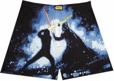
Being from Great Britain that picture initially had a different meaning for me, I initially thought it was a metaphor for the 2004 SE being "Pants" as in rubbish. Pants is a generic term for male underwear here and those shorts look like boxer-shorts underwear, pants also means rubbish, crap, etc. here.
Any way here are some comparison shot between the GOUT with G-Force's script applied sans the colour correction commands and the GOUT with G-Force's script applied with my colour correction command.


Original Trilogy in Replica Technicolor Project
Star Wars PAL LaserDisc Project

Definitely looks too cyan, the highlights are slighly green, and the colours could use a big boost too. I would say split the difference in terms of the colour-shift and it should be pretty good. If you can program a saturation increase of a few points that would help a lot, that was basically the main point I was trying to emphasize with this thread.

Lee, referring back to my post on page 1, did you attempt a basic calibration of your display before making any colour adjustments? I can't stress how important this is. The X0 Project website used to have a tutorial that was useful, shame it's now gone.
This advice also applies to anyone who wants to make comments about someone else's adjustments (Zombie)!
Guidelines for post content and general behaviour: read announcement here
Max. allowable image sizes in signatures: reminder here
Is there any alternate sites to show how to do basic monitor calibration? because I have ran into this also, what might look good on my PC does not look so hot on my HDTV and vice versa.
Zombie84, thanks for the feedback, I was thinking the corrected shots looked a little too green/cyan, so thanks for confirming that. ;)
Moth3r to answer your question, yes I have done a basic calibration of my display, well actually I have done as advanced a calibration as Mac OS will allow me! I am running Windows XP SP3 in a Virtual Machine at present.
Here are some updated comparisons using Zombie84's suggestions for settings adjustments.


Here are the latest settings I am using for colour correction:
ColorYUV(off_u=-1.0,off_v=-2.29).Levels(15,1.08,255,0,255).Tweak(sat=1.2)
Original Trilogy in Replica Technicolor Project
Star Wars PAL LaserDisc Project

dark_jedi said:
Is there any alternate sites to show how to do basic monitor calibration? because I have ran into this also, what might look good on my PC does not look so hot on my HDTV and vice versa.
If your monitor is listed, you might be able to find settings you can use on this site: http://www.digitalversus.com/colour-calibration-profiles-your-monitor-article-424.html
If they have a review, they have detailed info. At the time I bought my monitor, it wasn't listed there so I calibrated it myself using RadLinker (to set the gammas at boot time), Catalyst Control Center (to set colors after CCC has loaded), QuickGamma (as reference for finding the settings I wanted, not for setting anything) and these websites:
http://www.docstoc.com/docs/37868163/Bryce-Alive-Quick-Guide-to-Monitor-Calibration (This is an archive of a dead site.)
http://www.normankoren.com/makingfineprints1A.html#gammachart
QuickGamma is a good tool to do it all (since CCC and Radlinker are ATI only (and fight each other)): http://www.quickgamma.de/indexen.html
Dr. M
Funnily enough, there is a monitor calibration guide on the 2004 DVDs. You can find it in the upper left corner of the language setup menu.
I calibrated my TV according to the guide provided on the DVDs themselves (in other words what should be perfect settings for the correct presentation of the discs) and the colours still look like sh*t.

^I did the same. Initially, I thought there must be something horribly wrong with my television set. Later, I discovered the flaw was in the product itself. Pretty frickin' irritating.
Every 27th customer will get a ball-peen hammer, free!
IIRC, the problem with DVD calibrations such as the THX Optimode is the method involved.
The Optimode calibration video/audio is intended to go through the same processing as the movie itself. As a result the Optimode for a given DVD is so you can calibrate your home theater so it is accurate for that DVD only. It is not an absolute calibration for accuracy.
(At least this is what I remember reading way back when. I hope they've changed that.)
Dr. M

The Optimode calibration video/audio is intended to go through the same processing as the movie itself.
Doctor M said:
IIRC, the problem with DVD calibrations such as the THX Optimode is the method involved.
The Optimode calibration video/audio is intended to go through the same processing as the movie itself. As a result the Optimode for a given DVD is so you can calibrate your home theater so it is accurate for that DVD only. It is not an absolute calibration for accuracy.
(At least this is what I remember reading way back when. I hope they've changed that.)
That's nice and all, but that's the joke, isn't it? I calibrated my TV based on the THX optimode from the 2004 TESB disc and the colours of the film on the very same disc still looked like sh*t.
Doctor M is on the right lines, but has slightly misremembered the facts:
Doctor M said:
IIRC, the problem with DVD calibrations such as the THX Optimode is the method involved.
The Optimode calibration video/audio is intended to go through the same processing as the movie itself.
This is correct. Modern video card drivers have separate settings for the desktop and the video overlay. So if you use the THX Optimizer, DVE, etc. to set up your monitor for DVD playback in a media player, then look at a JPG on the internet, your monitor may give you different set of levels.
I would recommend you rip the calibration screens off the DVD and save them as BMPs. Also be careful because some MPEG-2 decoders don't give you accurate colours, ie avoid VirtualDubMod and use DGIndex or the latest VirtualDub w/MPEG-2 decoder plugin instead.
Once your monitor is calibrated for your desktop, leave the monitor settings as they are, then calibrate DVD playback by adjusting the video overlay settings in your graphics card drivers.
As a result the Optimode for a given DVD is so you can calibrate your home theater so it is accurate for that DVD only. It is not an absolute calibration for accuracy.
(At least this is what I remember reading way back when. I hope they've changed that.)
This is incorrect. The THX optimizer screens on the Star Wars discs are the same as the Indy discs, etc. (I've checked!)
Guidelines for post content and general behaviour: read announcement here
Max. allowable image sizes in signatures: reminder here

Fight Club has it too (at least the old single-disc version I have does).
This signature uses Markdown syntax, which makes it easy to add formatting like italics, bold, and lists:
THX says their test signals are unique, though, because they’re equal to the final reference levels set during the individual DVD’s mastering. This supposedly means you can tailor your system’s performance to each specific DVD title that has the Optimode stuff encoded onto it.
Source: http://www.technofile.com/articles/thx_optimode.html
Seems to be true. It's a by disc calibration, not absolute for your system.
I agree you shouldn't use any DVD decoding software to view optimode. Mostly because NTSC black levels are 16-235 (which some software players will output. PC monitors are 0-255. So your black and white levels may be miscalibrated to these levels, or worse, the decoder may use some adjustment/filtering to "improve" playback in a random way.
Forget Optimode, it's not useful for much of anything, and I would certainly never use it for a PC.
Use http://www.normankoren.com/makingfineprints1A.html#gammachart, quickgamma or similar calibration software to set the right levels for an RGB display, not software for YV12/NTSC video.
Btw, Blu-Rays are also 16-235 levels, so even though HDTV and BD have more vibrant colors, a BD Optimode would be just as inappropriate.
As far as overlay vs desktop color schemes, you don't need to take that into account if you are making your adjustments in your monitor's controls instead of your PC's software.
Finally, I'm not certain that overlay has separate settings, I know 3D graphics have different gamma corrections versus 2D (desktop). If your software player uses DirectX for rendering, than you might be effected by that distinction.
Edit: That all being said, it's why I used the method that I do for making adjustments to video. They are based on absolute numbers and/or comparison to other sources, not my eye which may be just as inaccurate as my monitor's calibrations.
Dr. M

Since I have Avid Media Composer, I also have a bunch of professional-level test patterns that I can send to people.
The patterns I have are made for 16-235. HOWEVER, if you import them into Avid using Computer RGB (0-255) levels, you WILL get inaccurate color (I've seen this personally many times - your blacks will be super intensely crushed). Therefore, they need to be imported into Avid at 601 (CCIR) color (16-235). I know how to do this on Avid, but I'm not sure how to do it in other programs.
I have (at NTSC and PAL SD, and 720p/1080p):
SMPTE Bars
Color Bars
Bowtie
B&W Ramp
Multi-Burst
If anyone wants any of these test patterns, let me know and I'll send them to you.
Long post, so strap in.
The first and most important thing is that GOUT's colors are crap. While the balance is better than the SE, it just doesn't have as dynamic a range of colors as we really need.
The below screenshots below were taken in VirtualDubMod. Both the GOUT and Technicolor images have been resized and/or cropped. That should have no effect on color. (Technicolor above, GOUT below)
You can see that the problem isn't just saturation, but that the GOUT colors just don't cover enough of the spectrum.


So you can saturate those colors as much as you want, it won't get you a match.
The next problem is that each color has a different peak. The worst offender is red. The next screenshot is from GOUT during the opening space battle. I swear no picture levels have been messed with:

See those boxes?
They identify where a 75% intensity value for the primary (and complementary) colors would fall. For TV viewing, you should never adjust colors past these targets. Some high intensity/highly saturated colors are not valid for a TV signal. They will most likely be clipped and cause distortions. Red is especially problematic. TVs tend to actually add a red cast to a signal. So for TV viewed source, you should try to keep the red a bit low.
Ouch. It's really not uncommon for commercial DVDs to exceed those boxes, but I've never seen a color fall outside of the scope's limit.
So what did I do? Okay, keep in mind a few things.
1) I do not have the full DVD at the moment. Peak values were determined based on a few key scenes.
2) The Levels were adjusted. I stuck with g-force's 1.08 gamma adjustment because it brightens the picture slightly without over doing it. I know of no objective adjustment, and PC levels being different tend to make DVD video look darker than how it would look on a TV. Should it be left alone all together? I'm not sure.
3) I disagree with g-force's black level boost. The black and white levels hit the maximums. g-force said 10, I say 3 is just enough to keep the darkest blacks around the same level after the gamma adjustment. (Unless he intentionally crushed the black level to remove fx matte problems. Anyone know for sure?)
4) I have fair color vision at best, so for all I know the people look like oompa loompas and C3PO is green.
5) I went the opposite direction with the hue than g-force. He went -3 I went +5, and then only for red, yellow and green so the skin tones would be closer to the technicolor print.
6) Red is overdriven and clips, green is almost too strong (but I liked it untouched best), Cyan is just about right.
The script would be:
levels(3, 1.08, 255, 0, 255) #Note: Changes in gamma can effect
#color saturation.
converttorgb() #required to use Hue filter
hue(channels="RYG", hue=5) #Adjust hue "CCW" for Red, Yellow, Green
hue(channels="YBM", sat=1.4) #boost Yellow, Blue, Magenta to 140%
hue(channels="R", sat=0.85) #Tough call. 0.9 looks a bit better,
#but is probably still too high.
converttoyuy2() #If you are encoding using CCE


I'm trying to get a hold of the full DVD to be more specific, but this should be a good starting point.
(Avisynth Hue() filter can be found here: http://www.wilbertdijkhof.com/)
Opinions? Criticisms? Suggestions?
Dr. M
Great post Doctor M!
It is my understanding that the black levels boost in G-Forces script improves the contrast, I'm no expert so I don't know if this is the best way to do this, but IMO the GOUT certainly does need the contrast boost!
It is my observation that the reason the GOUT looks so washed out is down to three factors:
1. Lack of contrast
2. Excessive red levels
3. Lack of saturation
For factors 2 & 3 I have found that by reducing the red levels this improves the overall colours although they still need a slight saturation boost.
Original Trilogy in Replica Technicolor Project
Star Wars PAL LaserDisc Project