logo Sign In

revenge of the sith font?

Author
Time
i'm sure somebody already gave the info, but can you tell me what font was used in the "jedi" type logo for "episode3"?

this one:

Author
Time
Yes way! (sorry, but I love juvenille expressions like that)
Don't forget: with Lacuna, you can forget.
Author
Time
Quote

Originally posted by: Duke's alter ego
Yes way! (sorry, but I love juvenille expressions like that)


You just had to say it, didn't you? I sense too much Bill and Ted influence in you!
Author
Time
Glad it's not Comic Sans. Worst Font Ever.

Wouldn't that Jedi/Sith logo have looked SWEET on the poster? And with like, Anakin's mug on the left, and Vader's on the right or something? I thought that overly uniform motif of the prequel logos (emphasizing Episode numbers and not movie titles) was a bummer. Think about all the various, cool OT posters/logos. Although, I believe that Sith logo was used as a soundtrack cover in the UK.
We don't have enough road to get up to 88.
Author
Time
Yeah, I hated that too. But I really went crazy when he decided to redo the OT logos in the same style. I nearly shit a brick. It's really a crappy logo to begin with, but it was just taken too far.

There is no lingerie in space…

C3PX said: Gaffer is like that hot girl in high school that you think you have a chance with even though she is way out of your league because she is sweet and not a stuck up bitch who pretends you don’t exist… then one day you spot her making out with some skinny twerp, only on second glance you realize it is the goth girl who always sits in the back of class; at that moment it dawns on you why she is never seen hanging off the arm of any of the jocks… and you realize, damn, she really is unobtainable after all. Not that that is going to stop you from dreaming… Only in this case, Gaffer is actually a guy.
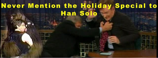
Author
Time
At least the new logos give the movies a sense of unity.
Author
Time
Quote

Originally posted by: booah
Glad it's not Comic Sans. Worst Font Ever.

Wouldn't that Jedi/Sith logo have looked SWEET on the poster? And with like, Anakin's mug on the left, and Vader's on the right or something? I thought that overly uniform motif of the prequel logos (emphasizing Episode numbers and not movie titles) was a bummer. Think about all the various, cool OT posters/logos. Although, I believe that Sith logo was used as a soundtrack cover in the UK.


Old people seem to be quite fond of Comic Sans. They seem to use it to be 'hip' for all the youngin's reading their materials.
MTFBWY. Always.

http://www.myspace.com/red_ajax
Author
Time
Quote

Originally posted by: Adamwankenobi
At least the new logos give the movies a sense of unity.


Too bad the logos are the *only* thing that do that.

Quote

Old people seem to be quite fond of Comic Sans. They seem to use it to be 'hip' for all the youngin's reading their materials.


It's also the credit font in a lot of 80's sitcoms. And the Bob Saget version of America's Funniest Home Videos.
We don't have enough road to get up to 88.
Author
Time
ok thanks! i needed that to make for myself a nice "revenge of the shit" t shirt!
there's one convention coming up in Paris, so the t shirt will be ready!

Author
Time
no, the guy needed an illustrator type doc, and i didn't want to "retrace" the whole thing on Illustrator!