logo Sign In

The Unofficial Complete REVISITED SAGA Ideas and Random Discussion Thread — Page 4

Author
Time

Bingowings said:

As astonishing as ESB:R will no doubt be, the fun really starts with ROTJ:R and PT:R because what there is to work with incrementally decrease and you will all have to rely on your ingenuity and imagination.

 As pumped as I am to be a part of ESB:R....I'm REALLY looking forward to helping out on ROTJ:R and the PT. Those films NEED some work....done by someone who cares about the films themselves as opposed to the toy sales.

Author
Time
 (Edited)

Captain Antilles said:

muddyknees2000 said:

nightstalkerpoet said:


A part of me would love to see Ewan McGregor's mole added to Alec Guinness in the OT.

 Why not remove it from the PT instead? Thats more Revisited's style anyways.

hahahahahahahahahahahahahahahahahahahahahahahahahahaha


...I agree completely. =)

Although I'm keeping my powder dry until the actual ROTJ:R and Prequels:R threads come along one day (I'm guessing the prequels will get a dedicated thread each at the *same* time as each other, seeing as adywan is planning on editing all of them at the same time)...I do love the fact that the 'mole' thing has been brought up already. :)

It's always been a trivial little thing that caught my attention during the prequels, but add me to those that are hopeful that adywan will erase it from Ewan's forehead wherever it's prominent, to better match Alec's blemish-free, 'older' Obi-Wan forehead, lol. 

Especially since Ewan got rid of it anyway - http://www.dailymail.co.uk/tvshowbiz/article-479865/Ewan-McGregor-gets-mole-truth.html

Author
Time

I can already see it... Ady "chasing the mole" for months. :)

Should the PT be desaturated a little to match the OT color palette a little better? Or do people think the PT blus don't need a color correction.

I think the first two definitely need some visual help. I'm torn on RotS though. It is absolutely beautiful on Blu - one of my standard movies to show off on my HDTV. But it looks so much newer than the OT that part of me thinks it needs to be taken down a few notches :/

Preferred Saga:
1/2: Hal9000
3: L8wrtr
4/5: Adywan
6-9: Hal9000

Author
Time
 (Edited)

 I'm definitely all for a re-tooling of the look of the PT. It has none of the "second hand galaxy" feel that the OT did......its all just too new and flashy, colors like candy as opposed to more toned down palettes. It looks like a video game, or something from Star Trek.

Author
Time

muddyknees2000 said:


I'm definitely all for a re-tooling of the look of the PT. It has none of the "second hand galaxy" feel that the OT did......its all just too new and flashy, colors like candy as opposed to more toned down palettes. It looks like a video game, or something from Star Trek. 


I agree. I'll go as far and say that I hope when Ady gets done with the prequels, that they are unrecognizable from what we know them to be currently.

Author
Time

mrbenja0618 said:

...I hope when Ady gets done with the prequels, that they are unrecognizable from what we know them to be currently.

 He has said that himself so thats one thing you can count on.

Author
Time

This is why I'm more excited about his prequel work than anything else at the moment. Don't get me wrong; I'm excited about ESB, but I think we can all agree that we are all far more interested in getting proper prequel films.

Author
Time
 (Edited)


The key is to remember that the used look should only apply to technology used by people who can't afford the latest thing or maintain older things to mint level.

So the Naboo Royal flight should look shiny and clean as it's hardly ever used and mostly ceremonial.

The Republic courier ship should look clean because it's a vehicle used by the political arm of a rich galactic government.

Arguably the only ships in Episodes 1 through to 2 that should look used should be seen on Tatooine and Slave One.

In ROTS the war has been going on for a long while so you can understand both sides looking a bit battered.

I would add damage to Coruscant in ROTS implying that the battle and the diversion of funds to the war has taken the sheen off the capital but it's still the Capital.

It should look shiny on the surface but get dirtier and grungier the lower down the huge city you get.

The Republic's official droids should look clean all the time so I would have a gold shiny Threepio (not made by Anakin) behind the Queen or Padme every time she might need a translator.

The pit droids and the battledroids in ROTS could look beaten up.

Largely this matches what was actually done in the PT.

The real problem with the worlds of the PT is that they are populated by boring characters and are the setting for nonsensical situations.

The missed opportunity of the PT was not seeing the X-Wings and Y-Wings when they were cutting edge and clean.

So arguably the films need more sheen on select items not less. 


Author
Time

I don't know. I get what you're saying, but still, at the end of the day, the ships still need to feel lived in a bit to me. Adds that little bit of realism needed in a fantasy/scifi film. Going by this rule, the Empire should have had shiny ships, but the tie fighters were just as rough looking to me as the rebel ships. You could make an argument for the star destroyers, but at least those ships looked real. At no point did the queens ship give me the illusion of a believable flying craft. I kept looking for the Mattel and Lego markings.

Author
Time
 (Edited)

The rebels had tatty ships because they had to maintain ancient machines, the Jawas sold tatty robots to moisture farmers because that is what they could salvage and the townships of Tatooine had speeders with dents in because they were average Joe farmers going about town.

When you are showing a royal flight for example, this is a ceremonial fighter group.

It may be old but because it's ceremonial it looks brand new.

Airforce One looks new because you don't want the leader of the world's superpower stepping off a tatty looking rust burger. It doesn't inspire confidence.

The look should be applied in a logical way not just for the sake of applying it.

Show me the rust, dents and flaky paint on the Imperial ships. 

Author
Time

Again I understand what you're saying. But new looking and fake looking are two different things. Like I said, the Star Destroyers had a new look to them in the ot, but they looked real and believable. The Queens ship looks like ship from Flight of the Navigator on the surface, and then looks like my daughters toy kitchen on the inside. It looks fake all around.

Author
Time
 (Edited)

I have to disagree there.

The difference is down to design not in universe plausibility.

I remember seeing AOTC and being rather taken with the opening scene of a giant chrome wing landing on foggy Coruscant.

The Star Destroyer is a piece of military brutalism.

It's matte clustered detail lends it a sense of massive scale.

The Naboo ships aren't from that same design ethic.

They are meant to look light and shiny and they do.

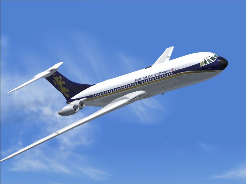
A VC10 looks just as other worldly :

One may argue that the resolution of the digital medium and the computer model get in the way of selling the model itself but the idea is sound and plausible.

Author
Time

Bingowings said:

I have to disagree there.

The difference is down to design not in universe plausibility.

I remember seeing AOTC and being rather taken with the opening scene of a giant chrome wing landing on foggy Coruscant.

The Star Destroyer is a piece of military brutalism.

It's matte clustered detail lends it a sense of massive scale.

The Naboo ships aren't from that same design ethic.

They are meant to look light and shiny and they do.

A VC10 looks just as other worldly :

One may argue that the resolution of the digital medium and the computer model get in the way of selling the model itself but the idea is sound and plausible.

Honestly, the "clean" designs of the ships in I and II are one of the best ideas from the Prequels. The Prequels should also be DIFFERENT from the PT guys, remember? 

Author
Time

Bingowings said:

I have to disagree there.

The difference is down to design not in universe plausibility.

I remember seeing AOTC and being rather taken with the opening scene of a giant chrome wing landing on foggy Coruscant.

The Star Destroyer is a piece of military brutalism.

It's matte clustered detail lends it a sense of massive scale.

The Naboo ships aren't from that same design ethic.

They are meant to look light and shiny and they do.

A VC10 looks just as other worldly :

One may argue that the resolution of the digital medium and the computer model get in the way of selling the model itself but the idea is sound and plausible.

But my argument is not only of a CG model, but of interiors as well. The interior of the queen's ship looks incredibly artificial to me. The controls in the cockpit, everything looks corny to me. Shiny isn't my main issue, artificial appearances is. It all looks like it was designed by a 5 year old girl trying to dream up her own version of Star Wars ships.

Author
Time
 (Edited)

I think the problem with the Naboo ship is the fact that it looks almost like a snap together toy rather than something that is of sturdy build quality. Elegance is definitely required when it comes to royalty, but so is protection. It appears when looking at it that it was built ONLY for elegance...

The other problem I really have with it is that it doesn't show any obvious wear and tear after running the blockade It'd be nice to see some slight smoke as it lands on Tattooine, and perhaps some slightly shoddy patch-work visible whenever it is seen after they get the parts for repairs.

I wouldn't be opposed to the redesigned flight controls, etc. I'm sure Ady could do amazing work there.

The Queen's ship audience chamber should be even nicer, IMO. It should look exactly like the Audience chamber in the Captial.

Preferred Saga:
1/2: Hal9000
3: L8wrtr
4/5: Adywan
6-9: Hal9000

Author
Time

nightstalkerpoet said:

I think the problem with the Naboo ship is the fact that it looks almost like a snap together toy rather than something that is of sturdy build quality. Elegance is definitely required when it comes to royalty, but so is protection. It appears when looking at it that it was built ONLY for elegance...

The other problem I really have with it is that it doesn't show any obvious wear and tear after running the blockade It'd be nice to see some slight smoke as it lands on Tattooine, and perhaps some slightly shoddy patch-work visible whenever it is seen after they get the parts for repairs.

Thank you for explaining my view much better than I did. =)

Author
Time

Adding battle damage when it happens is basic continuity and makes perfect sense but once again the shape looks as real as it needs to look.

One of these :

in chrome would look pretty much the same as one of these :

I suppose you could add colour details and art to the audience chamber to carry over the 'look' of the palace into the interior of her Yacht.

Here's a real Royal Yacht for example.

It looks rather PT to me though.

Author
Time

I totally get what Bingo is saying about ceremonial ships, or ships being upkept by organizations or institutions with money to do a good job of it. But the interiors really SHOULD show a little more wear and tear. Everything literally looks like it just came from the factory. Naboo fighters? Yeah ok, turtle wax and buffing every day....but the cockpit interior should look like its been around a bit. Doesn't have to be dirty and greasy....but it should look USED....the metal not quite as shiny, with scuff marks where a pilot would bump into it everytime when he/she gets in or out....upholstery that looks like its been rubbed a little thin in places....some grime or dirt in the harder to clean areas. The interior of every ship looks like its been pulled right from Star Trek......everything is too clean and smooth.

Author
Time

It was a real missed opportunity, not to show the universe 'used' but decadent, opulent.

The Naboo interiors should have been as chrome as their exteriors or have decorative switches and frames to their screens (more like Lynch's Dune).

Similarly the Feds should have giant sculptures of themselves as parts of their bridge.

The idea should have been that the Empire wipes away all that bling and makes everything cold and mechanical or in the Rebel sense scratched and beaten up.

I would have loved to see physical models of this sort of thing too.

Author
Time

I've long advocated for replacement of PT CG shots with model work

But then I realized how difficult and/or expensive it is to build a motion control rig

And as it turns out, TPM is full of models already!

ROTJ Storyboard Reconstruction Project

Author
Time

Bingowings said:

Adding battle damage when it happens is basic continuity and makes perfect sense but once again the shape looks as real as it needs to look.

One of these :

in chrome would look pretty much the same as one of these :


The difference there is texturing. If you look, you can see the realism. The best part about the OT was that it never looked "spacey' or futuristic. It felt common and comfortable. Sure, there are jets out there that look similar, thus basing them in a certain reality, but it's not a reality a vast majority of us identify with closely enough to give it that vintage comforable Star Wars-y feel.

^ I do much prefer those fighters, and would be happy to see Ady replace the ones in the film with those. That'd be A LOT of work though.

Preferred Saga:
1/2: Hal9000
3: L8wrtr
4/5: Adywan
6-9: Hal9000

Author
Time
 (Edited)

I would have had the Naboo ships made by the people who made Threepio (Planet Shiny).

The Naboo architecture and clothing doesn't really match their technological design ethic.

If that's their ships their home and clothes should have been more Flash Gordon and less Kabuki Venice.

Maybe the easiest thing to do would be to do a Kabuki Venice make over on the exterior of their ships.

The original design for the Queen's ship became Dooku's ship.

I could see her flying a giant oriental parasol with flowers painted on it or a dragon kite :

Author
Time

It is a shame that we didn't see iconic ships in earlier forms in the prequels, shiny new x-wings, the Y-Wings that appeared in the cartoons....perhaps a YT-1300 without modifications and no missing panels etc.

I think the thing I missed in ROTJ was the lack of scenes inside the Falcon.....so no YT-1300 in the prequels was a shame. To me its a bit like bringing Dr Who or Space 1999 back with no TARDIS or Eagle Transporter.

What we did get was the Blockade Runner (Tantive 4) and the ARC-170 which were reminiscent of the X-wings.

J

Author
Time

Jaitea said:

It is a shame that we didn't see iconic ships in earlier forms in the prequels, shiny new x-wings, the Y-Wings that appeared in the cartoons....perhaps a YT-1300 without modifications and no missing panels etc.

I think the thing I missed in ROTJ was the lack of scenes inside the Falcon.....so no YT-1300 in the prequels was a shame. To me its a bit like bringing Dr Who or Space 1999 back with no TARDIS or Eagle Transporter.

What we did get was the Blockade Runner (Tantive 4) and the ARC-170 which were reminiscent of the X-wings.

J

Are you kidding? I say we can count ourselves lucky there was no Falcon or Falcon-imitator in the prequels.