- Time
- Post link
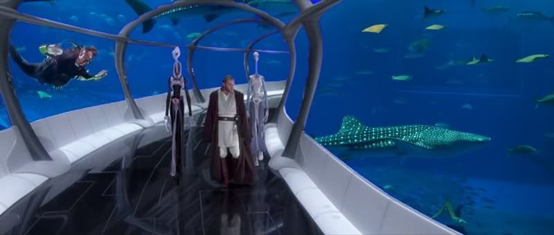
Worst mockup EVER!! Still it gives the idea... I hope. It's 00.42 here ;/
Worst mockup EVER!! Still it gives the idea... I hope. It's 00.42 here ;/

Darth Venal said::-)
Hahaha! You beat me to it :D
Tayyab

Couldn't help it, dude. Everytime we play the BSG I think aquarium!

Zak said:
Still it gives the idea... I hope. It's 00.42 here
yeah. it reminds me the SE opening to bespin walls. I like your idea to make it less revealing and more OT like.
its 02:05 here ;)
-Angel
Darth Venal said:Couldn't help it, dude. Everytime we play the BSG I think aquarium!
It's alright man :) Btw I'm gonna try to get a few mock-ups done for the prequels.
Tayyab


Star Wars Episode XXX: Erica Strikes Back
![]()
![]()
If you want Nice, go to France

I love the Yoda shot, it turns a dull piece of CGI into something genuinely emotive, the glass tube is good too but perhaps making the windows a bit easier to see through and the floor a little less like black glass and maybe just a little out of sharp focus would be just the tweak.
Something a bit like this :


Nice one, Davnes.
These recent mock-ups are neat, but I have never really minded the look of Kamino. As fake as it is (and I also feel bad for Ewan having to do everything sitting in a room by himself), it's different. It does have that Tantive IV look to it, but meh.
I guess what I'm really getting at is that there's so much meh in the PT, what's a little more? :p
Well sometimes im amaze my self. lol
Fucking uber interactive lighting from hologram :D like the one we saw in ROTS when grievous talks with palps.
And a zoom because the resizing hides the glory lol
-Angel

at least that gives a good reason for the blinds to be closed on the windows.
Looks great, and looks like it should. Looks closer to holograms we see in the other films.
That really does add more drama to the scenes, CGI Yoda has never looked so good.
I really wish this sort of work does get done to these films, it adds so much more punch to the visuals.
If only it could do the same for the script and the acting.

vaderios said:SilverKey said:I do like your color adjustments of the opening of AOTC, Vaderios. You did take them a bit too far in my opinion, but as I said before, I like how playing with the contrast reveals a little more detail in this case on the ships and the platform. It makes them feel more real.
I like your feedback and im open for constructive criticism. Yes you are right i tried to make it look more real and eliminate the CGI result. Even some ships are actually models they lose their authenticity into this fog thing whatever thing. In what part you think i went too far? Feel free to suggest things. As you know i return to previous mockups and I revisit them ;)
thanks again
-Angel
Thanks Vaderios :)
What I meant is that sometimes, in my opinion, you boost the contrast too much, which makes some of the shots look a little unnatural because we're seeing way too much. Your adjustments make every little detail visible, and that makes the shots kind of "flat". All the subtleties are gone, and every little detail is there, screaming for our attention.
An example: the shot of Amidala's ship landing on Coruscant in AOTC. The platform is very "busy" now with every little thing we see on it. I like that the original shot was a little more "quiet".
That said, I do like how you changed the color palette of the scene. You got rid of the purple-ish tone that hangs over the scene and made the scene look a little more industrial. I also like how the yellow of the fighters stand out a little more too.
I don't mean to rag on your and others' color adjustment work, but I think there is a little too much of a "Let's make it more dark and faded and it'll look like the OT!"-mentality going on here. I agree very much that TPM (the horrible pink) and AOTC (to an extent) could use some color adjustments. In AOTC's case, I think we have to keep it subtle: bring out some more details, and tone down the cartoonish stuff.
Hope I haven't offended anyone :P

SilverKey said:What I meant is that sometimes, in my opinion, you boost the contrast too much, which makes some of the shots look a little unnatural because we're seeing way too much. Your adjustments make every little detail visible, and that makes the shots kind of "flat". All the subtleties are gone, and every little detail is there, screaming for our attention.
An example: the shot of Amidala's ship landing on Coruscant in AOTC. The platform is very "busy" now with every little thing we see on it. I like that the original shot was a little more "quiet".
I don't mean to rag on your and others' color adjustment work, but I think there is a little too much of a "Let's make it more dark and faded and it'll look like the OT!"-mentality going on here.
I agree
The title of the thread includes the word radical so I personally am happy to see Angel's extreme make-over mock ups because they really change the mood and look of the films rather than just correcting the colour by removing the tints.
Perhaps in some cases blending the more extreme changes with the original footage creates a more natural look.
The OT was largely filmed on real sets an in real locations and therefore less crisp and contrast heavy but the official PT is often the other way, too blurry and plastic.
Oh don't get me wrong Bingo, I still like what Angel does, it's just that I don't like the crushed blacks. Only space should be that black ;-)
You edited Angel's mockup of the glass hallway on Kamino: you make the blacks lighter, and blurred everything somewhat so you wouldn't see too many details everywhere. I think your version looks better.

vaderios said:
In some parts maybe too rough but it became with ROTS standards :D as well from OT too.
-Angel
Yeah this is good, what I'd like to see, still very clean and sterile but also looks like a real set.
That glass tunnel picture you're all having shots at might be lost cause by default, ocne again from the god awful bluescreen job on Obi-Wan, which is one of the biggest problems in AOTC. Though maybe that's easily correctable, I don't know anything about this sort of thing. if it is, brilliant, because that would save a lot of shots in AOTC.

ChainsawAsh said:Okay, here's my reasoning behind why Yoda and the Emperor should never be seen with lightsabers. I'll focus on Yoda, but similar reasons apply to Palps:
Yoda is like the Buddha. He's someone who's been enlightened, who is perfectly in tune with the Force and nature, and uses his unique position to guide others toward this path. He's, for lack of a better way of putting it, better than using a lightsaber. Beyond it. He doesn't need one. He's the perfect Jedi, and showing him fighting just like any other Jedi - good at it though he may be - cheapens his status and makes him no different than any other Jedi. (This will bring me to another point later, but I'll tackle Palps first.)
Palpatine is similar, but on the other side. He doesn't fight, he's mastered the Dark Side so well that he doesn't need to - he manipulates others into doing his bidding. He has everyone around him wrapped tightly around his finger. All he cares about is controlling everything, and he's damned good at it. He's the perfect Dark Side master (I'm trying to avoid the term "Sith" here because I hate it), and, again, showing him fighting cheapens him and makes him no different than Vader or Maul or Dooku.
Now, back to the point I wanted to make from Yoda. The Force needs to be a religious thing again. The Jedi shouldn't be the Republic's fighting force like they're made out to be in the prequels - they work outside of the Republic. They're trying to become in tune with the Force, much like Buddhism's ultimate goal of reaching enlightenment. They should be highly-regarded, almost holy figures that try to keep the Force in balance, and only interfere with things outside of their own group when this balance is threatened. "The guardians of peace in the galaxy," and all. They practice lightsaber combat almost as a form of meditation, like martial arts. They only use it when they must, and they certainly DON'T flip around all over the place wasting precious energy the way they all seemed to do in the PT.
In other words, the Jedi use the Force to find spiritual enlightenment, and only fight when the Force is at an imbalance, to right it. The Sith use the Force for personal gain, which causes the Force to imbalance itself, kind of like a cosmic Karma. That's the only difference, that's what the "Light Side" and "Dark Side" are.
At least, that's how I feel it should be portrayed. It's in line with everything that's said about them in the OT, but completely shattered in the PT.
Unfortunately, I think the existing material in the PT prevents such a depiction, which is very, very sad.
I know this is a rather old post to be responding to, but it's something important enough that I felt compelled to respond to it. While this interpretation of the Jedi sounds all well and good, it is also a massive disservice to one of the Jedi's most important aspects-- they are the Jedi KNIGHTS, not Jedi MONKS. They are the guardians of peace and JUSTICE. Ultimately, Jedi prefer the olive branch to the lightsaber, but they are willing to use both depending on the situation. The Jedi are not soldiers, but they are chivalrous warriors just as much as they are enlightened religious students. If Yoda truly does consider himself above combat, then he can't really be considered a Jedi Knight, since he would essentially be filling the function of a monk.
Bingowings said:
While we are on the subject of things Sith, I'd have Anakin use force lightning on Padme ( I hear some hisses from the readers at this point).
At no point does Vader use this Sith skill in the OT but he chokes people left, right and centre (I've already voiced my hope that Adywan stops Luke from doing the choke move in ROTJ:R).
One of the more popular theories for why Vader doesn't use force lighting is because of his mechanical arms. If you think about it, using force lightning would likely fry the delicate electronics inside of Vader's arms since the lightning would be channeling out of his stumps, and having to have his arms replaced every time he kills a dude would probably not be a very fun ordeal. If it's possible to add the lightning effect without making it look cheesy, and it makes sense within context to the film, it may work.
And on a side note, I'd like to add that I don't want to see Mace Windo's iconic purple lightsaber messed with. Yeah, no-one else in the entire saga has one that isn't red, blue, or green, but that's exactly what makes it so cool. :(

I don't know if it could be done. But my radical idea would involve removing Jar Jar completely from the prequels, those annoying roger roger robots and Hayden for starters, get rid of completely useless characters like Mace Windu and Count Dooku, make the senate and jedi less retards and more intelligent,but then you would pretty much have to reshoot the whole damn trilogy,lol.
“Always loved Vader’s wordless self sacrifice. Another shitty, clueless, revision like Greedo and young Anakin’s ghost. What a fucking shame.” -Simon Pegg.
Something I would hope Adywan would consider for his edits, is that rather than dub over Jar Jar with an alien language and then use subtitles, try to actually find a voice actor who's willing to donate his services to the project and actually record new dialogue for him with a new voice. I thought the alien language worked pretty well in Magnoliafan's edits, but it did stretch the believability of the story a bit (like, why does everyone in this movie understand Gunganese?), and it also made it a bit more obvious that it was a fan cut since it doesn't quite seem like something that would be in a real, professionally released movie. Using an actual voice actor would be much yield much more professional and convincing results, assuming the actor doesn't suck (but really, what could be worse than the official Jar Jar?).
If I was going to come up with a new voice for Jar Jar, I think I might make him sound a little like Jim Varney-- on the raspy side with a touch of southern drawl. :^D
SilverKey said:What I meant is that sometimes, in my opinion, you boost the contrast too much, which makes some of the shots look a little unnatural because we're seeing way too much. Your adjustments make every little detail visible, and that makes the shots kind of "flat". All the subtleties are gone, and every little detail is there, screaming for our attention.
An example: the shot of Amidala's ship landing on Coruscant in AOTC. The platform is very "busy" now with every little thing we see on it. I like that the original shot was a little more "quiet".
That said, I do like how you changed the color palette of the scene. You got rid of the purple-ish tone that hangs over the scene and made the scene look a little more industrial. I also like how the yellow of the fighters stand out a little more too.
I don't mean to rag on your and others' color adjustment work, but I think there is a little too much of a "Let's make it more dark and faded and it'll look like the OT!"-mentality going on here. I agree very much that TPM (the horrible pink) and AOTC (to an extent) could use some color adjustments. In AOTC's case, I think we have to keep it subtle: bring out some more details, and tone down the cartoonish stuff.
Hope I haven't offended anyone :P
In certain mockups i boost the detail because especially in AOTC everything is blured.
Its interesting that the platform gets busy because what i did is to replace the silhouettes of coruscant buildings and add some others that had some highlights that indicates depth and perspective. as for the crushed blacks you will notice that OT is full of big black (sometimes hard) shadows so im trying to do the similar effect to PT. Plus in AOTC because the elements are so bad composited and for some scenes (yoda and mace in hologram room) the cgi and compositing are so obvious im based on how on ROTS should have look without looked tho like a pic that have all the levels sliders in the wrong place ;). ROTS has crushed blacks. You can name it more as illustration from one movie to another for better continuity.
In AOTC case as you said IMO always you cant keep it sublte. ROTS and some parts of TPM has that, not AOTC.
You havent offended anyone :P Good feedback leads to better results :)
-Angel
Having put some more thought into how re-imagined Gungans ought to sound, and for some reason my mind kept wandering back to the rather silly idea that they could have accents that sound reminiscent of Celtic-- like if a celtic version of Jim Varney was playing Captain Ahab, that would be Jar Jar's voice. It sounds wacky, but in my head it works. In the car today, I found myself reciting a bunch of Jar Jar's lines in various different voices and accents, and the one that seemed to sound the best to me ended up being a vague derivative of Scottish.
"Ah caused a body ur tois wee wee accidents. ye ken loch explodin' some gas an' crashin' th' bosses motur an' fur 'at Ah gie banished."
Only joking!

vaderios said:
In some parts maybe too rough but it became with ROTS standards :D as well from OT too.
-Angel
I must say that even a simple color palette adjustment makes this look so much better! Perhaps simply a color-edited prequel would be good enough for me, after seeing just how horrid it looks in comparison to many of the mock-ups here.
A Goon in a Gaggle of 'em

i was having a silly sleep deprivated thought earlier whilst listening to the ESB OST. what IF, in ROTS, anakin doesnt concsiensly turn to the dark side, and palpatine doesnt make a huge lightning display infront of him. anakin fights the jedi believing that they are trying to overthrow the chancellor, but he does it as a morally 'good' decision. the film progresses, and on mustafar we could have a moment similar to ESB. obi wan and anakin fight. obi wan incapacitates anakin somehow, perhaps by lopping off his arm and slicing his leg a bit. anakin backs away from obi wan thinking that he is an 'evil' jedi like the others. begging anakin to end the fight, obi wan walks toward anakin until they are eventually at the edge of a drop in front of some lava. here obi wan could reveal the chancellors true identity as the Sith Lord. Anakin overcome by the realisation of this, and overcome by his actions in light of the truth drops off the edge of the platform, attempting suicide.
perhaps a speech made by a character (bail or padme, or invent a character) that could perhaps talk about rebirth, or second chances could be overlaid as we watch anakin burn and obi wan weep, closing the saga. the twins birth could be presented as a closing epilogue.
until ESB, we wouldnt know that anakin is darth vader, but a tragic hero who made some mistakes.
still doesnt add up with what obi wan says in ANH, and it would be better if palpatine was revealing 'I AM THE SITH LORD', but it would be hard to place him on mustafar logically at this point.
i was also thinking that perhaps the birth of the rebellion could be represeneted in such a way that we see some skirmishes starting at the end of the film, maybe also included in the closing speech.
what do people think?
ben_danger said:what do people think?
Can it be done? :P
-Angel