From my Facebook conversation with writer/director Jerry Rees:
I knew that even though my primary intention was for a theatrical release with a 1.85:1 aspect ratio, it was destined to eventually have a life on home video, which was 4:3 at the time. (little did I know it would only have the home video life)
So I made sure that our compositions for every shot worked in both formats. We’d start with a 1.85.1 composition that worked dynamically, then extend the drawing above and below to fill a 4:3 frame. To be sure that we were being honest with ourselves, I didn’t allow the use of the transparent all-aspect-ratios chart that was usually laid over top of the drawings. When you can see through the chart, and perceive extra information that will not actually be visible to the audience, you can make mistakes in judgement. Instead, I had the two aspect ratios cut into black cards that would register to the pegs on the desk, and mask out everything except for what was visible within the frame. This “no cheating” approach helped us be more dynamic.
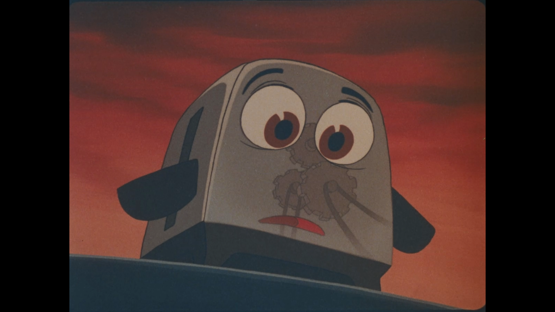
The PAL version destroyed the intentional slow increase of red filtering through the section where Rob is in peril. If you look at the ONE SHOT where the masher teeth are lowering down, but stop just above Rob’s hand, you can see how intense the red was supposed to be before fading back to normal as the danger stopped.


