logo Sign In

Info: Star Wars - What is wrong and what is right... Goodbye Magenta — Page 5

Author
Time
 (Edited)

You can use selective correction, on a particular color and shift that.

But essentially It might be a bit of a slog, but with the Cockpit shot I did shift everything because that was what was needed it had all shifted.

Whatever the right tool for the job I guess, but I am not seeing these things dealt with and I would like to see someone have a go, but If everyone is using just curves then yeah it won’t really get fixed.

The Brutality of some efforts will put people off.

Author
Time

Okay, calibrated monitors are a must. If you haven’t done that what you are seeing is going to be wrong and your corrections are going to be wrong. There are many ways to calibrate a monitor. I do not have finely calibrated monitors, but I use 3 of them plus 2 TV’s, my phone, and a tablet. I know some lean yellow and some red, so I make sure it looks good on all of them. Also, the monitors, my phone, and my tablet I also use to check this site so I know when Dr. Dre posts an image how each of my screens displays it. Your images lean far too much to the yellow. Your image of Luke looks aweful. He is yellow orange and his jumpsuit is the same color. His face should be pinker than the jumpsuit.

With ANH blu-ray, we have a film that has badly faded over the years. It is from the original negatives (except for the composited shots). Each original shooting reel of film will fade slightly differently. So we may have a few shots that all need the same correction interspaced with other shots that need other corrections. I have been working to correct those shots as a unit and maintain consistency. But the shot of Luke you claim is so bad is actually one of the ones that is closest to the original and seems to have deteriorated the least. My correction is based on the blu-ray being so dark and trying to lighten it a bit which results in oversaturated dark areas. I have a way to fix that and tweak the color at the same time. Some shots I have to nudge the red a bit to bring it down, but what you are doing is not a nudge, it is a shove. You are using far too heavy a hand. Rather than what you are doing, you need to find what you think is the right place and then back it off. Subtle corrections are often all that is needed.

And it all starts with a calibrated monitor. You have to be using a monitor that produces colors that are accurate. If you aren’t then your correction is going to be wrong. As your correction is wrong as I and others have pointed out.

I recommend you get the 4k77 DNR version. That has very good colors (better than the non-DNR version). If you think that is off then your monitor is off or your eyes. Same with the grindhouse ROTJ. My colors are based on the sample frames Mike Verta release (every 24th frame) which hits most of the scenes and the ROTJ Gridhouse release. I used those to color correct ANH, TESB, and ROTJ GOUT and that correction is what I’m using to fix the blu-ray. I was able to apply the same correction to each of the three GOUT sources (all are taken from a set of interprositives made in the late 80’s) and have ANH and ROTJ match the 35 mm sources (adjusted for their known flaws). So when you say I did not go far enough in my correction and I look at 4k77 and my corrected GOUT and see that it is exactly where it should be, we suspect there is a flaw in your correction process. The mostly likely is your monitors. Like right now the monitor I’m using is too blue and cold. That changes what you see on the screen.

Author
Time

No, the cockpit shot did not need everything shifted. Your “correction” is not really an improvement at all IMO. In many ways it’s worse. I honestly don’t know how you don’t see that when comparing your version to the BR or to others’ attempts.

Anyway, I’m done now, since you refuse to listen to advice from people with real experience. Instead you seem to assume your way is the right way, even when the flaws in so many different levels of your approach have been pointed out and tangible advice on how to correct these flaws has been offered many times along the way.

Have fun making everyone purple.

Author
Time
 (Edited)

yotsuya said:

Okay, calibrated monitors are a must. If you haven’t done that what you are seeing is going to be wrong and your corrections are going to be wrong. There are many ways to calibrate a monitor. I do not have finely calibrated monitors, but I use 3 of them plus 2 TV’s, my phone, and a tablet. I know some lean yellow and some red, so I make sure it looks good on all of them. Also, the monitors, my phone, and my tablet I also use to check this site so I know when Dr. Dre posts an image how each of my screens displays it. Your images lean far too much to the yellow. Your image of Luke looks aweful. He is yellow orange and his jumpsuit is the same color. His face should be pinker than the jumpsuit.

With ANH blu-ray, we have a film that has badly faded over the years. It is from the original negatives (except for the composited shots). Each original shooting reel of film will fade slightly differently. So we may have a few shots that all need the same correction interspaced with other shots that need other corrections. I have been working to correct those shots as a unit and maintain consistency. But the shot of Luke you claim is so bad is actually one of the ones that is closest to the original and seems to have deteriorated the least. My correction is based on the blu-ray being so dark and trying to lighten it a bit which results in oversaturated dark areas. I have a way to fix that and tweak the color at the same time. Some shots I have to nudge the red a bit to bring it down, but what you are doing is not a nudge, it is a shove. You are using far too heavy a hand. Rather than what you are doing, you need to find what you think is the right place and then back it off. Subtle corrections are often all that is needed.

And it all starts with a calibrated monitor. You have to be using a monitor that produces colors that are accurate. If you aren’t then your correction is going to be wrong. As your correction is wrong as I and others have pointed out.

I recommend you get the 4k77 DNR version. That has very good colors (better than the non-DNR version). If you think that is off then your monitor is off or your eyes. Same with the grindhouse ROTJ. My colors are based on the sample frames Mike Verta release (every 24th frame) which hits most of the scenes and the ROTJ Gridhouse release. I used those to color correct ANH, TESB, and ROTJ GOUT and that correction is what I’m using to fix the blu-ray. I was able to apply the same correction to each of the three GOUT sources (all are taken from a set of interprositives made in the late 80’s) and have ANH and ROTJ match the 35 mm sources (adjusted for their known flaws). So when you say I did not go far enough in my correction and I look at 4k77 and my corrected GOUT and see that it is exactly where it should be, we suspect there is a flaw in your correction process. The mostly likely is your monitors. Like right now the monitor I’m using is too blue and cold. That changes what you see on the screen.

You have just clearly stated you are trying to preserve the original film.

That is however with flaws that we’re introduced.

What I am trying to establish is what might the film have looked like without the flaws that were introduced. How would it have looked? No doubt your correction looks exactly like the print.

Let’s go over it once again I like the fact that the original is preserved great job on that.

But there is room for a bit more than that, and you are not responding in terms of what you think it should “look like” but slapping clones of the print in my face. Can we accept the print looks pretty good apart from where special effects are involved (Some Instances) or not?

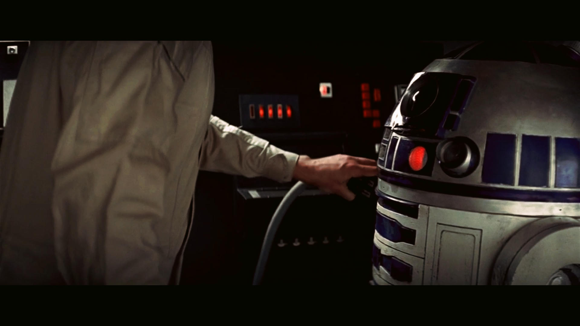
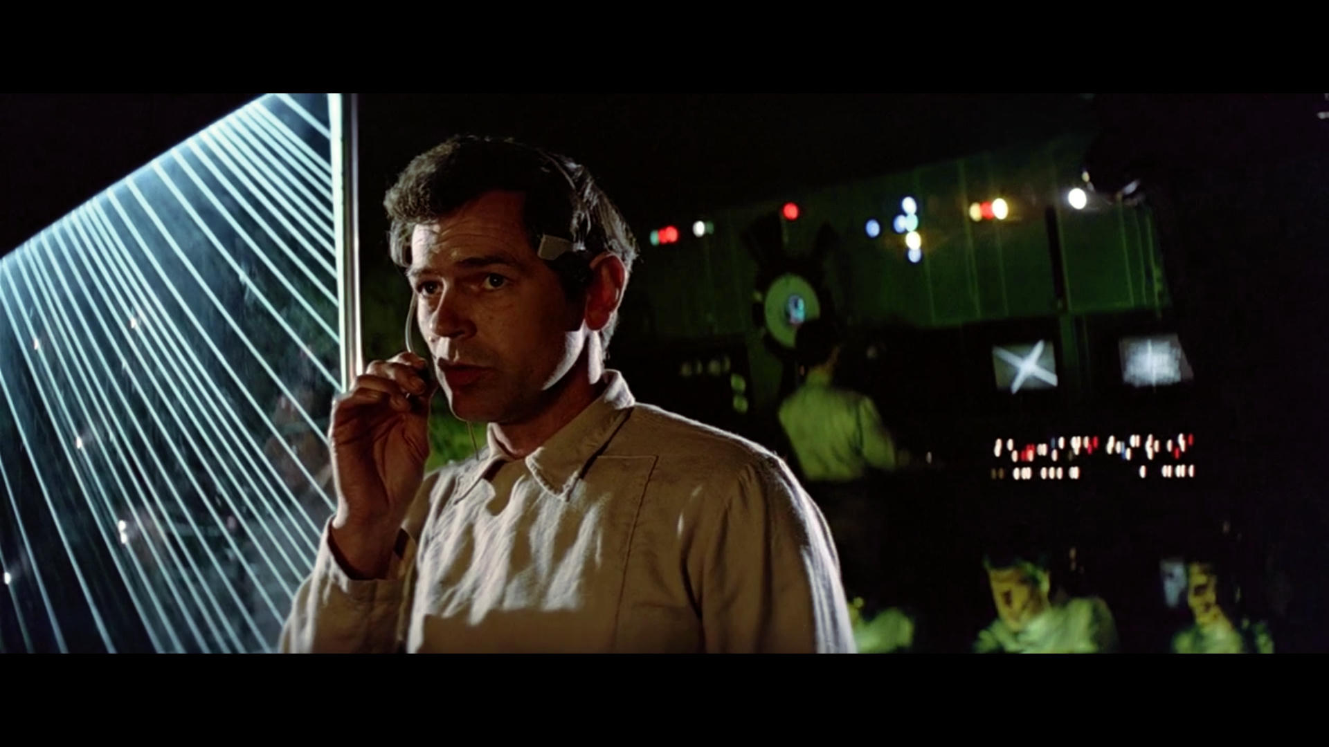
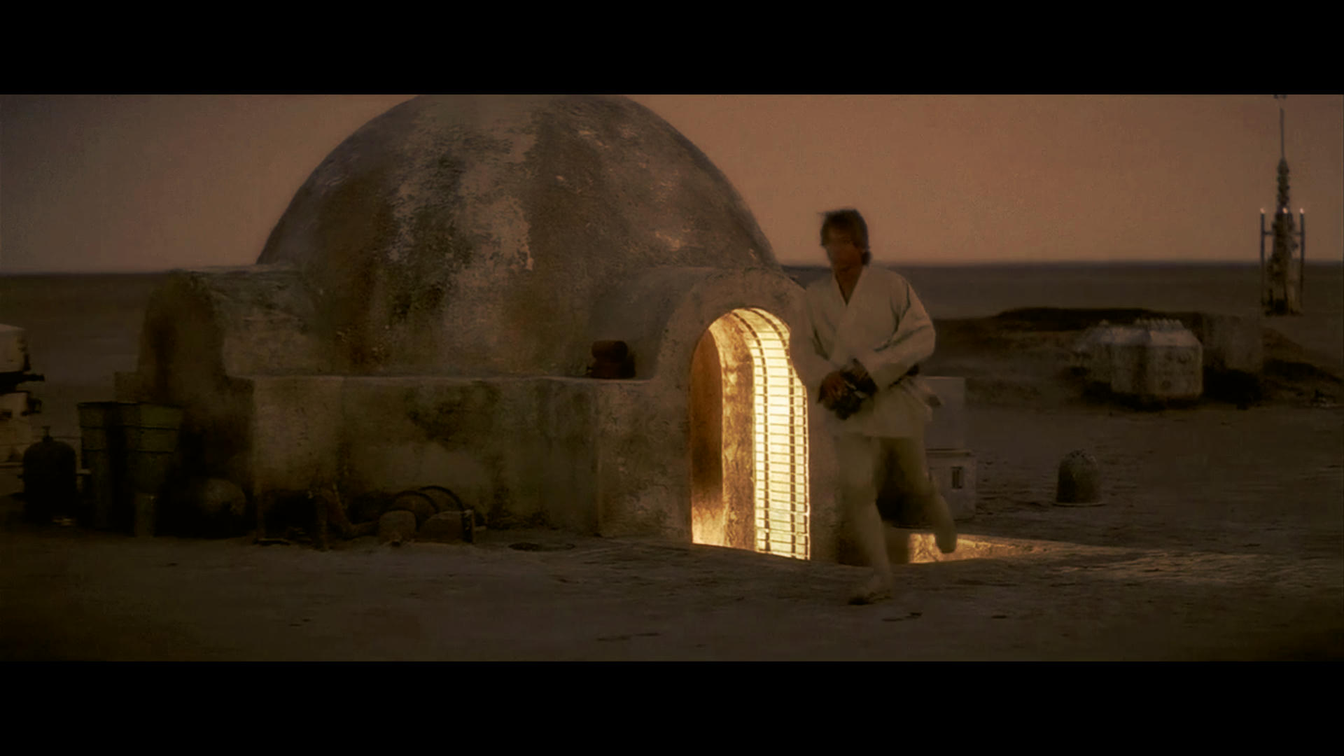
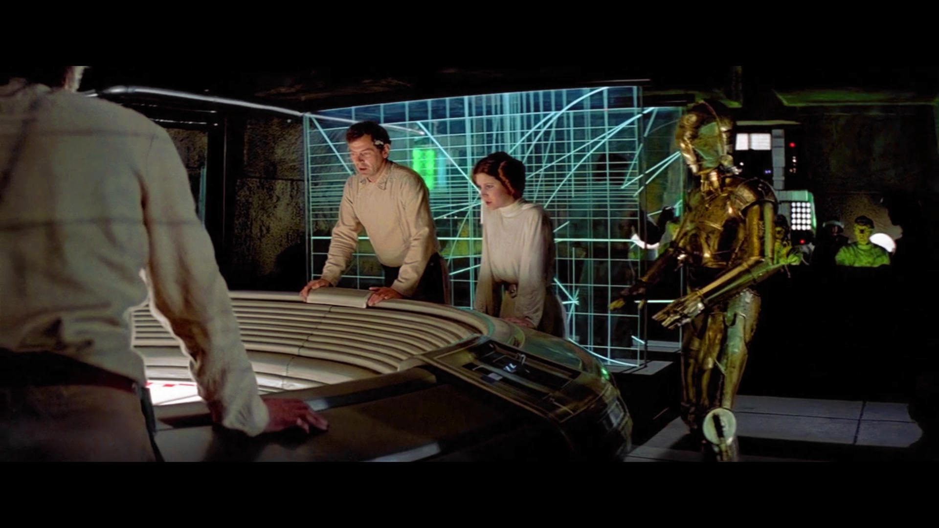
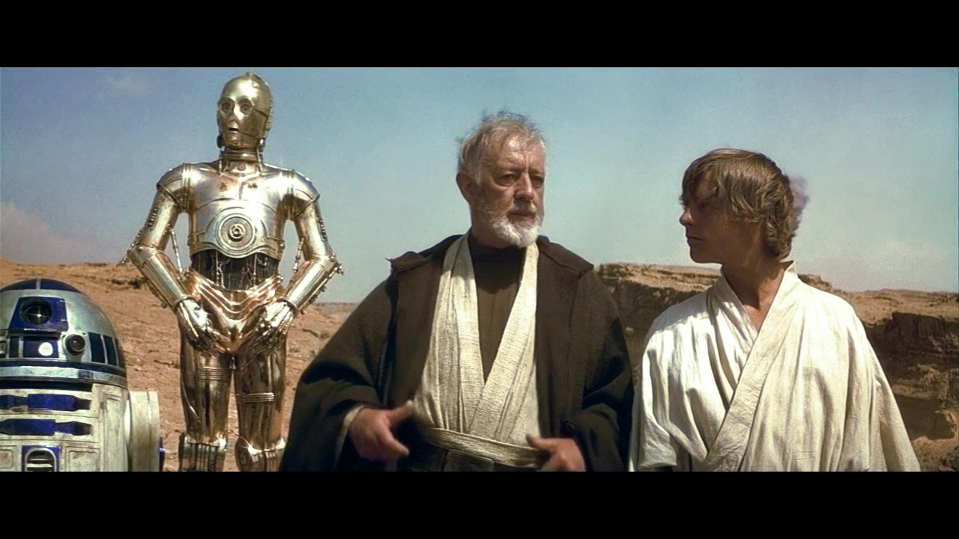
And Ben Kenobi in the Canyon also I may add aswell as the Rebel Control Room on Yavin is also very wrong. I have not seen the versions you speak of… I am going by what I have seen in Home Media more than anything else. I would really Like to See Neverar’s Technicolor Version but I think I will wait for his 2nd version.

I only see stills on here some I really, really like and it inspires me when I see something looking really good and others I question and kind of feel things are travelling off a bit.

To be honest I am not even using the tool I usually use, because I am trying to relax a bit because I have a lot of work on and odd hours and stuff. I need to keep a distance from concentrating too much on it tbh.

Author
Time
 (Edited)

This is the corrected Tie Fighter Targeting Display Color. (Again not holy Grail of RGB) It’s a Indicator of what it is meant to look like.

Had a go at the briefing room again not holy grail of RGB but an indicator, but the display should be more turqoise in color not blue.

Display is corrected

I cheated the planet was selected separately from the rest of the shot…

An example of when R2-D2 should have more purple panels in the dark.

Enemy Fighters Coming your way…

A bit of a cushion to the shock of some of the more different moments but nonetheless it is what it is an opinion and a rough estimate either way I think there is a variance in Hue to get it to all line up these are more small compared to some of the others so let’s not take my opinion as a complete rejection of any one else’s work. But I hope you can feel this look anyway.

Author
Time
 (Edited)

First off, when trying to find the original look, there are some big clues and some sources that we have that are pretty good. First off is the technicolor print. While some of the shots look horrible in it, the overall look preserves the 1977 colors. Second, we have the home media versions, the 1997 special edition (which is mostly chemical color correction of a faded print for ANH and is the same negative) and its home media versions. Then we have the 2003 scan (as bad as it is). Plus we have an LLP 35 mm print (that means low fade and accurate colors.

Now, for the home media version of the GOUT, we have a few different sources. We have the US/UK sources for early releases. the US 16 mm film and the widescreen bookleg (preserved by Moth3r) appear to be from the original version of the film (4 things were changed from the early prints to the general release print and international prints made later in the year). The official VHS and LD versions that came out after that all have the Episode IV opening and the revised end credits, but the rest of the film appears to be also from the 1977 first release prints. All the foreign language and the Definitive Edition/Faces/2006 GOUT version all are from the same edit. We know that the Definitive Edition/Faces/2006 GOUT was done from a new interpositive struck in the mid 80’s. Then we have the SE and its VHS and LD release. First off, the colors of all these are very consistent. I have focused only on the widescreen versions so I can’t say how the pan and scan versions looked. Not really interested. The widescreen versions have very little color difference between them. That means there was not a lot of tweaking by the telecine operators to the colors on a scene by scene basis.

I took the GOUT and made one assumption - the orange tint of the interpositive had not been completely removed. That was pretty common in transfers. I used the accurate scans of the technicolor print (every 24th frame provided by Mike Verta and corrected for the green tint) and corrected the GOUT. I used the same corrections to TESB and ROTJ and found my corrections to ROTJ pretty much matched the colors of the grindhouse 35 mm scan of ROTJ. So the color pallet I’m trying to match has strong source corroboration. Plus I have researched and found as many set photos as I could and referenced the behind the scenes images from the Making of Star Wars.

DrDre has used more scientific means to come to virtually the same colors. He has found a way to use the dark, unseen parts of the print to balance the colors and correct fading. He and I have come to nearly the same conclusion by different means. Poita does this sort of thing for a living and has his own methods. So for you to tell all three of us that we are off and your are right when you obviously aren’t using a calibrated monitor and are using scanned stills from printed sources (and from what you have shared some of them are pretty bad), that doesn’t aid your cause.

Skin tones need to be that prefect balance between red and yellow. The X-wing flight suits are bright orange. The Imperial uniforms are green gray. R2 is cobalt to indigo (with some shots in ANH of a more purple colored version). These aren’t my opinions. They are documented. I have photos that show the colors of the original costumes. You are slanting your correction way too far to the yellow. These latest shots show very crushed blacks. The Blu-ray is not that far off.

Here is the collected versions of that shot of Luke you claim is so far off.

Top left is my BR color correction. Top right is my GOUT correction
second row is the BR and the GOUT
third row is 97 SE LD and the DE LD
fourth row is 4k77 DNR and the JSC LD
fifth row is the TN1 (1.5 I think) and the SWE LD
sixth row is Puggo Grande and Moth3r bootleg

This shows how consistent the home video releases are for this shot. It shows how close the BR is. The 4k77 is from a Technicolor print so it shows the greenish tint. TN1 is from several faded prints and is pretty close to the home video colors. The bottom two are of the most interest. They are the oldest known copies. Other shots in ANH are not nearly so close between versions. So your hypothesis that this shot suffers badly from color shift is not born out. The home video versions are either faded prints or from interpositives. TN1 was from a faded print (very red as I recall). The 97 SE LD shows very blue instead of green. The blu-ray is lacking in yellow rather than just too much red. Each of the RGB/CYM colors fades differently on film. So it is no surprise that they didn’t get the balance right during the restoration. But your idea that the colors have shifted doesn’t match the various prints/scans we have.

Author
Time
 (Edited)

yotsuya said:

First off, when trying to find the original look, there are some big clues and some sources that we have that are pretty good. First off is the technicolor print.

He’s going to stop reading right there because he “doesn’t trust prints” and wants to figure out “how it was meant to look” and not “how it actually looked.” In other words, an excuse for him to make horribly inaccurate “corrections” and then say “But I think that’s how it should look!” when someone tries to give him any amount of constructive criticism or advice.

Oh, and he’ll still refuse to calibrate his monitor, so every correction he makes will continue to have zero value to anyone but himself.

Author
Time

mike verta’s print had wonderful colors despite having a heck of a lot of damage IIRC.

Author
Time

ChainsawAsh said:

yotsuya said:

First off, when trying to find the original look, there are some big clues and some sources that we have that are pretty good. First off is the technicolor print.

He’s going to stop reading right there because he “doesn’t trust prints” and wants to figure out “how it was meant to look” and not “how it actually looked.” In other words, an excuse for him to make horribly inaccurate “corrections” and then say “But I think that’s how it should look!” when someone tries to give him any amount of constructive criticism or advice.

Oh, and he’ll still refuse to calibrate his monitor, so every correction he makes will continue to have zero value to anyone but himself.

Well, that is what accurate color photos of costumes are for. I posted those as well and met with similar responses.
Such as these:

And that doesn’t even begin to get into how the sets were lit and how it was processed. I don’t think any of the extant copies are exact, but I think if you put all the pieces together, you end up with something close. That is why I point out that DrDre and I have almost the same results with completely different methods. And if you want to go a step further you could try to get in touch with the costumer designers or those who care for the costumes today for Lucasfilm, and see if you can pin down the exact fabric and color used and get samples of it (if they still make it). But that is going a bit far when there are such good resources already available.

Author
Time
 (Edited)

yotsuya said:

First off, when trying to find the original look, there are some big clues and some sources that we have that are pretty good. First off is the technicolor print. While some of the shots look horrible in it, the overall look preserves the 1977 colors. Second, we have the home media versions, the 1997 special edition (which is mostly chemical color correction of a faded print for ANH and is the same negative) and its home media versions. Then we have the 2003 scan (as bad as it is). Plus we have an LLP 35 mm print (that means low fade and accurate colors.

Now, for the home media version of the GOUT, we have a few different sources. We have the US/UK sources for early releases. the US 16 mm film and the widescreen bookleg (preserved by Moth3r) appear to be from the original version of the film (4 things were changed from the early prints to the general release print and international prints made later in the year). The official VHS and LD versions that came out after that all have the Episode IV opening and the revised end credits, but the rest of the film appears to be also from the 1977 first release prints. All the foreign language and the Definitive Edition/Faces/2006 GOUT version all are from the same edit. We know that the Definitive Edition/Faces/2006 GOUT was done from a new interpositive struck in the mid 80’s. Then we have the SE and its VHS and LD release. First off, the colors of all these are very consistent. I have focused only on the widescreen versions so I can’t say how the pan and scan versions looked. Not really interested. The widescreen versions have very little color difference between them. That means there was not a lot of tweaking by the telecine operators to the colors on a scene by scene basis.

I took the GOUT and made one assumption - the orange tint of the interpositive had not been completely removed. That was pretty common in transfers. I used the accurate scans of the technicolor print (every 24th frame provided by Mike Verta and corrected for the green tint) and corrected the GOUT. I used the same corrections to TESB and ROTJ and found my corrections to ROTJ pretty much matched the colors of the grindhouse 35 mm scan of ROTJ. So the color pallet I’m trying to match has strong source corroboration. Plus I have researched and found as many set photos as I could and referenced the behind the scenes images from the Making of Star Wars.

DrDre has used more scientific means to come to virtually the same colors. He has found a way to use the dark, unseen parts of the print to balance the colors and correct fading. He and I have come to nearly the same conclusion by different means. Poita does this sort of thing for a living and has his own methods. So for you to tell all three of us that we are off and your are right when you obviously aren’t using a calibrated monitor and are using scanned stills from printed sources (and from what you have shared some of them are pretty bad), that doesn’t aid your cause.

Skin tones need to be that prefect balance between red and yellow. The X-wing flight suits are bright orange. The Imperial uniforms are green gray. R2 is cobalt to indigo (with some shots in ANH of a more purple colored version). These aren’t my opinions. They are documented. I have photos that show the colors of the original costumes. You are slanting your correction way too far to the yellow. These latest shots show very crushed blacks. The Blu-ray is not that far off.

Here is the collected versions of that shot of Luke you claim is so far off.

Top left is my BR color correction. Top right is my GOUT correction
second row is the BR and the GOUT
third row is 97 SE LD and the DE LD
fourth row is 4k77 DNR and the JSC LD
fifth row is the TN1 (1.5 I think) and the SWE LD
sixth row is Puggo Grande and Moth3r bootleg

This shows how consistent the home video releases are for this shot. It shows how close the BR is. The 4k77 is from a Technicolor print so it shows the greenish tint. TN1 is from several faded prints and is pretty close to the home video colors. The bottom two are of the most interest. They are the oldest known copies. Other shots in ANH are not nearly so close between versions. So your hypothesis that this shot suffers badly from color shift is not born out. The home video versions are either faded prints or from interpositives. TN1 was from a faded print (very red as I recall). The 97 SE LD shows very blue instead of green. The blu-ray is lacking in yellow rather than just too much red. Each of the RGB/CYM colors fades differently on film. So it is no surprise that they didn’t get the balance right during the restoration. But your idea that the colors have shifted doesn’t match the various prints/scans we have.

The JSC Laserdisc Looks by far the Best in fact I would say TN1 tried to go for that sort of also but the JSC looks about right to me. The Blu Ray is Horrid Pink man. Red is in the correct Shade of Red. Look at his Helmet stripe in the JSC.

The Gain and Levels are all wrong on the Blu-ray.

Drop Gain for Blu-Ray by by 33% increase High level by 50% and Shadow by 13%. You will have to alter contrast also. That seemed to bring it sort of back to a normal looking old transfer at least.

I am now waiting for this is a telecine and it’s not what it’s meant to look like. The JSC is better than anything else there and outshines the lot. Anything lesser that the Peak that the JSC reached we are heading downhill after this high point in so much as that particular shot never got better or was maintained even it just slid in to the pink mess it is now. And it’s also artificially bright.

Author
Time

Ronster said:

yotsuya said:

First off, when trying to find the original look, there are some big clues and some sources that we have that are pretty good. First off is the technicolor print. While some of the shots look horrible in it, the overall look preserves the 1977 colors. Second, we have the home media versions, the 1997 special edition (which is mostly chemical color correction of a faded print for ANH and is the same negative) and its home media versions. Then we have the 2003 scan (as bad as it is). Plus we have an LLP 35 mm print (that means low fade and accurate colors.

Now, for the home media version of the GOUT, we have a few different sources. We have the US/UK sources for early releases. the US 16 mm film and the widescreen bookleg (preserved by Moth3r) appear to be from the original version of the film (4 things were changed from the early prints to the general release print and international prints made later in the year). The official VHS and LD versions that came out after that all have the Episode IV opening and the revised end credits, but the rest of the film appears to be also from the 1977 first release prints. All the foreign language and the Definitive Edition/Faces/2006 GOUT version all are from the same edit. We know that the Definitive Edition/Faces/2006 GOUT was done from a new interpositive struck in the mid 80’s. Then we have the SE and its VHS and LD release. First off, the colors of all these are very consistent. I have focused only on the widescreen versions so I can’t say how the pan and scan versions looked. Not really interested. The widescreen versions have very little color difference between them. That means there was not a lot of tweaking by the telecine operators to the colors on a scene by scene basis.

I took the GOUT and made one assumption - the orange tint of the interpositive had not been completely removed. That was pretty common in transfers. I used the accurate scans of the technicolor print (every 24th frame provided by Mike Verta and corrected for the green tint) and corrected the GOUT. I used the same corrections to TESB and ROTJ and found my corrections to ROTJ pretty much matched the colors of the grindhouse 35 mm scan of ROTJ. So the color pallet I’m trying to match has strong source corroboration. Plus I have researched and found as many set photos as I could and referenced the behind the scenes images from the Making of Star Wars.

DrDre has used more scientific means to come to virtually the same colors. He has found a way to use the dark, unseen parts of the print to balance the colors and correct fading. He and I have come to nearly the same conclusion by different means. Poita does this sort of thing for a living and has his own methods. So for you to tell all three of us that we are off and your are right when you obviously aren’t using a calibrated monitor and are using scanned stills from printed sources (and from what you have shared some of them are pretty bad), that doesn’t aid your cause.

Skin tones need to be that prefect balance between red and yellow. The X-wing flight suits are bright orange. The Imperial uniforms are green gray. R2 is cobalt to indigo (with some shots in ANH of a more purple colored version). These aren’t my opinions. They are documented. I have photos that show the colors of the original costumes. You are slanting your correction way too far to the yellow. These latest shots show very crushed blacks. The Blu-ray is not that far off.

Here is the collected versions of that shot of Luke you claim is so far off.

Top left is my BR color correction. Top right is my GOUT correction
second row is the BR and the GOUT
third row is 97 SE LD and the DE LD
fourth row is 4k77 DNR and the JSC LD
fifth row is the TN1 (1.5 I think) and the SWE LD
sixth row is Puggo Grande and Moth3r bootleg

This shows how consistent the home video releases are for this shot. It shows how close the BR is. The 4k77 is from a Technicolor print so it shows the greenish tint. TN1 is from several faded prints and is pretty close to the home video colors. The bottom two are of the most interest. They are the oldest known copies. Other shots in ANH are not nearly so close between versions. So your hypothesis that this shot suffers badly from color shift is not born out. The home video versions are either faded prints or from interpositives. TN1 was from a faded print (very red as I recall). The 97 SE LD shows very blue instead of green. The blu-ray is lacking in yellow rather than just too much red. Each of the RGB/CYM colors fades differently on film. So it is no surprise that they didn’t get the balance right during the restoration. But your idea that the colors have shifted doesn’t match the various prints/scans we have.

The JSC Laserdisc Looks by far the Best in fact I would say TN1 tried to go for that sort of also but the JSC looks about right to me. The Blu Ray is Horrid Pink man. Red is in the correct Shade of Red. Look at his Helmet stripe in the JSC.

The Gain and Levels are all wrong on the Blu-ray.

Drop Gain for Blu-Ray by by 33% increase High level by 50% and Shadow by 13%. You will have to alter contrast also. That seemed to bring it sort of back to a normal looking old transfer at least.

I am now waiting for this is a telecine and it’s not what it’s meant to look like. The JSC is better than anything else there and outshines the lot. Anything lesser that the Peak that the JSC reached we are heading downhill after this high point in so much as that particular shot never got better or was maintained even it just slid in to the pink mess it is now. And it’s also artificially bright.

So… make the bluray darker? Crush the blacks even more? Blow out the whites? Um… no. Yes, some scenes might benefit from being brighter, but contrast and brightness are one of the worst aspects of the bluray for consistency. I found the colors can be corrected in a pretty narrow range. But some shots need to be darker, some lighter, and some need to have the brights turned way up while others need it left alone. In this shot you don’t gain anything from your description. And you applaud the JSC while ignoring the reds that come from its interpositive source. The one I think is closest is the Moth3r bootleg. The bluray does not need what you think it does and doing what you suggest creates a horrible image. I’m assuming your description of gain, high and shadow is what you did to all the images you posted that look so dark and terrible. That is what the copy of a copy of a copy of Gone With the Wind looked like before they restored it. Again it comes down to a good calibrated monitor. You definitely need one.

Author
Time

yotsuya said:

Ronster said:

yotsuya said:

First off, when trying to find the original look, there are some big clues and some sources that we have that are pretty good. First off is the technicolor print. While some of the shots look horrible in it, the overall look preserves the 1977 colors. Second, we have the home media versions, the 1997 special edition (which is mostly chemical color correction of a faded print for ANH and is the same negative) and its home media versions. Then we have the 2003 scan (as bad as it is). Plus we have an LLP 35 mm print (that means low fade and accurate colors.

Now, for the home media version of the GOUT, we have a few different sources. We have the US/UK sources for early releases. the US 16 mm film and the widescreen bookleg (preserved by Moth3r) appear to be from the original version of the film (4 things were changed from the early prints to the general release print and international prints made later in the year). The official VHS and LD versions that came out after that all have the Episode IV opening and the revised end credits, but the rest of the film appears to be also from the 1977 first release prints. All the foreign language and the Definitive Edition/Faces/2006 GOUT version all are from the same edit. We know that the Definitive Edition/Faces/2006 GOUT was done from a new interpositive struck in the mid 80’s. Then we have the SE and its VHS and LD release. First off, the colors of all these are very consistent. I have focused only on the widescreen versions so I can’t say how the pan and scan versions looked. Not really interested. The widescreen versions have very little color difference between them. That means there was not a lot of tweaking by the telecine operators to the colors on a scene by scene basis.

I took the GOUT and made one assumption - the orange tint of the interpositive had not been completely removed. That was pretty common in transfers. I used the accurate scans of the technicolor print (every 24th frame provided by Mike Verta and corrected for the green tint) and corrected the GOUT. I used the same corrections to TESB and ROTJ and found my corrections to ROTJ pretty much matched the colors of the grindhouse 35 mm scan of ROTJ. So the color pallet I’m trying to match has strong source corroboration. Plus I have researched and found as many set photos as I could and referenced the behind the scenes images from the Making of Star Wars.

DrDre has used more scientific means to come to virtually the same colors. He has found a way to use the dark, unseen parts of the print to balance the colors and correct fading. He and I have come to nearly the same conclusion by different means. Poita does this sort of thing for a living and has his own methods. So for you to tell all three of us that we are off and your are right when you obviously aren’t using a calibrated monitor and are using scanned stills from printed sources (and from what you have shared some of them are pretty bad), that doesn’t aid your cause.

Skin tones need to be that prefect balance between red and yellow. The X-wing flight suits are bright orange. The Imperial uniforms are green gray. R2 is cobalt to indigo (with some shots in ANH of a more purple colored version). These aren’t my opinions. They are documented. I have photos that show the colors of the original costumes. You are slanting your correction way too far to the yellow. These latest shots show very crushed blacks. The Blu-ray is not that far off.

Here is the collected versions of that shot of Luke you claim is so far off.

Top left is my BR color correction. Top right is my GOUT correction
second row is the BR and the GOUT
third row is 97 SE LD and the DE LD
fourth row is 4k77 DNR and the JSC LD
fifth row is the TN1 (1.5 I think) and the SWE LD
sixth row is Puggo Grande and Moth3r bootleg

This shows how consistent the home video releases are for this shot. It shows how close the BR is. The 4k77 is from a Technicolor print so it shows the greenish tint. TN1 is from several faded prints and is pretty close to the home video colors. The bottom two are of the most interest. They are the oldest known copies. Other shots in ANH are not nearly so close between versions. So your hypothesis that this shot suffers badly from color shift is not born out. The home video versions are either faded prints or from interpositives. TN1 was from a faded print (very red as I recall). The 97 SE LD shows very blue instead of green. The blu-ray is lacking in yellow rather than just too much red. Each of the RGB/CYM colors fades differently on film. So it is no surprise that they didn’t get the balance right during the restoration. But your idea that the colors have shifted doesn’t match the various prints/scans we have.

The JSC Laserdisc Looks by far the Best in fact I would say TN1 tried to go for that sort of also but the JSC looks about right to me. The Blu Ray is Horrid Pink man. Red is in the correct Shade of Red. Look at his Helmet stripe in the JSC.

The Gain and Levels are all wrong on the Blu-ray.

Drop Gain for Blu-Ray by by 33% increase High level by 50% and Shadow by 13%. You will have to alter contrast also. That seemed to bring it sort of back to a normal looking old transfer at least.

I am now waiting for this is a telecine and it’s not what it’s meant to look like. The JSC is better than anything else there and outshines the lot. Anything lesser that the Peak that the JSC reached we are heading downhill after this high point in so much as that particular shot never got better or was maintained even it just slid in to the pink mess it is now. And it’s also artificially bright.

So… make the bluray darker? Crush the blacks even more? Blow out the whites? Um… no. Yes, some scenes might benefit from being brighter, but contrast and brightness are one of the worst aspects of the bluray for consistency. I found the colors can be corrected in a pretty narrow range. But some shots need to be darker, some lighter, and some need to have the brights turned way up while others need it left alone. In this shot you don’t gain anything from your description. And you applaud the JSC while ignoring the reds that come from its interpositive source. The one I think is closest is the Moth3r bootleg. The bluray does not need what you think it does and doing what you suggest creates a horrible image. I’m assuming your description of gain, high and shadow is what you did to all the images you posted that look so dark and terrible. That is what the copy of a copy of a copy of Gone With the Wind looked like before they restored it. Again it comes down to a good calibrated monitor. You definitely need one.

I like working to be honest, but I work a lot of hours. I obviously don’t have the same amount of time you have.

I liked Laserschwets special edition trailer scan. There was something good about it.

no I did not do that to all the images. The thing you fail to understand is that every image I posted in the last set are Special effects or animation shots apart from the last image. The last image was to show you what I was bringing it closer to.

The shots with animation and special effects stink of problems from the process they went through. Is it wrong to look at them and make a rough estimate and then you come in here and start slagging off a rough estimate.

You would do well to look at other films say like Bullitt to see what a film should look like because you seem to have too much emotional involvement with Star Wars and you don’t understand what I am even doing and you can’t even take somone having a rough guess and trying to figure out how the special effects have altered the image.

The way you are going on you are trying to make it sound like I am msking outlandish statements about the special effects and how they have altered the image. Jusg take a look at any one of the shots that have blue / purple all over them.

Uou are really starting to get on my nerves because you don’t understand what I am looking at. If you don’t understand still now after telling you 3 times forget about it.

Author
Time
 (Edited)

Ronster said:

You would do well to look at other films say like Bullitt to see what a film should look like

You’re so right: Yotsuya doesn’t know how a film should look like. That’s because he has a calibrated monitor (such a mistake). He is a newbie. Luckily you’re here.

Author
Time

ZigZig said:

Ronster said:

You would do well to look at other films say like Bullitt to see what a film should look like

You’re so right: Yotsuya doesn’t know how a film should look like. That’s because he has a calibrated monitor (such a mistake). He is a newbie. Luckily you’re here.

ALLOL

Author
Time

ZigZig said:

Ronster said:

You would do well to look at other films say like Bullitt to see what a film should look like

You’re so right: Yotsuya doesn’t know how a film should look like. That’s because he has a calibrated monitor (such a mistake). He is a newbie. Luckily you’re here.

He has failed to understand what I am looking at. I don’t feel the same rules apply to the special effects shots as to the normal footage for the simple reason that the special effects make the image look different from the rest. It was quite a simple thing I am looking at and I have had to explain over and over and over again and he still does not understand.

I am also lookingcat degraded highlights also.

Sorry but having to keep repeating that is getting on my nerves, and also I am only just roughly having a look at it and a quick guess because it is all I have time for and I have also explained this but I keep getting loads of stuff thrown at me for which I was never saying ok this is the gospel of the star wars color religion which is what it feels like around here. I was just having a rough guess and if you disagree I am fine with it, but nobody is saying anything about how they think the special effects are altering things which they clearly are and it is just like talking to a load of people who can not see past their own nose.

Author
Time
 (Edited)

Ronster said:

ZigZig said:

Ronster said:

You would do well to look at other films say like Bullitt to see what a film should look like

You’re so right: Yotsuya doesn’t know how a film should look like. That’s because he has a calibrated monitor (such a mistake). He is a newbie. Luckily you’re here.

He has failed to understand what I am looking at.
(…)
It was quite a simple thing I am looking at and I have had to explain over and over and over again and he still does not understand.

He is so stupid…
And what’s more, he believes that a calibrated monitor is better than a wonky one…

Author
Time

Ronster said:

I have had to explain over and over and over again and he still does not understand.

Pot, meet kettle…

Author
Time

Yeah. It’s not like I’m comparing ANH to the other OT and PT films, or to American Graffiti, or the Star Trek films, or classic color films. Or even modern films. No, I’m taking ANH as an isolated case and completely ignoring all high quality source materials to help me calibrate the colors and ignoring on set lighting. And it’s not like I have been calibrating my TV and monitors for over 20 years. And it’s not like I have been restoring faded photo for the last 25 years.

Sorry, but one look at the skin tones you achieve and lack of color depth and it is pretty easy to see you have overdone whatever effect you are after. My early color correction efforts went the same way to try to get rid of the lobster man effect, but when I compare the blu-ray of this shot to all the other shots, it is not nearly as bad off as you claim. You praised the JSC while at the same time saying the blu-ray needed to be darker when it is already much darker than the JSC or any other of the home video versions (and on all of them you can see the garbage mattes you aren’t supposed to see). You are advocating a heavy handed correction and so many of us have done that and found it to be grossly in error and we are trying to share our collected wisdom with you and you are blowing us off. Calibrate your monitor. Recheck your references (and for goodness sake, don’t use bad scans of printed images… find higher quality scans that are not so obviously skewed by the scanning process - remember I have done photo restoration for a living and know about not only calibrating monitors, but scanners as well).

The problem with ANH is not any one color or brightness issue. It is a slew of them. The big issue is that what we are dealing with now was not scanned by a professional colorist. We have several of those working with the 35mm film prints of Star Wars and many other movies. Just check out the Technicolor scan of Song of the South. It does have some issues, but the colors are vibrant and well balanced. This site is full of talented people who know what they are talking about and you can learn a lot if you listen.

Sorry to be so hard on you, but you are basically saying all the pros are doing it wrong. The pros are using calibrated monitors and professional level hardware and software. They have excellent references and have tools to help restore the original colors by clues on the film itself so they can counter the fading time has caused. Not to mention a huge amount of experience actually doing it. I have some issue with how some are handling ANH, but that is because I think the Technicolor, while not suffering much from fading over time (why that type of print is so good) suffered from some bad handling as Technicolor closed its shop and is not a good representation of the original colors for the general release. DrDre’s work on recoloring the 4k77 release is amazing and looks better than any other recoloring I have seen.

Author
Time

yotsuya said:

Sorry to be so hard on you, but you are basically saying all the pros are doing it wrong.

This right here. Sorry if it seems like we’re picking on you, but we’re trying to give you honest advice and feedback based on tons of experience and your responses have all been “Nah, I’m right and you’re all wrong.”

Author
Time
 (Edited)

OK but you must admit that a true Jedi doesn’t need a calibrated monitor: he closes his eyes and uses the Force.

Author
Time
 (Edited)

I have used those calibration sensors before, but only when I have had to put up a video walls to make all the screen match up as say 9 screens (3x3) make a whole image and it is important that every screen match. If you say have dual projection it is again important you have matching images (especially if you are blending which I don’t really get involved in but I might put the projectors in) I understand you are trying to tell me that calibrating my monitor may change things slightly about my screen but that it is not that important unless you have the same screen as me as different screens will display an image differently. Even if I Calibrate my display it will still look different on yours to mine unless you have a very similar panel.

There is a bit of a futility to such things as my monitor is not part of your image nor is your monitor part of my image.

It’s not particularly important for this exercise because for some of the special effects and the highlights are quite a way off where they should be anyway, so It’s more important that it goes in the right general direction more than anything else, as it’s way off anyway.

This is an effort that know is good in a way but I don’t feel it’s really all the way there yet. I think it is overdone but I was trying to pull as much out so this would be scaled back. Degraded Highlights very bad here.

Quick test of dusk sky… This is again not too great I feel. But Possibly again degraded highlights.

This is a fairly good reference for the Command center though.

Rebel Clock - Just realised that the rim should be Yellow not Blue it’s missing a lot of red and yellow in the shadow. I hued the green for the reference but adjusting the color in the shadow will bring the green patch to that color so it’s a mistake on my part. Again obvious animation color error I suppose.

Should be like this one not the cyan color one…

A look at the Highlights vs trying to bring more yellow in to Han’s shirt. Special Effects probably removing far too much color from image. Hard to get anything from this but the hues were more conformed on the explosion. Looked at correct shade of Red also.

Did this tonight the others on Sunday but just trying to figure out how hard to push it. It needs a harder push in general but I think this is about the limit. I would use Bias saturation decrease on this slightly perhaps decrease by about 2-3% just to thin out R2 cyan dome and pink clouds. Good Brightness and saturation.

Author
Time

Ronster said:

I have used those calibration sensors before, but only when I have had to put up a video walls to make all the screen match up as say 9 screens (3x3) make a whole image and it is important that every screen match. If you say have dual projection it is again important you have matching images (especially if you are blending which I don’t really get involved in but I might put the projectors in) I understand you are trying to tell me that calibrating my monitor may change things slightly about my screen but that it is not that important unless you have the same screen as me as different screens will display an image differently. Even if I Calibrate my display it will still look different on yours to mine unless you have a very similar panel.

There is a bit of a futility to such things as my monitor is not part of your image nor is your monitor part of my image.

Seriously? If you don’t make sure the rbg balance on your monitor is accurate, how do you know your monitor isn’t lying to you? Calibration is important. No, it might not get us 100% in agreement, but it gets us 98%. And you shouldn’t just be using one monitor or screen. I use 6; 2 computer monitors (both ACER), 2 TV’s (1 Samsung and 1 Sony), 1 tablet (a Kindle Fire), and my HTC Phone (which has a known red slant). I know the Samsung is a bit dark, the Sony a tiny bit yellow, the tablet too bright, etc. You have to know these things and check the color on multiple sources so you know how it is coming out. What we are telling you is that on our monitors your work isn’t looking too good. It is far too yellow and dark, likely meaning your monitor is too red and bright. This will skew what you think looks right. So that is why you calibrate your monitor. Even if you can’t fix it perfectly, if you know what sort of bias your monitor has, you can correct for it. If you don’t calibrate your monitor you can’t correct for it and your results will be … less that perfect.

But don’t stop there. Play other movies on your computer. Check out what professionally graded movies look like. Particularly some of the well done classics. I can vouch for Blade Runner and American Graffiti. Because if you are slanting your corrections a given way, you will notice that they don’t match well done home videos. If you find that everything is too red on your monitor, it is probably your monitor, not the material you are watching.

Author
Time

^ This

I once graded a few shots of Star Wars and thought it looked great… Until I played it back on a few other monitors. My grading monitor turned out to be very pink, and I had compensated for that, making it swing way too far the other way on just about all other devices.

It is totally true that no matter how well calibrated your monitor is, any samples you post will look at least slightly different on anybody else’s screen, probably even slightly different browser to browser on the same screen. However, you now have multiple people here telling you that your screen shots are WAY off where they should be.

Perhaps if these same people were standing right behind you, looking at your screen and they could see what you see, they wouldn’t be so critical. (Chances are they would still argue that you need more blue, or less red, or something like that, but they probably wouldn’t think it looks awful).

However, everybody here believes you are making terrible color choices, which means that either your monitor is way off, or you see colors in a very different way to the rest of us.

TheStarWarsTrilogy.com.
The007Dossier.com.
Donations always welcome: Paypal | Bitcoin: bc1qzr9ejyfpzm9ea2dglfegxzt59tys3uwmj26ytj

Author
Time

I don’t really want to spend £100 or more for the calibration device and what I was hoping was that if I do just some rough versions people would pick up on the general sense of direction.

I do understand though what is being said but I was really hoping that it would be a bit simpler in interpreting roughly i was trying to communicate.

At work at the moment waiting to do something but If i get one I will try to get a cheap one because I really don’t see too much worth in roughly looking at something and trying to communicate where I feel the faults may be for £100.

Can you see my point on that?

I kind of feel that budget to communicate with some still images is fairly high priced when I would also still not be saying this is exactly how it should look but trying to find guiding principles or patterns.