adywan, I know you've mentioned that the final version of your Xmas clip is likely to have a few additional minor tweaks yet, but here's a few thoughts I'd still like to bring up about this at this point -
1. I've only studied this clip on my laptop screen, so the details are very small and I can't see if you've added a faint orange (or black?) 'scorch mark'/'lightsaber burn' to the 'Vane' immediately after Vader takes his 2nd swipe at Luke near the doorway, or not...
Here's how things look in your clip immediately after Vader's 2nd swipe -

...I think you've added a brief hint of 'smoke' here, but if you haven't already, do you think you could add a hint of the 'scorch' behind the railing too? (perhaps only as thick as the faint 'panel lines' that are just visible nearby?)...as it would probably be noticeable on a bigger monitor, and would tie-in nicely with when we then cut to the still glowing 'scorch mark'/'lightsaber burn' that you've added to the 'close-up' afterwards.
Or would it be too hidden behind the 'walkway' railing at the angle we see Vader swiping twice anyway? I can't really tell from the small screen size I'm looking at, unfortunately, but see what you think.
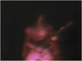
Also - In the above shot, you'll notice that I've 'arrowed' the 2 RED lights that you've added on your new vertical 'strip' running down the chasm wall here...
...but I reckon it might be neat to see them added to the vertical 'strip' in the establishing shot of the 'Vane' below too, if possible...as they seem to be missing here...
Here's how things look at the very start of the shot -

___________________________________________________________________________________________________________________________
2. I'm pleased to see that you've 'filled in' some of the 'missing'/darkened 'vents' with RED now... I brought this issue up recently, and am still interested to know if you're planning to 'fill in' any more of them, or not?
For easy reference, I've described/shown the relevant shots to do with these further down this particular post here. Just scroll down a little - MISSING RED VENTS
___________________________________________________________________________________________________________________________
3. Although I REALLY like the fact that you've made Vader's lightsaber 'blade' retract now, I have to be honest (you wouldn't want it any other way) and say I personally prefer the look of the original 'hilt' that was seen in this shot below...and think that your retracting 'blade' might seem even better if it was seen to extinguish into that extra little bit of the 'hilt' that we see in the original version...or alternatively, if your 'hilt' end was 'shaped' a little differently here...

Here's what I mean - for the sake of a recap, here's how the 'hilt's end looks in the shot shortly before it's 'retracted'...

...and here's a 'rotational' example of the various 'angles' of the lightsaber's 'opening' end...and I especially like the way it looks at the very end of this clip - http://www.youtube.com/watch?v=LatF7r2cpXw
...and here's another good example which gives a good look at 'angles' of the 'opening' end, once the rendering kicks in - http://www.youtube.com/watch?v=sQYDTosOIm8
Again, see what you think, but even if you don't want to keep the original 'hilt', I still reckon that your shot might look a little better if you could show a 'diagonal'-looking 'angle' of the 'hilt's end, instead of the 'rounded' way you've previewed here. It would just look more like the 'end' of a lightsaber, if you know what I mean. Only my own opinion at the end of the day, so no worries.
___________________________________________________________________________________________________________________________
4. At this point, it seems that there was a missing orange light in the background. I see you've re-coloured it in the 2nd comparison shot below that I've 'arrowed', but I wonder if it should be nearer in hue to the lighter orange ones seen in the rest of the 'dotted line' here? Also, will you be re-colouring the one in the 1st comparison below that's still missing, too?...


___________________________________________________________________________________________________________________________
5. I'm curious about why your version of the chasm in the 1st comparison below seems to be 'squeezed' narrower in shape compared to the original? Although your version has been 'flipped' upside-down, it should still look as equally 'circular' overall as the original blu-ray version surely? - it's easier to notice how 'squeezed' yours looks if you compare the shape of the 2 sets of black holes and the 'dotted lines' of orange lights near the bottom... Your version definately has an 'oval' look to it here, and seems less 'wide' when watching the clip now...

...strangely however, your later shot of the chasm in the 2nd comparison below is perfectly fine, as it looks just as 'circular' overall as the original shot here...

___________________________________________________________________________________________________________________________
6. Finally, I'm still wondering if it's possible for you to re-colour/'whiten' the 'yellowish' lights seen in certain shots, for better continuity, or not?...as well as perhaps add some of the missing 'tubing' to the end of the 'gantry?...
For easy reference, I've described/shown the various issues to do with these further down this previous post here. Just scroll down a little - YELLOWISH LIGHTS AND MISSING TUBING
And before anyone 'starts'...I *know* these are all 'trivial', 'unimportant' things...but so are several things that adywan has thankfully tweaked in the clip anyway...