
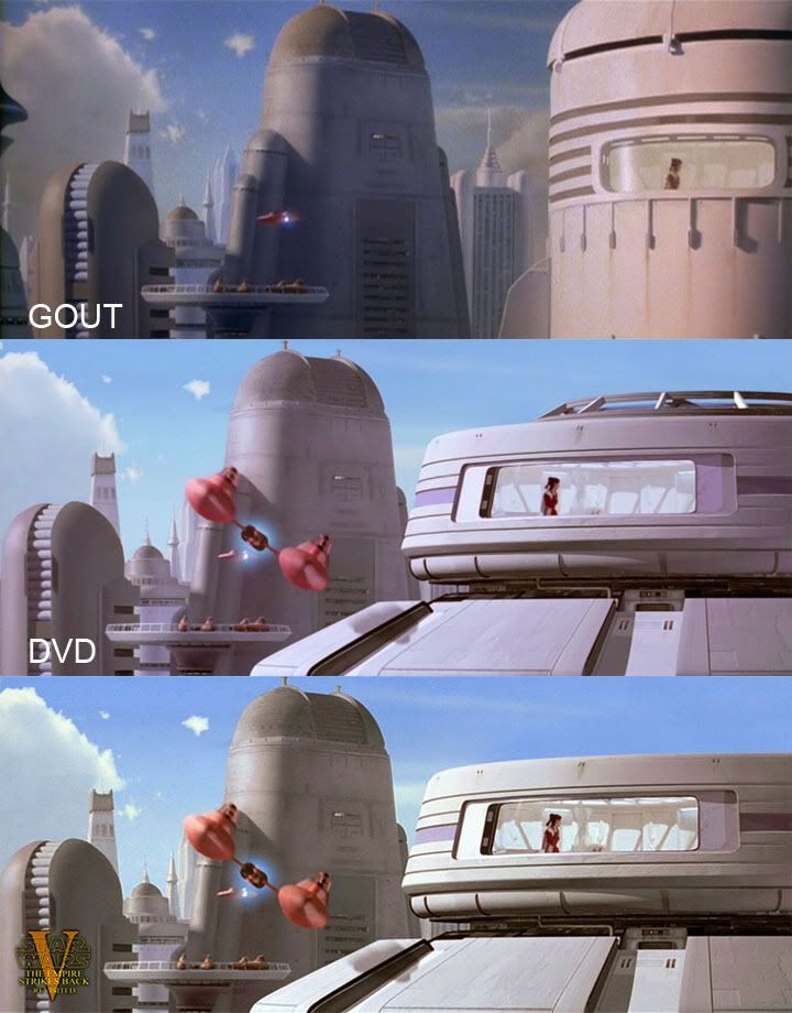
Going by the current SE shots, if you choose to look on the 'apartment window' shot as being the WHOLE 'rounded end' of the top section of the building seen in the preceding shot....then the top section is only as wide as the 'apartment' is (quite narrow it seems), and the position of the 'tall, fat building and platform seems to be SIDE-onwards on the right-hand side to the whole of Leia's building....BUT if you look on the 'apartment window' shot as being positioned 'unseen' at the far-edge of a WIDER top section, then the position of the 'tall, fat building' and platform can seem to be facing almost DIRECTLY towards the end of Leia's building, and better matches the positioning seen at the end of the preceding 'fly-by' shot too.
And also going by the current SE shots, shouldn't the single 'wine'-coloured stripe either side of the 'apartment window' be covering the 'strips' indicated just above and below it as well, to better tie-in with the MUCH THICKER 'wine'-coloured stripe seen in the preceding SE shot? (or the one in the preceding shot could be made THINNER) Especially since it's seemingly intended to represent the same structure?
As far as the 'INTERIOR' of the 2 shots shown here are concerned -
I agree that Han enters the doorway beside the 'plant in the red vase', and that Chewbacca and Lando BOTH end up entering the SAME doorway a good distance away from Han's one, and which has the 'seashell' beside it (You can just briefly see the 'seashell' on the alcove shelf on the LEFT of Chewbacca when he enters the apartment with the pieces of C3PO).
And I always imagined that the bottom shot, showing a 'close-up' of 'Leia looking out of a supposed window', is intended to show us an almost DIRECT-on view of the REAR of the apartment's layout, with Han's doorway on the RIGHT of the shot, and Chewbacca's and Lando's doorway on the FURTHEST FAR LEFT of the shot here (which means that the angle of the current 'interior' seen through the 'window' before it, is quite off-kilter).
The current layout of 'doors' seen through the 'window' seem to lead to nowhere, as Chewbacca and Lando would have had to come into the apartment using the same doorway situated somewhere around where Leia is facing in the 'window' shot seen here! And although the spacing of the SHADOWS on the wall are not perfect between the 2 SE shots shown here, judging by the direction of their angles, I would say that we shouldn't see in this preceding 'window' shot, what seems to be the TOP of the 'plants in the red vase' beside where Han enters, when compared to the positioning of the NEXT shot....
Therefore, the ways I'd like to see the existing 'window interior' adjusted would be these, if possible -
I reckon the SE hint of 'twisting, glass ornament' that we can make out behind Leia, that is currently on the left-hand side of the interior, should be moved over to the far- RIGHT of the 'interior', to give it a better 'centrally-placed' look in the overall structure as seen through the 'window'. This would better match the actual set positioning behind Leia in the NEXT shot shown above, to reinforce that the back of the apartment is more to the RIGHTof the 'inside' of this structure....
OR if that's not achievable during this slightly 'zooming-in' shot, could you alternatively consider REMOVING IT COMPLETELY out of the shot (and out of our viewpoint) , ALONG with the 'hint' of what seems like the TOP of the 'plants in the red vase'? This would give the impression that the 'central ornament' and the 'plants in the red vase' are FURTHER BACK to the RIGHT of the structure, unseen by us. I know the hint of ceiling curvature is possibly slightly wrong for this, but I'd prefer that to being more distracted by the strangely-positioned 'ornament' compared to it's positioning in the shot that follows. It's a little thing in the scheme of things, but this subtle tweak could make a good difference, if possible. Even if the 'ornament' isn't adjusted or removed, I'd definately like to see the hint of the TOP of the 'plant in the red vase' TOTALLY REMOVED, as that REALLY gives a misleading layout to the interior, where it would seem 'vaguer' without it. (There seems to be something sticking out now on the inside on the left-hand side that passes in front of Leia close to the window's interior. This is not really a problem, as the camera-angle of Leia's 'close-up' supposedly 'looking out of the window' in the next shot doesn't show exactly how close she is to the window, and isn't at an angle to see this 'protrusion', even if it had been included in the actual set. It's just an extra detail that could EITHER be left in, OR removed) The figure of Leia is fine to be seen pacing in her current way, even if any of these interior adjustments are made.
Either of these 2 scenarios would greatly improve the continuity between these 2 shots I think.
Adywan, just wanted to re-suggest these specific points above, that may have got missed in a lengthy post I made a while back. I still think they are worth considering if you did miss them. Not a biggie at the end of the day, just a few thoughts on it still.
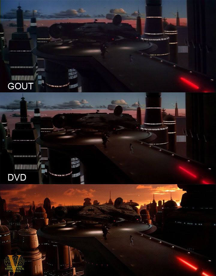
The removal of the top of the structure was mentioned by a few at the time, and is a welcome improvement for the sake of continuity with the interior ceiling shots. Great to see you did this tweak.


