
- Time
- Post link
I think Adywan gave us the best of both worlds. Shame he could do it better than the professionals.
https://www.youtube.com/watch?v=wNnYpODghl4
I think Adywan gave us the best of both worlds. Shame he could do it better than the professionals.
https://www.youtube.com/watch?v=wNnYpODghl4

Indeed, Emperor was in '04.
But let’s be honest, the original Emperor in ESB is absolutely shocking, and not in a good way.
But at least it is interesting. They did such a shitty job shoehorning McDiarmid in there. If they went through trouble to do proper makeup and costume, that plus perhaps the windows on Bespin and a better executed re-done wampa sequence could have been a really good Director’s Cut (which the '97 version of Empire is more so than the other two, which are much more radical), if the original were available to watch beside it.
I think Adywan gave us the best of both worlds. Shame he could do it better than the professionals.
https://www.youtube.com/watch?v=wNnYpODghl4
Never watched Adywan’s versions. This is more or less what I said above, though I wish the skin were darkened/greener/yellower as it was both in the original ESB and in ROTJ.
EDIT: added second quote rather than double post
I would put this in my sig if I weren’t so lazy.
I think Adywan gave us the best of both worlds. Shame he could do it better than the professionals.
https://www.youtube.com/watch?v=wNnYpODghl4Never watched Adywan’s versions. This is more or less what I said above, though I wish the skin were darkened/greener/yellower as it was both in the original ESB and in ROTJ.
The dialogue there has been edited to match the original, and the Emperor looks as he does in ROTJ, as he has been lifted straight from it, so what you’ve said above does not quite apply. It’s definitely a step in the right direction compared to the 04 SE.

While I do agree with you to an extent, I don’t really agree that the Emperor needed to look more like he did in ROTJ than ROTS.
He doesn’t look nearly as different between '04 ESB and ROTJ as he does between ROTS and ROTJ.
His appearance changes in pretty much every film he’s in so it isn’t really too unbelievable that he would look different from '04 ESB to ROTJ.
At the end of the day you have to remember that the SE from '04 onwards was altered to be more familiar with the PT (like it or not, that’s not really relevant), so it makes sense to an extent to give the Emperor more of a ROTS look.
Personally I think it’s a decent hybrid between ROTS and ROTJ and while the original may be more interesting, that doesn’t make the quality better.
Nostalgia is obviously a very big factor, but while someone may personally prefer the aesthetic of model ship battles in ANH, it’s not really subjective that the ones in ROTS look objectively better, which they should, almost 30 years later.
He doesn’t look nearly as different between '04 ESB and ROTJ as he does between ROTS and ROTJ.
'04 ESB literally uses the same makeup as ROTS, so I’m not sure what you’re getting at there.
His appearance changes in pretty much every film he’s in so it isn’t really too unbelievable that he would look different from '04 ESB to ROTJ.
There’s something of a 40 year jump between ROTS and ROTJ, and something of a few months to a few years between ESB and ROTJ, a jump like that is really odd.
At the end of the day you have to remember that the SE from '04 onwards was altered to be more familiar with the PT (like it or not, that’s not really relevant), so it makes sense to an extent to give the Emperor more of a ROTS look.
Though the first part of this statement is true, the second part is an incongruity.
Personally I think it’s a decent hybrid between ROTS and ROTJ and while the original may be more interesting, that doesn’t make the quality better.
Wouldn’t creating more interest in the audience lend the film to having a better quality than one that does not create that interest? This doesn’t make sense.
Nostalgia is obviously a very big factor, but while someone may personally prefer the aesthetic of model ship battles in ANH, it’s not really subjective that the ones in ROTS look objectively better, which they should, almost 30 years later.
Looks are purely subjective, there’s no objectivity about it.
What was this post?

He doesn’t look nearly as different between '04 ESB and ROTJ as he does between ROTS and ROTJ.
'04 ESB literally uses the same makeup as ROTS, so I’m not sure what you’re getting at there.
Wasn’t it even recorded on set during the filming of ROTS?
He doesn’t look nearly as different between '04 ESB and ROTJ as he does between ROTS and ROTJ.
'04 ESB literally uses the same makeup as ROTS, so I’m not sure what you’re getting at there.
Wasn’t it even recorded on set during the filming of ROTS?
Yep.
Looks are purely subjective, there’s no objectivity about it.
Well… No.
Yes I get the whole “personal taste” argument and while I agree that what you personally like is subjective, there is objective quality.
This is obviously a drastic example/hypothetical, but let’s say two movies come out and they both have a scene of a teacher at their desk, an apple at the foreground and clearly the main focus.
One film has a real, nice, shiny looking apple, and the second film literally just has a red splotch that looks like it was put in there using Microsoft Paint, with the intent of it resembling an apple.
One apple looks well on film, the other is a piece of shit.
You may think the second apple looks good personally, but that doesn’t mean it looks like a good apple in general.
Looks are purely subjective, there’s no objectivity about it.
Well… No.
Yes I get the whole “personal taste” argument and while I agree that what you personally like is subjective, there is objective quality.This is obviously a drastic example/hypothetical, but let’s say two movies come out and they both have a scene of a teacher at their desk, an apple at the foreground and clearly the main focus.
One film has a real, nice, shiny looking apple, and the second film literally just has a red splotch that looks like it was put in there using Microsoft Paint, with the intent of it resembling an apple.One apple looks well on film, the other is a piece of shit.
You may think the second apple looks good personally, but that doesn’t mean it looks like a good apple in general.
You’re comparing apples (haha get it) and oranges here. IMO good quality modeling shot on 35mm looks way better than crappy 1080p unimaginative CGI.
I would put this in my sig if I weren’t so lazy.
Looks are purely subjective, there’s no objectivity about it.
Well… No.
Yes I get the whole “personal taste” argument and while I agree that what you personally like is subjective, there is objective quality.This is obviously a drastic example/hypothetical, but let’s say two movies come out and they both have a scene of a teacher at their desk, an apple at the foreground and clearly the main focus.
One film has a real, nice, shiny looking apple, and the second film literally just has a red splotch that looks like it was put in there using Microsoft Paint, with the intent of it resembling an apple.One apple looks well on film, the other is a piece of shit.
You may think the second apple looks good personally, but that doesn’t mean it looks like a good apple in general.You’re comparing apples (haha get it) and oranges here. IMO good quality modeling shot on 35mm looks way better than crappy 1080p unimaginative CGI.
Well that’s, just like, your opinion, man.
I won’t touch the ship argument due to all the SE modifications that have improved them, but instead offer up a less “apples and oranges” comparison.
You cannot tell me that this:
http://dorksideoftheforce.com/files/2015/08/return-of-the-jedi-speeder-bike-race.jpg
Looks better than this:
http://www.angelfire.com/scifi/banthapodoo/Podrace.jpg
Both use film stock, both use a blend of green/bluescreen and practical effects.
And yeah I know, crappy links, but I’m on my phone.
Notice how I said IMO (in my opinion)
I would put this in my sig if I weren’t so lazy.
You cannot tell me that this:
http://dorksideoftheforce.com/files/2015/08/return-of-the-jedi-speeder-bike-race.jpgLooks better than this:
http://www.angelfire.com/scifi/banthapodoo/Podrace.jpg
The first one looks better than the second one.
I would put this in my sig if I weren’t so lazy.
It doesn’t.
Stop treating your opinion as objective fact or you’re gonna have a rough time.

Was that an actual color regrade though? It kind of just looks like the saturation has been bumped up a notch.
I think if it is an issue with the overall grading, Harmy would have been able to get rid of it when he regraded it. Given the fact that he had to rotoscope them out, I’d say there is more to it.
Ceci n’est pas une signature.
You cannot tell me that this:
http://dorksideoftheforce.com/files/2015/08/return-of-the-jedi-speeder-bike-race.jpgLooks better than this:
http://www.angelfire.com/scifi/banthapodoo/Podrace.jpgThe first one looks better than the second one.
+1
Ceci n’est pas une signature.

Composited models look more real, although you can get more creative movement out of CG.
And going back to ESB 97, the cleaned up effects just hold things together really well. This mostly comes down to the Hoth battle, which looks incredible in the 97. It also doesn’t have the fucking 04 emperor.

You cannot tell me that this:
http://dorksideoftheforce.com/files/2015/08/return-of-the-jedi-speeder-bike-race.jpgLooks better than this:
http://www.angelfire.com/scifi/banthapodoo/Podrace.jpgThe first one looks better than the second one.
You beat me to it. Where’s TV’s Frink when you need him??
Stop treating your opinion as objective fact or you’re gonna have a rough time.
Thank you.

It doesn’t.
Sounds like someone’s angling for a furious taxes thread of his own.

This is the one I bring up whenever someone tries to make the “George’s vision” argument. His true original vision was . . . a couple of extra rocks? More than anything else (besides maybe the door to Jabba’s Palace), I think this is the best illustration of how George was just changing stuff for the sake of changing it towards the end.
I’m still pretty sure any '11 additions were for the 3D release. Foreground rocks, deeper Jabba door matte, more poke-out-of-the-screen bits when R2 gets shot.
Star Wars Revisited Wordpress
Star Wars Visual Comparisons WordPress
Stop treating your opinion as objective fact or you’re gonna have a rough time.
It’s not my opinion, it’s called not being narrow-minded and deluded by nostalgia.
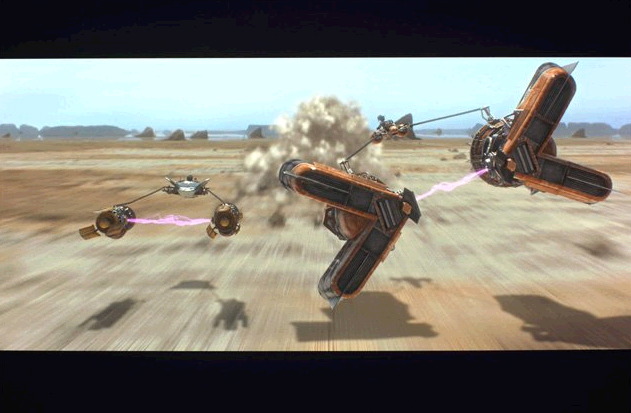
From a technical standpoint the screenshot of TPM looks more real than that of ROTJ, which is ultimately what the filmmakers were aiming for: amazing special effects that felt real.
Star Wars isn’t some weird trippy arthouse film, it’s a Hollywood blockbuster, the effects of which are supposed to be convincing, and the shot from TPM is objectively more convincing than that of ROTJ.
And the fact that ESB has considerably better SFX than ROTJ across the board doesn’t help.
Nobody cares if you prefer the way ROTJ looks, but being arrogant and stubborn about it just because you don’t like another movie doesn’t make you right.
Ceci n’est pas une signature.
I’m not discussing the PT, I’m saying being pretentious is not indicative of intelligence.
So where is the scientific fact that the TPM picture looks realer? Unless you can present objective criteria, you’re just as pretentious as you claim other here to be.
Ceci n’est pas une signature.