logo Sign In

FACEBOOK PAGE & Sticker Campaign — Page 4

Author
Time
 (Edited)

Updated with the 'S' and 'E' changes, as already done. Here's the illustrator files: (scaleable)

*EDIT* Links Removed */EDIT*

Here are 4 variations, tweaking presentation:

Update:

Fading away:

Yellow outline:

Since the outlines were bleeding together, here's a Slightly thinner version:

Would like to try these out with Luke/Leia version of this original logo. Is there a vector, Anchorhead? Otherwise i'll see what can be done with the posted pic.

These are fine as logos, but they don't bring any info along. They don't provide a reason for the saving of star wars or an explanation why it needs saving. Think people would scratch their heads when seeing these, but not sure if they would feel the need to find out more. So the idea of having this logo as part of a larger image which could get into a specific thing (Shaw & Wolfman for instance) unfortunately has the drawback of being too clued in, so i'm suggesting having lots of these with as many crazy ideas as possible. Let people pick and choose which they feel is appropriate.

*EDIT*

Could do a bunch of 'Did You Know...'

Author
Time

Hopefully this will remind generations to come of what LUCAS SHOT FIRST.

Author
Time

Good call fixing the first "S".  Here's a link to buy stickers from cafepress with the updated image.  It's a 3x5 inch sticker.  To make it any bigger, they say it needs to be a higher res image.  But it looks pretty good to me.  I know people who've used cafepress for things like this before & they are very high quality, equivalent to professional bumper stickers.  I would think these would last much longer than what you could print from home, depending on where you want to stick it.

http://www.cafepress.com/cp/customize/product2.aspx?number=567726754


Here's a quick t-shirt idea.  Again, if you want it any bigger it needs to be higher res.

http://www.cafepress.com/cp/customize/product2.aspx?number=567728526

Author
Time

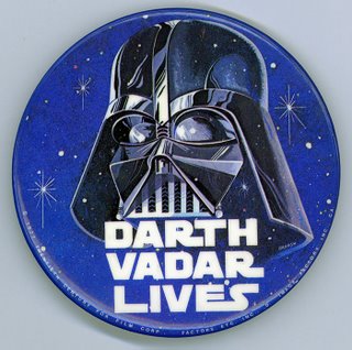
I remember the old "Darth Vadar Lives" badges (buttons if you are over the pond).

So maybe the Seb Shaw thing could be a side project in the same vein.

Some copy shops still make badges/pins they would be a nice visible addition to the campaign especially at conventions.

Author
Time

Anchorhead said:

That's called a spur - and good catch, by the way.  Looks better.


This gets my vote. Strong and simple.

I would love to have a white version (maybe 5 inches across) that I could apply to my rear car window. I'm talking about the kind where the letters are basically each independent stickers. I'd pay $15 for that.

You know of the rebellion against the Empire?

Author
Time

none said:

Would like to try these out with Luke/Leia version of this original logo. Is there a vector, Anchorhead?

No.  I found the Luke\Leia version on a couple of internet sites, but none of them were high-res.

Forum Moderator
Author
Time

Anchorhead wrote: No.  I found the Luke\Leia version on a couple of internet sites, but none of them were high-res.

Ok, they're very nicely hand drawn.  Attempting to vectorize them, realized they cheated in a few spots, the A in 'Wars' is missing a leg.  (what's the file name? site?)

Erikstormtrooper wrote: I'm talking about the kind where the letters are basically each independent stickers.

Had a similar thought, even if it was on a transparent background to help with the placement.  If they were to be individual letters, using the version with the increased space between letters will help.  Also looks a little better when at a smaller size:

Author
Time

WOW! Amazing work! I can't wait to start printing these out.

Is there such a thing as "bumper sticker paper"? Something that would be weather-resistant?

Author
Time
 (Edited)

Since the design discussion seems to be entering a close, i'll toss out the files again, and everyone's got to do some research on paper choice, could we get a 'cut' version where each letter would require application, or is there a transparent paper which is weather resistant.  Once that's found some discussion on actual final size.  But it's probably worth having a straight black on white or white on black version as a fall back.

But here's where we left off with some modifications:

Black text (.com cut out)                    White text (.com cut out)       Black text / White field

So seeing this version with the .com cut out, go this way or have the .com the opposite color?

All these versions can be Temporarily found here: http://noneinc.com/SSW/Logo4Voting/

[the .ai is the source illustrator file (infinitely scaleable) also in there are a larger version and the sm(all) version for posting in thread]

And we can throw any image into the text:

The Jung poster perspectived

  Escape Pod

Wolf Man...


For those on the cheap, Staples has 'Light Fabric Transfer' paper, print out and iron onto whatever t-shirt you've got.  (have done one so far, and it's held up thru a year of washing/wear)

http://www.staples.com/Avery-3271-Inkjet-Light-Fabric-Transfer-Paper-8-1-2-x-11/product_355125?catalogId=10051&fromUrl=home&cmSearchKeyword=light+fabric+transfers&cmArea=SEARCH&langId=-1&storeId=10001&ddkey=http:StaplesSearch

Author
Time

I feel like the "A" in "Save" needs to have that italic lean to it like the others.

Not sure how that would work with the "V" next to it, but I guess it could look more like "|/" and be okay.

Keep Circulating the Tapes.

END OF LINE

(It hasn’t happened yet)

Author
Time
 (Edited)

Tyrphanax wrote: I feel like the "A" in "Save" needs to have that italic lean to it like the others.

Not sure how that would work with the "V" next to it, but I guess it could look more like "|/" and be okay.

I tried to recycle as much as I could.  So the 'S' is from warS, flopped and re-perspectived.  The 'A' is from stAr and just needed to be mirrored.  Generally the 'S' and 'R' take up a block, with the other letters pushing and pulling on each other as needed.  The 'E' ends up odd, but with the three legs all being the same your eye is drawn to the perspective edge more then the 'V' side.  Looking at this next version maybe the 'V' could be a little thicker.  (sorry can't stop futzin')


Puggo wrote: This sticker looks great... I'd proudly display it on my car.  It would also look great as a website reference.  Could go viral!

Thanks, great suggestions all around, it's pulling together.  Who is the target audience for this?  Viral would be great, but how do we go about that?

Author
Time

Those that would like one for their car can try here. Never used them before but they seem to know their stuff.

I think a little flyer with the logo on top and then a blurb beneath it would work just fine for raising awareness. Sticking them between the blu-rays would do it I think.

Another idea I like is to create a QR code like TheoOdo suggested and have it link to a short video people can watch on their phones that briefly explains what this is all about. You could post these near the the blu-rays possibly using adhesive putty so they'd be easy to remove with no residue.

Forum Moderator
Author
Time

none,

I think you need to tweak the E just a bit. If you look at anchorhead's version, the lower "notch" in the E is longer. It makes the E look less wide at the bottom if you do that.

You know of the rebellion against the Empire?

Author
Time

I'm going to print a few on plain paper and scotch tape them around, like a lost pet flyer. I live in L.A. so I'll put some outside FOX.

Author
Time

Tobar wrote: I think a little flyer with the logo on top and then a blurb beneath it would work just fine for raising awareness. Sticking them between the blu-rays would do it I think.

Flyer idea (quarter of a 8.5x11) can have a different message on each side.

DID YOU KNOW...

...you are not purchasing the 1977 version of Star Wars.  Or even the 1981 re-release version or the 1997 Special Edition version.  The films which grabbed the public’s attention is fading from the public’s consciousness as the creator continues to tinker with the films.  Copyright laws prohibits the general public from preserving these films.  We ask you to consider this when shopping today.  May the films be preserved.

SAVESTARWARS.COM

Forgot about the bar code scan, will drop the text size down a notch and put the barcode next to the SSW logo.  Throw out ideas for text, there's different angles to approach from.  In this version tried to quickly point out the issue, but leave it up to the reader to decide.  In a fairly benign way.

That car sticker company looks perfect for the window kind, you see those 'Stick Families' everywhere.

Erikstormtrooper wrote: I think you need to tweak the E just a bit. If you look at anchorhead's version, the lower "notch" in the E is longer. It makes the E look less wide at the bottom if you do that.

Ahhh see that now, will update tomorrow.

Author
Time

none said:

The films which grabbed the public’s attention is fading from...

This should be changed to either of the following:

The films which grabbed the public’s attention are fading from...

OR

The film which grabbed the public’s attention is fading from...

Otherwise, looks good.

You know of the rebellion against the Empire?

Author
Time

Mielr said:


none said:


Thanks, great suggestions all around, it's pulling together.  Who is the target audience for this?  Viral would be great, but how do we go about that?


I just posted it on the Facebook site (which by the way, NO ONE HERE HAS YET JOINED ALTHOUGH IT'S BEEN UP SEVERAL HOURS!!!)

We need 25 people to get started, so PLEASE JOIN!


Some of have cause to fear and loathe facebook, so I unfortunately must decline. It's bad enough google already knows too much about me!

I will put a sticker on the car asap though.

Forum Moderator

Where were you in '77?

Author
Time
 (Edited)


Puggo - Jar Jar's Yoda said:


none said:

<img src="http://img37.imageshack.us/img37/1492/sswflyerv01.jpg" width="277" height="331" />


Hmm, I'm not entirely sure the average person would know whether this flyer is asking people to buy the set, or to not buy the set. It's obvious to us, but a bit cryptic for others I fear.


I agree- it's not really explicit enough.

Author
Time

About the logo, maybe move the "cracks" in E so that the lower crack is a little wider than the upper one, and then make the sidelines of them in that perspective.

And in the time of greatest despair, there shall come a savior, and he shall be known as the Son of the Suns.