logo Sign In

Episode II: Shroud of the Dark Side (the TM edit) (Released) — Page 51

Author
Time
I am so excited about this edit Trooperman, and if you have time I would love to see some clips with the new and improved audio.
Author
Time
Does my custom cover from way back in the thread count as credit material? That's right I'm still following this thread. I pop in every few weeks and catch up. I'm sorry I haven't contributed any ideas but then I'm not good at that sort of stuff.

I am willing to update the cover btw. I'm sure that you could give me a nice official "blurb" for the back cover and a screenshot or two. And the vital details which have no doubt changed since I last updated the cover.

To contact me outside the forum, for trades and such my email address is my OT.com username @gmail.com

Author
Time
Would you mine reposting that cover. I can't find it.....
Author
Time
Darth Richard; I never actually posted the cover - just small previews. I will post the finished cover of course, but I'd rather get Trooperman's input on it beforehand so I can post the final version.

Here's a preview-size version of the latest incarnation of the cover. The text is probably all out-of-date:
http://home.iprimus.com.au/paulgaliazzo/sotds_11_orange.jpg

And here's the cover with a more brown hue. I think, reading over the thread, that the hue of the cover should be shifted from orange to brown. Y'know, more sepia-like. What do you think? Trooperman?
http://home.iprimus.com.au/paulgaliazzo/sotds_11_brown.jpg

To contact me outside the forum, for trades and such my email address is my OT.com username @gmail.com

Author
Time
I definitely think the "washed out" cover looks better.

As far as the SL/DL is concerned, I'd prefer to have the commentary only on the DL disc so that the quality isn't diminished (as much). Just my two cents.
Light speed too slow??
Author
Time
TM: did you get those re-takes I sent for the Owen dialogue?

On the cover: Not bad, but I am so sick of the standard gold spine on all the releases. It is on almost everything. This edit is special, why not have a bit more 'oomph' in the cover? Not that the washed out one isn't nice, but printed covers tend to be a bit washed out anyway. I'm concerned that it will look extra-murky when printed. Just my 2¢.
Author
Time
Sluggo:
This is just what I had lying around from several months ago (at least). I am all for a more creative cover, however I'd like Trooperman's input before I start changing anything. The washed-out one was a quick and dirty effect. I expect that if I were to do something similar for real then I'd make it look better.

To contact me outside the forum, for trades and such my email address is my OT.com username @gmail.com

Author
Time
Originally posted by: klokwerk
Sluggo:
This is just what I had lying around from several months ago (at least). I am all for a more creative cover, however I'd like Trooperman's input before I start changing anything. The washed-out one was a quick and dirty effect. I expect that if I were to do something similar for real then I'd make it look better.


No big deal. Just my 2¢. I do like the washed out concept. Like most projects and edits, I usually modify all the covers anyway for my personal collection.
Author
Time
I modify a lot of covers too actually. Please, no matter what I release, if you change it - send me a copy? Or I can change it for you in Photoshop so you don't lose quality?

To contact me outside the forum, for trades and such my email address is my OT.com username @gmail.com

Author
Time
Does my custom cover from way back in the thread count as credit material?

Of course! I'm glad you're still following the thread after all this time Yes, the specs have definitely changed since last year. The title, the characters being dubbed, the crawl... all of this has been changed. When I get time, I can send you the necessary info. What a great start on the cover, though! I like the washed out idea too.

Was there ever a PT poster made to look like it was from the 70's?

Now THAT would be neat Maybe an alternate OT-style cover with a SOTDS title to match the OT logos, and a colorful layout.

I am so excited about this edit Trooperman, and if you have time I would love to see some clips with the new and improved audio

I'll see if I have time to do that On the one hand I don't want to give too much away, but on the other hand I want you to see my work. I'll see if I can't get you all a couple more glimpses.

-----------------------

In addition to that outline of my game plan I just posted, I just remembered that I haven't finished Mace Windu's lightsaber yet. So I'll have to do that before I start on credits as well....

Episode II: Shroud of the Dark Side

Emperor Jar-Jar
“Back when we made Star Wars, we just couldn’t make Palpatine as evil as we intended. Now, thanks to the miracles of technology, it is finally possible. Finally, I’ve created the movies that I originally imagined.” -George Lucas on the 2007 Extra Extra Special HD-DVD Edition

Author
Time
Thanks Trooperman, it's great how responsive you've been and it's greatly appreciated.
Author
Time
I'd love to see a DVD cover that carried the OT vibe that SOTD is supposed to evoke. The most "OT" piece of AOTC promo work I saw was the "Art of..." book. I saw a wicked cool set of OT DVD cases done using concept art from the movies. I think a painted-look would make the "Shroud of the Dark Side" cover look way different than the other Prequel Trilogy releases.

Something based on this, for example:
http://images.amazon.com/images/P/0345431251.01._SCLZZZZZZZ_.jpg

Author
Time
Maybe ask Coov to make it. I have an idea, that might be a pretty wicked cover, but only Coov could pull it off.
Author
Time
MTHaslett's idea of using concept art is a good one. I was annoyed to find that I didn't have any hi-res prequel concept art lying around in my SW image archives. I found a photoshoppery that some fan did for Episode II and applied a basic cutout filter to it, played with the color a bit and came up with this (ignore the bars):
http://home.iprimus.com.au/paulgaliazzo/sotds_12_test.jpg

I am sure we can mock up a colorful 70's style poster looking cover. However, I'm afraid my hi-res resources for Ep II aren't as great as III or even I & IV-VI. Anyone care to share some publicity shots or concept art?

To contact me outside the forum, for trades and such my email address is my OT.com username @gmail.com

Author
Time
Sorry, I haven't posted here lately. It's just that I haven't had anything to say. I searched for Episode II publicity shots/concept art. Results follow:

Clone ships
Wallpaper
Promo shot's and movie stills
Jango
Clone Trooper1
Clone Trooper2
Clone Trooper3
Wallpaper
Clone Trooper4
Clone Trooper5
Clone Trooper6
Anakin
Anakin2
Jango2
Dooku
Obiwan
Some more wallpapers
Gallery of images
Jango3
Anakin
Dooku
Clone Trooper7
Clone Trooper8
Clone Trooper9
Jango4
Anakin
Anakin and, Obiwan
Anakin and, Obiwan
Jango and, Boba


There ya go klokwerk.

http://twister111.tumblr.com
Previous Signature preservation link

Author
Time
The painted theatrical poster used in klokwerk's earlier cover looks pretty OT to me. It's way better than the official DVD cover. I've never seen a photo photoshopped to look like a painting that looked good.
Author
Time
Originally posted by: THXThe painted theatrical poster used in klokwerk's earlier cover looks pretty OT to me. It's way better than the official DVD cover. I've never seen a photo photoshopped to look like a painting that looked good.

Are you talking about the ones on page 63?

This one here with Anakin carrying Padme looks pretty cool. Still could probably use the main Star Wars title logo on the front, though.

Pink Floyd -- First in Space

Author
Time
I really like the picture on the last cover posted by Klokwerk. But I do like the faded theatrical poster as well. Maybe the faded theatrical poster (or another 70's/80's style movie poster created from concept art) could be put on the front, and the picture with Anakin holding Padme could go on the back of the cover, or the chapter list, or something like that. I really like that last picture.

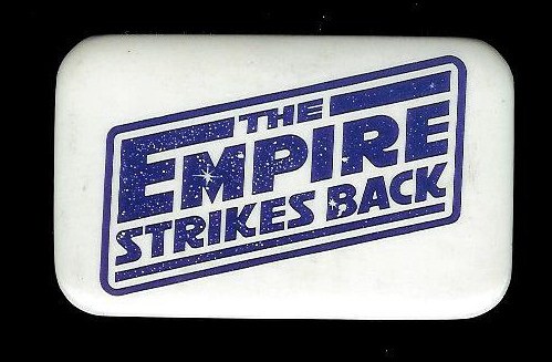
One thing that would be really neat is if a logo could be made for SOTDS (that could be put on the front cover) that matches the OT logos. Like this: http://www.toysrgus.com/pete/empirelogo.jpg

Notice how "Episode V" is nowhere to be seen- it's just the title.

Thank you so much for putting a cover together- I have no experience with that whatsoever, and I really love what I'm seeing so far. And thanks to Twister for the links...

Episode II: Shroud of the Dark Side

Emperor Jar-Jar
“Back when we made Star Wars, we just couldn’t make Palpatine as evil as we intended. Now, thanks to the miracles of technology, it is finally possible. Finally, I’ve created the movies that I originally imagined.” -George Lucas on the 2007 Extra Extra Special HD-DVD Edition

Author
Time
Well, page numbers are relative, but I meant this one:

http://home.iprimus.com.au/paulgaliazzo/sotds_11_brown.jpg

P.S. Is it Shadow or Shroud?
Author
Time
Originally posted by: twister111
Sorry, I haven't posted here lately. It's just that I haven't had anything to say. I searched for Episode II publicity shots/concept art. Results follow: (Links removed for quoting)
There ya go klokwerk.
twister111, thanks for those links. I actually had most of those images however, there were several that I didn't have as well as higher quality versions of some of the ones I do have. Thanks.

Originally posted by: THX
The painted theatrical poster used in klokwerk's earlier cover looks pretty OT to me. It's way better than the official DVD cover. I've never seen a photo photoshopped to look like a painting that looked good.
THX, I agree that Struzan's work for the prequel posters does look pretty OT (though it would be good if he did a joining set at som point in the future, much like he did for the SE). I think that I will do a version with the poster no matter what other covers I do. Does everyone agree that adding some filters like sepia, film-grain, etc, would be a good idea for the poster? Untouched it just doesn't seem to fit.

Originally posted by: auximenies
This one here with Anakin carrying Padme looks pretty cool. Still could probably use the main Star Wars title logo on the front, though.
The Star Wars logo was on there but was very low-quality as that shot has been resized to 250-300% to fill the front cover. That's partly why I decided to use some filters on it. I did do a layer with the SW logo but I must've left it off. Will give a preview of that soon.

Originally posted by: Trooperman
I really like the picture on the last cover posted by Klokwerk. But I do like the faded theatrical poster as well. Maybe the faded theatrical poster (or another 70's/80's style movie poster created from concept art) could be put on the front, and the picture with Anakin holding Padme could go on the back of the cover, or the chapter list, or something like that. I really like that last picture.

Trooperman, I've always liked that "Episode II Teaser" as it's called too. I might try and email the person who photoshopped it and see if they have a higher quality version.

Originally posted by: Trooperman
One thing that would be really neat is if a logo could be made for SOTDS (that could be put on the front cover) that matches the OT logos. (Image removed for quoting) Notice how "Episode V" is nowhere to be seen- it's just the title.

I can take a crack at it. I recreated Jambe Davdar's "Building Empire" logo for my cover as I wanted a hi-res version, so I've had experience dealing with that style of logo before.

Originally posted by: Trooperman
Thank you so much for putting a cover together- I have no experience with that whatsoever, and I really love what I'm seeing so far.

No problem.

Originally posted by: THX
P.S. Is it Shadow or Shroud?

THX, I think it's "shroud" now isn't it? The thread is "shroud". I think at the time when I first created the cover Trooperman was using "shadow". I changed it to "shroud" on the latest preview because I assumed that's what it was now (hard to know for sure when we all just use the SOTDS abbreviation). I also changed the fonts if anyone's interested. Well sort of. See, I was using Trajan and now I'm using Trajan Pro. It looks much nicer up close.

To contact me outside the forum, for trades and such my email address is my OT.com username @gmail.com

Author
Time
I'm a fan of the latest picture, it definetly has somewhat of an OT feel to it.
Author
Time
Well, I played around with the logo. I've just done a large rendition of it on top of that last picture. This is not meant to be a cover mock-up - just to give the logo some context. This version of the picture is a bit brighter and the colors are truer to the original image (it was a bright image - and I keep wanting to add a brown/orange tinge to evrything ). Here ya go, what do you think of the logo?

http://home.iprimus.com.au/paulgaliazzo/sotds_12_test3.jpg

To contact me outside the forum, for trades and such my email address is my OT.com username @gmail.com