logo Sign In

Toggle Background Color For Any Depth Of Nested Quotes

Author
Time

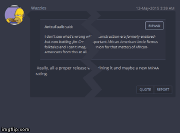
Viewing nested quotes more than 2 levels deep is hard to read because the background color stops toggling. Oh, my eye! Here’s to show the present (left) and the wished-for (right):

[OK, Wazzles, there’s your advertising plug. Please send non-sequential, small-denominations bills.]

Author
Time

Honestly I think it’s hard to see all levels of quoting with the current color scheme, I’d like to see something a little more differentiated. I’d also like to see the new part of the post match the surrounding color (similar to the way the first post appears) because it’s tough to find the new parts among the quoted parts when there’s multi-quoting going on.

Author
Time

TV’s Frink said:

I’d also like to see the new part of the post match the surrounding color (similar to the way the first post appears) because it’s tough to find the new parts among the quoted parts when there’s multi-quoting going on.

I don’t follow. Do you mean that the new part of the post would be the color of the center area?

Author
Time

The new part of the post would be the same color as the surrounding area. Look at the first post in this thread (or any thread) and that’s how I’m suggesting all posts should look. It’s not a big deal when there is no quote or a single quote in a post, but when there’s a quote-post-quote-post pattern it’s difficult to find the new parts vs. the quoted parts.

Author
Time

Okay! Nice solution and easier on the eyes (TV’s Frink’s too?) …

One suggestion – when expanded, the button should be named “collapse”.