
- Time
- (Edited)
- Post link
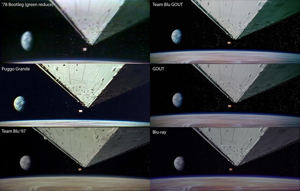
After gathering a bunch of references, it looks as if the earliest examples of the film have a greenish tint to them. I actually had to reduce the green of the bootleg to balance the colors somewhat:
And here’s the attempt with a single set of adjustments:
http://screenshotcomparison.com/comparison/176880
And with slightly less yellow:
http://screenshotcomparison.com/comparison/176882
Finally one that has less green in the shadows:
http://screenshotcomparison.com/comparison/176886I have no idea which one is more correct.


The answer really is none of them are “more correct” since no two prints we’re exactly alike. It’s a photochemical process, so the colors were slightly different from print to print, and then the color changed even more depending on how it was projected. We can certainly gain an idea of how the colors in general were, but nobody (not even mike verta with all of his material and reference) can know for sure what the colors were originally on the negative. All we can do is make some inferences based on what little reference we have to get in the ballpark, and use our own judgement of what looks right.


