logo Sign In

Idea & Info: Cinerama 70mm '2001' preservation. Is it possible? — Page 14

Author
Time
 (Edited)

Without knowing the source of this 70mm clip (from a picture search, to a 2015 article that doesn’t specify it’s vintage; although those edge marks may say) . .

. . see how closely the colors of this particular shot (minus source-light tinting) matches a picture from the Taschen book (again, from a picture search, to a 2013 article with the picture not credited; but I saw it in Taschen book articles) . .

Author
Time
 (Edited)

SilverWook said:

Are senitypes actual frames from a print though? The limited edition version of the Kubrick Archives came with a small strip of frames touted as being taken from an actual 70mm print of 2001.

The Archives book also has stills from a 70mm 2001.

Edit: I’ve been regrading some frames from the blu-ray to match the 70mm frames from the Stanley Kubrick Archives.
http://screenshotcomparison.com/comparison/164043
http://screenshotcomparison.com/comparison/164044
http://screenshotcomparison.com/comparison/164045

I also tried a smilebox effect:
http://i.imgur.com/g0kXgVX.jpg?1

Here’s the intro (color corrected and smilebox effect):
http://we.tl/rhTafBA2W5

Author
Time

I guess you read early on in this thread about Smilebox®? Oops, those pictures are no longer there – THANK YOU, Imageshack! : P
It is just a wrong simulation of the real thing, because . .

captainsolo said:
The screen curvature should not cause distortion, stretching or cropping, especially since this is a single projector/single film Cinerama release.

I had suggested using a 3D rendering program (also back there) to map out a theater screen as viewed from the best seat in the house, for a more accurate Cinerama experience (I never did it … didn’t have the time … but linked to a really good program, now freeware, that could do the job).

Any way could you find and post the SK Archives pictures, too, which you used to adjust those 3 Blu-ray snapshots, for comparison? I only ask because the opening-titles-comparison text isn’t white, as I think it would be. The rest look good, needing only touch-ups to make the greys non-tinted.

Author
Time

I tried to scan the photos but the book’s too big. I could try my camera or phone although I don’t know if it would be a true representation of the colors.

Here’s a few more regrades:
http://screenshotcomparison.com/comparison/166391/picture:0
http://screenshotcomparison.com/comparison/166394

The last one is bit off… the space station is correct but the Earth is too bright.

Spaced Ranger said:
I only ask because the opening-titles-comparison text isn’t white, as I think it would be.

The text has a slight orange/brown edge to it. I’ll try to post those photos soon.

Author
Time
 (Edited)

In past, I’ve scanned parts of over-size material and manually “stitched” them together in a paint program (some cameras include stitching software – don’t know how accurate they are). Be sure to include a color chart on your scans for confirmation and for color correction (if needed). The same is definitely recommended when using a camera or cell phone.

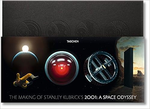
BTW, how many pages are devoted to 2001:ASO in The Stanley Kubrick Archives book? Do you have The Making Of Stanley Kubrick’s 2001: A Space Odyssey? Does TMOSK2001ASO have all of TSKA and more (or is anything unique in TSKA)?

Author
Time

I just have The Stanley Kubrick Archives. It has 38 pages of frames (of various sizes) taken from the 70mm and then pages 366 to 407 go more indepth with articles, interviews, set photos etc.

Author
Time

I have the option to buy that second 2001 print for 305 plus shipping. Can some people help chip in a bit?

Author
Time

Sorry for the lack of info - I was recently bidding on a print of 2001 to combine with my existing mag, original release print of 2001. Needless to say, I originally lost it, only to have a second chance offer come up. I am having two prints scanned, so would definitely appreciate the help for scanning and print acquisition costs.

Author
Time
 (Edited)

I would recommend that you create a whole new thread for your 2001 project. And when you do, I would recommend that you describe, in detail, what your goals are for this 2001 project, especially since you are asking members, here, to contribute monetarily.

I feel that if the members are aware of what you intend to do for this print, you may find a like-minded person, or two that will give to that course.

I, for one, will look forward to see what you have in mind for the print, even though I am, at the moment, satisfied with the current home video release. For all I know, I may be blown away by what you may have come up with later.

EDIT:
Here is an example on how to present your proposal.

http://originaltrilogy.com/post/id/915167

Although this member had purchased the print already, he describes what he intends to do with it and how it would benefit us.

My best wishes to you.

Author
Time

alexp120 said:
… I am, at the moment, satisfied with the current home video release.

The Blu-ray? Oh, I hope not …

Spaced Ranger said:
I tried a test color-correction to confirm that the 2001 HD release (screenshot from the DVDBeaver review, linked previously) wasn’t some unholy Lucas-Lowry space graffiti. Fortunately not, for my simple histogram R-G-B manipulations corrected the spectrum nicely:

Author
Time

SilverWook said:
The hardcover is one huge and heavy book!

I own the hardcover one (sans CD ROM and Film strips). Its very heavy, but quite impressive!

Author
Time

That is the popular stand-alone book?

Or a broken set of the collector’s edition (which includes a couple of extra books, besides the CD & filmstrips)?

Author
Time

Yes, please be sure to check the other thread - I will be posting samples and screenshots as I get them from the scanner!

Author
Time

[ I posted some of this on the 2001: A Space Odyssey 35mm Preservation (Help Needed - original 1968 prints obtained), but moved it here where it belonged ]

In the other thread, an observation came up on 2001's use of front projection. This article illuminates:

American Cinematographer: Front Projection for 2001: A Space Odyssey, by Herb A. Lightman wrote:

The surfacing material used for the giant screen was a special 3M fabric coated with very tiny mirrored beads of glass. … This special lenticular 3M material comes in rolls and an effort was made to surface the screen by mounting it in 100-foot strips. However, because of a slight variation in reflectivity between rolls, seams were frequently visible under projected light. An attempt to match strips exactly proved unsuccessful, so the material was finally torn into small, jagged, irregular shapes which were mounted in a “camouflage” mosaic, shape on top of shape, so that there was no longer any visible variation in reflectivity.

While examining such a shot in a Dawn Of Man sequence (specifically the sky area, which looked patched & tattered), I was reminded of something else I noticed long ago – the set and the projection didn’t blend very well. Naturally, I tried a quick fix. Masking off all of the projected area (an easy task to clearly see the color-difference boundary), the set was color corrected to match the projection. (It could have been corrected the other way around, but this was just a proof-of-concept.) The result was amazing! Suddenly it looked like an on-location shoot that went all the way to the horizon, just as they originally wanted.
TOP is the original Blu-ray screenshot, BOTTOM is the projection-masked-off color correction . .

Doing that reminded me what I noticed more recently – something that looked like an anamorphic-lens brightness roll-off, where the edges of the picture darkened in curvature. Again, a quick fix, to make a mask that would brighten the picture ever more towards the edges. A square gradient from black-to-white was made, pasted back against itself for white-to-black-to-white, and then stretched to fit the picture size . .

Next, to apply the proper lightening, the mask’s histogram was adjusted to produce no lightening effect in the center but to sharply increase it’s lightening towards the edges . .

In a paint program, this mask was layered onto the picture and specified as a “dodge” mask, to increase the exposure as mask-areas increased from dark to light . .

The result was excellent (even though the picture still needs more rounded illumination into the corners)!
TOP is the color-corrected picture, BOTTOM is the luminance compensation . .

So, could something like this be applied throughout the film (it all looked like roll-off)? With another screenshot, bright instead of dark, colorful instead of earth-tones, I tested it but it was too much. By adjusting the mask layer’s transparency to limit the effect (50% seemed about right), the noticeably dimmer walls at the edges now became more like the brightness of the walls in center screen (BTW, no color correction this time, just the luminance test) . .

More fixes for 2001: A Space Odyssey. (Forgive me, Stan, forgive me!) 😄

Author
Time

Spaced Ranger said:

Doing that reminded me what I noticed more recently – something that looked like an anamorphic-lens brightness roll-off, where the edges of the picture darkened in curvature.

https://en.wikipedia.org/wiki/Vignetting

This signature uses Markdown syntax, which makes it easy to add formatting like italics, bold, and lists:

Author
Time

Thanks, vignette! So, wow, looks like I re-invented the wheel, Dawn Of Man style . .

Author
Time
 (Edited)

Just a note about the vignetting here (this is from the Blu-ray release, with all the errors that entails) – it is not identical in all the original picture’s R-G-B layers. The above pictures have changed colors (or from bad color correction that just came through stronger) in the dark areas that were uniformly brightened.

Keeping that in mind, I made another test correction at, this time in the moon base conference room (nice, big light panels on the walls to easily check values all across the frame) . .

A dodge mask was applied to each R-G-B layer independently (instead of universally as previously tried). I worked up a spherical mask to better approximate the lens-distorted vignetting . .

. . and stretched it to fit the picture frame . .

Each dodge also was independently adjusted via histogram, for proportion of change of the vignette area, . .

. . and transparency setting, for strength of application. Adjustments were guided by an eyedropper to ensure that R-G-B color proportions remain equivalent across brightness-changed areas (like in those light panels). The result looks the best so far! Check out those brighter and uniform color, frame edges:

.

Just an aside

Ever notice that in this meticulously crafted shot, only one edge (the far center light panel’s top edge) that is straight? Every other edge in the room is crooked! Was that deliberate? You better believe it! Then why? Well, where else would you expect a government agency, which conspires and lies to keep the public it serves in the dark, to meet? In a crooked room, of course.

Author
Time

Just a heads-up for those looking the get Taschen's The Making Of Stanley Kubrick’s 2001: A Space Odyssey for cheap!

Amazon - The Making of Stanley Kubrick’s 2001: A Space Odyssey

Amazon has been drifting their prices up & down (the new price was going down, but not too low, and suddenly jumped back higher; the used price is still going down). Don’t worry about usedAmazon has “classes”:

  • New
  • Used - Like New – An apparently untouched item in perfect condition. Original protective wrapping may be missing, but the original packaging is intact and pristine. There are absolutely no signs of wear on the item or its packaging. Instructions are included. Item is suitable for presenting as a gift.
  • Used - Very Good – A well-cared-for item that has seen limited use but remains in great condition. The item is complete, unmarked, and undamaged, but may show some limited signs of wear. Item works perfectly.
  • Used - Good
  • Used - Acceptable

Go for new or used - like new or even used - very good and it’s a bargain! The low price now is $26+ for used - like new, but you must act fast. If you miss it, don’t fret. This goes up & down all the time, sometimes with $new = $used! Just watch for your price and be patient. The lowest I saw was $21+ for (I think) a “like new” before everything starting going up again. For free shipping, you must get something(s) else to get the total price up to their free-shipping threshold. (Plan that in advance. You can loose an item, even in your shopping cart, if someone else buys it first.)
.

And don’t forget to keep watching the other 2001 thread! They are still taking donations … as much or as little as you like … anything will help!
2001: A Space Odyssey 35mm Preservation (Help Needed - original 1968 prints obtained)

Author
Time

Not sure if we had gone over this before but I just stumbled across this on in70mm.

2001" and the flat screen

Quote from a Douglas Trumbull interview in Cinefantastique June 1994:

"The film was shot in Super Panavision for projection on the curved Cinerama screen but the unique format wasn’t accounted for during the years of production. During the entire production, we never once viewed footage on a curved screen or in the format.

What would happen is we’d shoot in 65mm, but the lab would generate 35mm anamorphic prints for us to look at on a small flat screen. We never saw it in a Cinerama theatre. It wasn’t until the very, very end of photography, or maybe once during production, that I think Kubrick took a couple of 70mm prints and went down to a 70mm theatre to see how it looked. So, in a sense, the movie was not made with a curved screen in mind. In some of the Cinerama theatres there were a serious projection problem, because the projection booths were mounted up too high and you had a horrible sort of curved, keystoning effect: the titles would come out badly curved and it looked very distorted".

VADER!? WHERE THE HELL IS MY MOCHA LATTE? -Palpy on a very bad day.
“George didn’t think there was any future in dead Han toys.”-Harrison Ford
YT channel:
https://www.youtube.com/c/DamnFoolIdealisticCrusader

Author
Time

To take it one step further, Kubrick would frame his shots with a square viewfinder, like on his still-camera, for the super-widescreen extravaganza 2001: A Space Odyssey. That means we should be able to buy a “fullscreen” DVD/Blu-ray and watch Kubrick's original vision! 😄

Author
Time

Here’s some recent thoughts I had:

So is it confirmed the WB DVD from 1999 has the original audio track with the missing line on the 99 non-MGM DVD?

We seriously need to make a definitive original transfer preservation with video either from Criterion, corrected MGM, the early DVDs or a mixture of all-combined with the PCM and 5.1 tracks

Is it worth it to do an averaging of the CAV and CLV Criterions or is this just too difficult for an extra sliver of information?

I now have a 7.1 system. The upmixed Dolby crafted for taking PL and 5.1 to 7.1 are excellent. However, if you move the back rearsand set them as front height channels you could effectively have five channels across the front if desired.Of course this would necessitate having a processor that could take the LCR and give two extra channels to spread them or doing it manually somehow.

VADER!? WHERE THE HELL IS MY MOCHA LATTE? -Palpy on a very bad day.
“George didn’t think there was any future in dead Han toys.”-Harrison Ford
YT channel:
https://www.youtube.com/c/DamnFoolIdealisticCrusader