I downloaded the clip a few days a go. And it is immense and I did not want to say anything about it until I let it settle on me.
So Feedback.
Wow! this is the best clip we have yet been served the colors and the refinement and the brightness and contrast are all (well feel to me) 100% balanced and rock solid. If you can get the rest of the film up to this standard that's it. The official release is in even deeper trouble than it was already :)
I Like all the fixes you have done and especially those new shots although I think the Light saber retracting speed could do with being a bit slower... If I remember correctly your old version retracted more slowly and I think you had it nailed in terms of speed on the old youtube clip "the revelation" .
I pointed out Helmet reflections before not sure how you feel about them but I think that one particular one with messy reflection and the big 4K lamps reflecting on the underside of Vaders helmet should be painted out. But It's minor really.
Fixing aspect ration on Falcon POV shots to include dashboard? This is another iffy one but I think it would push those shots to feel balanced with the rest of the footage and maintain aspect.
2 more larger visual disconnects I felt whilst watching the clip and they are shots that you have not really altered as in they are a carbon copy more or less so not really a problem you created but I will give feedback on these as other ways of looking at it.
1st one is update existing shot.
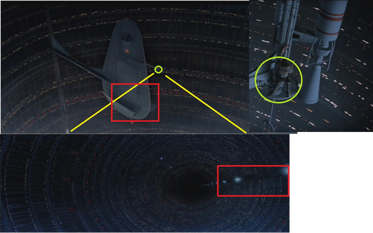
Seeing the actual bottom of the large structure when Luke looks down and perhaps when he falls?
I think you have a 3d model of the object?...So, really that is a snapshot static render if you agree the bottom of the Gantry Crane would be indeed visible.
2nd one is iffy but I think it either needs something like this or needs altering in someway to maintain visual flow a bit better and the scale is way off.
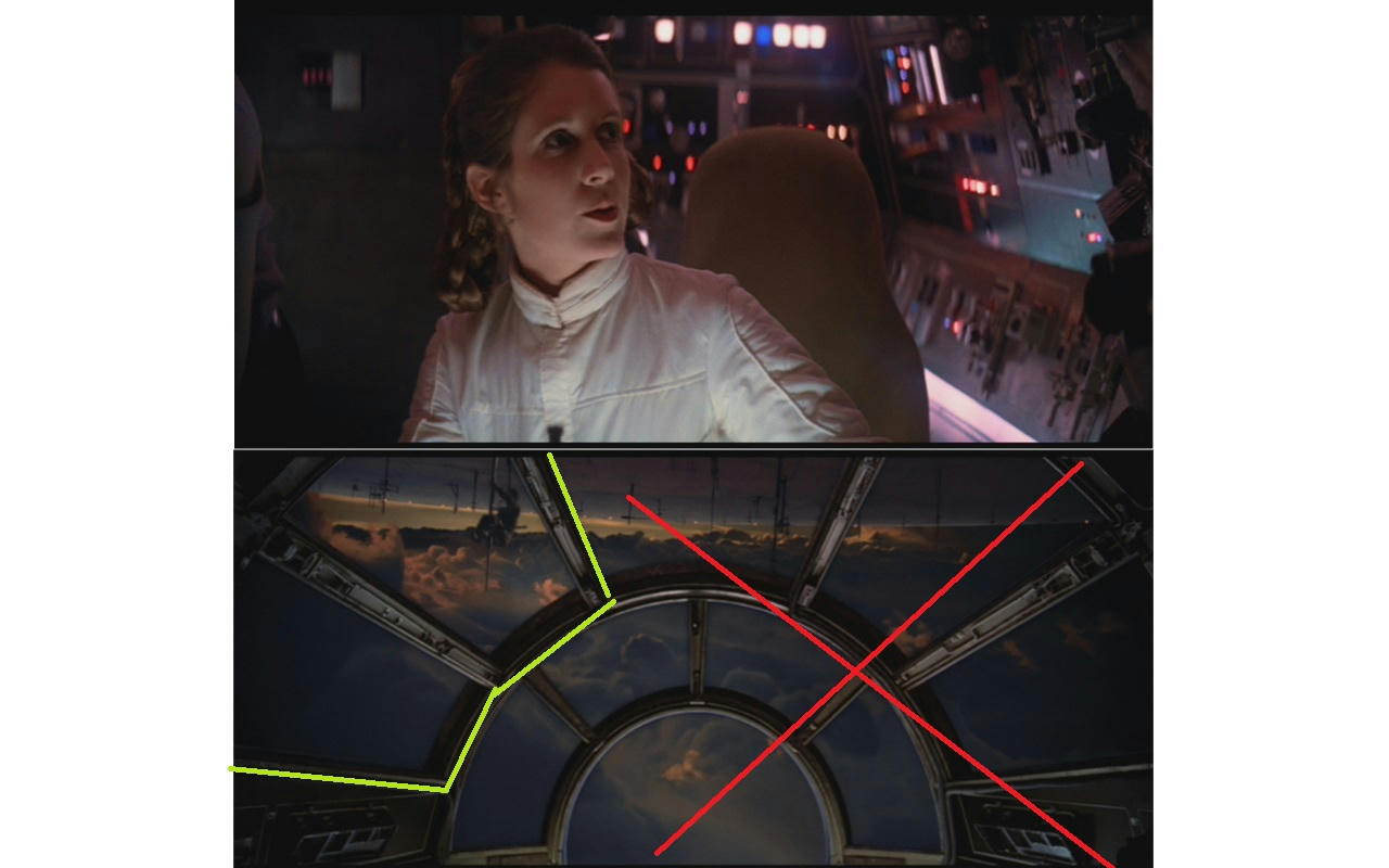
So Leia looks out to the left but Luke would actually be off screen if he was in the correct position to match the following shot in terms of visual flow... So
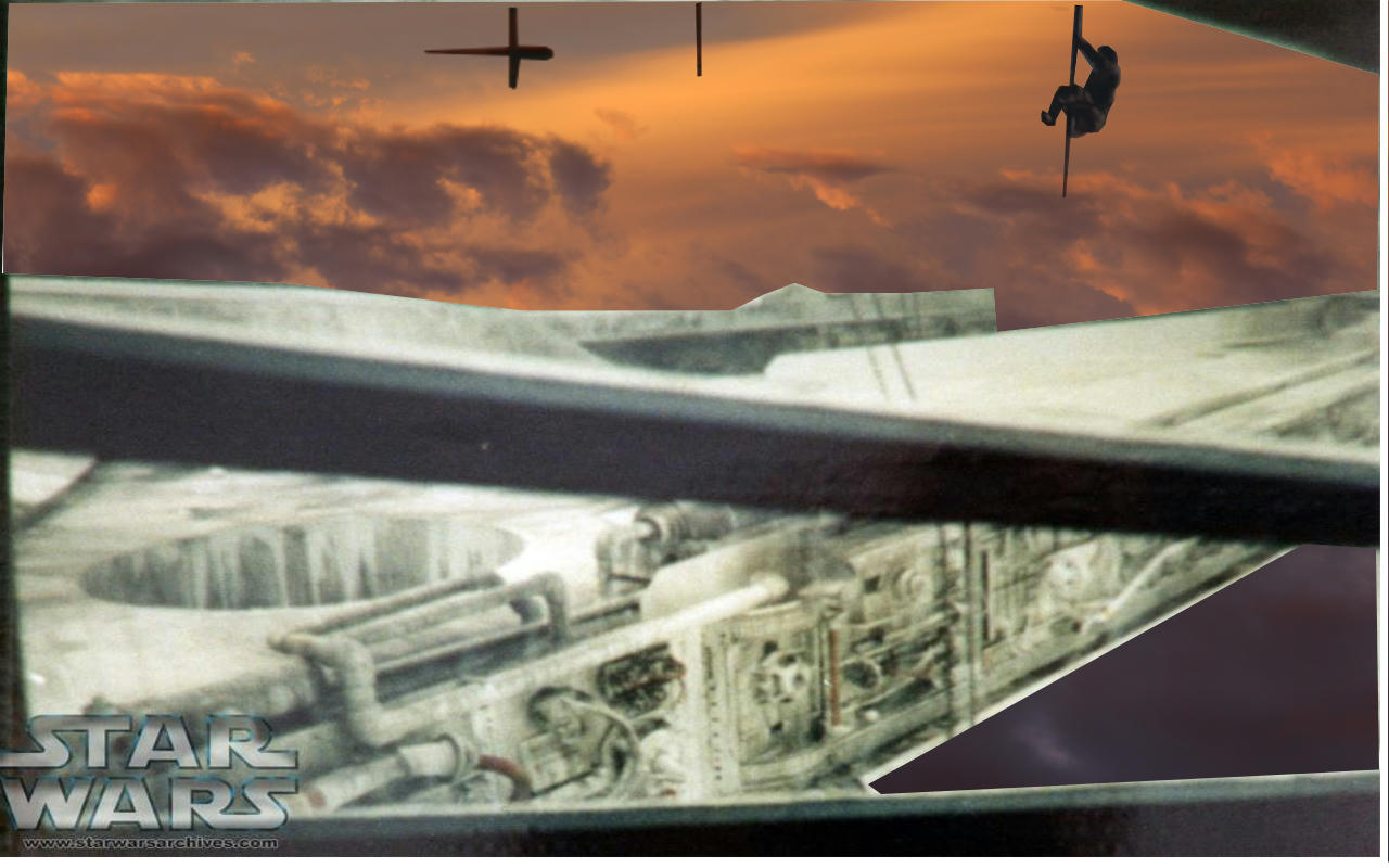
Yes pretty nasty mock up, but it's not worth me putting too much effort in but anyway it get's the point over about another way of looking at it although the actual angle in the mock up is totally not right something similar (from the never before seen angle) could make it flow better together visually and be a nice way to see it like we never seen it before. Oh yeah I am obviously not in competition with my crap art skills :)
Over all I thought the clip was outstanding stuff and visually the best I have seen from you yet.
I will talk about some audio stuff in this part later on