- Time
- Post link
RE:match is for match colors between two video sources ,is that right ?
This is simply a file that applies the same color correction to every frame.
RE:match is for match colors between two video sources ,is that right ?
This is simply a file that applies the same color correction to every frame.

Do you have a list of scenes/shots that are appropriate for the second blue-related LUT?
sorry i've uploaded a wrong lut.The correct version is v3...
removing the pink cast the red come back again....


I hope someone can find these luts useful.
I don't really start any new project, I should move this thread in another part of the forum?

Really loving what I'm seeing. Everything looks so "natural" with the luts. If anyone wants to post a tutorial on the best way to work with these I'd even be willing to try an encode on my system. Great stuff! :)

My eyes just teared up in joy.
Those colors are so juicy.
Just look at the silky silhouettes of Leia's robe
I think I can finally see the make-up as true make-up and not as enhancement of the face... well whatever, it simply feels life-like and not implied.
The imagery of Star Wars never ceases to amaze me
Can I watch the full movie with those color-profiles?
Could you post a comparison of v1 vs v3 with that shot? I really liked the v1 LUT. I think a lot of us (me and kk650, certainly) have probably found ourselves not able to stop tinkering and trying to remove the issues of the bluray to the point of going too far in another direction. Not saying it can't possibly be improved upon, but there are limits to how much it can be improved, and your v1 had great results.
Yes it's true !! The v1 is more equilibrate and in many scenes is better, v3 gives sometimes a purplish-blue color cast that I don't like very much...in conclusion v1 should be the best choice ..
age requested video from two of the samples I did, only without the splitscreen bluray comparison.
So here are longer cuts of those:
http://www.dailymotion.com/video/x2hgcmz_rotj
http://www.dailymotion.com/video/x2hgcsl_rotj-1
edit: sorry it seems like at least one of these was encoded with potato quality settings. Should still be able to judge the color, though.
Thanks towne32 for posting this video.I like this scenes, in 1080p the color look very good,adding a bit of grain the effect would be very "cinema-like" !!
I played around with these a bit this weekend in Aftereffects, using the Star Wars Blu-Ray video. The filterblue I thought gave everything a bit too drastic of a golden amber-hued tint I thought. The filtertemp V1 looked excellent. I applied the "shadow/highlights" as suggested but ended up with a drastically blown out image. The highlights was at 50 I believe. I reduced that down to 5 and got a slightly brighter more vibrant image. Is the shadow/highlights tweak even necessary? I'm really a lay person when it comes to all of this.
Also, is there a difference between the .cube and .dl versions of these files?
Anyone played around any more with these settings? Curious if any more tweaks can be made.
I have done another lut(filtersw) that is very similar at filtertemp but more precise in the color correction, the temperature is more cold.
here some example in many environments
The version .3dl and .cube is the same.
Curious what your thoughts are on the highlights/shadow setting, age. The automatic setting is way too high, but were you able to make some manual tweaks? Trying to figure out an ideal setting for it. Would it maybe be better not to utilize?
Yes, sometimes is better do not aplly the effect shadow/highlight,I used very low setting : 2-3 for both
Hello again. Could you post your new lut? Thanks!
https://www.dropbox.com/sh/fzus0pn3qrbkjn1/AADX10xIaNHTp9Y87Dco2hU5a?dl=0

I don't really understand what this LUT is or what it does or how to apply it...
But what I will say is that this is the best looking footage I have seen. It all feels there and the colors look right. Barring errors that need a replacement due to technological limitations badly lit composites.
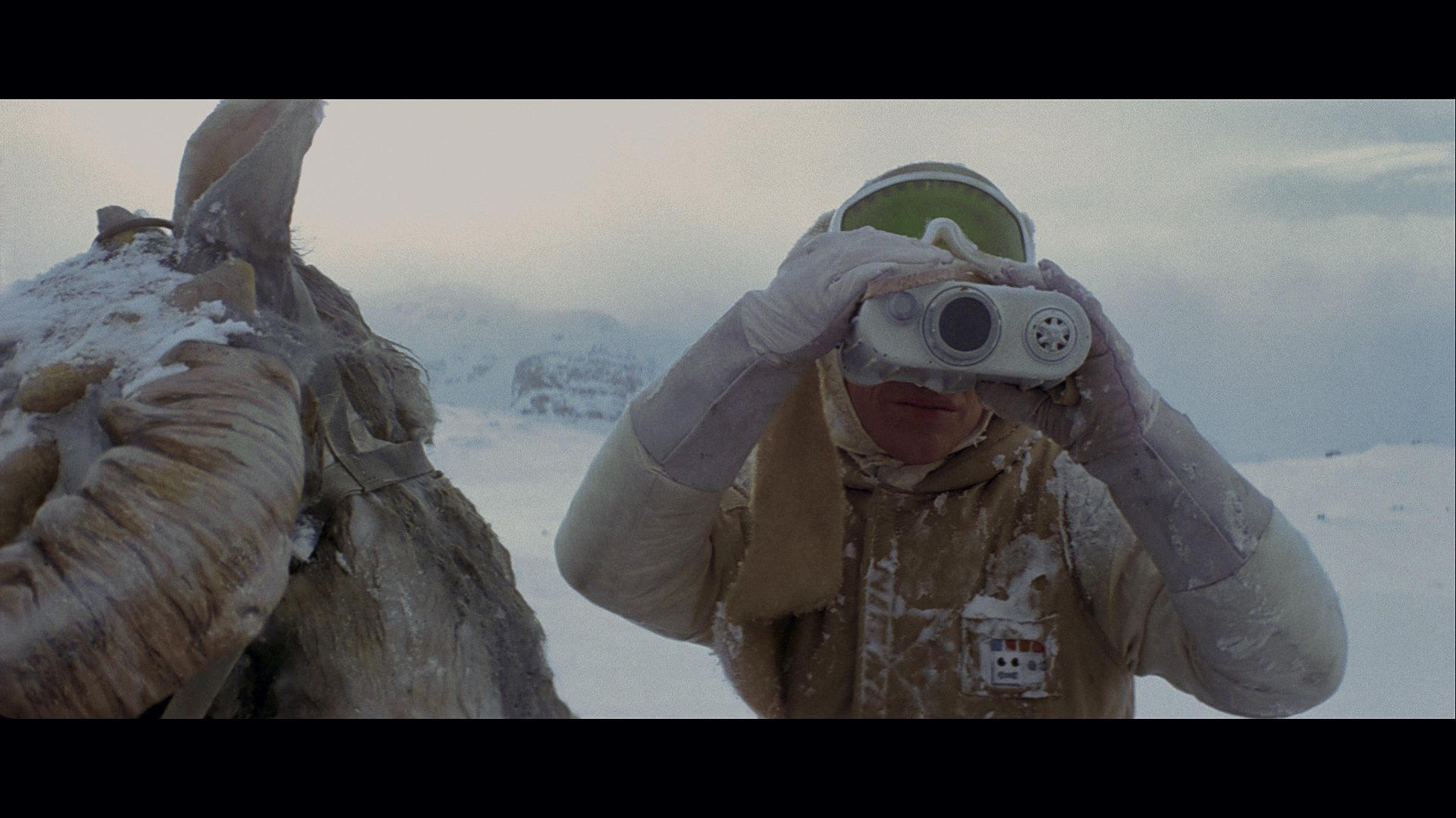
Hat's off.... But how does it work on Battlefield Hoth? i.e. Purple / pink blown out cockpits and alike?
That is really the ultimate test for it as it is a color correcting nightmare whilst trying to eliminate the Blue tint and boosted brightness other elements suffer greatly especially the Lasers / Flak Bursts explosions and so on (Hand painted).
In my mind that is the real test for this luts, but I like it Luts... I mean lots.
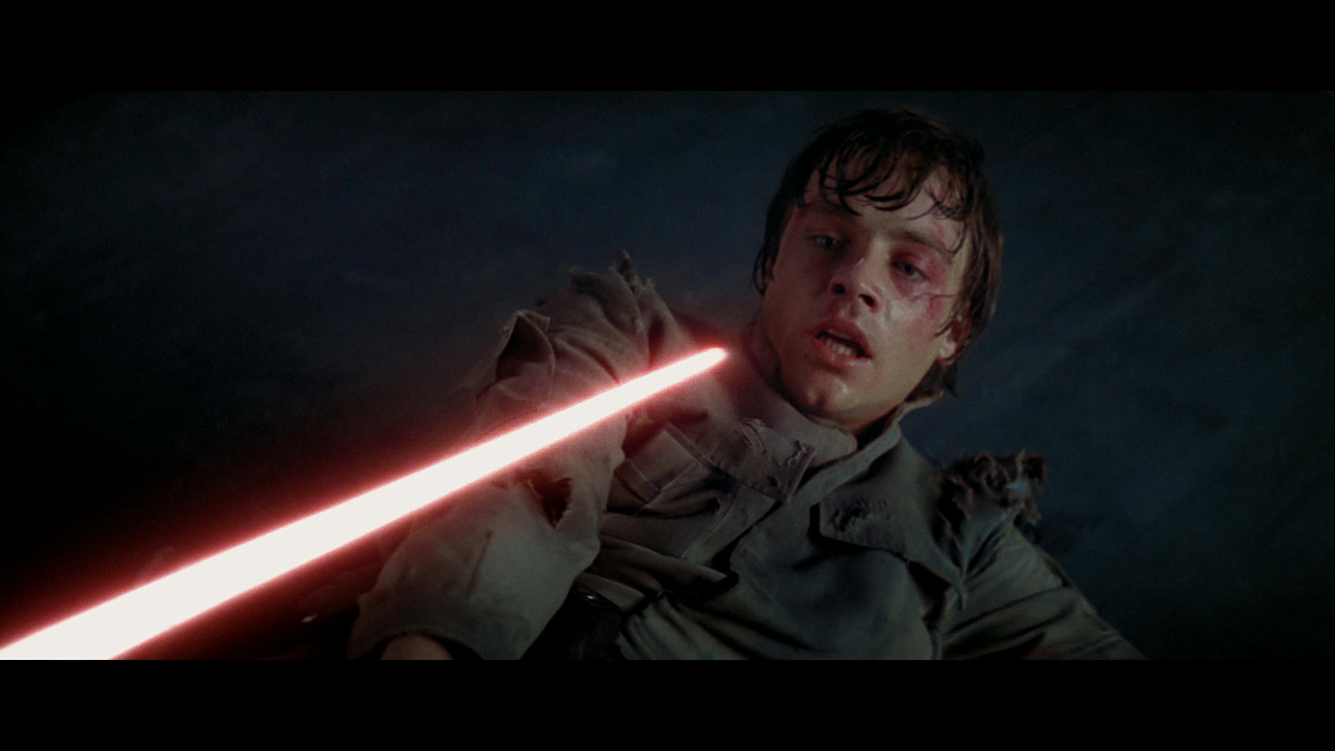
Edit: looks far too bright though... Compensate for the brightness and the contrast boosting less bright bit more contrast and I think it will be just a bit better taking off some of the garishness it's a small touch mind. Color looks grand though. BTW I am looking at Luke with Red Light sabre picture.
Example
Perhaps overdone with brightness contrast? might need a dip in yellow hue? But this looks dark in the right way now I think.
This one has some yellow removed... Perhaps too much but I think it's somwhere around here that it strikes the right medium. Gimp Settings
Brightness - 14
Contrast +2
Color Balance
Shadow +3 blue (-3 Yellow)
Midtones + 3 / 2 Blue (-3/2 Yellow)
Highlights +1 Red (optional) +3 Blue (-3 Yellow)
But I can see a real potential in this process you are doing and I have to say I am quite excited by it it seems like it could be the way forward perhaps but let's see it work on those pink blown out cockpit flashes and then we will be sure. This may mean you Blue filter is too strong giving up too much yellow?
The +3 Blue highlight is important giving the ice a natural look assuming you applied the same LUT to this shot. Needless to say I am very excited about how the image intensity now appears. This shot uses exactly the same settings applied in gimp as the extremely dark indoor shot.
I also listened to a podcast regarding Luts and I now have a much better understanding of what it is all about. If you can can emulate the cameras that filmed the film initially as your standard Lut and then it would be great but the problem really is the footage is not Raw. But it might be worth creating a number of Luts depending on environment, lighting and dodgy color tints for various shots and using a bit of artistic license perhaps too.
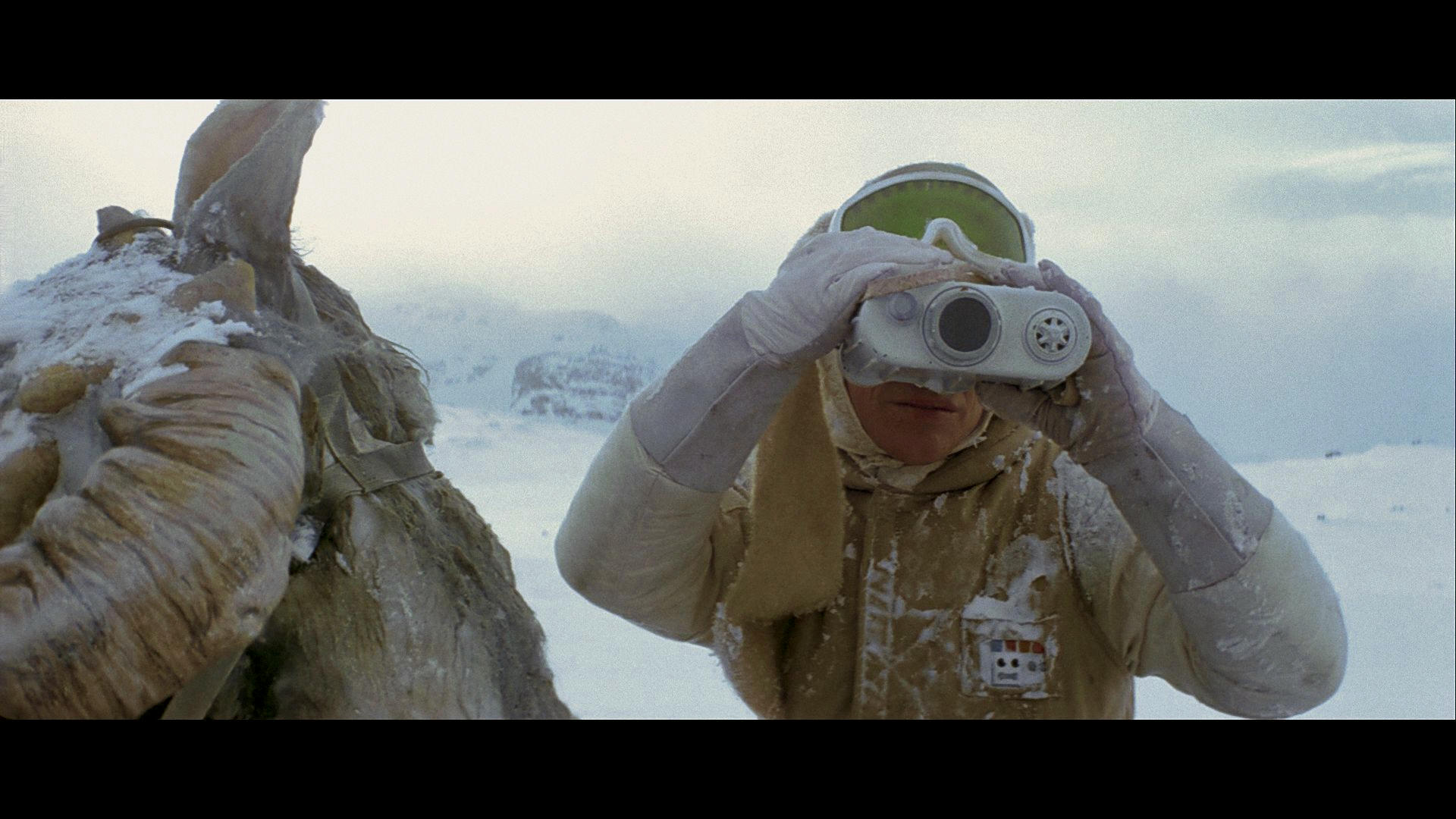
This seemed still too garish to me though so I reduced the brightness and contrast by another -14 and +3 and fiddled with the red and magenta more dull day and natural look the green goggles gives a lot away.