
- Time
- Post link


WRONG THREAD!!!
You're looking for the Awesome DVD/Blu-ray Cover Art thread.

Tobar said:
Do they really have blue backgrounds there? Here those are black.
And in the time of greatest despair, there shall come a savior, and he shall be known as the Son of the Suns.

With all that blue, it would be nice to see someone drop in some inappropriate backgrounds on those things. ;)
Where were you in '77?

LexX said:
Tobar said:
Do they really have blue backgrounds there? Here those are black.
HERE IN THE STATES I'VE ONLY SEEN THE BLUE BACKGROUND VERSION.
"I'VE GROWN TIRED OF ASKING, SO THIS WILL BE THE LAST TIME..."
The Mangler Bros. Psycho Dayv Armchaireviews Notes on Suicide

SilverWook said:
With all that blue, it would be nice to see someone drop in some inappropriate backgrounds on those things. ;)
Maybe this one? I'm feeling nostalgic.


LexX said:
Tobar said:
Do they really have blue backgrounds there? Here those are black.
They're black here in the UK. The black doesn't make it look as terrible as the blue
<span style=“font-weight: bold;”>The Most Handsomest Guy on OT.com</span>


Ever since I bought it I've found this one particularly awful. A quick and lazy cheap photoshopping (but it was the two-disc edition!).
I like the single-disc cover much better.

captainsolo said:
That isn't just bad, that's plain lazy! They look like really bad temp pictureholders for Amazon or something!
The new one for Strangers on a Train was pretty lackluster but nothing compared to that above:
Yeah i hate having that on my shelf, it has nothing to do with the movie. I remember back when I was a kid a lot of old movies VHS covers were just the old film posters and those looked pretty cool, why can't they just do that with Bluray instead of giving us garbage like this?!

I wish there was a law making it mandatory to use original poster art for the DVD/Blu-ray covers of films made prior to 2000.
I'd vote for it.
I mean if you have to choose between a lovely painted poster that you can use for free and a bad photoshop job that has nothing to do with the movie and you have to pay for what kind of person chooses the photoshop job?!
The cover art for the DVD release of Birdman of Alcatraz is the latest to catch my eye.
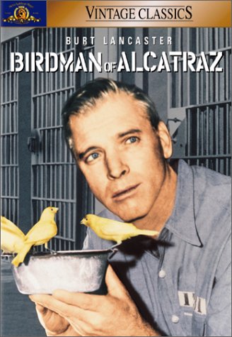
I'm almost certain I could make a similar cover just working with MS Paint and my computer's rudimentary photo editing program.

DuracellEnergizer said:
The cover art for the DVD release of Birdman of Alcatraz is the latest to catch my eye.
Oh my days, that ^ is a perfect storm of dreadful.
captainsolo said:
The new one for Strangers on a Train was pretty lackluster
^ That's actually a superbly designed cover. The well chosen creative yet minimalist fonts, the bold use of colour, the inventive, disturbing and intense composition etc. Of course I'm quite happy that my DVD version has the original poster art but I'll be more than happy with that when I eventually upgrade it to HD.
^ This is probably the worst from my collection. The longer you stare at it, the more wrong it gets. Annoyingly the edition with that cover is the best version to buy (Also the best HD version too). But the cover kinda suits the cr*pfest within.
VIZ TOP TIPS! - PARENTS. Impress your children by showing them a floppy disk and telling them it’s a 3D model of a save icon.
From my own shelf I hate Barbarella the most. I don't know how they managed to make her not look hot. What was wrong with the poster art in Europe, I don't know.

And in the time of greatest despair, there shall come a savior, and he shall be known as the Son of the Suns.


This one is particularly lazy. The original posters for these films look great and should've been used. Thankfully they went with original poster art for the similarly packaged Halloween boxed set
The Person in Question

The TOS movie ones are alright because they're not individually packaged with those covers. The lazy part of those covers are the completely random quotes on the back.
Star Wars Revisited Wordpress
Star Wars Visual Comparisons WordPress


I always disliked these.

“First feel fear, then get angry. Then go with your life into the fight.” - Bill Mollison
FanFiltration said:
I always disliked these.
Yeah those are awful, I hate the fact that they used those on the Blurays. When compared to the VHS and Laser Discs, which used the great classic movie posters they just look insanely stupid.
I mean just compare those to these.


Some of those Bond covers aren't too bad. From Russia with Love in particular is very cool, and very classic Bond. Just because those covers don't have the original poster art doesn't make them bad (though I'll admit, some of them are).

Sometimes redoes are not too bad. The John Alvin covers for the star wars laserdiscs are not the original poster art but they are still nice covers.
The cheap cgi Photoshop jobs i do find pretty much unforgivable.
“Always loved Vader’s wordless self sacrifice. Another shitty, clueless, revision like Greedo and young Anakin’s ghost. What a fucking shame.” -Simon Pegg.
skyjedi2005 said:
Sometimes redoes are not too bad. The John Alvin covers for the star wars laserdiscs are not the original poster art but they are still nice covers.
The cheap cgi Photoshop jobs i do find pretty much unforgivable.
Yeah cheap photoshop jobs are what I hate. I am not saying they have to use the movie posters, just that I would like the covers to look nice and photoshop jobs just don't look right for older films. The James Bond Blurays that look okay still feature photoshop jobs where you can tell the older actor's head is being cropped onto a photo of someone else and blurry backgrounds that just don't fit the feel of the films.
DrCrow, please don't requote all of a large image post in the very next post. You keep doing it.
...anyway, I've got the OHMSS Blu-Ray and it looks classy IMO. The rest are of variable quality though.
Another bad one that I own is...
...it even gives away the plot of the film. This vintage poster is quite similar in layout but is clearly superior in every way...

VIZ TOP TIPS! - PARENTS. Impress your children by showing them a floppy disk and telling them it’s a 3D model of a save icon.

what do you think about the one on the Criterion blu ray?

Ryan McAvoy said:
DrCrow, please don't requote all of a large image post in the very next post. You keep doing it.
DrCrowTStarwars said:
FanFiltration said:
I always disliked these.
Yeah those are awful, I hate the fact that they used those on the Blurays. When compared to the VHS and Laser Discs, which used the great classic movie posters they just look insanely stupid.
I mean just compare those to these.

TV's Frink said:
Ryan McAvoy said:
DrCrow, please don't requote all of a large image post in the very next post. You keep doing it.
DrCrowTStarwars said:
FanFiltration said:
I always disliked these.
Yeah those are awful, I hate the fact that they used those on the Blurays. When compared to the VHS and Laser Discs, which used the great classic movie posters they just look insanely stupid.
I mean just compare those to these.
alright, you asked for it.


