Leonardo said:
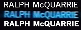
Here's where I realized I needed to change the font slightly:
Top one is the one I used, News Gothic, bottom one is the font for the first part of the credits, News Gothic BT.
Would you suggest I change the first part and just use News Gothic for everything? Only in the first section I'd use it bolded.
Oh, I see. But in that case I really would only substitute single letters (in this case the Q) to better match the original (but still use them in bold!). The problem is, back then those credits were done by hand, and the fonts did look different than today's digital equivalents.
You might want to try changing font spacing and vertical scale to better match your VHS, but you should really never use different fonts (and in this case have them stay bold as well).
On the subtitles, that's a fantastic find! I'm glad thxita made it to the screening. I would really assume that all international Greedo subs had that font. I think I'll have to change the German subtitles after all!
