

- Time
- Post link
Harmy, if you need another tester, I'm game for testing the workprint.

Sure, why not :-)

awesome. if someone is willing to upload this(the 30 minute work print of V2) to megaupload or rapidshare i would love to get the links.
i just hope you do it before the whole project is released LOL
Where's my damn medal?

Harmy said:
Whoa. This looks really impressive. Much less on the dreaded pink tint, black levels look better and more frame information! Harmy are you still PM'ing the wp?
VADER!? WHERE THE HELL IS MY MOCHA LATTE? -Palpy on a very bad day.
“George didn’t think there was any future in dead Han toys.”-Harrison Ford
YT channel:
https://www.youtube.com/c/DamnFoolIdealisticCrusader
Harmy, if you need another tester, I'm game for testing the workprint.
@Aluminium Falcon: Yeah, I'll be happy to send you the link if you respond to my PM ;-)
EDIT: Sorry, I see you just did :-)
So, just an idea... :-) If I render and upload a BD25 of this, is there anyone willing to burn and send it to me? :-)

Harmy said:
So, just an idea... :-) If I render and upload a BD25 of this, is there anyone willing to burn and send it to me? :-)
Yes, of course....no problem
J
Thank you, that would be great. It sucks but I actually don't know anyone who owns a BD burner. BD players and ROMs are finally becoming kind of commonplace in my country now, but burners, not so much :-/
And just FYI, the DVD9 AVCHD and large MKV are still on, but I thought a BD25 with menus and stuff would be pretty awesome too but I wouldn't have any way to burn it - and it's just an idea, I need to find out how hard it is to author BDs first.
We have a BD burner in work, so it won't be a problem Harmy.....just give me a shout
J

Gotta say, I like the idea of a BD25. I don't have a burner (yet) but my media player plays blu ray folders and isos.
Would this mean we might get some uncompressed audio options?
I might start budgeting for a burner now so I can help others out if/when the time comes...
P.S. I don't post on here often but I'm subscribed to this thread and read every post. Version 2.0 is really looking spectacular. Keep up the great work, Harmy!

I continued watching the WP a bit today, and found some more stuff.
First there was some inconsistency, the first one being a bit brighter:


Not extremely important though, since the shots doesn't come right after each other.
Then there was this frame which looks kinda weird:

Is this the same kind of thing that I helped you with in Greedo's scene? Like some frame missing and needed to be blended? In that case I could render a new frame for you if you want.

The DVD5 seems to be offline.
EDIT: Is there something wrong with MU? I've checked numerous files and they all seem to be offline or temporarily unavailable. I checked the clip the adywan posted last night on MU and it says that that's unavailable too. ???
EDIT PART 2: So... seems like MU is working again, and I realized that the DVD5 download isn't even MU, but I've figured out how to download it so... never mind!
It was an honor to review this workprint. I know I haven’t been a Despecialized tester since ESB, but this 40 minute workprint blew me away. Do forgive me if anything I say here has already been pointed out. The workprint starts on a very good note with sharp and well defined title cards. The crawl here seems much better than the 1.0 crawl and more vivid. The color of it seems spot on. During the opening shots, the starfield is very visible which is awesome, considering how obscured they were in the 2004 master. I was surprised you were able to make that many stars visible.
When I got to the Tantive IV halls, I was thoroughly impressed. Though I’d seen screenshots of the color correction, it didn’t strike me just how good they were until I saw the CC in motion. You_Too and Harmy, you guys rock in color correction! You’ve somehow restored that good old fashioned 1970s film look. It doesn’t seem bland like the GOUT but more like a vivid version of the earlier releases… if that makes any sense. In any case, it seemed to resemble screenshots from the IB print. I felt the original’s color correction did not go far enough and this certainly did. I noticed there was no red push like the GOUT and instead a slight green cast, which makes it more resemble any film cels I’ve seen of 70mm prints. Anyway, the Tantive IV halls were in stark, Kubrick-ian white and all the soldiers had spot on flesh tones: very natural-looking. I also enjoyed the color of C3PO and R2D2. I was very impressed by the amount you retrieved from the crushed blacks. It’s pretty astounding. Thank you for having no lobster man this time around! It’s worth noting that the color correction did not interfere with the laserblasts in any way. I did notice that the black widescreen bars occasionally changed color, hopefully you’ve resolved this.
One slight think I noticed was a matte box (?) in the initial shot as the escape pod as it was launched out of the Tantive IV. It seemed like an artifact of undercontrasting in order to retrieve crushed blacks. I was once again impressed as Vader confronted Leia since his helmet wasn’t at all obscured.
The Tattoine sands look great: not pinkish or reddish by any means; they are more natural than I’ve seen them in quite a while. I’m also really digging the canyon scene! It’s not too dark but not too bright. It feels like you referenced the video of the Senator IB screening, which is great. In any case, it was a good balance and I feel that you really nailed just how it should be. I noticed a very, very vague distortion behind the left trooper in the “Look Sir, Droids” scene, possibly to remove a Dewback. It didn’t bother me.
The droid selling scene was wonderful. I really loved the color of Luke’s hair and skin! In some scenes, I noticed that without the overcontrasting typical to the ’04 master, some instances of slight DVNR appeared to be visible. This is certainly no fault of yours; I just felt like mentioning it. The sunset was nice: not over contrasted and light enough to be like a real sunset. When we get to Ben’s hut, the exterior shot looks good, and, inside, less contrast reveals so much more detail.
I must say my favorite thing about this workprint, even better than the color correction, was the lightsaber! It looked so old-fashioned like in DJ’s Project Blu. I was blown away by how you put the original ’77 lightsaber (I assume) back in. The hand-animation makes it very simplistic but adds a whole great feel to it. The color of the lightsaber is spot on. Some close ups of Luke look a tad desaturated. This may be because of color inconsistencies in the ’97 restoration, passed to the ’04 master.
Just when I thought the color correction could not impress any more, I saw: THE DEATH STAR! You nailed the grey-green look of the Death Star. It’s now exactly like in the 70mm scans. Flesh tones look great and the uniforms are a good grey/brown. I’m impressed how there is no blue cast whatsoever. Red skin tones do not pervade this scene. The daylight scenes on Tattoine afterwards looked fine. Thank you for that humorous ending, BTW J.
Harmy, you’ve truly blown me away with this one. It’s unbelievable better than V1 and I can’t wait to test more. I'm very sorry if I've repeated anything that's already been said. As some of you may or may not know, I was on a hiatus for awhile so I haven't had time to catch up on the thread.
@You_Too: Yeah, that frame's a mistake and that's exactly what happened, I was missing one frame, so I simply slowed it down by one frame but Premiere is stupid and always interpolates the first or last frame of the shot with the previous or next frame. But it's not necessary for you to render a new frame for me, I simply need to make sure that I cut the middle out and add one frame to that.
@AF: Wow, thanks, that's what I like my WP reviews to look like ;-)

I might not be able to offer the insight that Aluminum Falcon can, but - despite my earlier comments to the contrary - I have to say that I find the color pallet a tiny bit too warm compared to V1.
V1: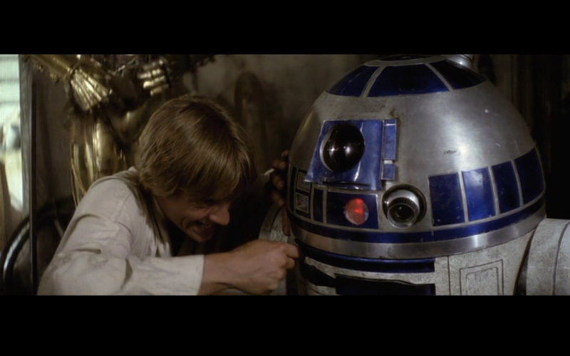
V2 WP: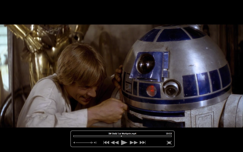
Timecodes may not match exactly but hopefully they demonstrate what I mean. Mind you, this may boil down to personal taste. I'm still amazed by your work, and I won't deny that the new pallet certainly brings out lost detail a lot more than the previous.
A Goon in a Gaggle of 'em

bkev said:
I might not be able to offer the insight that Aluminum Falcon can, but - despite my earlier comments to the contrary - I have to say that I find the color pallet a tiny bit too warm compared to V1.
V1:
V2 WP:Timecodes may not match exactly but hopefully they demonstrate what I mean. Mind you, this may boil down to personal taste. I'm still amazed by your work, and I won't deny that the new pallet certainly brings out lost detail a lot more than the previous.
Not to say anything wrong with your opinion but I like it. V1 looked too dark to me...its nice to see the changes in this version.
I love everybody. Lets all smoke some reefer and chill. Hug and kisses for everybody.
I agree with vbangle, V1 is darker and also less saturated. V2 looks better.
Well, actually, seeing it in comparison, I must agree with bkev that the colours may be a tad too warm (red mainly). The brightness is a whole other issue and it will definitely stay the way it is in the WP but I will consider making it slightly less red.
Yes. I'm not against the brightness as much as I am the warm push of the colors. The most important improvement remains the detail regained by this color grading. And, you (and You_Too) seem to have gotten rid of as much of the crushed blacks as you can given the source.
A Goon in a Gaggle of 'em
Yeah, unfortunately, at the same time this resulted in even more white clipping (look at the reflection in R2's dome). But it's just a little and I feel that comparatively it is a small price to pay for all the detail recovered in the dark areas.
Harmy said:
Yeah, unfortunately, at the same time this resulted in even more white clipping (look at the reflection in R2's dome). But it's just a little and I feel that comparatively it is a small price to pay for all the detail recovered in the dark areas.
I'm glad you also think it was a small price. And actually it's not that much clipping, what I did was to push the highs closer to white to make the movie look closer to the original. The shades of white being closer to white sometimes creates an illusion of them being clipped. The raw blu-ray is badly underexposed so I thought it was necessary.
Actually, when examining that brightest part of those screenshots in photoshop, the only color which peaks at 255 is blue, so if something was clipped it was some blues in the middle of the brightest part. The rest was just pushed up towards white and that's why it looks clipped when it's not.
Yeah, sure, like I said, compared to the detail revealed in the dark parts it's totally minor :-)

Okay, continuing where I left off before (sorry about the delay)...
24423-24424 : inconsistent lighting between the two shots
25031-25032 : inconsistent lighting between the two shots
28617: perhaps too red relative to next shot
32230: perhaps too green
36728: sunset shot perhaps a little too bright relative to preceding and next shot
53048 : flesh tones too yellow in this whole scene on the Death Star IMHO
60760-60761 : inconsistent lighting between the two shots, the later overlooking Mos Eisley being too yellow IHMO
A lot less inconsistencies this time, the bit on Tantive IV at the start is definately tricky to grade, that's where the majority of the noticable inconsistencies were. The rest is great. I may have missed a few inconsistencies due to getting too immersed in the film itself. :)
Found a subtle color inconsistency which is on the raw blu-ray as well, but I thought I'd post it anyway.
Look at the blue on R2:


Is it like this in the HDTV version too?
You_Too said:
Found a subtle color inconsistency which is on the raw blu-ray as well, but I thought I'd post it anyway.
Look at the blue on R2:
Is it like this in the HDTV version too?
Just checked. Yeah, its in the HDTV version as well. These sorts of inconsistencies are everywhere in the first film.