logo Sign In

regrading/editing original trilogy using blu-rays and german hdtv streams to remove bad but not all specialised/blu-ray changes (* unfinished project *) — Page 2

Author
Time
 (Edited)

You_Too said:

OMEN!-_-! said:

The original theatrical fellowship of the ring colour palette comes to mind as an example of this later type of grading, where many locations feel different due to having their own unique colour grading.

Don't get me started on it! :)

I love the grading of all three Lord of the rings movies, but I get totally sick of the thought of how they could mess up Fellowship's extended blu-ray release. It had a green tint over the whole movie, especially provable by taking a color sample of the brightest whites, which had more green in them than red and blue. There were lots of other color errors in it as well.

Otherwise I love the idea of using color grading in new movies to make different scenes feel the way the director wants.

Funny that you mention the abomination that is the green tinted Fellowship of the Ring extended edition blu-ray. I have recently created a regraded version of the fellowship of the ring blu-ray that has the green tint removed and has been brightened as well because the blu-ray is very dark compared to the theatrical blu-ray and dvds. That and regrading The Two Towers and Return of the King to remove the not so obvious teal tint running through them was my last project before I started this one. :)

Here's a comparison between the blu-ray and my final regraded version:

Blu-ray: http://img805.imageshack.us/img805/5954/fotrbluray.jpg

Regraded version: http://img20.imageshack.us/img20/6972/fotrregraded.jpg

How they could release that fellowship of the ring ee blu-ray as it is when the snow so blatently looks green and there is no remaining white in the entire film due to the strong green tint throughout the film is beyond me...

Author
Time
 (Edited)

... and here's what the shot looks like in my bootleg of a 35mm exhibition print from ca. 1981. (Click to view the full image.)

The pinkish sky certainly gives it a "dusk" vibe. I'm not claiming this is correct, but you can at least tell how much of the sky was exposed on film. To me it looks like this was shot on a somewhat overcast day.

(There also seems to be more image on the top compared to the official releases.)

Correct or not, I'm still going with OMEN's grading on this. The pale skintones and bright whites seem more appropriate to the storytelling.

Visit my *NEW* Star Wars on Video Collection site:

http://www.swonvideo.com

Author
Time
 (Edited)

Thanks for getting this thread back on track, Video Collector! A very interesting screencap there, definately darker than the blu-ray like Harmy's screencap and the GOUT. Is it possible that the 35mm exhibition print this bootleg was based on was already fading and shifting towards red? I've seen pictures here and on ebay of star wars original trilogy film prints that have also started turning a similar shade of red. I don't know much about film and how the colours change when it isn't preserved properly so maybe somebody can correct me on this.

I'm glad to hear that i'm not the only one that feels the colour grading on my screencap fits more with the scene and storytelling as a whole. Cheers for the feedback! Would you say the slight increase in brightness in my screencap makes the image better/more appealing/accurate looking than the blu-ray screencap or should I just leave the brightness as it is in the blu-ray?

I'm still very much in two minds about this brightness issue with ESB, whether to increase it or just leave it the same. ROTJ and SW definately need slight brightness boosts though IMHO.

Here's a clip from ESB, the first time Han and Leia are together onscreen in the movie:

http://www.megaupload.com/?d=9Q5Q5XQD

It has the same increase in brightness as the previous clip with the Wampa attacking Luke, plus removal of the blue tint of course. It's be great if you and others could check it out and let me know what you think about the brightness. Is it too bright in your opinion?

Here are screencaps from the blu-ray and this regraded clip as a comparison:

Blu-ray 1: http://img585.imageshack.us/img585/4011/argument1bluray.jpg

Regraded 1: http://img716.imageshack.us/img716/2481/argument1regraded.jpg

Blu-ray 2: http://img338.imageshack.us/img338/1458/argument2bluray.jpg

Regraded 2: http://img683.imageshack.us/img683/6821/argument2regraded.jpg

Author
Time
 (Edited)

OMEN!-_-! said:

Funny that you mention the abomination that is the green tinted Fellowship of the Ring extended edition blu-ray. I have recently created a regraded version of the fellowship of the ring blu-ray that has the green tint removed and has been brightened as well because the blu-ray is very dark compared to the theatrical blu-ray and dvds. That and regrading The Two Towers and Return of the King to remove the not so obvious teal tint running through them was my last project before I started this one. :)

Here's a comparison between the blu-ray and my final regraded version:

Blu-ray: http://img805.imageshack.us/img805/5954/fotrbluray.jpg

Regraded version: http://img20.imageshack.us/img20/6972/fotrregraded.jpg

How they could release that fellowship of the ring ee blu-ray as it is when the snow so blatently looks green and there is no remaining white in the entire film due to the strong green tint throughout the film is beyond me...

Interesting! Especially since I did a regrade myself on that one. Before registering here I created a little blog site about it, check it out: http://fotrfix.blog.com/

Now that I have more tools, like selective color for avisynth, I'd be able to correct that movie even more sometime maybe.

Sorry for off-topic talk!

That 35mm image looks very interesting indeed.

Omen, make sure you check out the ESB shots on this site: http://www.jedi1.net/
They all have their own tint and stuff, but could also give you clues on how the movie should look.

Author
Time
 (Edited)

Yeah, I remember seeing your blog crop up while I was busy regrading fellowship of the ring myself. In fact, you have pretty much the same screencap as the one I posted regraded on your blog. Our approach to regrading this was very similar, using the snow and fade to white as a reference for what should be 'white'.

The thing is though that I found that you can't just remove the uniform green tint and leave it at that, Hobbiton starts looking a little too red IMHO, so I had to selectively colour grade that part of the film to give it the green colouring that it originally had that made Hobbiton look so lush and special, a paradise in Middle Earth. Others may like that reddish Hobbiton more but I liked Hobbiton too much as it was theatrically, in the dvds and the theatrical blu-ray, lush and green, to leave it like that.

As soon as I get my upload speed majorly increased, I was planning to upload this in blu-ray quality as well (two dual layer blu-rays!!!). Do you have any plans to upload your version as well You_Too?

Anyway, getting back to Star Wars, i've seen those 70mm frames on jedi1.net before, pretty much all of them have yellow, green or red fading to my eyes with one or two exceptions, I don't think that they can be all that useful as far as colour grading is concerned IMHO. Did you get round to checking out my new clip from ESB btw? If you did, what did you think of the brightness?

Author
Time

Yeah I would've recolored Hobbiton and everything separately if I had done a real restoration project on it. What I did was a bit like my Star Wars project, that I tried to find the best overall settings for the whole thing. I won't upload it at least now, actually first I only made it as a guide to help people to do it themselves, since it's a huge upload and I don't have good upload speed. We'll see what happens if I do another take on it in the future.

I haven't seen your ESB clip yet but I'll check it later.

Author
Time
 (Edited)

The entire film is touched, but I'm not sure how consistently.  But your eye can adjust for the green cast more easily in some scenes than others, and some scenes already may have had a different color cast originally that the green balanced out.  Luckily the other two films are not like this, unfortunately Fellowship is my favorite of them.  There's definitely not a single pixel of pure white in the entire Fellowship (unlike the other films, including Fellowship flashbacks), that's been shown elsewhere.

Project Threepio (Star Wars OOT subtitles)

Author
Time

timdiggerm said:

Doesn't the Hobbiton example demonstrate that a constant green was not accidentally cast over the entire film, but instead that whatever differences exist were intentional?

Based on having analyzed lots of frames from the movie by color samples and comparing, I'm almost sure they first made a re-grading of each scene and some overall color changes, then the green cast got added on top of it.

For example, aside from the green cast there's a lot of parts where grey and green colors from the theatrical are instead blue or cyan. Some blue colors are darker overall, and some green colors have been shifted a bit more towards cyan, making for example forest trees look neon-like. Some red here and there have also been shifted towards yellow.

Funny how we are so off-topic here, sorry! :)

Author
Time

Ah, thanks Harmy! I guess we have to move that discussion over there.

Author
Time
 (Edited)

lol, You_Too, you've turned this thread into a fellowship of the ring green tint thread!!! ;)

Seriously though, where's the feedback on the last clip guys? If you don't like the scene I chose, tell me a scene you want to see from ESB and i'll upload it so you can let me know what you think about the brightness. I really need your help here, still very much in two minds on the brightness issue. You're my only hope!

Author
Time
 (Edited)

Sorry, totally forgot to comment. The difference is very subtle but definitelly an improvement, which I think is the way to go here, because that set is supposed to be rather gloomy IMO.

Author
Time

Posted in previous tthread just seen we're now on here...


Well OMEN, just checked back here and I'm very glad you've taken up the task of this Updated Partly Despecialized edition or "Mostly Despecialized" lol, I would'nt know where/how to start it myself.

Liking your thoughts on the changes needed from your post pretty much same as what I was thinking was a lil conserned about having the SE sarlacc pit (beak n all) in there but Harmys saved the day on that one :D

Just a few thoughts on my wish list for the films...

New Hope:

All as you said about removing the cringy in your face CG like Jabba and the dumb Jawas at moss islie, but the some of the >background< creatures in moss islie should stay it makes it more of a busy space port and the canteen smoking creature over the wolfman mask creature for sure.


Empire:

Again what you said plus keep most of the cloud city changes minus the scene as lando saves luke, that dual CG hatch is really annoying.

Wampa scene works and would be nice if it stayed.


Jedi:

If you can get that original sarlacc scene back in happy days and that super dame door must go if your sourcing from the blu rays, that CG dance also must go.


you summed it up best when said...

"That same ridiculous, wooden, lifeless nonsense that plagued the prequels." lolz ... Must Go !

Author
Time

Omen, about the clip you posted, I think the difference is not very noticeable unless one looks at the screenshots you posted. (Why are the screenshots in 2560x1600 btw?)

The small difference that is there is probably a step in the right direction though.

Author
Time
 (Edited)

Thanks for all the feedback guys!!! :)


@Harmy: Yeah, the change in brightness is quite subtle, at least it seems so in this scene. I'm glad you think its a step in the right direction here. :)

In the clip with the wampa though, you saw how the same brightness increase was really pushing the white highlights to the limits of acceptability. This brightness increase really is the upper limit for ESB IMHO. Right now, I'm really leaning towards increasing the brightness, it just makes the image more appealing throughout the film, even if a few whites here and there get blown out in the process, I definately think its a worthwhile sacrifice to make for a better image overall. 100% agree with you about the set, it definately supposed to be quite dark and murky, with lots of shadows.


@Darf Muffy: Thanks for showing interest in this project! It's guys like you that make me more motivated towards finishing this asap. My plan is to have these ready to upload by the new year, about the same time as I should be getting a big upload speed upgrade.

Don't worry about all the background creatures in Mos Eisley (I like the extra hustle and bustle as well), they're all still going to be there, the only thing being cut is the droid being knocked to the ground (it cuts to when the speeder enters the frame) and the Jawa falling off its mount and swinging from side to side, everything else is still there.

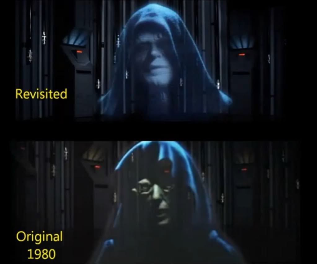
The wampa scene in the cave is definately staying untouched (Luke's lightsaber might require a slight change of colour in one shot where it becomes darker just for the sake of consistency) but removing that dual CG hatch could be a problem. As far as i'm aware, only the GOUT has that clip intact without the dual hatch and I don't want to mix GOUT footage with the blu-ray footage in such a small shot, it'll be too jarring. Perhaps Harmy's done another great matte job to get round that as well and he doesn't mind me borrowing that as well as the fantastic work he's done with the Sarlacc pit.

The humungous door from Return of the Jedi is definately gone, i've reinstated the original shot from the german hdtv stream without any problems so it flows seemlessly. And Jedi Rocks is definately gone and Lapti Nek reinstated, that bit is so awful in the special editions, it just kills the whole shady gangster vibe that Jabba's Palace has going until then. Lapti Nek just fits that seedy atmosphere so much better IMHO.


@You_Too: It's great that you and Harmy both think that it's better a little brighter. I agree 100% with you guys so I think i'm definately going to go with brightening ESB now. Thanks for all your feedback and helping me to finally make my mind up! :)

Yeah, the changes in colour and brightness are pretty subtle, at least in that scene between Han and Leia. When there's snow or anything else that's meant to be white like the Hoth battle, the colour change is a lot more obvious. The star wars original trilogy on blu-ray is far from the colour grading mess that was the FOTR EE blu-ray, so the colour grading change doesn't need to be so extreme IMHO. For ESB, i'm only using one setting to remove the blue tint throughout, much like you are with the Star Wars blu-ray, I think it works pretty well that way, so i've had to be very careful with the amount of blue I remove. If you go any further than I have in removing the blue tint, I find that the whites and the image as a whole starts to turn a little too yellow for my liking, especially the snow during the Hoth battle and the walls when they're running around the corridors in Cloud City at the end of ESB.

As you know, it's a really fine line when you're using only one setting, you're having to balance so many different scenes and locations throughout the film. Ultimately, it also boils down to ones own colour preference as well without any 100% reliable theatrical source to use as a reference for colour grading. I hope i've struck a fairly good balance in that regard.

Author
Time
 (Edited)

Darf Muffy said:

Adywan's

Adywan's emperor scene should be in place of the rubber face ghoul of old with this original gout dialogue ...

Clip Link: http://youtu.be/yZlSwBag61o


I was actually planning to use the original emperor, which I like the look of (always have). He looks a lot more sinister than the SE emperor and even Adywan's Emperor IMHO, I love the way his face is mostly concealed in shadow. I don't believe in this continuety revisionism that GL is so fond of, changing earlier films to fit later films (like changing the voice of Bobba Fett to the NZ guy in the prequel trilogy to give another example). If anything, it should be the other way round.

I've been hearing rumours that Ian Holm may be replaced by Martin Freeman at the beginning of FOTR in a new FOTR 'ultimate edition' that'll be released when The Hobbit comes out, but I REALLY REALLY hope that's not the case. I'm pretty sure that Peter Jackson would never do that to Ian Holm. I just wish that they would just leave these old films that have already been released theatrically and seen and loved by so many millions alone. The old emperor looks much much better than the special edition emperor anyway (don't get me started on the dialogue changes...), so why change it!?

The work Adywan has done for his revisited versions is amazing but this project is about removing all the bad changes and reinstating the original theatrical versions of said changes, not creating totally new content like Adywan has done. For me at least, that's going too far. That said, I'm very much looking forward to seeing what Adywan's been up to these last few years with ESB revisited and especially all the new content he's added. :D

Author
Time
 (Edited)

OMEN!-_-! said:

Darf Muffy said:

Adywan's

Adywan's emperor scene should be in place of the rubber face ghoul of old with this original gout dialogue ...

Clip Link: http://youtu.be/yZlSwBag61o


I was actually planning to use the original emperor, which I like the look of (always have). He looks a lot more sinister than the SE emperor and even Adywan's Emperor IMHO, I love the way his face is mostly concealed in shadow. I don't believe in this continuety revisionism that GL is so fond of to fit later films (like changing the voice of Bobba Fett to give another example).

I've been hearing rumours that Ian Holm may be replaced by Martin Freeman at the beginning of FOTR in a new FOTR 'ultimate edition' that'll be released when The Hobbit comes out, but I REALLY REALLY hope that's not the case. I'm pretty sure that Peter Jackson would never do that to Ian Holm. I just wish that they would just leave these old films that have already been released theatrically and seen and loved by so many millions alone. The old emperor looks much much better than the special edition emperor anyway (don't get me started on the dialogue changes...), so why change it!?

The work Adywan has done for his revisited versions is amazing but this project is about removing all the bad changes and reinstating the original theatrical versions of said changes, not creating totally new content like Adywan has done. For me at least, that's going too far. That said, I'm very much looking forward to seeing what Adywan's been up to these last few years with ESB revisited and especially all the new content he's added. :D


Yes, completely agree, OMEN.  The original scene is awesome and the emperor looks pretty creepy.  No need to mess with this scene.

“In the future it will become even easier for old negatives to become lost and be “replaced” by new altered negatives. This would be a great loss to our society. Our cultural history must not be allowed to be rewritten.” - George Lucas

Author
Time

OMEN!-_-! said:

but removing that dual CG hatch could be a problem. As far as i'm aware, only the GOUT has that clip intact without the dual hatch and I don't want to mix GOUT footage with the blu-ray footage in such a small shot, it'll be too jarring. Perhaps Harmy's done another great matte job to get round that as well and he doesn't mind me borrowing that as well as the fantastic work he's done with the Sarlacc pit.


Here:

And of course you can use it. No problem. Like I said, team work is the basis of all good projects that people do here, so feel free to use any of my footage :-)


Author
Time
 (Edited)

Sounds all good so far for me looking foward to it :]

Put me down for the 1080p BD-50 dual layer, DTS-HD, LCD, KFC monster version as this is gonna be the definitive version for me. The colour theme of the films I think should be down to what the editors feel whats right about there work on that one.

So long as you can see the stars in between the wars and the rebels are not throwing yellow snowballs at the emperor I'm good on what colour theme is picked:D


Lak Sivrak (or wolfman) was replaced in the Special Edition because he was just a store bought Halloween werewolf mask that Lucas thought was unimpressive and I agree.  Smoking rasta lizard is a good change and should stay.


EDIT: OMEN regarding your emperor choice over adywans scene I understand what your saying about the darker hiding in the shadows feel to it for me though it's just his eyes look so false and adywan kept that same feel but it's your film edit bud your shout and apart from that I'm all for the changes spoken.

Author
Time
 (Edited)

As to the Emperor, I'd recommend using Ady's 97SE 1080p reconstruction MKV (it's on tehparadox). That's where mine came from, so it will by definition be higher quality than in my 720p AVCHD, since it's one generation up, 1080p and quite high bitrate if you use the MKV and not the AVCHD version.

Author
Time

OMEN!-_-! said:

I've been hearing rumours that Ian Holm may be replaced by Martin Freeman at the beginning of FOTR in a new FOTR 'ultimate edition' that'll be released when The Hobbit comes out, but I REALLY REALLY hope that's not the case. I'm pretty sure that Peter Jackson would never do that to Ian Holm.

I believe, at most, they would replace the single shot of Ian finding the ring, and none of the rest of the film. I don't think they should either, but it's better than what they could do. At the same time, they've brought Ian (and Elijah Wood as Frodo) in to film bits with FOTR-era Bilbo for the intro to The Hobbit.

ROTJ Storyboard Reconstruction Project

Author
Time

I'm not concerned. Once a film comes out on Blu-Ray, with good, nicely detailed, not DVNred transfer, and that Blu-Ray is still available, I don't really mind what they do with it in other releases. A well mastered Blu-Ray is good enough to be projected on a huge cinema screen, so as far as I'm concerned, the film's preserved.

Author
Time

Harmy said:

As to the Emperor, I'd recommend using Ady's 97SE 1080p reconstruction MKV (it's on tehparadox). That's where mine came from...

Keep in mind that he didn't fully restore that scene, see the lack of blinking lights in the wall behind the hologram. Just thought I would point that out as it is easy to miss small details like that.


I often hear that one of the main problems with the 2004 transfer of Empire is that it's too blue compared to how it originally looked, this popular thought needs to go away. The original Empire had always a lot of blue in it, especially on Hoth. The 2004 transfer has instead for the most part an ugly cyan tint, and that's a big difference.

Not to discourage you OMEN, but besides having crushed blacks, it also have many instances of clipped whites, and many scenes are already more bright in the SE compared to the original, so I'm afraid that just slightly boost the brightness and reduce the blue will not help making this disaster of a video transfer look anything close to how this film looked originally.

An example of the clipped white levels in the 2004 transfer.

2004 DVD

SWE LD

GOUT

Even the THX transfer with its blown out whites have more detail in the bright areas than the DVD in some parts. The old LD transfers aren't perfect either, this example have the contrast too low, but it helps demonstrate that the crushed blacks aren't the only problem with the 2004 video. One setting for the whole film doesn't solve the problems with either Star Wars or Empire, there's simply too many problems that are changing depending on what scene you are looking at, there's no way around it than to correct it scene by scene if you want some good results.

Look at this matte-shot for example, the '04 DVD at the top and the '97 SE below:

A few moments later when it cuts back to the bridge on the 2004 DVD, someone have turned on the red lights:

Still look lifeless, see how pale the skintones are. Anyway, this wild inconsistency is present in all levels throughout the '04 transfers, from colors to saturation to contrast and brightness. Combine that with the artificial sharpening, grain reduction, starfields and engine glows that have somehow lost their former glint, and finally add some horrible audio re-mixes and added digital effects, and you will have something that is starting to resemble Lucas' vision of how these films were always meant to be seen.

Btw, shouldn't this be in the fan-edit section of the forum?

We want you to be aware that we have no plans—now or in the future—to restore the earlier versions. 

Sincerely, Lynne Hale publicity@lucasfilm.com