
- Time
- Post link
While the OT covers are okay, I really like the PT ones.
DVD covers with the original poster on them are pretty cool.

I said to myself, I'm not gonna do a Star Wars set. Everyone else is doing it. And if I WAS gonna do a Star Wars set, I certainly wasn't doing a Drew set. Everyone is doing a Drew set...
*sigh*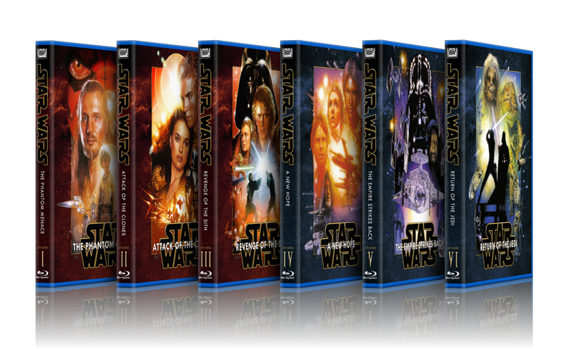
Seeing as I am the biggest Star Wars nerd on the Northern Hemisphere (check out my Star Wars Video collection at www.swonvideo.com) I just couldn't help myself.
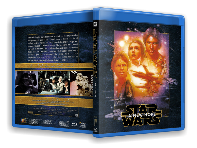
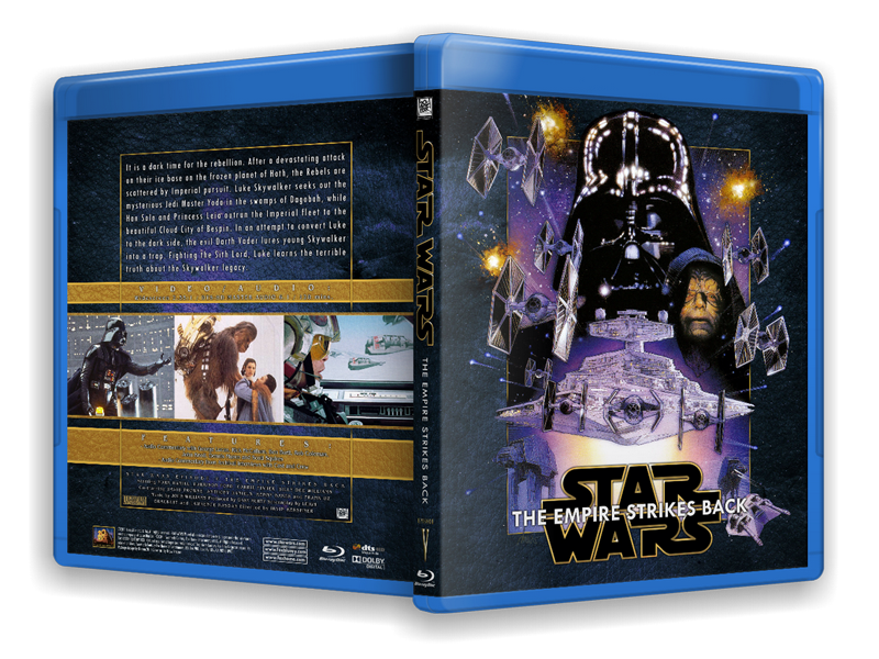
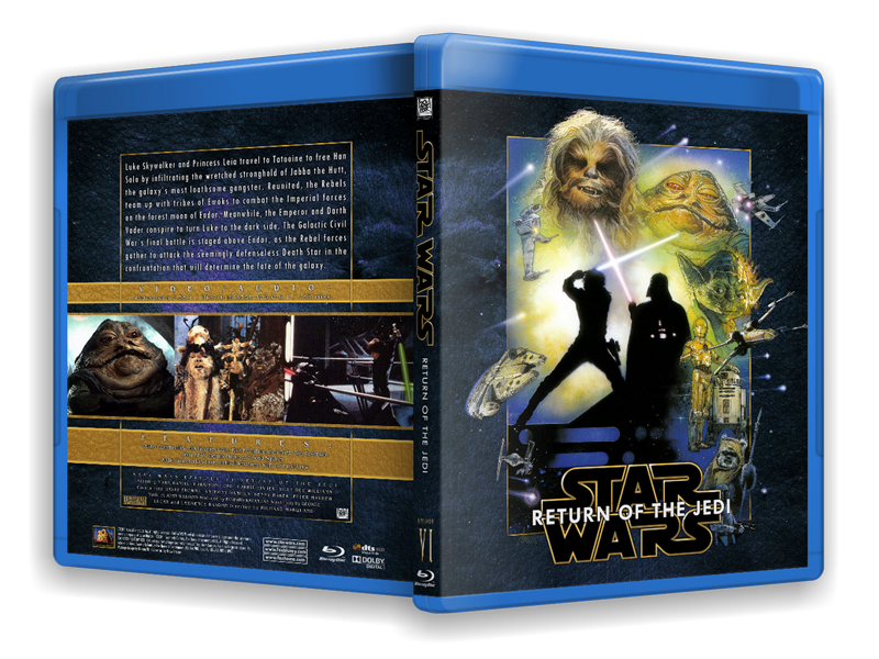
It HAD to be the Drew Struzan posters. For one thing, that's about the only set that unifies all six movies. Mixing and matching posters from several different artists makes it difficult to make a cohesive set. Then there's the fact that the Drew posters are bloody excellent (almost, but I'll get to that later).
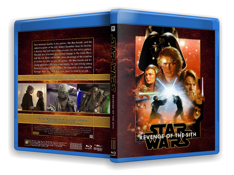
I usually start off these ramblings by complaining there's a lack of available Hi-rez images on the net for my projects. Well, for Star Wars there's a tonne of it. Still, I wanted to have textless versions of the posters to work with, and I needed to modify them so I wanted as much resolution as possible. I cracked open my Drew artbooks and scanned the posters myself. Some of them didn't fit the scanner so I had to scan in segments and stitch them together afterwards. I also wanted the original, unaltered version of Drew's Ep.3 poster and that is nowhere to be found online. It took me a day (out of three working on this project), but in the end I had pristine, 600dpi scans of the posters to sink my teeth into.
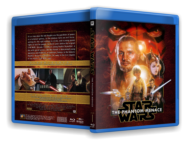
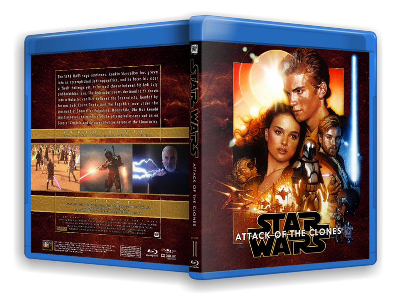
The challenge with the Drew posters is that they are formatted to fit a rectangular theatrical poster, which doesn't really fit the almost square front of a Blu-Ray cover. I see a lot of custom conversions of the Drew posters struggle with this, so I first had to modify all six posters to fit the proportions of Blu-Ray. Luckily, Drew included a rectangular frame in all the posters' design, so I used that as a starting point. I had to cut off some ships and characters from the bottoms of all the posters, and move the bottom frame up. I formatted all six posters to have an identical frame size, doing my best to preserve as much of the original compositions as possible. (Lopping of the bottom third of all the posters throws them somewhat out of whack, the center being lost, but they still work.) I discovered that Drew had been somewhat inconsistent with the size of those frames, especially between the original trilogy and the prequel trilogy posters, so that proved quite a challenge. To cap off the artwork and make it seem like it was originally finished at the bottom, I added a gold frame. This frame also replaced all the different frames between the posters, thus making them more of a unified whole.
As has been mentioned elsewhere, the Episode 3 poster does not have the same, obvious frame around it as the other posters do. Well, not the commercially released posters anyway. I had to go back to Drew's original version for Ep.3's poster, predating the hackjob the marketing gerbils did on it to squeeze a larger Darth Vader in there. Drew's version of the poster had the frame just fine.
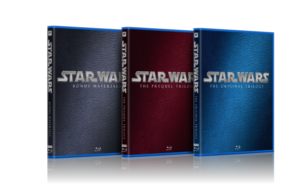
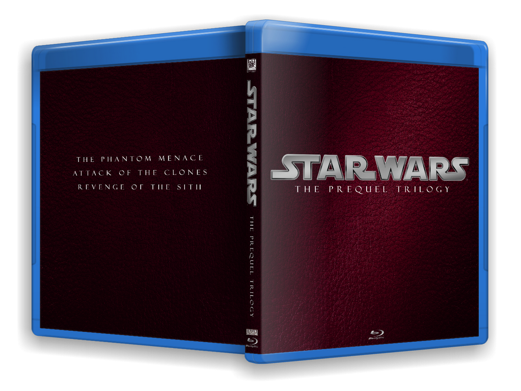
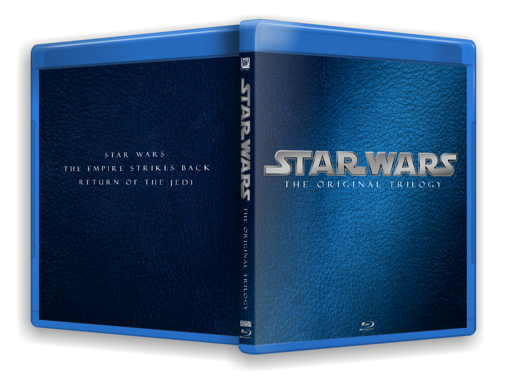
Originally I was doing black covers for these, because black is the only single colour that goes with all six posters. The prequels are rendered in warm, golden tones while the original trilogy posters are colder. I found the black background to be bland in the extreme, so I decided to do a textured, coloured background instead. I tried to make all the covers crimson/gold, but ultimately I had to split up the set in two sections using blue as a background for eps. 4-6. I would have preferred them all to be the same base colour since it brings all the spines together beautifully, but I wasn't going to settle for black. No way.
For the background I used a NASA still of a Nova, tilted it on it's side and duplicated it back and front. To give it some texture I overlaid a leather texture image I googled. The Nova already had the red/golden hues I was looking for so I didn't need to modify that for the prequels. For the OT, I shifted the hue and saturation of the Nova towards a pale blue.
The one-sheets had to be isolated from their background to seamlessly fit on the covers. I used the colour-selection tool to isolate most of the blacks, then touched up the finished mask by hand. A lot of work, and I bet everyone takes it for granted. This removed Drew's signature for all the paintings, and I wanted to retain that, so I isolated his signature from the Ep.4 poster and put it on a separate layer from the artwork. That way it is consistent between all the posters. I found myself masking out most of Drew's paint-splatter stars, as they were conflicting with the stars from the Nova background, and frankly some of them just look like schmutz.
I mentioned a reservation about these posters' greatness earlier, and to me, the posters for Eps 1, 2 and 4 are just too hot, colourwise. It may just be in the way they are printed, but I toned down the redish skin on all of them. I still couldn't approximate anything approaching natural skin tones for Qui Gon on the first poster. I know it irks Drew when someone second guesses his choices (as would any artist) but I took that liberty. For Obi-Wan's lightsaber on the Ep.1 poster I replaced it with the one from the Ep.2 poster. It's still all Drew artwork, but that feeble, anemic, pointy lightsaber from the Ep.1 poster had to go. :)
When making a set, as opposed to a single cover, I want to remain as consistent between covers as possible. This poses certain challenges when the artwork on all is going to be different. When placing the Star Wars logo on the front, I had to find a position that would remain the same across all covers, yet not obscure anything important on the different posters. I was largely successful, but poor Boba Fett got shafted on the Jedi cover. It just couldn't be helped. (Actually it could, I could have moved him to a different part of the painting, but I am just too knackered to perform that kind of precision surgery.)
The logo I opted for is one I first saw a year or so back, a slightly modernized version of the standard logo. I can't for the life of me find out who made it, but I see it used on the wallpaper sites everywhere. Anyone recognize it? It had to be a stacked version for the front, a horizontal version would obscure too many elements on the posters. For the spine I split it up and modified the leg of the "R" to follow the lines of the following "W". It's just a small thing, but it seemed in keeping with the other letters. I redrew the entire logo with the same gold/brown I used for the poster borders. I put in some shadow and highlight effects by hand to make it a little richer looking. I used that same colour for other elements on the spine and back, to tie the whole thing together.
For the actual titles of the films, I used a sans-serif font to complement the logo. It had to be readable against the logo, so I used a black glow effect to make it stand out more. I use the glow effect a lot when I need the text to be legible against a busy background. I find using a glow is more flexible than a standard stroke around the letters. The same font was then used for the text on the spines. Consistency is the word.
The roman numerals on the spine are rendered with the Emboss and Satin blending options from the layer pallette, as is the word "Episode". The titles themselves are so wordy, there's hardly room for much else on the spines.
The backs would be identical for all six, so once I established that template, it was just a matter of plopping in the images in their assigned placement and size. I still struggle with the backs, so I made three versions of them before I was satisfied. They're still a bit "boxy", and I am ambivalent about the gold frame I used, but it ties the back and front together so beautifully. The gold and crimson theme I used made the covers seem a bit excessively ornamental, sort of like baroque art. This called for a slightly elegant font for the specs (I believe I used Bangle, don't quote me on that because I can't be bothered opening the PSD files to check). For the summary I used a narrow sans-serif font ("TW Cent" something...) to set it apart from the other text on the back. Typography doesn't come naturally to me, so maybe these mixes clash to a more trained eye. Let me know, OK?
BTW, where do you guys take the summary blurb from? I always use what's on the official releases, in this case the DVDs, and just add or subtract text to fit my needs (and remove the worst spoilers). This is where typos creep in, so if there are any, do let me know. Good thing a scan of the actual Blu-Ray back surfaced, so I could get the specs and running times right.
When choosing images for the back I wanted to, like I always do, feature as many different characters as possible. I made a point of including Jar-Jar for the first one. It's kind of tongue-in-cheek, but also that I feel sorry for the guy getting the short end of the stick from everyone. I like him just fine, and if there was room I'd have put him on the spine just to spite the haters. That's also why the Ewoks are centered on the Jedi cover. Come on, who doesn't love the Ewoks? Really. I mixed some lesser known photos with the same, stale PR photos we've seen in every article about Star Wars for the last thirty years. Usually I'd avoid them like the plague, but that Falcon cockpit shot from ANH is pure nostalgia.
As always I used Illest Villains template for this, but for once I redid the legal copy to reflect the actual Star Wars property. I added the artwork credit for Drew Stuzan, as well as a Package Design credit for myself.
That's it. Took me three whole days. A custom three-disc for the bonus discs is forthcoming, but for now this is all I have. If you appreciate these long write-ups for my covers, let me know. I enjoy writing about them just as much as making them. I'd love to read about other designers' processes as well.
Okay, High Rez JPEGs of these are available by PM.
Visit my *NEW* Star Wars on Video Collection site:
While the OT covers are okay, I really like the PT ones.
DVD covers with the original poster on them are pretty cool.

George has rights to some the greatest pieces of art ever, and he goes with crap every release. The 1990's, he'd release the films and they'd have beautiful covers.
"The other versions will disappear. Even the 35 million tapes of Star Wars out there won’t last more than 30 or 40 years. A hundred years from now, the only version of the movie that anyone will remember will be the DVD version [of the Special Edition], and you’ll be able to project it on a 20’ by 40’ screen with perfect quality. I think it’s the director’s prerogative, not the studio’s to go back and reinvent a movie." - George Lucas
<span> </span>
That's it. I'm done with Star Wars.
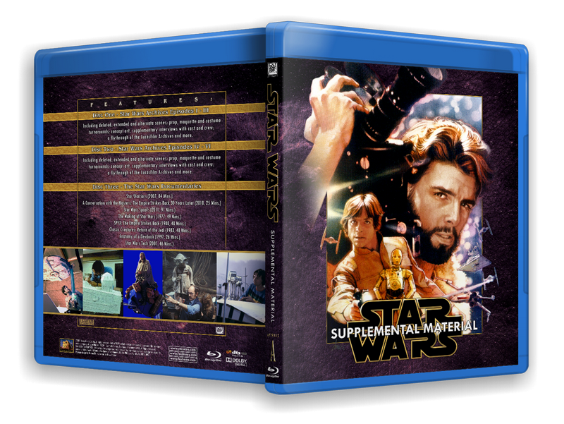
Supplement Case (3-disc) now added. I used the info from Bartlett's custom for the contents of the bonus discs. Special thanks to Greg Masciola from Blu-ray Forum for the poster image.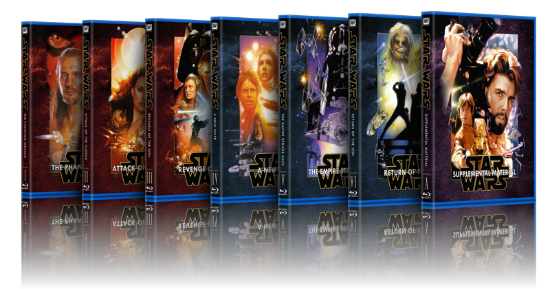
My mother asked me yesterday what I'd been doing the past week. I told her I'd made custom Star Wars covers for a Blu-Ray set that's coming out this autumn. She just looked at me for a second and said, in confused disbelief, simply "Why?".
How do you explain stuff like this to a 65-year old?:) There must have been at least three words in that sentence she didn't know.
Everyone who knows why, PM me for the High-Rez version.
Visit my *NEW* Star Wars on Video Collection site:

She's never heard of autumn? Maybe you should have said "fall." ;-)

Okay, so I wasn't completely done with Star Wars after all :-)
These are inspired by the mock-up covers that were used as placeholders on Amazon etc. when the Blu-rays were just announced.
I thought they looked okay and found it a pity they weren't used, so I just made some myself. I tried soooo hard to make a cover with a simple background colour, but in the end I just couldn't resist adding some texture to it. I'm a slave to textures :-)
This is as simple a cover as I'm ever likely to make. I didn't even sign them.
They'll fit a regular 3-disc case, so anyone who wants them can PM me for High Rez files.
Visit my *NEW* Star Wars on Video Collection site:

I'm a huge fan of covers like those ^
I don't really have my DVDs and BRs on display, so it's not a huge issue. I'd still like to try a few for some of my DVDs that have particularly bad artwork on the covers. Along those lines, I really wish most of my mass market paperbacks had covers like that. Understated works well for me. Good job, man.

Yeah, I like 'em. :)
Galatians 2: 20: I am crucified with Christ: nevertheless I live; yet not I, but Christ liveth in me: and the life which I now live in the flesh I live by the faith of the Son of God, who loved me, and gave himself for me.

The "book" covers are nice, but the Struzan covers are damn works of art. :)
I downloaded them and they are just fantastic... the attention to detail won't let anyone down, and the quality is just phenomenal.
I do kind of wish that Struzan had made paintings to cover the two trilogies, so we could have 3 disc cases with a Struzan cover that represents all three movies. But I think in this case I will just sacrifice the shelf space and go with the individual covers... something I would never have done if I never found Video Collector's covers. They're simply too good to pass up. :)
I truly don't understand why Lucas doesn't make covers like these for the released discs. I suppose his Blu-ray covers are at least better than those terrible photo collages they used for the DVDs.

Really work you guys! I love them!
Thanks very much for sharing.
Unaltered Original Trilogy Forever

Wov, all the covers are really good. I'm still in shock ;-)
He’s no good to me dead
NOTICE REGARDING MY COVERS:
Due to the unfortunate fact that I messed up, most of my covers have the spine slightly off-center. It had slipped in my original template and I only caught the screw-up yesterday.
This affects my Star Wars covers (both series), my Superman covers, Punisher, Chaplin and Rocketeer.
The Conans (all four of them), The Shadow, Cyborg and Captain America are NOT affected.
All covers have been fixed and the new versions uploaded. Those of you who downloaded my affected covers should do so again. You'll find them in the usual place.
I apologize for any inconvenience this may have caused.
Fritz
Visit my *NEW* Star Wars on Video Collection site:

Wait. Really? I printed your Star Wars Original Trilogy cover and it looked fine on my Blu-Ray case. Perfectly centered. Thanks for the update though.
The Aluminum Falcon said:
Wait. Really? I printed your Star Wars Original Trilogy cover and it looked fine on my Blu-Ray case. Perfectly centered. Thanks for the update though.
Good to know. I said slightly :-)
Visit my *NEW* Star Wars on Video Collection site:

Imrahil said:
Okay! I think I'm done with the set, though I'm not sure which ROTJ I like better.
Here we go:
ROTJ V. 1
AND V.2:
and the set:
Can someone please re-up these? They are gorgeous! I'm curious also, are there versions that would fit standard Amaray cases?
Thanks!

^Yes, please! I would love to use those.
A Goon in a Gaggle of 'em

First post here (though used to post as seventiesfilmnut) so hi folks, good to be back :)
I ADORE those covers too - would love a set of those for Harmy's HD despecialized editions! Superb artwork!

Welcome to the forum :-)
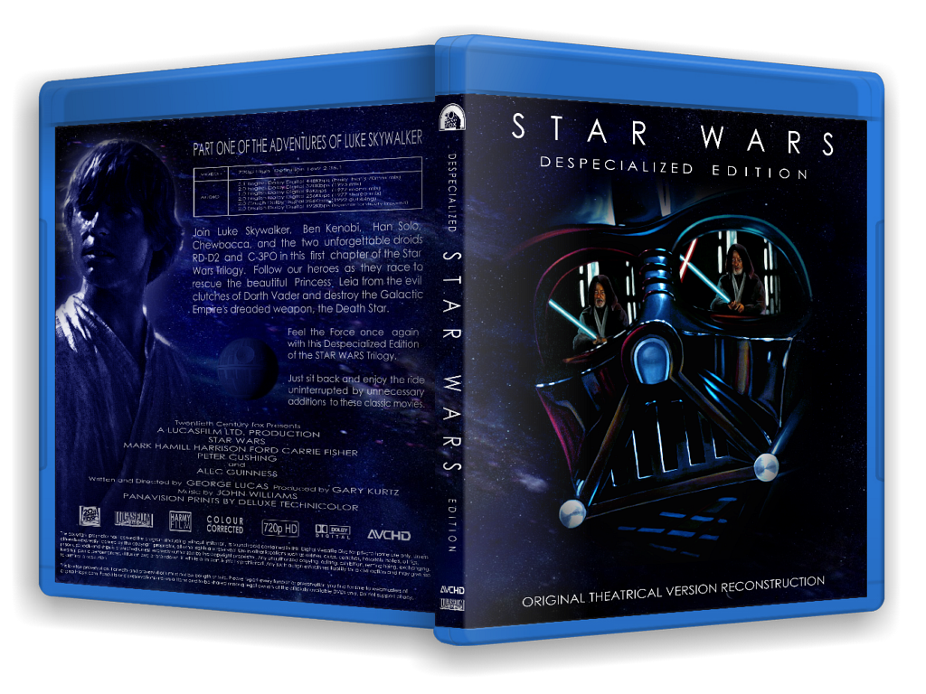
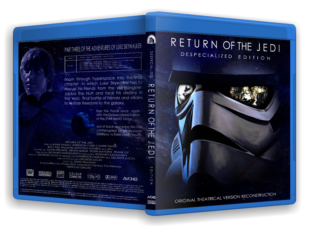
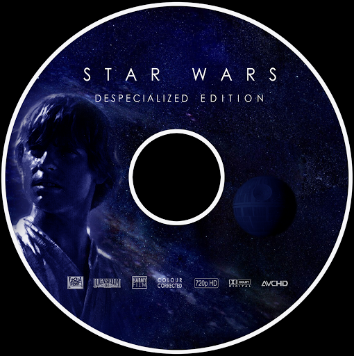
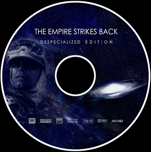
Covers made for the Despecialized set by me can be found here:
http://www.megaupload.com/?d=9304293B

Cheers Harmy :)
NICE covers!!! Do they come with the disc art also? (need an excuse to try out my printers DVD printing device!).

Harmy, you have just raised the bar.
I've just downloaded the Despecialized DVD-5 versions and I'm wondering if there will be DVD cover art for those, maybe re-worked from the Blu-Ray art?

Those are amazing!!!!! Only thing is I'd maybe reverse Vader and the stormtrooper. A stormtrooper feels off for a movie as deep and character-focused as Jedi. The reflection could be a charging Han, and you could keep the lightsaber reflection in Vader's eyes with Luke instead of Obi-wan.
rpvee said:
Those are amazing!!!!!
Thanks :-)
A stormtrooper feels off for a movie as deep and character-focused as Jedi.
This is a joke, right?
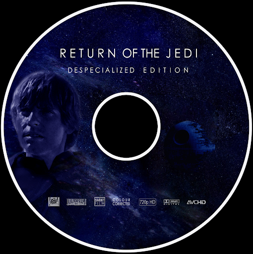
Here's the disc art:
http://www.megaupload.com/?d=R4UWXWY8
Fantastic!!! Thank you so much and again for the actual despecialized movies themselves. You've given MANY Star Wars fan back their favourite film, in a form that just blows away all previous releases/edits.
I'm in Star Wars heaven here haha!
Cheers.