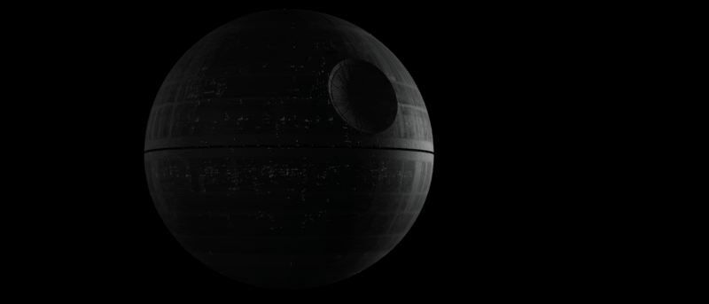
logo Sign In

The ANH:SE Redux Ideas thread (Radical Ideas Welcome). — Page 56

Author
Time

Angel said:

Note that is only a test shot. Might be different and more grand ;)

Still... for a test shot it's amazing. The grander the Death Star looks the better. The visuals should correspond to how it's the main threat of the movie... that is make it look huge and a killer.

When the Falcon approaches the Death Star, what do you think of having the Death Star's laser seem to be facing it, so as to heighten the sense of grave danger?

Author
Time

Looks amazing Angel,….really mean that, does look like a physical model,

The thing is a lot of the establishing shots of the DS in SW are all very similar.....some of the concept images that RMcQ did for SW have VERY dynamic angles....which do make what we got in film very safe.

The first render you did does give the DS a very mighty poise....as though looking down on you

Author
Time
i love the new death star! the lighting and the angle is what makes it i think. sort of looks like its hiding in the stars.
Author
Time

Question:

Does anybody knows how many different models were used for the creation of certain shots of the deathstar?

Im not concerned about the surface ones but one particular shot seems to have details that in the far shots are not visible or are there. Maybe a painting maybe a section of a more detailed model i dont know. I included some references that might light a bit this.

The second image is the original shot a bit zoomed out with better contrast detail.

The other i dont know


-Angel


–>Artwork<–**

Author
Time

This doocot (which isn't that far from me) has a nice Mos Eisley look about it.

Author
Time
 (Edited)

adywan said:

Just found one of the alterations done to Episode 4

I made the preview tiny just in case people don't want spoilers. Just click on the image to view

One nice change that i might use with some differenes :)

I was gonna eliminate that eye like things inside the cave anyway


-Angel

–>Artwork<–**

Author
Time

In some ways it makes sense that Artoo would take cover while hiding but as it's been pointed out the blu-ray version creates a continuity issue and it's not clear how he got in there let alone how he is going to get out.

Maybe if the sharp edge of the rock on the bottom was trimmed away and the new formation was carried over to the shot where he has moved into the open it would be a more workable idea.

Author
Time

or they could have just left well enough alone and kept it as it was, ....jus' sayin' is all!

Bingowings said: Do you want to see the project finished as a playable film or a flick book?

Author
Time

True but if we were to not consider any change these threads would be empty ;-)

Author
Time
 (Edited)

Why didn't they just put him further back in, in shadow more, perhaps harder to see.....just his lights

j

Author
Time

Have you thought about adding in a scene where Vader flies to Coruscant and sees Palpatine at the end, right before the ceremony, maybe using footage from the end of EPII when Dooku flies back (but obviously changing up the shots a bit)?

I just feel that if we're suggesting changes, something that I feel is somewhat missed in the OT is more of the Emperor and Coruscant. 

Just thinking this: what if the lightsaber duel in ROTJ had been on Coruscant? 

Author
Time
 (Edited)

I dunno......is there something missing in the bottom picture?

That new Adobe erase tool is great

J

Author
Time
 (Edited)

timdiggerm said:

I'll be the voice of dissent and say that it doesn't look cool. It's less convincing than the original.

Its the same model i made. maybe its the light condition.


-Angel

–>Artwork<–**

Author
Time

Jaitea said:


I dunno......is there something missing in the bottom picture?

<img src="http://img37.imageshack.us/img37/3831/deronto.png" width="700" height="600" />

That new Adobe erase tool is great

J

Wow! That would be my dream version of the shot to be honest...

A Goon in a Gaggle of 'em

Author
Time

i'd say the lighting needs to be looked at in the alderan shot. there is too much contrastin the death star too i think. just needs adjusting a tad.

Author
Time

An updated image of my previous post

J

Author
Time

I must side with Tim on this one. I'm sorry but the DS looks CG as hell (where the original was a physical model, so it looks real) and the planet also looks very fake to me.

Author
Time

Harmy said:

I must side with Tim on this one. I'm sorry but the DS looks CG as hell (where the original was a physical model, so it looks real) and the planet also looks very fake to me.

we might came up with a better render..

what do you propose at the end?


-Angel

–>Artwork<–**

Author
Time
 (Edited)

Well, I propose (with making a new Special Edition version in mind, not from a purist point of view) that if something can't be made to look better (and at least to me when I look at that comparison, the original looks better and more realistic), there is no reason to change it. Especially if you're basically just recreating with CGI what's originally been done perfectly with practical FX.

Oh, and in the last sample, you can see pieces of the original DS on the edges of the CG one.

Author
Time

timdiggerm said:

The newer one is slightly better, but the illumination is pretty crazy. Why are there light sources on either side?

Anyway, Harmy said it best.

Try to justify where the sun comes? Its a mystery that cant be solved anyway in OT. we never see it even more the second ambient light.

Its all about presentation ;) not originality.

I say more CGI :)


-Angel

–>Artwork<–**