logo Sign In

GOUT, Automated Theatrical Colouring, and a Reference Guide — Page 6

Author
Time
 (Edited)

I agree, I think dark_jedi's latest color adjustment to the V3 GOUT video looks better, more natural. It also restores the overall colors closer to what they should be, since it's obvious more saturation is needed to get the GOUT DVD set closer to the theatrical appearance.

I think some mentioned contrast may also be part of the problem with the colors in the GOUT DVD set. dark_jedi, has that also been adjusted in your latest screen shots?

Too bad we can't correct the flesh tones separately from the colors in the rest of the scenes, that would solve a lot of problems. You could get the flesh tones right, and have free reign to get the colors in the rest of the image adjusted correctly without interfering with the flesh tones. :)

The Star Wars trilogy. There can be only one.

Author
Time

No I did not do any contrast adjustment, just trying to find an all around good fix that looks better than how it looks now as is, I will not do a scene by scene adjustment, that will just take to long and I do not have the patience for that kind of work, but what I have now, at least to me anyways, looks way better than how the "as is" V3 looks now, I could try messing with the contrast a bit and see what happens.

Author
Time

hue(channels="YM", sat=1.25)
hue(channels="B", sat=1.4)

No hue, not even a levels adjustment.  Just stronger blue, and slightly stronger yellow and magenta.

Will post more if you guys like what you see.


77306152.jpg
92039838.jpg

Dr. M

Author
Time

I hate to say it after all the work you've been doing, but I can't see much difference and I prefer the GOUT.

Author
Time

Seconded. I really like DJ's settings, maybe only turn red down a tiny little bit and possibly slightly increase contrast and it would be great.

Author
Time

Chewtobacca said:

I hate to say it after all the work you've been doing, but I can't see much difference and I prefer the GOUT.

That was the point with the last tweak.  People were generally happy with the skin tones (which are largely red on the GOUT discs, with not much room for improvement).

With those settings faces are largely the same, but other colors are brought up.


22139482.jpg
43875975.jpg


This last one take with a grain of salt.  The source frame was from Apt Irrelevance, not directly from the DVD so it isn't exactly how it would look:

http://img152.imageshack.us/img152/3715/roughtest.jpg

Oh and adjusting the blue levels made me think about something for the first time: what the heck did they milk to GET blue milk?  I didn't see any livestock.

Dr. M

Author
Time

Doctor M said:That was the point with the last tweak.  People were generally happy with the skin tones (which are largely red on the GOUT discs, with not much room for improvement).

I understand, but while a couple of those shots look a bit better, I would rather have the GOUT as it is than that tweak because the compexions still look worse and overall it doesn't seem worth it.  That's just my opinion.

Author
Time

DrM are you running your samples through g-force's script or is this just straight GOUT tweaking, because it has to be run through the script to, it may make a difference.


Author
Time

No.  I just finished d/l'ing all the fiters and trying g-force's script for the first time.  I don't see a difference between my color corrections directly to the DVD video and video that has been through the script.

g-force's tweaks just seem to make a cleaner image and make scanning around much slower.

Dr. M

Author
Time

Not knowing sh*t about avisynth, I gave this a shot in photoshop and I don't think any major colour correction can be done with one setting to the whole film, because I tried one shot and the results were pretty good IMO and then when I applied the same settings to a different shot, it looked awful. But both looked better after the initial saturation increase, so maybe just increase the saturation a little bit and leave it at that.

Author
Time

I think I agree.  Why not put g-force's original saturation increase in and call it a day?  I think most people agree that that offers some improvement, but few people seem to agree on anything else as far as tweaks to the colors go.

Author
Time

Doctor M said:

Oh and adjusting the blue levels made me think about something for the first time: what the heck did they milk to GET blue milk?  I didn't see any livestock.

Banthas?

Author
Time
 (Edited)

Harmy said:

Not knowing sh*t about avisynth, I gave this a shot in photoshop and I don't think any major colour correction can be done with one setting to the whole film, because I tried one shot and the results were pretty good IMO and then when I applied the same settings to a different shot, it looked awful. But both looked better after the initial saturation increase, so maybe just increase the saturation a little bit and leave it at that.

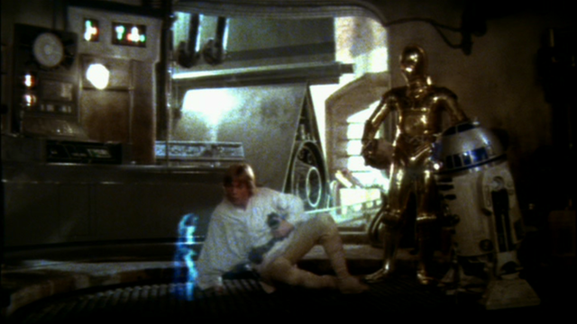
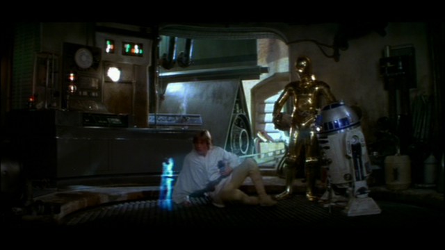
Here are the picture I tried, I think it's pretty self-explanatory but just to make sure:

1) Original GOUT

2) My tweaked version of picture 1

3) Original GOUT

4) Picture 3 tweaked with the exact same settings as 2

5) Picture tweaked with completely different settings


What this tells me is, that this kind of correction would be really time consuming because it would have to be done scene by scene and in many cases shot by shot and that it would be next to impossible to do it with something like avisynth, because you need to keep trying until you're ok with, which is quite time consuming even in photoshop where you can see the results in real time and if you couldn't see the results right away, it would be impossible to do a whole film (well, unless you had five years of free time and a lot of dedication ;-) )

Author
Time

To my eyes, Picture 5 looks the best. It seems like how it would probably have looked in theaters. However, I'm not completely convinced that Picture 2 has the best correction. It looks too green shifted too my eyes. How does the Han picture look like with Picture 5's settings?

Author
Time
 (Edited)

I think I'm getting on board the leave it alone boat.  While they could be better, I think no single settings will make people happy.

The red needs to be left alone or reduced, but then increasing saturation on any other color except blue is going to produce unpleasant skin tones.

I wish the yellows could be improved on (for C3PO and Tatooine scenes), I say just blue or nothing.

As far as Hue, I've got to leave that to someone else with a good eye for colors.  My +5 number was derived from the Technicolor print, but that doesn't mean it will cause the GOUT DVD to produce a pleasant image.

Edit: Okay, looking again, maybe I like my second to last script (compared to a 70mm cell that someone posted.)  I'm pretty much going to just stay out of it for now.

Leonardo said:


Doctor M said:


Oh and adjusting the blue levels made me think about something for the first time: what the heck did they milk to GET blue milk?  I didn't see any livestock.


Banthas?


(shudder)

Dr. M

Author
Time

Picture 2 looks great, Harmy.  Picture 5 has a bit too much of a yellow cast in the highlights - the silver droid behind Threepio looks gold, and the walls look stained.  4 is too blue.

I really think these need to be color corrected scene-by-scene and not "overall," as it were.

Author
Time

Okay, THIS is really my penultimate version before giving up. ;-)

http://img138.imageshack.us/img138/478/finalsn.jpg

Different hue changes RYG than BC.  Still no level adjustments.   Reduced red, green and cyan, boosted yellow, strongly boosted blue, and magenta is unchanged.

Will post more shots or a clip on request.

Dr. M

Author
Time

Doctor M said:

I think no single settings will make people happy.

I am beginning to agree with you.

Author
Time

Regarding the technicolour prints. I think there definitely is a real element of green in there when you look at other sources. For example, I dug out my SW Bonus DVD and looked at some of the trailers on there for comparison, and both the old and later on 1997 trailers have an element of green to them.

Old Star Wars trailer:

OldSW

1997 Release trailer:

1997release


Author
Time

dark_jedi said:

Doctor M said:

I think no single settings will make people happy.

I am beginning to agree with you.

Yours comes close DJ.

I love everybody. Lets all smoke some reefer and chill. Hug and kisses for everybody.

Author
Time
 (Edited)

ChainsawAsh said:

Picture 2 looks great, Harmy.  Picture 5 has a bit too much of a yellow cast in the highlights - the silver droid behind Threepio looks gold, and the walls look stained.  4 is too blue.

I really think these need to be color corrected scene-by-scene and not "overall," as it were.

I think I agree with you. The best method would be to color correct scene by scene. There seems to be no general setting that completely improves all scenes. However, Dark Jedi's method seems to come the closest.

Author
Time

fwiw, film, like painting, is not necessarily realistic.  A director of photography will purposely cast different shots in different hues in order to convey different moods: bluish for coldheartedness, red for passion, yellow for warmth and joy, green for illness, etc. 

So one scene might be a different color cast than another for good reason, because of the art direction.

It would be erroneous to recolor each scene towards realism.  Realism might not be the intent of the film maker.

Having said this, I do opine that DJ's screenshots look good, and they appear to restore color which has been lost due to technical issues, not artistic issues.

Author
Time
 (Edited)

Perhaps you're right Dufusyte. It just seems hard to separate what is unrealistic because of artistic direction and because of technical errors. This issue seems to come into play during the restoring of films. Often, it is unsure where to draw the line. After hearing what you said and thinking it over, I'm starting to disagree with my earlier opinion. Perhaps a general setting would be better to ensure that no artistic choices are lost.

On a separate note and forgive me if this has already been brought up but are the 1997 (not 2004) editions a reliable source for color timing. As I understand it, the color timing for the 1997 masters was based on a film print of Star Wars that George Lucas owned and claimed to have the definitive coloring. To my eyes the 1997 ones look the most majestic and colorful. Although, to be truthful, these are the ones that I grew up with, so I might be biased to agree with them. For example, I watched the Reivax edition a few weeks ago and loved the way it looked. It seemed so much better compared to the coloring of the 2004 version and the GOUT.

Author
Time

dark_jedi: The latest version of your color correction is looking good, maybe a tad red on the flesh tones, but not too much. And it brings the other colors closer

Can you post screen shots comparing that with shots from your master .avi file from the GOUT? Shots with Luke, Han, Leia, C-3P0 and R2-D2 in the corridor of the ship, uncle Owen, aunt Beru and maybe some shots of the rebels and Imperial officers onboard the rebel blockade runner ship would be helpful to see. So we have a direct comparison to the current untouched master .avi and what it would look like with the latest color correction method. Thanks. :)

The Star Wars trilogy. There can be only one.