- Time
- (Edited)
- Post link
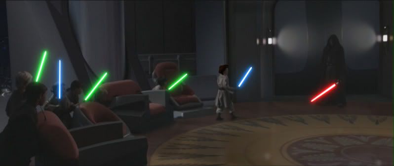
This is the true discovery of Starkiller.

This is the true discovery of Starkiller.

^Cheers.
I was thinking if the birth of the Rebellion scenes were to be returned it might add to the mood of those shots if the blinds were pulled.
The scenes are pretty dull to look at (like many of the exposition scene in PT) but having the founders of the Alliance meet in shadows might add to the sense of increased paranoia (like the early Christians meeting in the catacombs).
Like the open windows inviting assassination attempts in AOTC this secret meeting looks like it would be very open to outside observation.
Another opportunity lost, it would have been cool to have a shot of a Clonetrooper spying on them with electobinoculars and reading their lips but I imagine that would be impossible with the existing material.
Which is why I suggest the blinds being down which would at least create the impression that the Senators had thought of this possibility.
All this still neeeds alot of work, Star wars logo speed. Crawl needs to be changed, and dont think I'll be going with such a drastic color correction on the ships. Unless I can make it look bettter.
Hopefully youtube dont gank it down.
My Episode 3 Edit Reign of the Dark Side
I apologise if this has already been discussed...
My biggest gripe with the whole movie is Anakin's turn and how he willingly slays a group of kids as his first act after the turn. If somehow you could change it so the stormtroopers attack the Jedi Temple and kill the kids while Anakin goes to kill the Trade Federation on Mustafar it would make it a lot more plausible: and in the process it would cement his Dark Side turn as per Sidious' wish (killing unarmed, helpless idiots). Bottom line, I just do not buy that Anakin would kill those kids in cold blood (and no it's not like killing the Sand People, which was done in blind rage).
For me this is the moment that kills the film, it's Lucas' biggest screw up in the prequels, and if you could somehow make that change it might make his turn believable.
I liked the color of the ship in that last clip. Edit is looking good so far.
I like it on the big ship, i'm not sold on the jedi fighters though!
Bingowings said: Do you want to see the project finished as a playable film or a flick book?
I don't like the new SW logo, nor the fact that all the ships look black and white. There must be some color!
personally I loved the new SW logo I had a bit of a "What the..." moment when I saw it LOL
Bingowings said: Do you want to see the project finished as a playable film or a flick book?
The new logo looks great! But I think you should go with only one color. Either yellow or red, cause now it looks really weird. The crawl is red, logo is yellow...
Those bigger ships look very cool in gray, but I'm not sure about Jedi Fighters. They look weird and for a second (when they're flying over the big ship) they disappear, cause they don't stand out.
But whatever happens - keep the new logo! It's awesome!
Bob, not sure how I feel about the one tone ships... BUT, you excite me with the possibilities...
The color may not even be wrong... It may simply be that we have been so used to the stupid over saturated colors that we aren't sure of it when see something that indeed does look like OT. I think what distracted me was Coruscant... Maybe mute the colors there? I'm not sure, just something to try... But it wouldn't hurt my feelings if it stayed the way you have it now...
As far as the logos/crawl... I love the red, but I agree with and earlier poster, it would make sense if SW and the crawl were the same uniform color. How would that logo look in red?
Otherwise, I'm very excited with what you've been doing... You and your predictive masks! DANG MY 32 BIT SYSTEM! I WANT AE CS5! =)
The new "Star Wars" logo is neat - I really like the design of it. But I'm not sure how it fits in with the rest of the movies. If this were a spinoff movie like the Clone Wars cartoon or something, I think the different logo would be great. But it feels a little weird as one of the six films.
For the crawl, I vote for the regular yellow-orange treatment. If it ain't broke...
The Republic cruiser looks good in gray. On the other hand, the colored cruisers do make it easier to quickly see who's who in the busy battle. But I think the fighters should be colored regardless (I know, that will be more work).
You know of the rebellion against the Empire?
Also, you misspelled the word "thirst" in the crawl.
chyron just put a big Ric pic in your sig and be done with it.
I assume these new logos and fonts etc will be carried through all your SW edits?
I'd personally rather see the original Lucasfilm logo.
mrbenja0618 said:
The color may not even be wrong... It may simply be that we have been so used to the stupid over saturated colors that we aren't sure of it when see something that indeed does look like OT.
I'm actually starting to feel the same. The more I look at it, the more I like it. I don't know...
daneditor said:
I'd personally rather see the original Lucasfilm logo.
Well, the new one looks pretty sweet.
I was just thinking, if you were to make the Star Wars logo and the crawl RED, how would it look if you made the Lucasfilm logo also RED? Just a thought... ignore it if it sucks.

Although, maybe it would be better just to leave the crawl yellow. Because red doesn't stand out that much and for those who read slower than others - they won't be able to read the crawl when it gets smaller and starts to fade away.
I will break this down into 4 points, logo, crawl, republic ship and finally jedi fighters.
The logo:
Though it was a nice surprise to see a new logo and thought it was wonderful, i think a new logo isnt actually needed. Wouldnt fit in with the rest of the saga despite i know this isnt a saga you are doing as of yet. I say stick with the old.
The crawl:
The crawl is funny as hell and made me smile but for people not knowing of this project they may read this and think this is a spoof and will not take this seriously. Don't like the red colour if im honest. Just feels wrong to me.
Republic Ship:
Looked amazing and really felt like the OT which in way plays into my next point about Jedi starfighters. I would keep what you have done to the RepShip.
Jedi fighters:
Jedi fighters look good but i think you should keep with the colours of the original film. By showin the RepShip and then you see the Jedi fighters it felt to me like a preview of yet to come by the time we get round to see the OT. Make the RepShip colourless and the Jedi ships colourful. So later in the movie you see the empire slowly taking over. I think the same should happen in regards to the clone troopers. After the Empire starts to take over we should see colourless clone troopers.
Well these are just my opinions and hope i explained clearly.

DuTwan said:
Republic Ship:
Looked amazing and really felt like the OT which in way plays into my next point about Jedi starfighters. I would keep what you have done to the RepShip.
Jedi fighters:
Jedi fighters look good but i think you should keep with the colours of the original film. By showin the RepShip and then you see the Jedi fighters it felt to me like a preview of yet to come by the time we get round to see the OT. Make the RepShip colourless and the Jedi ships colourful. So later in the movie you see the empire slowly taking over. I think the same should happen in regards to the clone troopers. After the Empire starts to take over we should see colourless clone troopers.
I agree with these points now that I've read them. Not sure I agree with the crawl... I think I may like the red crawl... But what needs to happen is something uniform.... In other words if you decide to TPM and AOTC they need to have the red crawl too. Unless you plan on doing the entire saga, and plan on changing the crawl colors for each of the 6 films.
erm. hmm.
logo - very cool, but no. could work if someone tackled the reborn project.
red text - if you did this for every film in a different colour, like a thread somewhere suggested, then yes. but no.
grey ships - could you try making the light on them REALLY bright. the SDs in ANH look almost white, not gun metal grey. the fighters need some seperation, so perhaps they could remain the darker grey?
it would be awesome to see a vintage special effects genius redo this sequence with models, and see what is left with all the limitations.
Personally I never had a problem with the colour stripe on the Republic cruisers.
It's all about branding.
Removing the colour at that point would be like removing the Stars And Stripes before the shape shifting lizard-men declare the New World Orde....(forget I typed that).
Once Palpatine 're-brands' the Galactic Government as The Empire removing the old livery makes sense.
i love the red stripes, and all the insignia, but its all about kitschness for me, not logic. i'd love to see a PT more akin to the early mcquarrie drawings.
So uhmm... what's up?
Not much...you?
Nothing much, just watching the game, having a bud...
Hehe, works been a mess this last week due to the Holiday weekend. Think I got a totaly of 8 hours of sleep from Friday till today. So my editing time has been small. Things should be getting back to normal this week. Once I get caught up on my sleep. 8)
My Episode 3 Edit Reign of the Dark Side
Cannot wait to see this edit.
I agree... I've been following this for some time and seems to get a bit better every time he comes out with a new clip.