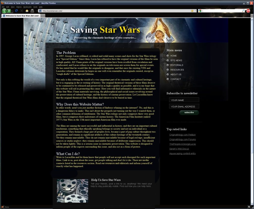
Just throwing another aesthetic idea out there. You have a lot of information on the home page. That's great, because there is a lot of important information that needs to be addressed up-front.
I think an outsider or uniformed guest might find it easier to read and maybe a little less Star Wars geeky if the copy wasn't so stylized. I'd left-justify the headings, change the font to Times, and leave the body ragged right. Giant blocks of justified copy without breaks can be a little cumbersome to read, particularly on a computer screen. I also added color to the copy to give it a little more depth, tying it in with your page header.
Just a thought.
