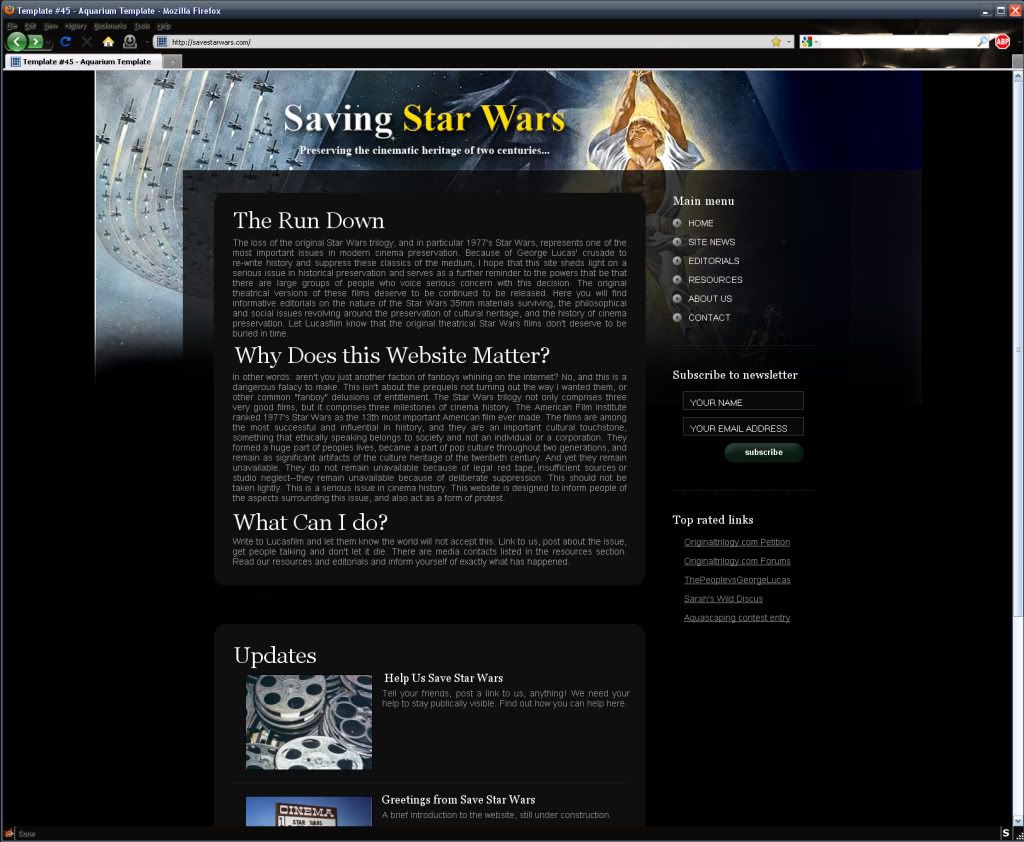
I'd like to point out that I really dig the layout. The original one-sheet works perfectly for your site. I also think the placement of the portion of the one-sheet you chose - X-Wings en masse - works very well with the whole idea of Saving Star Wars.
I made a few small changes that I thought would sort of grab the reader\passer-by with regards to your already well done layout. I saturated the color of your graphic and altered the text a touch to make it jump out a little more. I also moved the paragraph headers to left justified. Just an idea. I know you're still very early in the process.