I hate to triple post, but they do have separate topics, at least.
I tweaked my poster design. Replaced/rematted several elements and brought out the true green to the Klingons.

I felt bad for color balancing the ships to green, but after some research online I found that they are supposed to be green, not the grey they appear to be. I white-balanced the top and middle ships to their natural green, but the bottom ship (taken from the fly-under shot) still needed color balancing. This film needs a lot of love to show its true colors.
I'm also trying out my favorite title. Wish there was a font that had the rounded "E", but I don't feel bad after noticing that's what they used on the Blu-ray boxed set I have and the novel I'm reading.
Here's what I mean about the green (well, lack of it):
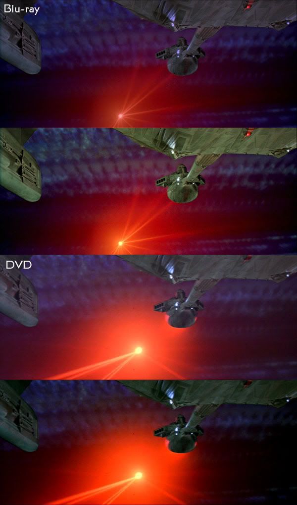
This is just a white/black balance. The DVD is a bit too dark, but at least the ship is green!