

- Time
- Post link
Thanks for the feedback! Obviously, this is still a WIP, and I appreciate having a fresh set of eyes looking at what I've got to see how I can make it better. :)

Timstuff said:
You can now see some screenshots of my edit in all their de-pinked glory!
Pretty awesome there Tim!
Just check a bit qui gon pic. It gets a green hue
Otherwise all the movie feels more vibrant and fresh!
Post some comparison videos too :D
Keep it up
-Angel
Thanks for the feedback! Obviously, this is still a WIP, and I appreciate having a fresh set of eyes looking at what I've got to see how I can make it better. :)

Look forward to footage.

Not for anything, but; you seem to have added a strange green tint to everything. And you crunched the lightsabers. :(
That was just the initial, "blanket adjustment." Since then I've started going into the individual scenes (and shots, in some instances) and giving them individual TLC. I'm making sure to avoid trading the pink tint for a green one, even though the sweet spot is a very fine line to walk. I'll put up some new screen shots later today, hopefully.
I just finished putting together a new compilation of screen shots for your enjoyment, one of which is a revisit of an earlier one to show how the project is looking after some fine tuning. Once I got over the intial "ZOMG IT'S NOT PINK ANYMOAR!!!" reaction, I was able to start looking at the color with a much more discerning eye, and I've rolled back the color correction quite a bit to so as to be more subtle and not accidentally go too far in the opposite direction, which would result in green, blue, or yellow looking images, and I'm also doing it on a scene-by-scene basis since each scene has its own individual needs.
I'm getting close to being able to call it a wrap on the color correction, and once that's all squared away I'll be able to get the whole thing rendered up and then put it back into Premiere for the final edits. Once it's back in Premiere, I'll be able to put out some video previews to tide y'all over until the DVD is ready.
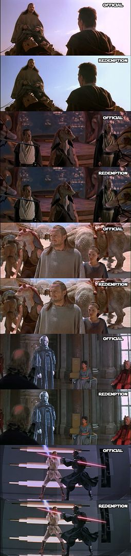
Also, all the rotoscoping is done, unless for some reason I think of something else that I want to change (I almost hope not, lol). While going through the film I noticed that a couple of holograms weren't monochrome, and I fixed those since in the PT color holograms haven't been invented yet (as you can see in the Palpatine comparison). Also, someone at school told me how one of their pet peeves with Episode I is that Darth Maul's lightsaber hilt disappears when he dies, so I digitally added one falling down the shaft with him. I'm no Adywan so don't expect much else from me in terms of fixes, but those problems just seemed so glaring to me that I had to do something. :P
It's still green. The sky is teal and the reddish greys become greenish greys.
Is your monitor properly adjusted? Maybe what looks white to you becomes greenish to everyone else.
I see it as the lesser of two evils. No matter how much I tweak it it's going to be one or the other, so I figure it's better to err on the side of the color that isn't as hard on the eyes.
Also, part of it is an optical illusion. Putting a pink image next to a gray one is going to naturally make the gray one seem green. It's same reason why someone's skin in a blue-tinted image looks like fleshtone, even though it's actually more of an off gray. If you look at one of the images alone though I think you'll find that it looks a lot less green looking than your mind may be telling you when it's next to the pink version.

Well on its own in the film the pink one looks white too. I still think it's a bit greenish still, and colour picking reveals a teal tint. Here's a quickie at fairly neutral:

To me, that looks like sepia. Different strokes for different folks, I suppose.
It's suprising how red/brownish a good gray appears. I guess that has to do with the whitepoint of sRGB? Or maybe LCD's just aren't up for the task of properly showing them. But a colour picking reveals that my attempt produces fairly neutral greys.

Timstuff, your colors are a definite improvement, but I have to agree that BmB's gray looks slightly better. What are you using for the color corection, may I ask? Sony Vegas?
After Effects.
Anyway, when you go about de-saturating grays there's a lot of problems you can potentially run into, especially since the original film print did not look like that. It's one thing to remove the blue tint from the OT DVDs, since that's not how the looked originally (and in all likeliness was just a transfer problem anyway), but it's another thing to take a movie that originally had more cool looking grays and trying to suck the color out of them, because you're going to suck the color out of a lot of other things as well.
Since my goal in this edit was to provide image quality that was more faithful to the theatrical version, I'm not going to try and desaturate the grays, especially since I lack the technical skills to do it without making everything look washed out. Someone else might be able to do it and make it look right, but for me I just don't feel like it's worth the hassle.

Timstuff, your colour correction is coming along nicely. I think you need to be somewhere between yours and BmB's as his too much of a brown/yellow tint to it. I know what a complete pain correcting this , and the other star wars movies can be. I can see straight away the problem you are having. It's the cyans because i had the same problem. It's a bi-product of removing the pink tint. In after effects, create a new composition and drag your colour corrected composition into the new one. Then to your composition layer add "effect>colourcorrection>hue/saturation". go to your effects control panel and in the hue/saturation effect select "cyan" in the "channel control" section. now in your colour bar drag the right side triangle a bit more into the green area (you will need to do a bit of trial and error here with how much of the green section you need to add when adjusting this next section). Now adjust the hue wheel towards + until the green tint is gone and it give a more neutral colour (towards blue). Again trial and error here. You can also adjust the saturation of each colour too. Very handy to adjust the reds when colour correcting because skin tones can become a little oversaturated. Just play with the filter with each colour to see how it affects the picture.
Hope this helps :)
Thanks Ady! I'd been doing my color correction using the curves tool, and finding the right balance was a pretty tricky process. I'll give your method a try, though!
yeh, sometimes you need to add more of the same filter to get the colour how you want it, tweaking a little more each time on certain colours
Well I certainly went overboard there (it also wasn't very accurate), I can't remember what the tint of the that scene is in the movie, but that is of course something you'd want retained. But on the other hand why are you colour correcting at all then? I'd say the "pink" is part of the expresssion of the film as much as the blue tint is of the scene.
Adywan, have you ever though about writing a basic guide to color correction at some point? I know much of it must be trial and error after a point, but I'm sure there are some basic pointers, such as you gave above, that people would find very useful when color correcting Star Wars and other films. (I don't if you're a Star Trek fan, but the blu-ray of The Wrath of Khan has the same blue tint as episode V, though perhaps not quite as bad.) More and more people seem to be attempting color correction in their Star Wars edits these days.
BmB said:
But on the other hand why are you colour correcting at all then? I'd say the "pink" is part of the expresssion of the film as much as the blue tint is of the scene.
Because it never originally had a pink tint. It didn't have a pink tint in the cinemas, it didn't have a pink tint in the broadcast theatrical version but suddenly got a pink tint for the DVD. Colouring problems due to the transfer. And here is the proof

As you can see, the redemption version is a lot closer to the original colouring of TPM. Every single DVD version of the whole saga has colour problems and does not represent the original colouring of the movies.

looks kinda good without the pink.
Any chance of painting out the jedi braid on kenobi there? since it's on the wrong side...
Well that's just sloppy.
In other news I thought I'd try to do a more accurate correction of that image just for fun.

Adywan, my grays look AWESOME now! Thank you! :)


There were two shots early in the film where I had to rotoscope Qui Gon's saber because I couldn't keep the Cyan desaturation from messing up the core of it (I'm sure I could have avoided it if I was willing to fiddle some more, but I decided rotoscoping was the easy way out), but other than that I'm having great results. I think tomorrow I'll bring my HDD to school and render the movie file up on one of the workstations. I think the color correction is just about done! :D
Yay, the funny green seems to be gone. :D
(There's still a subtle green and a subtle red to each of those but nothing jarring.)
Subtle, I can live with, because I think it's OK for the shots to have a little bit of character in that way. It's the really gawdy, obvious tints that I wanted to escape from, and I think that I'm able to do that now.
Also, another comparison pic!

This gets a bit more interesting every time I come back here. =)