- Time
- Post link
Wow. Just wow.
Wow. Just wow.

Jeez is it 2110 yet???? LOL
Damn Ady I wish I had a 10 of the talent not to mention patience!!!
Bingowings said: Do you want to see the project finished as a playable film or a flick book?

wow - again Ady proves how much time and painstaking effort he's putting into this awesome project.
I can't even mess with a little GIF animation for longer than a few minutes before going nuts, lol.

brash_stryker said:
Bingowings said:
Another re-jig of Angel's work, this time adding a bit of the atmosphere that Frink missed in the original.
I like it! Definitely an improvement. No offense to Angel, but everything seemed too crisp in his version.
The thing is, you don't want to go too white on the snow. Yes, snow is white, but it's also reflective. A field of snow under a blue sky will have just the slightest tinge of blue. I know we're looking to de-blue things, but this is one area where it can easily be overdone if one's not careful.
Avoid infestation. Rotate.

ron2112 said:
brash_stryker said:
Bingowings said:
Another re-jig of Angel's work, this time adding a bit of the atmosphere that Frink missed in the original.
I like it! Definitely an improvement. No offense to Angel, but everything seemed too crisp in his version.
The thing is, you don't want to go too white on the snow. Yes, snow is white, but it's also reflective. A field of snow under a blue sky will have just the slightest tinge of blue. I know we're looking to de-blue things, but this is one area where it can easily be overdone if one's not careful.
Some times these mockups go too far by half. Just take the original shot, add some people to the background interacting with the frigate, and maybe a silhouette of another one in the background.
No need for new mtns, new skies, etc.

I know it's not going to happen but just to illustrate what I was babbling about earlier this is roughly what I mean about Vader's cape (incorporated into Angel's mockup with the improved helmet) P.S. Is that a loveheart in the bottom corner of the shot?:


Bingowings said:
I know it's not going to happen but just to illustrate what I was babbling about earlier this is roughly what I mean about Vader's cape (incorporated into Angel's mockup with the improved helmet) P.S. Is that a loveheart in the bottom corner of the shot?:
And I dont know if you have noticed this, but whats up with that trooper to the right..hold his mouth "cape" thingy as he runs past..
it's quite noticeable in the film as well :)
Love the pics Angel, even better is that the helmet is fixed Wauw!
its nice with a cute heart, perhaps more females wants to see it then too :D
Star wars: Revisited. is now on facebook :)
http://www.facebook.com/swrevisited
It's the further adventures of Headbumptrooper somehow he must have escaped the destruction of the Death Star.

shanerjedi said:
ron2112 said:
brash_stryker said:
Bingowings said:
Another re-jig of Angel's work, this time adding a bit of the atmosphere that Frink missed in the original.
I like it! Definitely an improvement. No offense to Angel, but everything seemed too crisp in his version.
The thing is, you don't want to go too white on the snow. Yes, snow is white, but it's also reflective. A field of snow under a blue sky will have just the slightest tinge of blue. I know we're looking to de-blue things, but this is one area where it can easily be overdone if one's not careful.
Some times these mockups go too far by half. Just take the original shot, add some people to the background interacting with the frigate, and maybe a silhouette of another one in the background.
No need for new mtns, new skies, etc.
Define "go too far by half". How exactly are new mountains, new skies harmful? As long as continuity is protected I don't see any real harm. I'm not speaking to personal taste, I'm referring to actual "harm" to the project or film.
Shop smart! Shop... S Mart!

vaderios said:
-Angel
I like the contrast between the land and the sky on Vaderios's mockup.

Ganamae said:
And I dont know if you have noticed this, but whats up with that trooper to the right..hold his mouth "cape" thingy as he runs past..
it's quite noticeable in the film as well :)
Yeah that happens quite a bit. I guess the Empire is cutting corners on their design, or maybe Darth let one go and the trooper doesn't want to breathe it in. :)
And what's up with the two trooper face-mask designs? One looks plastic and fixed, while another is more flexible. (not from the image, but the film in general) Ahhhh, what're you gonna do?
O.T. or No T., baby!™

adywan said:
rpvee said:
vaderios said:
Because sometimes, something you cant have, is more sweet that something you already have, here 's a hint.
Vader factor +50
Ady into frustation +150
Doable? Live young or die hard
-Angel
That is SOOOO much better. That shot has bugged me for so many years now, that even just a fixed picture is awesome. Thanks!!! Now if Adywan can do that, I'd not only be very impressed (because I have no idea how the above image was even done), but also very happy! lol
The helmet has already been fixed. It was a nightmare to do in motion but i managed to pull it off in the end (after tearing most of my hair out. lol)
You've heard this hundreds of times, but you're amazing!!! How on earth did you do the helmet in motion? With reflections and everything?!
I can't wait for this to be finished, but I know that patience is needed. How long does it usually take for a fanedit to appear on the page with all the Rapidshare-jDownloader links? That's the only place I know to get them, and I when ESBR gets up there, I want to get it ASAP since Jdownloader takes so long to begin with.

Well mostl of my mockups are made through photographic POV and less to movie like. I m trying :D Its bad that i have Michael Bay (Mr. Awesome) as guide to frame shots? :P
I see now that i overdid it. its like i worked on it and didnt mind to doublecheck it ( as i do usually from rush). Feel free to enhance/improve/remake my mockups.
Thats why i dont put watermarks on them ( i did but i stopped)
Now move along
-Angel

rpvee said:
I can't wait for this to be finished, but I know that patience is needed. How long does it usually take for a fanedit to appear on the page with all the Rapidshare-jDownloader links? That's the only place I know to get them, and I when ESBR gets up there, I want to get it ASAP since Jdownloader takes so long to begin with.
Lol your second sentence is at odds with the second half of your first sentence. It's way to early too ask that kind of question.
5 by 5 said:
shanerjedi said:
ron2112 said:
brash_stryker said:
Bingowings said:
Another re-jig of Angel's work, this time adding a bit of the atmosphere that Frink missed in the original.
I like it! Definitely an improvement. No offense to Angel, but everything seemed too crisp in his version.
The thing is, you don't want to go too white on the snow. Yes, snow is white, but it's also reflective. A field of snow under a blue sky will have just the slightest tinge of blue. I know we're looking to de-blue things, but this is one area where it can easily be overdone if one's not careful.
Some times these mockups go too far by half. Just take the original shot, add some people to the background interacting with the frigate, and maybe a silhouette of another one in the background.
No need for new mtns, new skies, etc.
Define "go too far by half". How exactly are new mountains, new skies harmful? As long as continuity is protected I don't see any real harm. I'm not speaking to personal taste, I'm referring to actual "harm" to the project or film.
I didn't say "harm". You did. All I meant by "too far by half" is that the mockups work best when they take an existing shot and add bits here and there, not keeping bits and creating the rest.
One thing that would help is to put one of the freighters slightly out of frame instead of all of them right in the middle.

What bothers me most is the snow. It looks like a close-up, and there's not a single footprint. How does that work? :P
I do like the upper half though!

DarthBo said:
What bothers me most is the snow. It looks like a close-up, and there's not a single footprint. How does that work? :P
LOL I did not even notice that until now after you mention it,where are the footprints,that is a damn good question,they must ALL be wearing hover boots.
I have been just as amazed as everyone else on these mock ups and did not even catch that,footprints LOL.
Also ADYWAN you have a PM,please check your box,Thanks.

DarthBo said:
I do like the upper half though!
Nice of you to say. I am quite handsome, aren't I?
DarthBo said:
What bothers me most is the snow. It looks like a close-up, and there's not a single footprint. How does that work? :P
I do like the upper half though!
Well, I think Angel intends his mock ups to be more proof of concept or to stimulate new ideas. They're not really supposed to be finished shots.

The Hoth mock up is great, but it's not perfect.
What is perfect is the concept, I think it would be much better to show more of the evacuation as this mock up does.
In Rogue Squadron 2 and 3 you actually see something very similar to this.
In the Complete Locations book they describe an outside transport evacuation zone.
"She's never seen Star Wars?!?!
Ted the only people in the universe who haven't seen Star Wars,
are the characters in Star Wars and that’s cause they lived them Ted,
that’s cause they lived the Star Wars!”

rpvee said:
Enigmas said:
rpvee said:
vaderios said:
rpvee said:
One thing that annoys me a bit about when Vader enters Echo Base. His helmet seems wierd... like extra short or something. It's hard to explain.
Actually you have absolutely right. The helmet of vader, changes all the time. The one you pointed as short is the one that when he turns his head to the right direction, right?. Well that helmet supposed to be the first helmet to be in production and its from ANH as well. the mask and the helmet is glued together so there is no way to be separated. but after that they rethink the length of the helmet:)
Nice mockup there Bingo :)
-Angel
Thanks for the link. The shortness in that one shot is really annoying, though. I don't know what bugs me about it, it just doesn't look right, I guess. Adywan, you couldn't do anything to fix the helmet in that scene, could you?
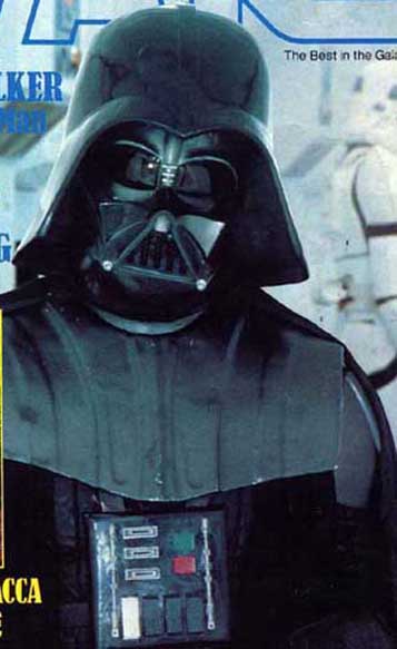
Is that not the worst photo of Vader you've ever seen? The helmet is crooked and the chest plate is... completely wrong.
It's just Vader's version of a bad hair day.
Its terrible when you get wind under your helmet...
I am a kite dancing in a hurricane …
As the late Marcus Brody said, "That's what the Hebrews thought".

i had a dream that this was all done. the film was so awsome! then i woke up and i was dissapointed. :(

We only have a few monthes to go!

THIS HAS ALWAYS BOTHERED ME! WHY THE FRACK IS VADER'S HELMET SO SHORT!!??
Me Love you long time Ady woot woot!