
- Time
- Post link
Hey, I completely forgot about this thread.
Is anybody interested in screenshots from my last version ?
Hey, I completely forgot about this thread.
Is anybody interested in screenshots from my last version ?

Sure!
You know of the rebellion against the Empire?

YES! :-)
OK :-)
First of all I have to apologize for the screenshots, they're taken directly from the DVD, which means they're full 720x576, and they're taken from VirtualDubMod which means that the aspect ratio is wrong (but the video is of course correct).
A couple of randomly taken shots
Which company did distribute it ?

Episode ... Ehm, which episode ?

Under attack

All men to attack position

There will be no escape for the princess ... ehm Captain this time

Droid escape

What happened to the message you intercepted ?

I love dewbacks

Luke doesn't go to the academy next year

Ben's luxury hut

Entré to Mos Eisley

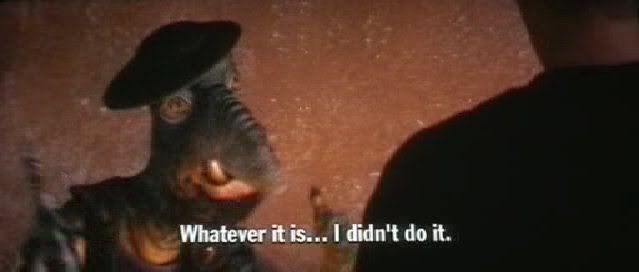
Going somewhere, Solo ? (with recreated subtitles)

Enough for now, do you have special requests for some scenes ?
I don't like the colors on some scenes (especially those created by colorlike) and I'm still not 100% satisfied with the Greedo font

Yeah, the Greedo font isn't quite right. It looks close...
The detail on the caps are pretty good at that size.
The screen caps look great, pittrek! :-)

Am I wrong in saying that the subs are also a little too high up? This is looking promising.
A Goon in a Gaggle of 'em
I was thinking the same thing- maybe they look that way because the image is vertically squished?
Hey, you like it ? Glad :-)
The subtitles are of course recreated, and done in AviSynth.
They're done by some script which I had from this site, I'm not sure about the author (I've done this last version last summer). Here is the same frame, after cropping and resizing to 720x326, does it look better ?

The main problem is that I don't have a proper reference for the font and position of the subtitles, all I have are screenshots from the terribly looking widescreen theatrical version, and Darth Editoud & Adywan's edits. Is any of the fanedits a good representation of the original subtitles ?

EditDroid?
"Right now the coffees are doing their final work." (Airi, Masked Rider Den-o episode 1)
The Editdroid's subs are the same as the laserdiscs.
There is a thread somewhere on here with references to the subs. I'll look around...

this might be of some help

hopefully this may help you. they are the complete pre-ANH theatrical subtitles taken from Moth3rs bootleg xvid

Based on that, the subtitle placement looks pretty accurate.
Yes, the position looks correct, but I think my subtitles are slightly too wide, what do you think ?
BTW thanks Adywan, I know it was posted here already but I still can't use this new forum software :)
pittrek said:Yes, the position looks correct, but I think my subtitles are slightly too wide, what do you think ?
Maybe a smidge- just looking at where the first and last letters fall on Greedo's and Han's sleeves. The typeface itself might be a point or 2 too large overall.

Maybe a little late but...
I'm pretty sure the original font used for Greedo's lines was "News Gothic". The text also had a shadow behind it.
It would be cool to replicate it. ("News Gothic" was also used for the Italian language on the first GODFATHER.)
We want you to be aware that we have no plans—now or in the future—to restore the earlier versions.
Sincerely, Lynne Hale publicity@lucasfilm.com
I'm pretty sure it's Franklin Gothic Demi Cond. Could be easily done with any SSA-compatible subtitle filter.
"Right now the coffees are doing their final work." (Airi, Masked Rider Den-o episode 1)

I've been working on making my own DVD collection that contains every version of the OT that I desire. My DVD collection will go like this: ANH: first disc: Adywan Revisited, Second disc: Purist Version, Third disc: GOUT, Forth disc: Deleted Magic. ESB: first disc: Revisited (when finished), Second Disc: Pursit (or GOUT if there isn't one), Third Disc: Building Empire. ROTJ: first disc: Revisited (when finished), Second disc: Pursist or GOUT, Third disc: Returning to Jedi and then the bonus disc from the '04 DVD will be included too.
I will convert the GOUT to anamorphic and burn them again. It sounds like the GOUT is still the best source of the classics. OPCmovie's classic versions sound pretty good, but ChainsawAsh said they are buggy.
Funny thing is, the only official thing from Lucasfilm that I am including in my set is the bonus DVD and even that, I'm a little reluctant to include. It only has trailers and the Empire of Dreams documentary with a lot of icky SE footage, and most of the stuff in that is covered in Deleted Magic and more thoroughly.
I thought they replaced News Gothic with Franklin Gothic Demi Cond. in the Special Editions and used it in the Prequels. I could be wrong, they are very similar though.
We want you to be aware that we have no plans—now or in the future—to restore the earlier versions.
Sincerely, Lynne Hale publicity@lucasfilm.com
Thanks for reviving this old thread. ;-)
SEs used Alternate Gothic 2, I thought...or at least, the 1993 LD, 1995 VHS and TPM 1999 VHS all used Alternate Gothic 2.
"Right now the coffees are doing their final work." (Airi, Masked Rider Den-o episode 1)
I'm trying to figuring out what font was used for Greedo's language in the 1977 print, if the font is still available and/or have been digitized. I'm beginning to think that TradeGothic may be the one. Many have suggested that it was Franklin Gothic Demi Cond, but I think that was the font used for the SE and the Prequels.
In Puggo's restoration, you can see it a little better than before:

And another one:

Any suggestions?
We want you to be aware that we have no plans—now or in the future—to restore the earlier versions.
Sincerely, Lynne Hale publicity@lucasfilm.com

Wow, this thread is a blast from the past! ;)
Looking at the examples, I would say it looks like a blurrier version of TradeGothic LT Bold. The 'g' is the key, I think. Look at how much higher that little bit sticking out on top is in the Franklin ones, whereas the TradeGothics are level with the top of the g.
Ripplin said:
Wow, this thread is a blast from the past! ;)
Yeah, I couldn't find the actual thread for it ;)
Ripplin said:
Looking at the examples, I would say it looks like a blurrier version of TradeGothic LT Bold. The 'g' is the key, I think. Look at how much higher that little bit sticking out on top is in the Franklin ones, whereas the TradeGothics are level with the top of the g.
Exactly my thoughts, I just included it for the popular belief that Franklin is the one. But I'm still not entirely sure about TradeGothic.
We want you to be aware that we have no plans—now or in the future—to restore the earlier versions.
Sincerely, Lynne Hale publicity@lucasfilm.com