- Time
- Post link
IndyFan89 said:ughh! How much longer are we gonna have to wait to see this fan-edit!
Depends which one you're referring to I guess. There's more than one currently being worked on.
IndyFan89 said:ughh! How much longer are we gonna have to wait to see this fan-edit!
Depends which one you're referring to I guess. There's more than one currently being worked on.

IndyFan89 said:ughh! How much longer are we gonna have to wait to see this fan-edit!
Relax, new guy. Or just make your own! Easy-peasy!

I've made some tests regarding the newspaper shot in the Dean's office.
Newspaper Version 1 (the pure 1080p-shot with the newspaper inserted)
Newspaper Version 2 (the shot rescaled to 720p with added panning an zooming to frame the paper better)
Newspaper Version 3 (the same as version 2, but with part of the video slowed down to keep the paper in the frame for a longer time)
The newspaper itself is just a dummy... the content has to be changed (obviously), the finished thing would be photorealistic and the masks (to keep stuff "in front" of the newspaper) aren't final... this is just a "quick" test.
Does it work?

^ Very nice, man! Well executed! With a more realistic newspaper, as you say, along with the right headline, this could be a brilliant way of tying up the Indy-under-investigation subplot!
Can't decide between your versions. Maybe the third one is a bit too slow? Then again, I suppose you do need time to take in the newspaper. But as it's only a headline/maybe a picture you'd be seeing, would you really need a lot of time?

Laserschwert said:I've made some tests regarding the newspaper shot in the Dean's office.
Newspaper Version 1 (the pure 1080p-shot with the newspaper inserted)
Newspaper Version 2 (the shot rescaled to 720p with added panning an zooming to frame the paper better)
Newspaper Version 3 (the same as version 2, but with part of the video slowed down to keep the paper in the frame for a longer time)
The newspaper itself is just a dummy... the content has to be changed (obviously), the finished thing would be photorealistic and the masks (to keep stuff "in front" of the newspaper) aren't final... this is just a "quick" test.
Does it work?
Hey Laser,
I think the effect is well done. If I had any suggestion it would be to lose the double fold of the newspaper. I'd just have it folded in half so you could see the entire upper half of the paper. I think that would catch the eye better and be more immediately obvious that it is a newspaper. It would also provide more room for title and picture to catch the eye quicker.
Ryan
HeKS said:If I had any suggestion it would be to lose the double fold of the newspaper.
I've had it folded in half at first, but there wasn't enough empty space on the table to have it that way, without putting it at an angle that makes it hard to read. Maybe Indy didn't make it to page 1 anyway, so his article is only 1/4 page...
Anyway, the next step would be to design the page itself...
topdawg193 said:Can't decide between your versions. Maybe the third one is a bit too slow? Then again, I suppose you do need time to take in the newspaper. But as it's only a headline/maybe a picture you'd be seeing, would you really need a lot of time?
I'm not sure either... but after all this is probably the simplest and most subtle way to integrate the newspaper... and if we have a short but concise headline, a short glimpse might be enough to "get it".

Very nice, Laser! I think two is the best, as one is too quick and three is unnaturally slow. Keep up the great work!

Holy crap. That is incredible.
Nice freakin work, Laser. Serisouly. Keep it up!
List of propsed changes to Indiana Jones and the Kingdom of the Crystal Skull http://originaltrilogy.com/forum/topic.cfm/Kingdom-of-the-Crystal-Skull-Edit-Suggestions/topic/9732/

Very good! I was a bit skeptical at first, if it was doable, but this looks great. Version 3 doesn't work as good as the other two; to me the slowdown feels "unnatural". Great stuff! :-)

holy smoke
thats looks awsome
wow
has any one attemped the news reel around spalko thing yet
Good work Laser, those were pretty good. A little rough, but good. I think that it should go a long way to tie up that loose end. Will you be making the final footage available to other editors?
Sluggo said:Will you be making the final footage available to other editors?
Of course... looks like that's probably the main thing I'll be doing, providing the digital edits on shots needed for other fan-edits. My own edit might take a few more years anyway, so I'll try to help out.
ImperialFighter said:jones1899 said:So when can we expect to see the something?
Well doubleofive has kindly done a little something extra that I asked for, so I have everything I need to suggest my preferred 'beginning' and 'ending' now. Despite a busy schedule this week, I'm aiming to find time to finish it all off, and post all my comments here no later than 5 days from today.
Quick update before I head off to work, just to say that my ideas will have to wait just a little longer before I can post them up here unfortunately.
'aiming to find time' were the relevant words in my recent post, but try as I could, there's just too much day-to-day stuff going on at present to fully complete the seperate (there's built-in limitations on the forum) posts I'm working on for this. I don't really want to post the ones that are completed, until I can show everything at once. I thought I'd have more time by today, but have only managed a little more here and there over the last few days. Life eh?
Anyway, after seeing Laserschwert's schedule, I guess a little longer to show this won't make much difference, lol.
Imperial, so you have some of it completed then?
Any chance of you reconsidering your wish to wait until its all done before posting anything? At least a taste of whats to come...?
List of propsed changes to Indiana Jones and the Kingdom of the Crystal Skull http://originaltrilogy.com/forum/topic.cfm/Kingdom-of-the-Crystal-Skull-Edit-Suggestions/topic/9732/
Here's the (more or less) "photoreal" newspaper:
Version 1 (full 1080p)
Version 2 (720p with panning and zooming)
The masks are still the same, so the Dean's arm is still going behind the newspaper, and the bible's edges are still a bit rough when it goes in front of the paper. I'll fix those when finalizing the thing with a proper article. Any ideas on that?
Laserschwert said:Here's the (more or less) "photoreal" newspaper:
Version 1 (full 1080p)
Version 2 (720p with panning and zooming)
The masks are still the same, so the Dean's arm is still going behind the newspaper, and the bible's edges are still a bit rough when it goes in front of the paper. I'll fix those when finalizing the thing with a proper article. Any ideas on that?
Great work, Laser! It really looks like the newspaper was on the table when they shot the scene!
Laserschwert said:Here's the (more or less) "photoreal" newspaper:
Version 1 (full 1080p)
Version 2 (720p with panning and zooming)
The masks are still the same, so the Dean's arm is still going behind the newspaper, and the bible's edges are still a bit rough when it goes in front of the paper. I'll fix those when finalizing the thing with a proper article. Any ideas on that?
That's lookin' nice laser. What software are you using to do the modeling and camera match rendering?
Ryan
Boujou for matchmoving and 3dsmax with VRay for modeling and rendering.
Laser, that is awesome. Really nice work.
I asked a friend if they could point out the object in the room that was added digitally - they couldn't.
List of propsed changes to Indiana Jones and the Kingdom of the Crystal Skull http://originaltrilogy.com/forum/topic.cfm/Kingdom-of-the-Crystal-Skull-Edit-Suggestions/topic/9732/
Laserschwert said:Boujou for matchmoving and 3dsmax with VRay for modeling and rendering.
I'm not familiar with Boujou, but I use 3DS MAX and VRay as well. They are what I used to to produce the images I posted a few pages back in this thread. I'm thinking of taking a look at zbrush and mudbox cause I'd like to start learning to do some character modeling and I hear they're good for that.
Ryan
jones1899 said:Imperial, so you have some of it completed then?
Any chance of you reconsidering your wish to wait until its all done before posting anything? At least a taste of whats to come...?
** 1ST POST **
Okay jones1899 and any others interested....it wasn't my ideal intention, but as it's looking that I probably won't get the chance to finish all this up as soon as I'd like to after all, I will indeed start off with just a couple of my opening posts, just to finally get some of this off and running for you to look at....
While my 'ending' scenario involves a very long post that I'm not finding the time to complete yet, I can offer you some thoughts to do with the 'beginning' of 'INDY 4' in the meantime.
I'm not currently in a position to do an edit of this myself, but there may be something (out of everything eventually) that someone else likes and may wish to use themselves.
(I'd like to say a big thanks to doubleofive for taking the time to organise all the necessary screenshots I required. It's very much appreciated.)
ImperialFighter said:
Just how the gopher fits in, will have to wait.... ;)
Ideally, it DOESN'T! :)
I'd gladly lose the initial 'transition shot' of the 'PARAMOUNT' logo fading into the shape of the 'gopher'-mound altogether, so that the opening of 'INDY 4' becomes a 'gopher'-free zone....
** 2ND POST **
Unlike each precious movie in the previous trilogy, it pains me to say that there are just so many annoyingly misjudged-moments throughout 'INDIANA JONES AND THE KINGDOM OF THE CRYSTAL SKULL' that I'd like to see removed or altered (starting with that mouthful of a 'title'!), that I won't be rewatching the 'theatrical cut' again anytime soon....which is a pity, as there are some good moments in it.
Currently, there are just too many flippant and unfunny, 'dumbed-down' scenes for my own 'Indy' tastes, but while 'KOTCS' is a misfire in my book due to other reasons too, I DO agree that certain alterations here and there could give it a different 'tone' that I'd much prefer. Most of these potential changes have been already covered in this thread, and I'm hopeful that there'll eventually be a fanedit by someone that can salvage the movie into something less cringe-worthy at times.
In the meantime, here's my own take on how I'd like 'INDY 4' to look, where the 'BEGINNING' and 'ENDING' scenes are concerned -
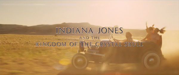
OPENING 'CREDITS' / 'MAIN TITLE' SEQUENCE
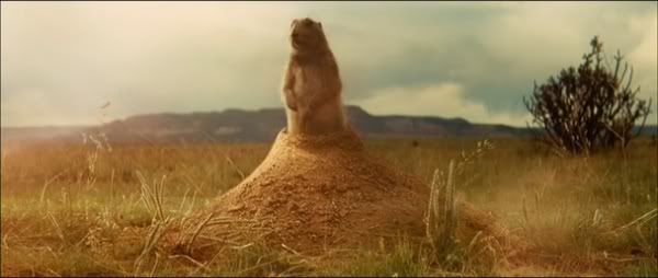
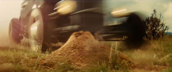
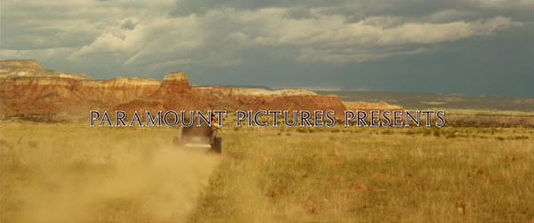
(to briefly recap - we currently see a silent 8 seconds long 'LUCASFILM' logo followed by a 6 seconds long 'PARAMOUNT' logo which is accompanied throughout by a short, steady 9 seconds long 'mysterious'-sounding John William's 'cue', before eventually 'fading'-out to reveal the 'matching' shape of a 'gopher'-mound....out of which pops a chirping 'gopher', as we then start to hear the strains of 'Hound Dog' by Elvis....just before the 'gopher' squeals as it leaps out of the way, as a 'hotrod' full of whooping teenagers runs over the 'gopher'-mound....)
Although I like 'Elvis' as much as the next guy....hearing 'You 'aint a nothin' but a hound dog, cryin' all the time' at the moment we see a 'prairie dog' and his pals scatter, is just grating, and not quite the 'opening' scene that I'd hoped for in this long-awaited sequel. Some equally-annoying, inane antics involving some of the 'hotrod racing the convoy' scenes complete a disappointing start to the movie for me.
However, although it's NOT my own first choice for an 'opening' sequence, I appreciate that certain edits of 'INDY 4' will stick to this whole current version, because that's the footage onto which the intro. 'credits' and 'main title' have been superimposed, at the end of the day. (the 'hotrod racing the convoy' footage DOES include some neat shots, but there are SO MANY various 'credits' overlayed throughout the sequence, it makes the exact, shortened-version I would have preferred, unworkable unfortunately....so there's little point in describing it)
Still, as far as keeping the current 'intro.' is concerned, I'd at least like to see the 'gopher's' appearance REMOVED altogether....and INSTEAD 'fade-out' from a slightly-shortened 'PARAMOUNT' logo DIRECTLY into the the faster-paced, more dramatic-looking (and sounding) shot of the 'hotrod' running over the 'gopher'-mound (starting at the point where the 'gopher' has just left the frame), as it scatters debris everywhere, then quickly recedes away from us....
(Note: although a DIRECT 'fade'-out from the 'PARAMOUNT' logo to the new shot would be nice, I reckon that a brief fade' to black BETWEEN the 'PARAMOUNT' logo and the new shot would work equally well, especially if the 9 seconds long 'mysterious'-sounding John Williams 'cue' can be timed to 'fade'-into the noise of the new shot starting, no matter which way the shot is introduced)
So the current 'intro.' would look something like this now -
We start to hear the short, steady 9 seconds long 'mysterious'-sounding John Williams 'cue' now begin sometime DURING the previously silent 'LUCASFILM' logo, which continues for the DURATION of a now slightly-shortened 'PARAMOUNT' logo....
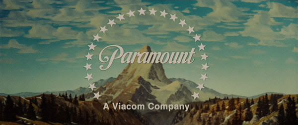
....until the 'cue' fades into the sudden noise of the 'hotrod' and it's passenger's 'whooping', when the now slightly- shortened 'PARAMOUNT' logo 'fades-out' DIRECTLY into this shot INSTEAD....
....and we only begin to hear the 'Elvis' song for the first time at this point now, as the noise of the 'hotrod' quickly recedes....
....and the footage proceeds as currently seen, with the 'main title' and various 'credits' superimposed over the inane antics that follow....
....still, at least we'd get rid of the 'gopher' with this scenario! :)
It's only a small tweak, but one that would certainly improve the current 'intro.' for me. (However, any potential version that DOES include the 'transition shot' of the 'gopher' would be tolerable to me, so long as the REST of the 'gopher' appearances thereafter are toned down or removed....so that they don't turn into a poor 'running gag' anymore. And I agree that even the removal of the 'sounds' it makes, would be an improvement)
For this particular entry in the franchise, I'd hoped for a return to an 'opening' scene that somewhat more closely approached the mysterious 'tone' of the 'RAIDERS' one, with it's marvellous eerily-atmosperic John Williams score....rather than another raucous, jokey entrance, this time set to a 'pop' tune!
So while it's by no means the worst sequence in the movie to me, I ain't ever gonna love it in it's current form....especially since there is a DIFFERENT sequence that I'd far rather had been used as the 'BEGINNING' of this movie INSTEAD....
** 3RD POST **
So here we go then. This is how I would have much preferred the 'BEGINNING' of the movie to have ACTUALLY started, as this would have set a very different, more serious 'tone' overall, compared to the current version.
'INDY 4' could have started off in a more dramatic, suddenly explosive way....

We start to hear the short, steady 9 seconds long 'mysterious'-sounding John Williams 'cue' now begin sometime DURING the previously silent 'LUCASFILM' logo, which continues for the DURATION of a now slightly-shortened 'PARAMOUNT' logo....

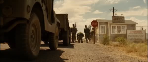
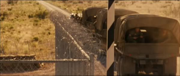
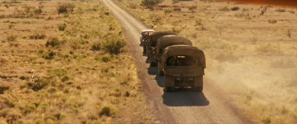
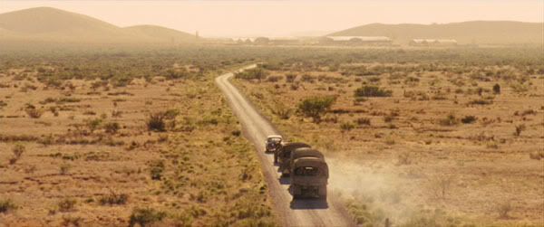
....until the 'cue' fades into sound of the vehicles in the following shot....as we bypass the whole EXISTING 'credits' intro. involving the 'gopher' and 'hotrod racing convoy' opening altogether (although we'd sadly lose the 'main title' also....or happily lose it, depending on your point of view....but more on that shortly), and INSTEAD 'fade'-out from the 'PARAMOUNT' logo DIRECTLY to the long-shot of the 'convoy approaching the US base checkpoint'....starting at the point IMMEDIATELY AFTER the 'credit' saying 'Directed by Steven Spielberg' completely fades-out....
(And again, a DIRECT 'fade'-out from the 'PARAMOUNT' logo into this new 'opening' shot would be nice, but a brief 'fade' to black between the logo and this first shot would be equally good, especially if the 9 seconds long 'mysterious' cue can be timed to 'fade'-into the initial sound of the 'convoy' vehicles)
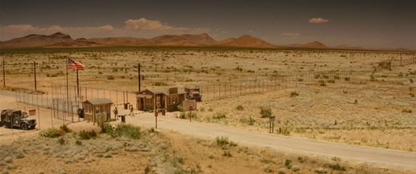
....there is no music 'score' at this point, as we hear only the sound of the convoy entering the frame and slowing to a halt, before the establishing words 'NEVADA 1957' appear....
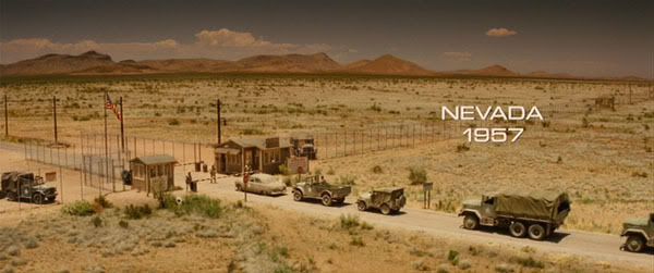
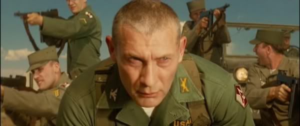
....and we continue (as per the movie) onto a scene involving the Army Police guards advising the 'US convoy' that the area is restricted for the next 24 hours and cannot be entered. As the 'US Colonel' in charge of the convoy approaches the guards, we unexpectedly see him kneel down as various other 'US soldiers' suddenly open fire behind him....
At this point, I would have preferred to have seen the shot cut HERE on the 'close-up' of Dovchenko's face at the exact point seen above, IMMEDIATELY BEFORE the camera then 'panned downwards' to show his hands tying his bootlace....as I just reckon this would have been a far better, more striking image to finish on.
We'd INSTEAD cut DIRECTLY to the beginning of the very next shot which then shows Dovchenko just beginning to get up.
(Note: We start to hear the first few notes of a short but atmosperic John Williams' 'cue' begin during the 'bootlace tying' moment, but the same notes repeat at the very start of the shot below anyway, and gradually build nicely from there onwards, so we are not losing anything of importance. It's no biggie to keep the 'boot tying' at the end of the day, though I just don't think it's such a good visual.
....as this first section of John Williams' score builds nicely from this point, we carry on (as per the movie)....
....until the camera 'pans upwards' to reveal the appearance of the 'main title' at this point, which lasts for 5 seconds onscreen (the same length as the actual one)....
....until it eventually 'fades'-out BEFORE the shot (and the 'cue') suddenly end HERE....
....as we then cut to the shot below of the 'car boot' being opened (as per the movie)....
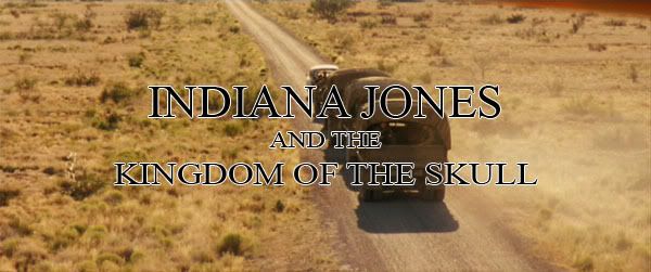
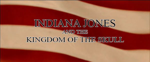
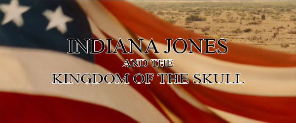
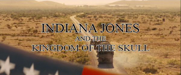
WHATEVER 'main title' for 'INDY 4' that anyone prefers, I would ideally have liked to have seen it superimposed over the 'convoy passing the flag' shot shown above in this alternative 'opening' sequence (WITHOUT any additional 'credits' over the rest of the footage), where it would have tied-in nicely with the short accompanying John Williams score at this point.
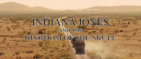
As a Brit, I see 'Indy' as one of the ultimate all-American action heroes, and would have been more than happy to see that highlighted during the 'stars and stripes' moment. For the purposes of this rough 'mock-up' (thanks again doubleofive), I've now decided my own personal favourite 'title' is definately 'INDIANA JONES AND THE KINGDOM OF THE SKULL'....since it sticks closely to the actual title, but isn't such a mouthful, and also doesn't give away the 'crystal' nature of the skull involved.
My own preference would have been to see the actual 'INDIANA JONES' logo fonts being used once again in this fourth movie, as I really like the imagery of that. However, the EXISTING plain font (seen in my 2nd post) would work well enough with this more serious 'opening' too, I guess. Either way, I'd ALSO be more than content to do WITHOUT an actual 'main title' for 'INDY 4', and settle for just seeing the establishing 'Nevada 1957' wording at the beginning, as long as I could see the movie start with this footage instead!
(Note: In the current opening, the 'main title' appears onscreen 26 seconds after the 'PARAMOUNT' logo 'fades'-out, whereas in this alternative 'opening', it would appear 1 min. 05 seconds after the 'PARAMOUNT' logo ends. However, I'd have been happy to wait longer for the 'main title' to appear at this point anyway, rather than over the 'hotrod'....)
So this brings us up to where the 'car boot' is opened....but you'll have to wait till I find enough time to properly finish up my NEXT post showing my preferred alterations to the rest of the 'Spalko' sequence, right up until we enter the 'US warehouse'.
(This will show exactly how I'd like to have seen the 'Mac's legs' and 'raised / dropped arms' continuity errors sorted among other things)
And AFTER that, I'll eventually post my 'ending'. :)

I think it's a good opening!
I like the title on the flag. And I think it is overall a much better opening for an Indy Movie. (tough I really like the car "chase" opening too.)
But one thing needs to be take care of: not to use the "directed by steven spielberg" that appears right before the "nevada 57". Then we could put the names of the actors when we see them for the first time (maybe it will be shown in your next pictures?). And only after that "directed by..."
Looking forward the next pictures! :)

He didn't have me mock up any more credits, so I don't think he planned at all to have opening credits. It's a loss, but not much of one.
You know, its weird taking so many shots for someone and still having no clue what he's planning. So far, I like it a lot. Beginning with the Elvis and car chase was a bit much. I saw the movie in theaters with a friend, his first Indiana Jones movie (he's young(er)!). I think opening with that turned him off, or mislead him as to what kind of movie this was supposed to be.
Like "Anything Goes" is better in that regard, but I like "Anything Goes". It's catchy.
Star Wars Revisited Wordpress
Star Wars Visual Comparisons WordPress