
- Time
- Post link
JediMasterFisher said:THat image is beautiful omg! :D
so ady, 2010 is the absolute confirmed release of ESBR? or is that just a goal you're making for yourself? i'm getting to excited to wait!

THat image is beautiful omg! :D
My Youtube Accounts OfficialPeterFisher http://www.youtube.com/user/OfficialPeterFisher and JediMasterFisher http://www.youtube.com/user/JediMasterFisher
JediMasterFisher said:THat image is beautiful omg! :D
so ady, 2010 is the absolute confirmed release of ESBR? or is that just a goal you're making for yourself? i'm getting to excited to wait!

WOW Ady, you hooked it up again! GREAT image!!!!!
_________________
In the Works - TMNT:Return to New York -

We won't have an absolutely confirmed release date until the film is actually finished.

Ady's work is always worth the wait. Although I am also somewhat impatient, I know the result is what counts - and Empire is one that deserves the time.

oh_riginal said:vaderios said:Here take the pic and try it out :)
-Angel
http://www.youtube.com/watch?v=0jjOvtOp_QI
Here is my 2nd attempt at it. This time I used the screen image from TPM, though I had to blow it up to work, so its pretty pixelated, but its still the type of image I would like to see on the screen, rather than the one in AOTC.
Thanks for the pic!
So now that a few days have passed for me since really having this chance to show my idea visually, I'm beginning to become curious for feedback.
What makes this idea work or not work, in your eyes?
Also, it relates to ESB, so its not entirely off topic! Control, control, we must learn control!
“Lifes a song you don’t get to rehearse, and every single verse can make it that much worse”

oh_riginal said:oh_riginal said:vaderios said:Here take the pic and try it out :)
-Angel
http://www.youtube.com/watch?v=0jjOvtOp_QI
Here is my 2nd attempt at it. This time I used the screen image from TPM, though I had to blow it up to work, so its pretty pixelated, but its still the type of image I would like to see on the screen, rather than the one in AOTC.
Thanks for the pic!
So now that a few days have passed for me since really having this chance to show my idea visually, I'm beginning to become curious for feedback.
What makes this idea work or not work, in your eyes?
Also, it relates to ESB, so its not entirely off topic! Control, control, we must learn control!
I don't think your idea works. I feel the scene is supposed to show Leia feeling more comfortable with Han. The focus is on their faces and their body language. cutting back and forth from faces to what is shown on the screen is jarring and loses the focus.
On another note, I kinda like that we don't see what the they are looking at. Similar to the wampa scene, less is more.
-porkins

Yeah, it's not necessary to see what they see - we get it from seeing their faces. That's something many modern films are guilty of - showing us stuff we don't need to see because they can, or because they don't think the audience is smart enough to get it.

I agree.
But to answer the question directly, the design of the 'monitor' is buried way too deep in its housing to make it look appealing. It looks more like a square cup-holder than a monitor. Maybe if you had a better display surface, you would get better results.
And the ESB:R Select #1 is beautiful, Ady. Good work as always!

Also agreed with those that think the viewscreen is unnecessary. We don't need to see it. It's about quiet time and facial reactions. Heh.

adywan said:
That is good. Maybe a bit more blue to the sky to make a slight contrast.
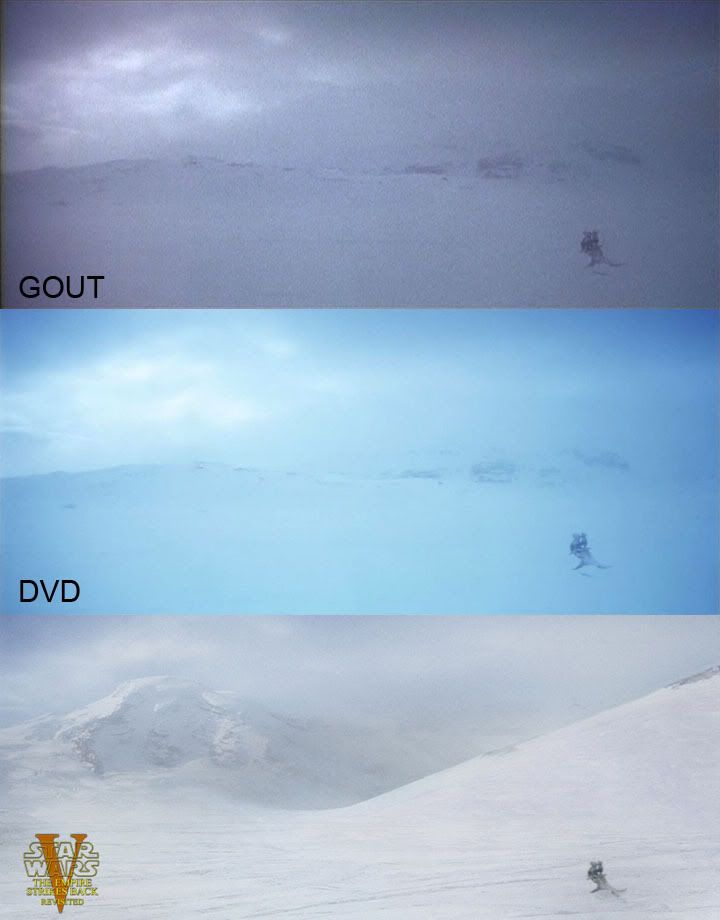
Still id like to see that when the snowspeeders searching for Han and Luke the mountains in the background are completely different. More rocky.
-Angel

Hey Ady, I was just glancing at the excellent comparisons you have in the first post when I noticed something:

Were these just temporary starfields?

...
wow
Oh my god. Someone has plenty time in his hands :) J/K.
Its a good note tho ;)
-Angel

Never in a trillion lightyears would I notice that...
Now I'm gonna see it everytime..... =P haha

Who had the nerd crown round here? Cos you Tobar my friend, shall now receive it with grace!!!


I believe that was me, curtsesy of my rank badge post. I guess I've now been dethroned ;)
That snow picture is awesome by the way. Really gives you an idea of how great the finished edit will be.
edit: Sorry, double post.
Siliconmaster482 said: Edit: And on a curious note, where exactly is that shot? I can't place it off the top of my head, and I'd rather not watch the entire first half-hour. : )
here :)
Still i like the sky has a bit more blue to popup
-Angel
Sluggo said:I agree.
But to answer the question directly, the design of the 'monitor' is buried way too deep in its housing to make it look appealing. It looks more like a square cup-holder than a monitor. Maybe if you had a better display surface, you would get better results.
Like I mentioned before, finding a better dashboard image just didn't happen for me, as hard as I tried. My question is really more about the idea, rather than what I put together. It is really just for giving a visual example of what I had in mind.
Seems everyone is against the idea though, so I'll step down. Thanks for the feedback, everyone.
“Lifes a song you don’t get to rehearse, and every single verse can make it that much worse”

Sorry, I'm really excited about Wookie Groomer's Split Screen I got, so I have to show some comparisons.
So much better than any color correction. Speaking of color correction:
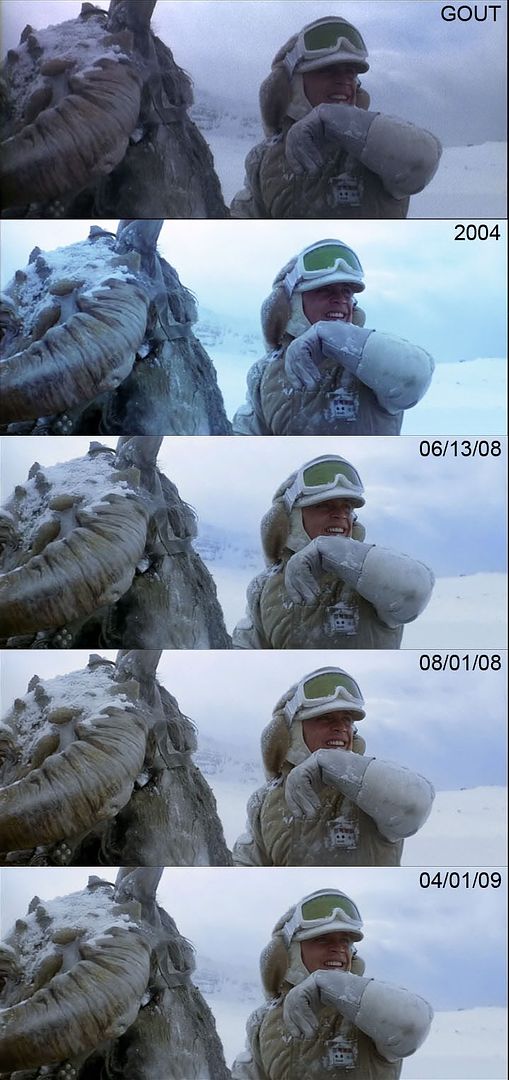
Ady is truly never finished tweaking. Every preview has a slightly different color, each one looking great on its own, but not as good as the more recent ones.
Star Wars Revisited Wordpress
Star Wars Visual Comparisons WordPress

Is the DVD THAT blue? Jeez.

OH! I thought it might have been that shot, but it looked so radically different that it threw me off. :D Thanks, Vaderios. Cool split-screen work, doubleofive.

Did someone say that a release date could be 2010?
Adywan said that it will be release in 2010. No Christmas release, which is fine by me. I'd rather have it perfected then have to go through the whole "XVID is different from the DVD5 is different from the DVD9 is different from the PURIST" again.
Star Wars Revisited Wordpress
Star Wars Visual Comparisons WordPress
