
- Time
- Post link
got it, whats the difference besides the opening description and attack of the clones beginning? same as org dvd? maybe i'm lost?

Here's a YouTube link for those of you who can't figure out how MegaUpload works:
Star Wars Renascent
Inspired by the Godfather Part II and a revamp of Star Wars: Reborn
got it, whats the difference besides the opening description and attack of the clones beginning? same as org dvd? maybe i'm lost?
Asteroid-Man said:Here's a YouTube link for those of you who can't figure out how MegaUpload works:
says vid unavailable on your tube. but i got your other one to work.
vaderios said:From where is the music when the starship enters the coruscant?
I had an issue with VLC player tho.
The image looks a bit sped up.
IMO try to minimize the text moves and effects.
Otherwise cant wait to see further progress :)
-Angel
The music is "Aereon Fortells" from the Soundtrack for "The Chronicles of Riddick" I'm only using unrecognizable music so no main theme music from movies.
Odd that it looks sped up, it looks fine on my PC and my Xbox.
I wanted to get the text size changing and fading to make it look not so still and bland. I'm just adding the little bit of text I mention in the first post for ANH and then that's pretty much all the text.
But does it look like a good way to start off the film?
Star Wars Renascent
Inspired by the Godfather Part II and a revamp of Star Wars: Reborn
46fleetline said:got it, whats the difference besides the opening description and attack of the clones beginning? same as org dvd? maybe i'm lost?
My own logo, different music, edited in new title style, and I begin the film with AOTC with new music. It's just the first 2:30 minutes, don't expect something too epic. Haha
46fleetline said:Asteroid-Man said:Here's a YouTube link for those of you who can't figure out how MegaUpload works:
says vid unavailable on your tube. but i got your other one to work.
It's still processing.
EDIT: It's done processing
Star Wars Renascent
Inspired by the Godfather Part II and a revamp of Star Wars: Reborn

Asteroid-Man said:The music is "Aereon Fortells" from the Soundtrack for "The Chronicles of Riddick" I'm only using unrecognizable music so no main theme music from movies.
Hah thats really funny!
I have the soundtrack of both movies and never listen to them
Thanks for point me :D
-Angel
well i noticed all that, just was thinking it was gonna have parts mixed together and or flashbacks meshed together or something. but the music is cool. gives is a darker tone. the descrip and background give that old ben hur or 10 commandments feel.

That was very cool A-man, I really can't wait for this one. How hard was it to separate the sound from the music?
The person your searching for simply does not exist
Not very hard, just a pain in the ass.
Star Wars Renascent
Inspired by the Godfather Part II and a revamp of Star Wars: Reborn

Two major comments. I like the style you're going for, but there are two things I have to say.
1. The font you use in your logo. Arial? Kill it. Anywhere you can use Arial, Helvetica does a better job. If you don't have it, I do.
2. The wording of the opening slides needs work; it reads quite clumsily. If you like, I can give them a slight rewrite to show you what I mean.

It looks really good, however the text you use feels like long, run-on sentences. It just needs some commas:
Turmoil had engulfed the Galactic Senate, with several star systems having declared their intentions to leave the Republic through a separatist movement led by the mysterious Count Dooku.
Senator Amidala returned to the Senate to vote on the critical issue of creating a Grand Army for the Republic to assist the overwhelmed Jedi, who were meant to maintain peace and order in the galaxy.
[EDIT: It seems I've been beaten to the above note - but I'll keep this here anyway]
I also noticed that your text said "lead by the mysterious Count Dooku," when it should be "led."
And if I'd never seen a Star Wars movie, I'd have no idea who the hell Senator Amidala was - is there a way you could add something of a brief explanation, such as "Senator Amidala, former Queen of the peaceful planet of Naboo, returned..."
Other than that, it's good. I love the music, and really like the look of the text. A nice break from the standard opening crawl.
I am iffy on the logo, however - I don't like how the "T" and "A" connect. I'd suggest using one of the 70s logos:
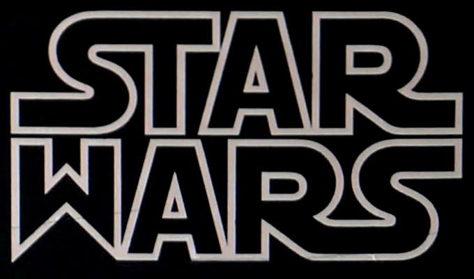
It's different, but still recognizably Star Wars.

Lookin' good so far, A-M. And it's neat to hear music that was never in Star Wars in Star Wars. :) I sort of agree about the opening text; not so much what it says, but it has that sort of run-on sentence feel, y'know? At any rate, keep it up!
RoccondilRinon said:Two major comments. I like the style you're going for, but there are two things I have to say.
1. The font you use in your logo. Arial? Kill it. Anywhere you can use Arial, Helvetica does a better job. If you don't have it, I do.
2. The wording of the opening slides needs work; it reads quite clumsily. If you like, I can give them a slight rewrite to show you what I mean.
The font is not Arial. It's Star Jedi. Unless you mean for "A-Man Productions". That's Zekton. I'm keeping those fonts, I like them and think they fit the new tone I'm aiming for.
ChainsawAsh said:It looks really good, however the text you use feels like long, run-on sentences. It just needs some commas:
Turmoil had engulfed the Galactic Senate, with several star systems having declared their intentions to leave the Republic through a separatist movement led by the mysterious Count Dooku.
Senator Amidala returned to the Senate to vote on the critical issue of creating a Grand Army for the Republic to assist the overwhelmed Jedi, who were meant to maintain peace and order in the galaxy.[EDIT: It seems I've been beaten to the above note - but I'll keep this here anyway]
I also noticed that your text said "lead by the mysterious Count Dooku," when it should be "led."
And if I'd never seen a Star Wars movie, I'd have no idea who the hell Senator Amidala was - is there a way you could add something of a brief explanation, such as "Senator Amidala, former Queen of the peaceful planet of Naboo, returned..."
Other than that, it's good. I love the music, and really like the look of the text. A nice break from the standard opening crawl.
I am iffy on the logo, however - I don't like how the "T" and "A" connect. I'd suggest using one of the 70s logos:
It's different, but still recognizably Star Wars.
If people wanna give a go at the opening titles, it's on the first page. I didn't realize the A and the T were connected, I can fix that. I want to keep the original Star Wars logo guys. And I think Senator Amidala is fine. Remember that the Prologue will be included for those who don't know anything about Star Wars. Plus not knowing who a character is in the first 10 seconds is no big deal. Remember that not all films are like Star Wars where you know everything when the film starts. I think the Queen bit is really unecessary.
Ripplin said:Lookin' good so far, A-M. And it's neat to hear music that was never in Star Wars in Star Wars. :) I sort of agree about the opening text; not so much what it says, but it has that sort of run-on sentence feel, y'know? At any rate, keep it up!
Thanks Ripplin, again if anyone would like to submit other opening titles, please do so. The writing is all in the first post. It's the first four sentences in Italic.
Star Wars Renascent
Inspired by the Godfather Part II and a revamp of Star Wars: Reborn

Good job, Asteroid-Man! I love your logo...LOVE the music...I like the direction you're going with the crawl. It feels a lot like Gladiator (which I love) and works perfectly with the new music. The mood you've created is great.
The typos that others have pointed out should be corrected, of course. And ditch the Star Wars logo you have. It's weird. Go here and download this font and install it: http://www.abstractfonts.com/font/10476
Shift + S gives you a perfect Star Wars logo. :)
The only other thing I'd say is that you have a little music bleed-through from the original track which (as I've found) is unavoidable unless you scrap the soundtrack completely and create your own soundtrack with your own effects from the bottom-up. Which I'm sure you're not going to want to do. But, other than that, I'd say great start! Thanks for posting the clip! It helps to see what kind of quality to expect. Keep it up!
--ID
Or you can download the EPS here (same place I got my 90s VHS-style logos):
http://vectorlogo.blogspot.com/2008/10/star-wars-logo-eps.html
The good thing about EPS files is that they're vector-based, which means you can resize them all you want and they'll never pixellate.
InfoDroid said:Good job, Asteroid-Man! I love your logo...LOVE the music...I like the direction you're going with the crawl. It feels a lot like Gladiator (which I love) and works perfectly with the new music. The mood you've created is great.
The typos that others have pointed out should be corrected, of course. And ditch the Star Wars logo you have. It's weird. Go here and download this font and install it: http://www.abstractfonts.com/font/10476
Shift + S gives you a perfect Star Wars logo. :)
The only other thing I'd say is that you have a little music bleed-through from the original track which (as I've found) is unavoidable unless you scrap the soundtrack completely and create your own soundtrack with your own effects from the bottom-up. Which I'm sure you're not going to want to do. But, other than that, I'd say great start! Thanks for posting the clip! It helps to see what kind of quality to expect. Keep it up!
--ID
Thanks Info! I'm glad to hear I have your approval! I was aiming for a Gladiator approach with the opening titles.
Thanks for the link. I just installed it. Sadly though I won't be able to get much more done for a while. Regardless folks, don't forget I'm aiming for December 25th! (Last Friday of the Year and Christmas) So I have time, but I'm aiming for Summer so then I can get to the DVD.
I thought I had isolated the music bleed. That's odd, are you sure it's not just the music I put in? If you could tell me at which point I can try and isolate it some more. Thanks for the feedback info. I was actually gonna ask that if you have msn or skype if we could do a voice chat discussing this edit? PM me.
Star Wars Renascent
Inspired by the Godfather Part II and a revamp of Star Wars: Reborn
Asteroid-Man said:RoccondilRinon said:Two major comments. I like the style you're going for, but there are two things I have to say.
1. The font you use in your logo. Arial? Kill it. Anywhere you can use Arial, Helvetica does a better job. If you don't have it, I do.
2. The wording of the opening slides needs work; it reads quite clumsily. If you like, I can give them a slight rewrite to show you what I mean.
The font is not Arial. It's Star Jedi. Unless you mean for "A-Man Productions". That's Zekton. I'm keeping those fonts, I like them and think they fit the new tone I'm aiming for.
The word "PRODUCTIONS" is in Arial, or something that resembles it and is equally ugly. The other fonts are fine.
My take on the opening crawl:
Turmoil had engulfed the Galactic Senate. Several thousand solar systems, led by the mysterious Count Dooku, had declared their intentions to leave the Old Republic.
The Jedi Knights, guardians of peace and justice in the Galaxy, were becoming overwhelmed. The Senate proposed creating a Grand Army of the Republic to assist them. Senator Amidala was returning to the Senate to vote on this critical issue....
The most important changes are the spelling "led", not "lead", and the "who were meant to", which doesn't fit the epic feel of the piece. The rest is more my own personal take, but I hope it's useful.

Asteroid-Man said:InfoDroid said:The only other thing I'd say is that you have a little music bleed-through from the original track which (as I've found) is unavoidable unless you scrap the soundtrack completely and create your own soundtrack with your own effects from the bottom-up.
I thought I had isolated the music bleed. That's odd, are you sure it's not just the music I put in? If you could tell me at which point I can try and isolate it some more.
I noticed it as well, it's very obvious at 1:52-54
I really like the new music, keep it up!

It looks very promising. A very nice atmosphere you've created.
A few niggles:
When your A-man logo zooms on screen it doesn't line completely up with the static version and there's a jump when that appears.
No offense meant, but I really didn't like that 'ave maria' bit. Felt a bit pretentious to me, and I don't like the religious connotations. But maybe it's just me lol :) As I said, no offense meant.
Could just be the clip, but in mplayer it plays slightly out of sync.
Again, possibly just the clip, but it seems your video is not (properly) ivtc'ed, or there is some other interlace issue? Most noticeable right after the interior shot when the building passes on the left and the pan at the landing pad. It looks jerky.
The Monkey King - Uproar In heaven (1965) Restoration/Preservation Project
Nezha Conquers the Dragon King (1979) BBC 1.66:1 & Theatrical 2.35:1 preservations

Hmmm. Interesting concept. Techically speaking, the opening logo was a little long, and the dialogue is drowned out by the "new" music. Thematically speaking...no Star Wars music? I understand the effort, to consolidate the story into an epic, but really...removing the main theme? It's at a point where some fan edits are simply to modernize, reimagine and remove what makes Star Wars...Star Wars. Battlestar Galactica (the new one) was an awesome show, with a completely different atmosphere then Lucas' saga. Unless we pick up cameras and reshoot everything again, it's going to remain different. I don't want to crush anyone's creativity, but removing the trademark stuff like music just jumped out at me:) What will you do with the swing across the chasm? Good luck with the rest.
RoccondilRinon said:Asteroid-Man said:RoccondilRinon said:Two major comments. I like the style you're going for, but there are two things I have to say.
1. The font you use in your logo. Arial? Kill it. Anywhere you can use Arial, Helvetica does a better job. If you don't have it, I do.
2. The wording of the opening slides needs work; it reads quite clumsily. If you like, I can give them a slight rewrite to show you what I mean.
The font is not Arial. It's Star Jedi. Unless you mean for "A-Man Productions". That's Zekton. I'm keeping those fonts, I like them and think they fit the new tone I'm aiming for.
The word "PRODUCTIONS" is in Arial, or something that resembles it and is equally ugly. The other fonts are fine.
My take on the opening crawl:
Turmoil had engulfed the Galactic Senate. Several thousand solar systems, led by the mysterious Count Dooku, had declared their intentions to leave the Old Republic.
The Jedi Knights, guardians of peace and justice in the Galaxy, were becoming overwhelmed. The Senate proposed creating a Grand Army of the Republic to assist them. Senator Amidala was returning to the Senate to vote on this critical issue....
The most important changes are the spelling "led", not "lead", and the "who were meant to", which doesn't fit the epic feel of the piece. The rest is more my own personal take, but I hope it's useful.
Oh yeah that's in Arial Bold and I'm keeping that. I want that to be bland because that's not the highlight of the Logo. Thanks for your edit of the credits. There's also another one that opens to "Present" scenes (ANH) also in the first post in Italic.
DarthBo said:Asteroid-Man said:InfoDroid said:The only other thing I'd say is that you have a little music bleed-through from the original track which (as I've found) is unavoidable unless you scrap the soundtrack completely and create your own soundtrack with your own effects from the bottom-up.
I thought I had isolated the music bleed. That's odd, are you sure it's not just the music I put in? If you could tell me at which point I can try and isolate it some more.
I noticed it as well, it's very obvious at 1:52-54
I really like the new music, keep it up!
Oh I know what you're talking about. That's apart of the music I put in. It has a lot of eerie background music. Check out the song, I posted the name above.
Star Wars Renascent
Inspired by the Godfather Part II and a revamp of Star Wars: Reborn
Asteroid-Man said:Oh yeah that's in Arial Bold and I'm keeping that. I want that to be bland because that's not the highlight of the Logo. Thanks for your edit of the credits. There's also another one that opens to "Present" scenes (ANH) also in the first post in Italic.
I'm not objecting to bland. Arial is not merely bland, it is ugly. I beg you, use Helvetica. It's just as plain, but it's not ugly. As you can see, Arial did call my attention to itself. You might not be able to see much difference, but to someone who knows a lot about design and especially typography, it is all the difference in the world.
Okay, the second crawl needs a bit of work. The way I see it, what's wrong with using the original (or most of it) word for word? At a minimum, there are two typos that need seeing to: its, not it's; and ensure, not unsure.
satanika said:It looks very promising. A very nice atmosphere you've created.
A few niggles:
When your A-man logo zooms on screen it doesn't line completely up with the static version and there's a jump when that appears.
No offense meant, but I really didn't like that 'ave maria' bit. Felt a bit pretentious to me, and I don't like the religious connotations. But maybe it's just me lol :) As I said, no offense meant.
Could just be the clip, but in mplayer it plays slightly out of sync.
Again, possibly just the clip, but it seems your video is not (properly) ivtc'ed, or there is some other interlace issue? Most noticeable right after the interior shot when the building passes on the left and the pan at the landing pad. It looks jerky.
I noticed it didn't line up but I was using Particle Illusions for the logo and It wouldn't line up completely for some reason. It was the best I could do. Sorry if it's long but I wanted to make sure to get my name out there at the same time and at the scale I'm going for. I didn't intend for Ave Maria to be a religious thing, I'm not even christian. I just really appreciate the music and the voice and thought it was a nice and subtle way to come out of all the exploding asteroids.
And regarding the jerky video it could be two things:
1. I only rendered that clip in WMV so it's not 100% quality and it's also only in 2.1 audio.
2. Perhaps it's your video card?
I did notice the shaky video on YouTube but the WMV isn't too noticeable. Again, I didn't render that clip in 100%. In Vegas it looks fine so no worries. ;)
wwdarth said:Hmmm. Interesting concept. Techically speaking, the opening logo was a little long, and the dialogue is drowned out by the "new" music. Thematically speaking...no Star Wars music? I understand the effort, to consolidate the story into an epic, but really...removing the main theme? It's at a point where some fan edits are simply to modernize, reimagine and remove what makes Star Wars...Star Wars. Battlestar Galactica (the new one) was an awesome show, with a completely different atmosphere then Lucas' saga. Unless we pick up cameras and reshoot everything again, it's going to remain different. I don't want to crush anyone's creativity, but removing the trademark stuff like music just jumped out at me:) What will you do with the swing across the chasm? Good luck with the rest.
There will still be Star Wars music but again, you must realize I'm going for a completely new approach. I know many "Die Hard OT" fans will be let down but this isn't Classic Star Wars, it's a reimagination. If you want something more true Ady has his Revisions of the saga. If you saw what info had released before, those clips were edited very differently aswell and had a lot of new music and even new and missing scenes. I've received complaints from others regarding the absence of the cral and the main theme but as I said before, it's like a reinterpretation. For example, Kamino and the Asteroid chase is being removed completely.
Star Wars Renascent
Inspired by the Godfather Part II and a revamp of Star Wars: Reborn
RoccondilRinon said:Asteroid-Man said:Oh yeah that's in Arial Bold and I'm keeping that. I want that to be bland because that's not the highlight of the Logo. Thanks for your edit of the credits. There's also another one that opens to "Present" scenes (ANH) also in the first post in Italic.
I'm not objecting to bland. Arial is not merely bland, it is ugly. I beg you, use Helvetica. It's just as plain, but it's not ugly. As you can see, Arial did call my attention to itself. You might not be able to see much difference, but to someone who knows a lot about design and especially typography, it is all the difference in the world.
Okay, the second crawl needs a bit of work. The way I see it, what's wrong with using the original (or most of it) word for word? At a minimum, there are two typos that need seeing to: its, not it's; and ensure, not unsure.
Haha wow, I made a lot of mistakes with those titles! I'll see if I still have the originally un-rendered logo, but if I don't it'll have to stay Arial.
Star Wars Renascent
Inspired by the Godfather Part II and a revamp of Star Wars: Reborn
Asteroid-Man said:And regarding the jerky video it could be two things:
1. I only rendered that clip in WMV so it's not 100% quality and it's also only in 2.1 audio.
2. Perhaps it's your video card?
I did notice the shaky video on YouTube but the WMV isn't too noticeable. Again, I didn't render that clip in 100%. In Vegas it looks fine so no worries. ;)
It has nothing to do with the video card, but the framerate of the clip. I could happen if you're working in 23.976 fps and exported to 29.97 fps for example. Or if your source is not IVTC'ed and you're editing in 29.97. You SHOULD be working in 23.976 fps.
The Monkey King - Uproar In heaven (1965) Restoration/Preservation Project
Nezha Conquers the Dragon King (1979) BBC 1.66:1 & Theatrical 2.35:1 preservations