
- Time
- Post link
Davnes007 said:Just a silly idea.
(it's not animated)
- I opened the GIF with 'GIF Construction Set', and most of the frames are just the changes between other frames.
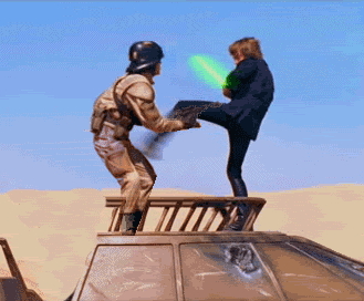
Zoinks! Right in the Midichloreans.
Davnes007 said:Just a silly idea.
(it's not animated)
- I opened the GIF with 'GIF Construction Set', and most of the frames are just the changes between other frames.
Zoinks! Right in the Midichloreans.

Sluggo said:Mark Hamill would never kick or punch someone in the groin.
Star Wars Revisited Wordpress
Star Wars Visual Comparisons WordPress
doubleofive said:Sluggo said:Mark Hamill would never kick or punch someone in the groin.
It's ironic that Cocknocker looks so much like the Galactic Heroes figures (from a joke in an adult spoof to a range of rubbish toys for toddlers).
http://www.youtube.com/watch?v=JVAy4J6Fy6w

It reminds me when the little droid kicks Jar Jar in the nuts at Watto's shop.

TMBTM said:It reminds me when the little droid kicks Jar Jar in the nuts at Watto's shop.
Man, that guy on the vid is an annoying twat. Can't even say Lando's name right. Number 1 fan my arse....Sad old man!!
;)

HotRod said:TMBTM said:It reminds me when the little droid kicks Jar Jar in the nuts at Watto's shop.
Man, that guy on the vid is an annoying twat. Can't even say Lando's name right. Number 1 fan my arse....Sad old man!!
;)
He comes across as actually being a rather nice guy (perhaps a little too enthusiastic), some of his video's are side splittingly funny and he has actively campaigned (with the emphasis on camp) for safer and better made toys (and gee does he have a collection...he basically has an aircraft hanger of almost every toy and video game ever made...makes you wonder how he spends his evenings).
And he does have a point here.

doubleofive said:Sluggo said:Mark Hamill would never kick or punch someone in the groin.
"Dont Fnck with a jedi Master son!"
OH man that was too funny hay any chance you could shove that in there somewhere ady? LOL
Bingowings said: Do you want to see the project finished as a playable film or a flick book?
Anyone who's seen my mockups before should know I'm not as slick as vaderios but here's a rough mockup of the skiff with little sails (and no I'm not cutting out all that rigging by hand ergo the roughness).
I threw in a few fat tentacles because I would love to see one of the skiffs get the classic giant squid treatment if it got too close (people being pulled overboard that sort of thing).
See beyond the roughness (and poor Chewie who seems like he might just get his head knocked off at any minute) and hopefully someone with a bit more panache could render it a bit better to get the idea of what I going for here.


Hmm that gives me an idea....
vaderios said:Hmm that gives me an idea....
That's what I'm here for, oh and if you scroll back a few I did an equally rough rebel briefing room which was met with less than 100% applause. Could you have a butchers at that too and see if you can draw inspiration from it?
Cutting around them edges is a real pain in the arse when you are as ancient and myopic as I am.

^I liked your briefing room, but honestly, I didn't have a problem with the original. The thing is, to me, it didn't have to look like the 'slapped together' places they'd used before so much because a lot of time had passed since the destruction of the first Death Star (meaning, uh...time to organize? New, richer allies?), and the fact that it's a big Mon Cal capital ship. I did like your mock-up of a darkened briefing room, but I liked the lit up one, too.
One thing that was quite cool about yours was the feeling of grandeur of the set. Very nice! The whole thing felt bigger and more important, so to speak. And using those mattes from The Black Hole was a nice touch. That movie really had some beautiful art design in it. :) I watched it recently for the first time in many years and I was impressed by a lot of it.
Ripplin said:^I liked your briefing room, but honestly, I didn't have a problem with the original. The thing is, to me, it didn't have to look like the 'slapped together' places they'd used before so much because a lot of time had passed since the destruction of the first Death Star (meaning, uh...time to organize? New, richer allies?), and the fact that it's a big Mon Cal capital ship. I did like your mock-up of a darkened briefing room, but I liked the lit up one, too.
One thing that was quite cool about yours was the feeling of grandeur of the set. Very nice! The whole thing felt bigger and more important, so to speak. And using those mattes from The Black Hole was a nice touch. That movie really had some beautiful art design in it. :) I watched it recently for the first time in many years and I was impressed by a lot of it.
Thank you for your kind...very kind words of encouragement.
I really can't stand the set as it is and seeing the designs in The Art Of Return Of The Jedi just made me want to see something more like them.
I can't find any uploaded images around and taking my scanner out in my current home is like trying to get the Ark Of The Covenant out of Area 51.
Bingowings said:I really can't stand the set as it is and seeing the designs in The Art Of Return Of The Jedi just made me want to see something more like them.
I can't find any uploaded images around and taking my scanner out in my current home is like trying to get the Ark Of The Covenant out of Area 51.
The only 'Art of' book I have is ESB, so I don't know if I've seen the designs you're referring to. Could you just take a picture of them with a digicam and post those? (I've done that a bunch of times since my old scanner won't work on my new[er] computer) Or maybe if someone else is reading this, could they do a quick scan for us?
Ripplin said:Bingowings said:I really can't stand the set as it is and seeing the designs in The Art Of Return Of The Jedi just made me want to see something more like them.
I can't find any uploaded images around and taking my scanner out in my current home is like trying to get the Ark Of The Covenant out of Area 51.
The only 'Art of' book I have is ESB, so I don't know if I've seen the designs you're referring to. Could you just take a picture of them with a digicam and post those? (I've done that a bunch of times since my old scanner won't work on my new[er] computer) Or maybe if someone else is reading this, could they do a quick scan for us?
Here you go,


Thanks, Bingo. Nice to see ideas from different artists like that. That last one is especially different. Actually, it looks like the bridge on a Star Destroyer, with those pits on the sides.
Ripplin said:Thanks, Bingo. Nice to see ideas from different artists like that. That last one is especially different. Actually, it looks like the bridge on a Star Destroyer, with those pits on the sides.
It would make sense if the command centre of Home One was to a similar scale as the Star Destroyer bridge going by this size comparison.
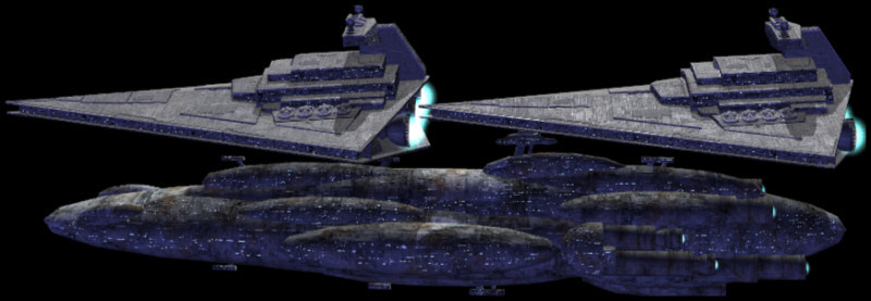
Didn't realize it was that big! I've always liked the Mon Cal ships; very Zentraedi. :)
Ripplin said:Didn't realize it was that big! I've always liked the Mon Cal ships; very Zentraedi. :)
Very indeed!

Any attempts to build mockups of the rebel bridge as seen in those pre-production designs would be great to see.
This thread seems to have gone to sleep for a bit.
Bingowings said:Any attempts to build mockups of the rebel bridge as seen in those pre-production designs would be great to see.
This thread seems to have gone to sleep for a bit.
ZZzzz... Um hmm?
oh yes. I owe an idea here pity it didnt came up well. Well i thought to make the sarlacc a bit bigger and meaner. but i failed. I will try when i grab ROTJ in HD.
The bridge thing. I like the changing idea. But can it be done in different angles of the shots?
I always like the Throne Room changed like the concepts. but it looks impossible because of the moving shots.
-Angel
Nothing important just felt that tatoine has too much color (green)
-Angel
^I like your new version, but I also like the old one in a way, because the red in the buildings reminds me of reddish clay. I like the brighter sky more in yours.
Oh, and care to take a stab at color correcting Bart's saber in this pic?

Who missed that?! :p I guess there was no time [or inclination?] to fix it. I'm surprised that Star Wars Insider printed it as-is. Whatever. Still neat-o. The "hair" on top of the helmet is a nice touch.
The sabre is better than the ones in ROTJ it's the costume Bart is wearing that is wrong.
Love the hair too but "Stay On Target!"
Bingowings said:The sabre is better than the ones in ROTJ
Yeah, I just meant that it's green when it should be blue.
Here's another pic:

(I recently uploaded them to my account, so I figured I'd share 'em here. Might be good for a smile or two, at least.)

That is a good one. I don't see Bart trying to kiss his sister in that version.