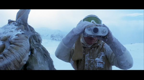
ImperialFighter said:irstly, can I say that while I wasn't quite sure about your change to the the AT-AT 'reveal' graphic at first, I've really come round to the look of it now, and realise that the consistency with the view from out of the identical Rebel binoculars will be a very good thing....
....however, although I know you confirmed that the 'red rectangle' would also be added to Luke's graphic too, I hope the same goes for the 'green and moving sections' that are seen either side of your new one. These are my favourite elements from the original one, and they really add interest to the 'double-circle' version. Nice work once again.
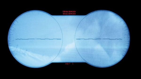
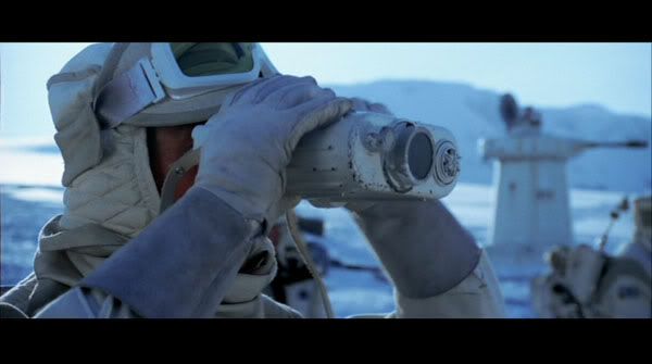
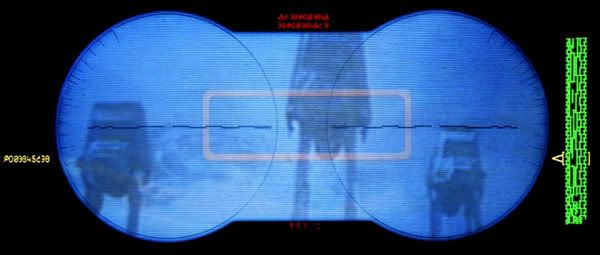
Ady: you may want to consider getting rid of the red box and extra stuff on the right and left. One, it wasn't on Luke's binocs and second, it kinda distracts from the AT-ATs in the frame. I could understand making the red numbers on the top and bottom more legible, but I would keep it toned down so people will be looking at the AT-ATs and not the green bar and red box (though I understand the red box was on the original binoc view).
At least try it out and see how it looks.