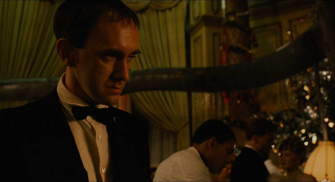
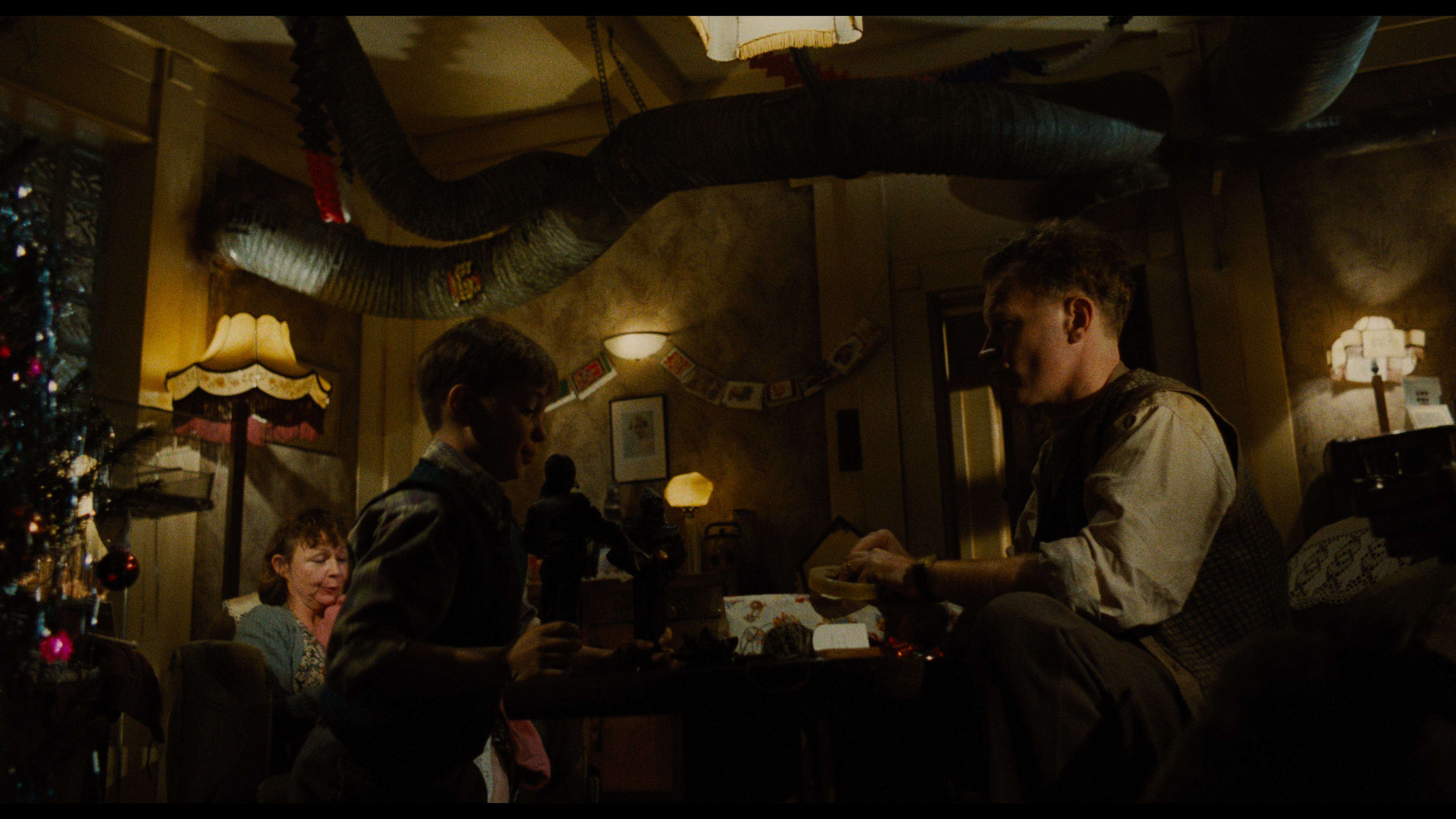
Here we go again with the teal and orange accusations. Teal existed in 1985 and the old masters are magenta tinted. People only hate the look of teal and orange because it was so popular in the late 2000s and are used to the old magenta tinted masters and thinking they’re correct.
No one has said this, only that Criterion went full-retard on this 4K remaster. Instead of fine-tuning the picture, it looks like this:
UHD:
https://i.postimg.cc/dQ4pZ5mt/UHD44.jpg
Blu-ray:
https://i.postimg.cc/VLhhD5Vx/UNI1.jpg
++++++
UHD: https://i.slow.pics/Z8kHLrDB.png
Blu-ray: https://i.slow.pics/SxQKLKVf.png
++++++
UHD: https://i.postimg.cc/cx8sY8Mm/UHD-DELES1.jpg
Blu-ray: https://i.postimg.cc/D2Nv8cs0/BD-TEA1.jpg
+++++++
The revisionism is shockingly bad on this one. It was never supposed to look like it was shot yesterday. Because, you know, this is a modern trend:
https://theabyssgazes.blogspot.com/2010/03/teal-and-orange-hollywood-please-stop.html
The fact you think the former Blu-rays are also bad, with pink/magenta tones, does not mean automatically this 4K disc is good, because it isn’t. Many films from all ages have been spoiled with a wrong color grading, it’s not my fault you are blind to these facts.