- Time
- Post link
I may have made an interesting finding. I’m getting a weird feeling that the official releases for the prequels accidentally got locked into sourcing from a standard gamut REC709 source at some point.
I’ve read that sometimes home releases were given a slight magenta push to try to counter the apparent yellow-green push that apparently the average consumer CRT TV had back in the day. I wonder if that is why the DVD for AOTC got a bit of magenta on some scenes. And then I wonder if they have not stuck with the HD master made for the DVD as the starting point ever since? Or some early master work done in REC709 as the basis (back then with no consumer wide gamut home formats around). And thus even the blu-ray ending up still with a magenta tint? And then even the UHD.
But the really new thing, the more shocking thing than just some home releases having some different tint or grading (which I think is very common), but I have a weird feeling that someone forgot to realize that at some point the main masters for the prequels got handled in REC709’s limited gamut colors and so when presented on the UHD… they still seem to clip away stunningly rich colors to REC709 even though UHD has full REC2020 gamut capability (although it is often aimed more at P3 a bit smaller wide gamut).
The reasons I say this are:
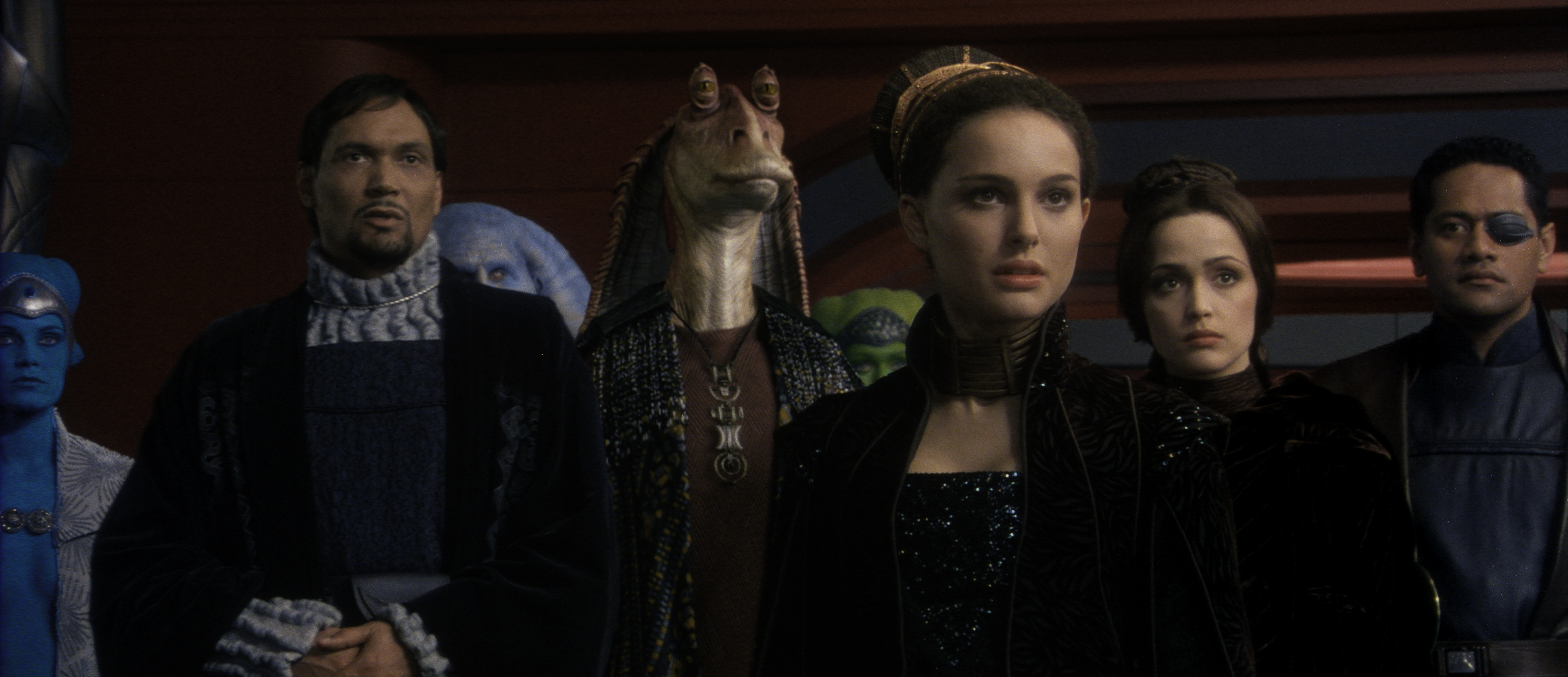
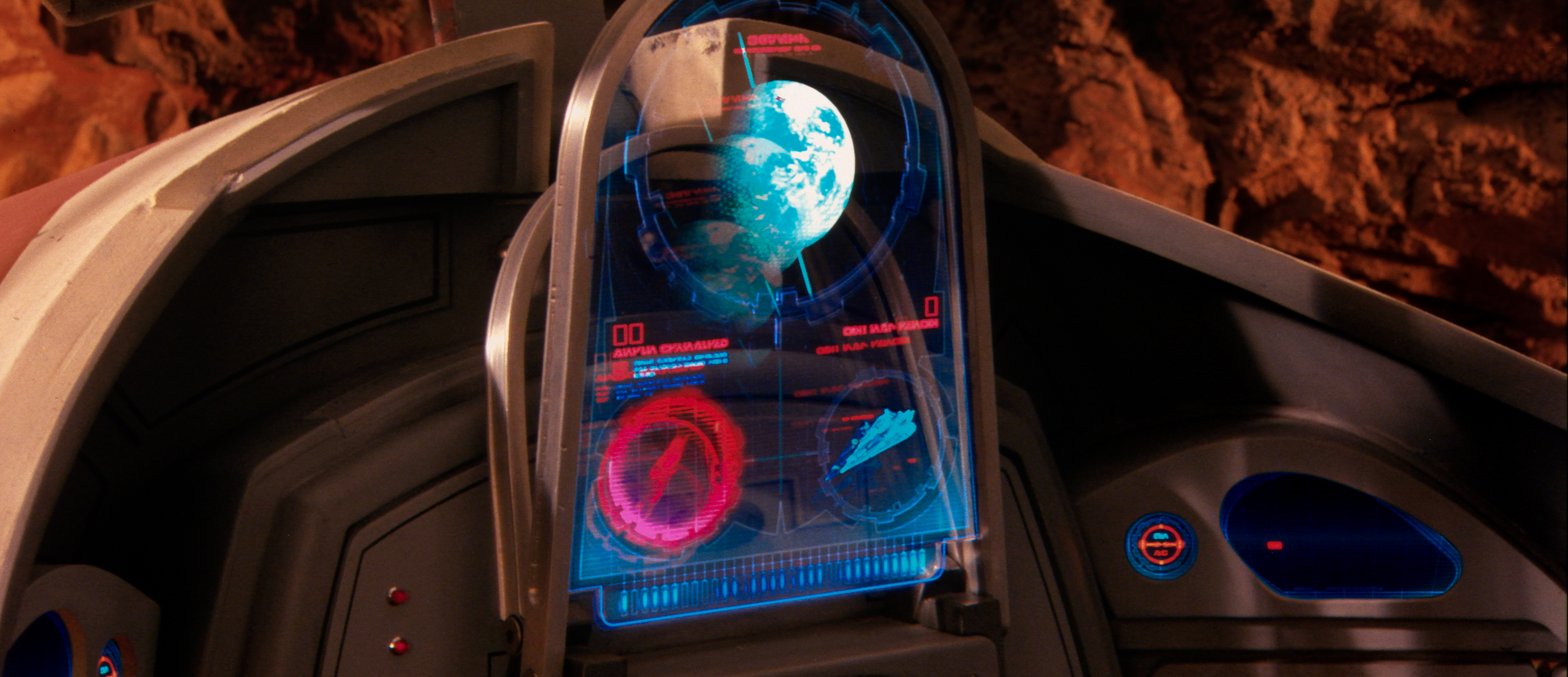
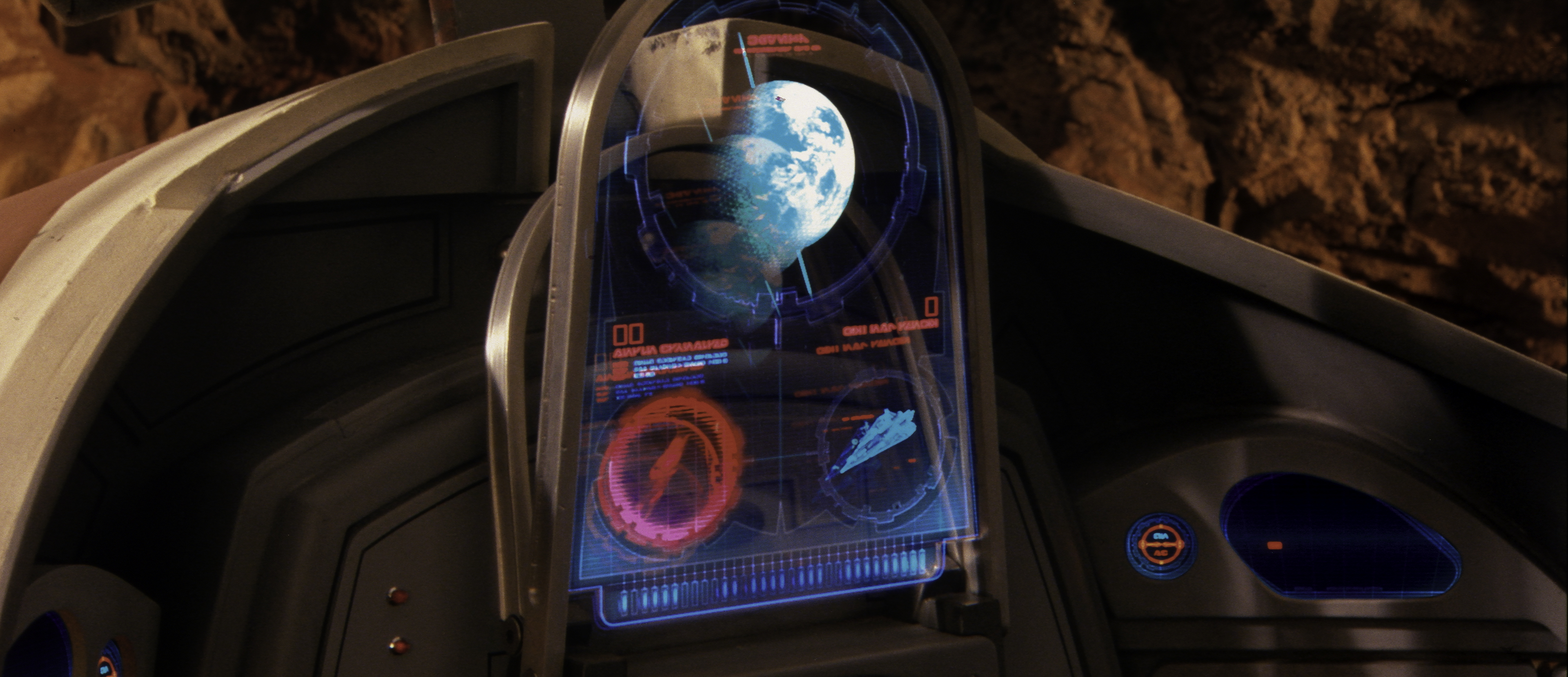
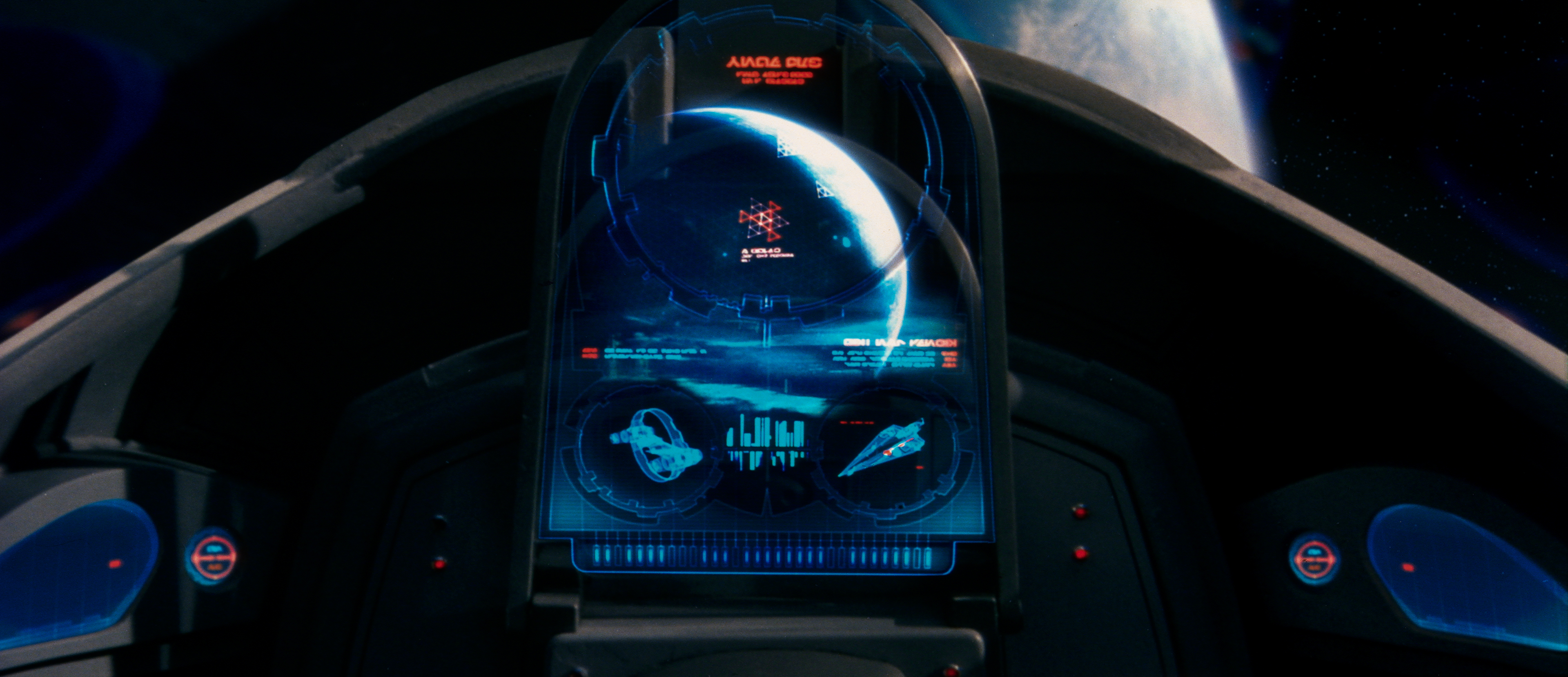
I just compared some scenes of AOTC 35mm side by side with AOTC UHD/BD/DVD and ALL of the home discs, not just the DVD/BD which would have to clip, but even the UHD which does support wide gamut colors, seem to show the same muted aquas/turquoise/deep cyan/deep intense green-blue (like of the blue girl, a Pantoran maybe?, in the early scene in Palpatine’s Senate office or the laser field along the floor of Padme’s bedroom near the start or the aqua rectangular the probe droid opens up in the force field on her bedroom window when it drops those poisonous creatures in or or some lighting on Coruscant cityscape or some of the heads up display items on Obi-wan’s ship, etc.) and even the intro title “A long time ago…” all look relatively similar on all home formats but then are often wildly more intensely saturated (or even a different shade of color that does not even exist in REC709) on the 35mm print and then if you digitize a frame of the print and mess around until it looks the same as the 35mm side by side on a calibrated wide gamut monitor and then convert the frame to standard sRGB/REC709 gamut all those colors in those scenes suddenly become muted in exactly the same way as they look on all the home formats.
Also interesting is that looking at the “A long time ago…” intro on say the ROTJ UHD it does have at least some of the intense weird slightly turquoise blue as scene on the AOTC 35mm print intro and the OT were fresh scans seemingly treated in wide gamut workflow.
So it almost seems like a mistake was made at some point and maybe the prequels official post-theatrical working masters got locked into limited gamut REC709 colors at some point! Either that or somehow the transfer from digital master to film simply boosted some of those shades wildly and the original 35mm prints never looked like the digital masers or the theatrical digital versions. I sort of feel like it might be more likely that they simply ended up bogging their modified working master into REC709 at some point and got stuck with that limited palette (and didn’t try to bring it back by hand at some later point once wide gamut home formats and digital P3+ projection came out), at the least for AOTC, but perhaps for 1 and 3 as well (since a quick glance at those also showed the “A long time ago…” looking a pale, muted blue on the UHDs).
Anyway, for whatever reason, I see some really wildly intense blues/aquas in some scenes on the 35mm print, stunning colors, that are simply not there on any home version (not that DVD or BD would be capable of showing them but not even on the UHD which is). So it seems to be a lot more than just a bit of a magenta tint or teal tint. It is interesting since AOTC was said to be shot on a camera that only did limited gamut REC709, but it would seem that they boosted up some colors that film can handle well intensely (stuff in blue-green intense range) in post, either that or somehow the transfer to film just made those colors go wild naturally.
It is also wild how completely absolutely different the color and saturation of “A long time ago in a galaxy far, far away…” looks on the AOTC 35mm print than on any home release. And that Pantoran(?) shown in the post above.