
- Time
- Post link
GREAT!

A friend told me he found a… ehr… “theatrical version” that has colors that look very similar to the theater projection, according to him at least.
He provided it, and I tried to regrade the BD using it as color reference.
BD untouched
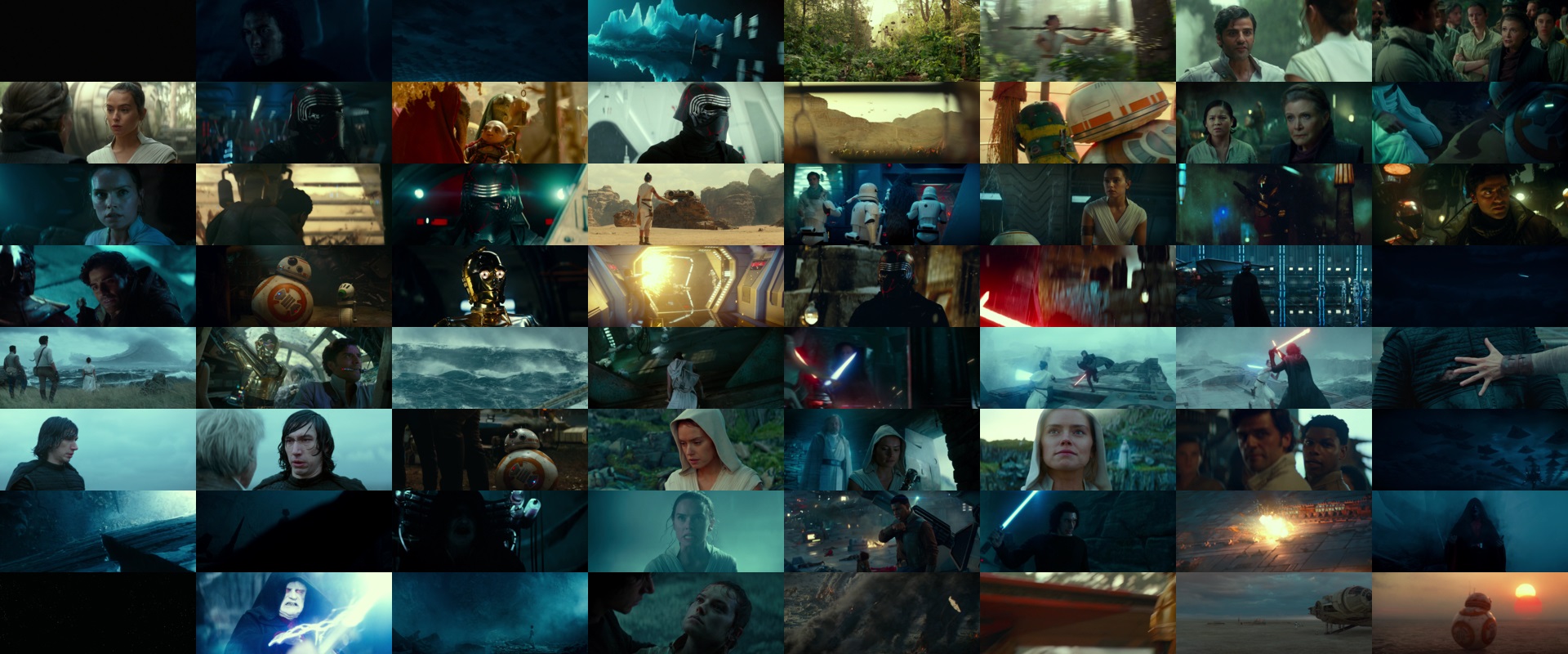
BD regraded
Now, I don’t know if this color grading is theatrically accurate, and if so, how much; if there is some interest in this regrading, I could do it BUT! I need help: the reference file is 30fps progressive and has quite many blended frames; if someone would step in to de-blend at least the ones in the shot changes, I’ll do the regrading.
Opinions?
Sadly my projects are lost due to an HDD crash… 😦 | [Fundamental Collection] thread | blog.spoRv.com | fan preservation forum: fanres.com
GREAT!

That color grading looks fantastic!
“The ability to speak does not make you intelligent.”
Thanks!
Now, if you want to see it finished, a good soul must step in to put in sync the reference video with the untouched one… 😄 😄 😄
Sadly my projects are lost due to an HDD crash… 😦 | [Fundamental Collection] thread | blog.spoRv.com | fan preservation forum: fanres.com
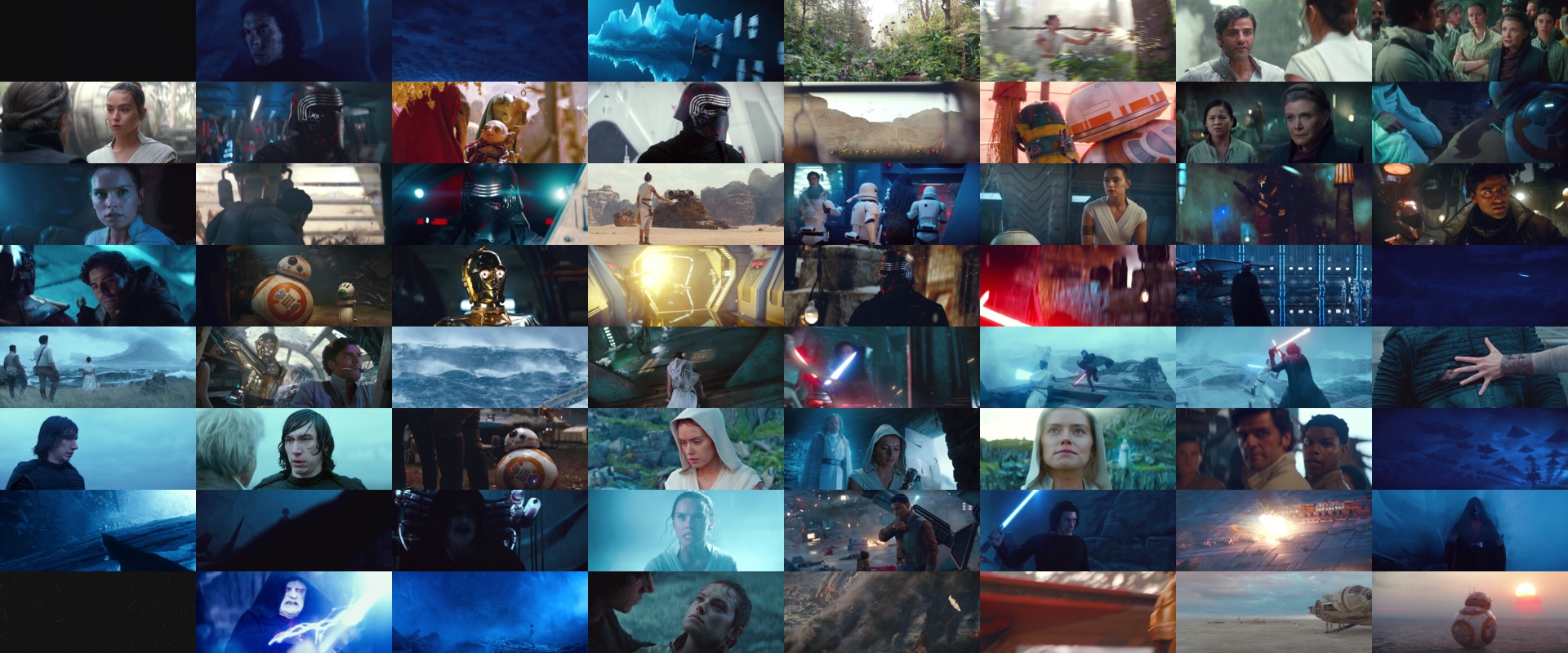
Test clip (top untouched, bottom regraded, 60s, no audio, few frames are wrongly regraded due to out-of-sync reference):
https://easyupload.io/vl4nm6 (online until August 8, 2021)
Waiting for feedbacks.
Sadly my projects are lost due to an HDD crash… 😦 | [Fundamental Collection] thread | blog.spoRv.com | fan preservation forum: fanres.com

from what i remember this looks closer
Looks fantastic… I’d be watching the film much more often in this form. The BD colors look downright ugly in comparison when you see it played like this. I’d love to watch it with your colors.
Much closer to what I remember from the theatre as well. Even before seeing this, I always felt the film looked weird on the BD.
When will they stop slapping these hideous tints on whole films and doing other unnecessary fugly changes to their home video releases?
I hope you’ll find a way to get this project done!
I also hope you’ll find the time to reply to my private messages 😕
“The ability to speak does not make you intelligent.”

This is a little off-topic but he hasn’t responded to any of my PMs either.
I love Japanese media and talk about voice acting a lot.
Sorry, didn’t want to be rude, but as I’m not here any day, and all the time I log in I see a lot of messages asking for links to my projects, sometimes I just forget to answer to some of them.
To be clear: sadly I had an HDD crash some times ago, therefore I lost all projects, along with links to online versions; someone reported that few of them are still floating in the wild, but frankly I don’t know where…
Sadly my projects are lost due to an HDD crash… 😦 | [Fundamental Collection] thread | blog.spoRv.com | fan preservation forum: fanres.com

That looks super nice! Much more “Force Awakens”-y in terms of colors.
Hiya, hiya, hiya! It is I, Yoda, to tell you life lessons that age like soda! Oh wait, that sounded wrong.

I’d really love to see this project seen to completion. While I’m not super sensitive to color grading stuff such as what happens with Blu-Rays. After seeing stuff like Hal9000’s Ascendant and this, I do look at the film as-is now and can’t unsee this kind of ugly tint that has been placed over the whole thing.

This certainly jogs my memory of how blue it looked in the theaters. It never really tracked with me how different the Blu Ray looks (granted, I’ve only watched it once).
This certainly jogs my memory of how blue it looked in the theaters. It never really tracked with me how different the Blu Ray looks (granted, I’ve only watched it once).
i watched the rise of skywalker twice in cinema’s

The cinema print of this film definitely looks more visually appealing. I don’t understand how studios see the need to change the colour grading with nearly every Blu-ray release they put out.
Can you imagine how the cinema version of Harry Potter and the Deathly Hallows Part 1 looks compared to the home releases?
“The Dark Side of the Force is a pathway to many abilities some consider to be unnatural.”
-Sheev Palpatine, Star Wars: Revenge of the Sith (2005)
I would imagine it looked similar to the UHD release. The Blu-ray also added too much green and teal.
I love Japanese media and talk about voice acting a lot.

Is there a way to create a LUT that recreates this look for the film?

One thing I recall is that the Dolby Cinema version had a different color grading than the other theatrical versions. Personally I thought it was uglier. One scene became particularly more yellow and over-saturated in a weird looking way. And some of the way they did the HDR seemed less appealing than the IMAX, IMAX Laser or regular grades. They tended to hype up some bright brights but leave mid-tones too dark, so like Rey’s face was always dark and it kinda changed the tone and clashed. In other versions her face showed up better and was brighter and it fit the mood better.
The UHD, only peeked at it, seems VERY bright for the highlights. The sabers and lighting strikes are like almost seizure inducing and distracting. IMO, it’s one to make sure to set your max brightness limited on playback to tame it back to more normal levels for the super highlights.
The IMAX Laser grading was my favorite (not all that different from the regular grading, mostly just better blacks, bit more DR and pop).