I have a bad feeling about this.
Okay, I’ve done what I could to try and fix the issues NeverarGreat brought up. After the work I did on the color grading for my TLJ edit, I wanted to be more conservative with the blue film look for IX. I’m bringing this up now, because as you’ll soon see, my tweaking has made the grade even bluer.
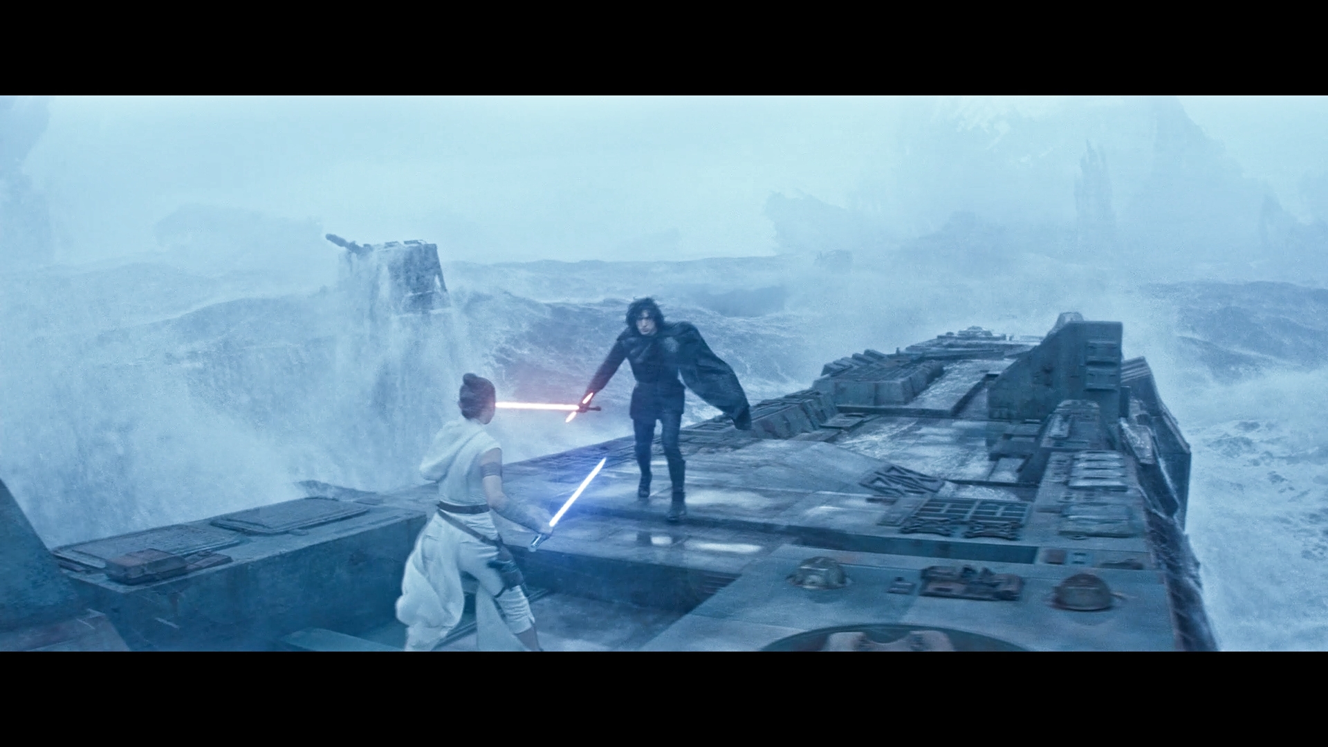
Here’s a shot from the previous grade:

The first thing I did was lower the reds. This made the purple/pink less visible, but it also brought back my biggest nemesis in the grading of this film: The skin tones. They didn’t look red enough anymore. They also made things more teal, which makes it worse. So, in order to fix this, I had to reduce the greens a bit so that the blues could come back. Only the blues remained unchanged. The result is this:

I’m not sure if this is an improvement, or a disaster. On the one hand, I like the increase in blue. On the other hand, I think that same increase might actually be worse. In fact, I think the teal issue is still a problem. It’s hard to make a good judgment call because the skin tones are sensitive to the blue grading I’m giving it. If I make it too blue, the purple tint issue that NeverarGreat is talking about becomes a huge problem. But if I don’t make it blue enough, the skin tones don’t look red, and it loses its film-like quality. Finding the right balance has been quite a difficulty for this grade. It’s also the reason why I haven’t updated as quickly as I did before with VII and VIII. I have to be very sure that nothing looks too off.
My hope is that the increase in blue, oddly enough, fixes the highlight issues and gives the grade an improvement. But I need a second opinion for this one. You may find the screencaps in the spoiler tag below: