Update, still working on the project. Received some great feedback from a few others on the thread, and have begun re editing scenes to improve flow, missing plot points, things of that nature.
One of the first things I’ve began to adjust however is the color grading because the initial cut was a bit… rough in that area.
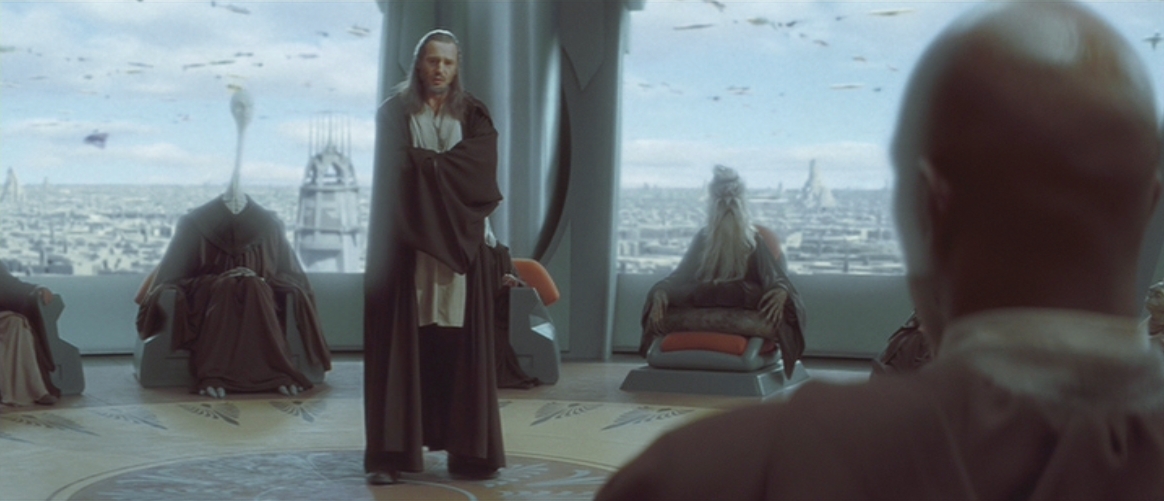
First, let’s look at the original grade from The Phantom Menace:
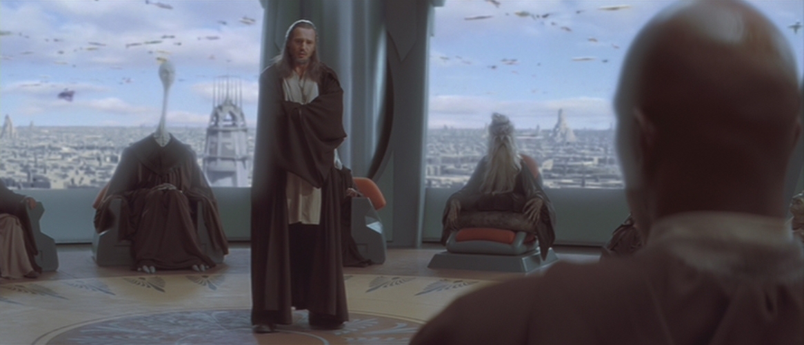
There are, in my opinion, a few very distracting flaws with the currently available color grading that really irk me.
For one, ever since the DVD release there has been an ugly pink tint over the entire film. When you notice it, it just makes the entire thing look ugly in my eyes.
Another thing is, there’s a large lack of contrast through the whole thing, the picture feels a fair bit flat and dull in that area.
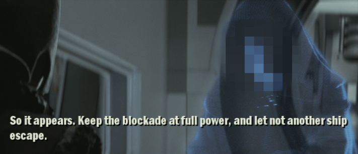
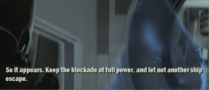
So, I tried to correct it in my initial grade, but, as a wise man once said, I went a bit too far in places.
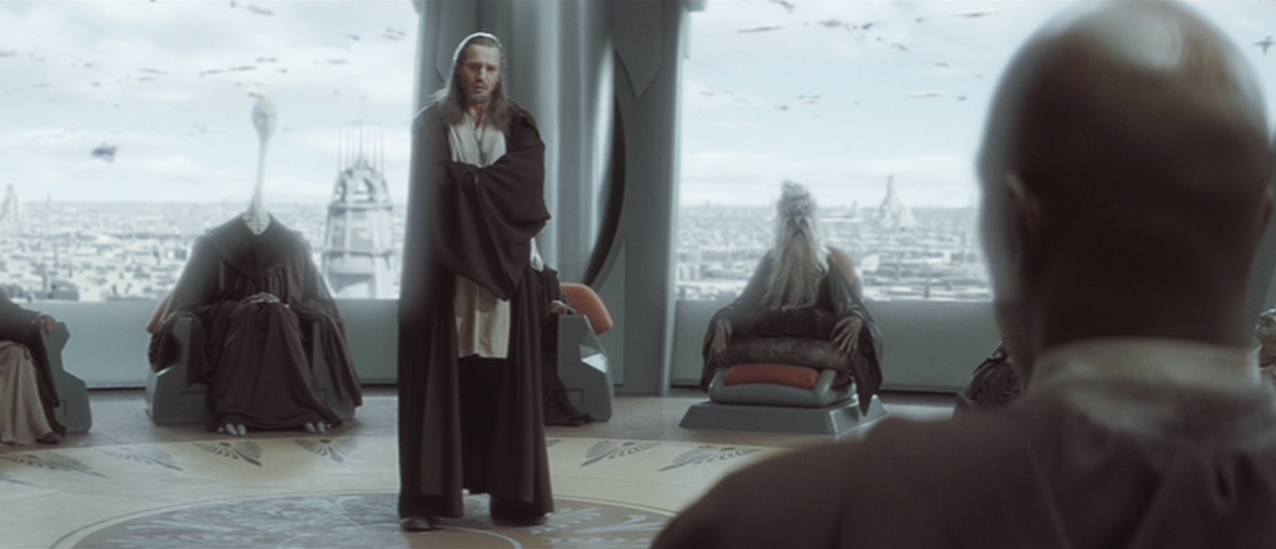
For one, upon rewatching it, it seems I had overcorrected and made the entire film pretty grey/green, which doesn’t really fit Star Wars.
And another, more important one, I upped the contrast wayyyy too high. As pointed out by someone in this thread, in scenes with especially bright areas, too much got lost in the high lights And the blacks.
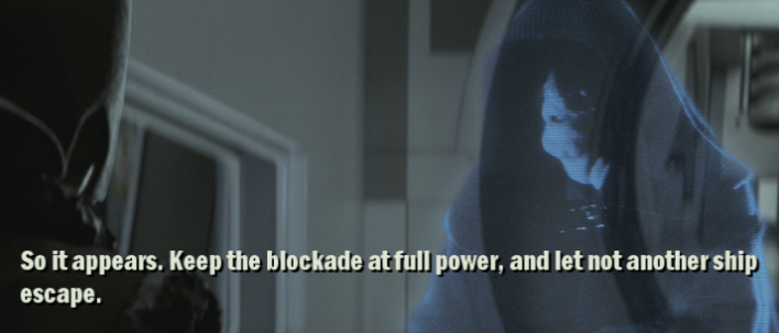
I’m currently trying to reach a happy medium of these extremes, I lowered the contrast and re saturated the footage to a point where I think it’s the best of all worlds, though of course criticism is always welcomed.