- Time
- (Edited)
- Post link
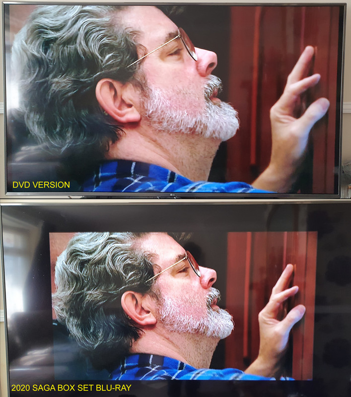
Looking at the cap from above, thought I’d put together a comparison of “Here to Rescue Yous”
http://www.framecompare.com/image-compare/screenshotcomparison/7DKY7NNX
I think I got those all labeled correctly.
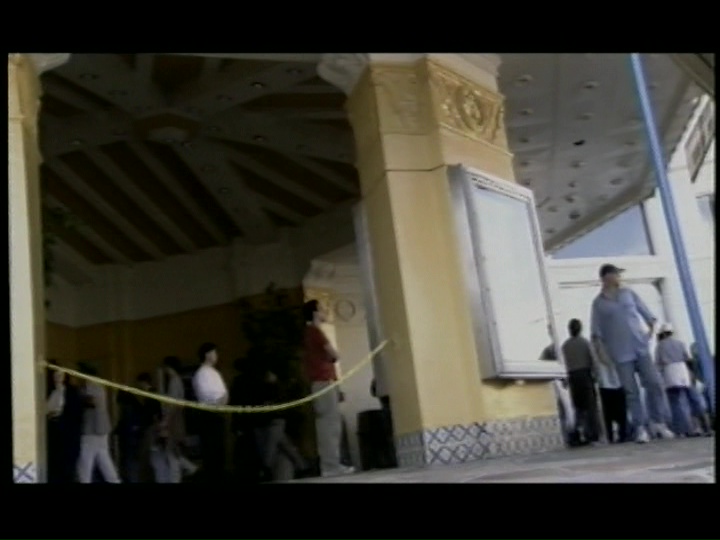
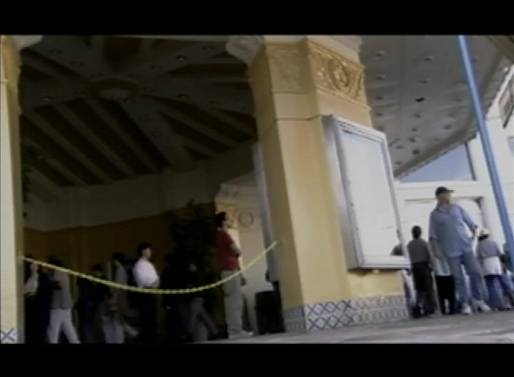
May I ask, is the last of these screenshots the 2019 Blu Ray or the 2019 4K?
It’s the 4K. It’s got a 3840x1610 pixel count.
It sounds like we need to rip the new BR’s and 4k discs and apply a lut to make the 4k version match the colors of the BR. From what I’ve seen the 4k versions have crap colors unless you discover what tinkering you need. Virtually all the 4k screen caps I’ve seen look like crap. Utter crap. So washed out and unlike any film I’ve ever seen in a theater. Natalie Kalmus would be appalled.
The 4K discs are orders of magnitude better than the new 1080p discs for colour and contrast on my GZ1000. Tone mapped screencaps on PC monitors don’t give a good or accurate representation of the 4K versions at all.
From what has been shared, I can’t see it. If you can’t even capture an accurate image of it, what good is it? It has the resolution but if this community is going to make use of that, the colors you claim to be seeing need to transfer over or they are useless. So if we can’t transfer them any other way, we copy the BR colors to the 4k image. Should be easy. I don’t care for 4k because of all the problems the format seems to be having. We can’t burn 4k disc, we can’t transfer HDR colors, can’t even get the right colors in screen caps.
Converting HDR to SDR will always be problematic because you have to compromise somewhere and fidelity will be lost. You can’t squeeze 10 gallons of water into a 5 gallon bucket. Troublesome SDR screenshots don’t imply a problem with the format.
Ignore the SDR screen caps. On a capable 4K HDR display, the overall dynamic range and colors of these transfers (based on the D+ versions, haven’t seen the discs yet) are fantastic. Brightness is just fine and they don’t look washed out at all. Maybe not as punchy as some transfers, but this isn’t Thor: Ragnarok (reference HDR image btw). It’s 70s film and they stayed truer to that aesthetic. Just a shame about the DNR and frozen grain.
The challenge with HDR isn’t that it has no guidelines; it does. Its real challenge is that it’s about 5 to 10 years ahead of current display technology. No consumer display can hit 4000 nits, let alone 10,000, and even then, LCDs don’t have anywhere near the contrast to do the format justice. I’ve had two relatively high-end displays recently: the Samsung Q90R and Sony XBR-65A9F. The Samsung is superior in terms of maximum brightness, but the higher contrast of Sony’s OLED gives it a much punchier image, and therefore the appearance of nearly the same brightness, while having superior black levels (obviously) and color volume. Judging HDR transfers on even the best LCDs isn’t fair to the transfer.
(I kept the OLED. It absolutely destroys the Pioneer Kuro it replaced.)
I agree! The HDR color grading is very good, and quite faithful to the original presentation. None of the screenshots posted do justice to how it looks on a proper HDR setup. Despite the frozen grain this is the best these movies have ever looked, and if I’m not in a purist mindset, this is the version I will be watching. I’m also happy they gave the PT a similar cinematic color grading, much more in keeping with how it would look on film, rather than have the OT conform to the hyper saturated imagery of the PT.