Interesting how the ROTJ logo very obviously doesn’t fit with the two prior films’ vintage logo designs.
I am with you ATMachine, and much prefer the boxier ROTJ alternatives, which match the other logos better:
or
^ even without the box lines itself?
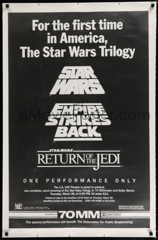

Did ROTJ have any vintage logo designs that were slanted to mimic the crawl effect? SW and ESB had them, as demonstrated in that poster, but I don’t know about ROTJ.