Interesting how the ROTJ logo very obviously doesn’t fit with the two prior films’ vintage logo designs.
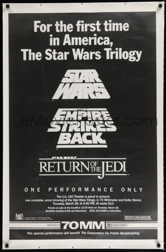
I am with you ATMachine, and much prefer the boxier ROTJ alternatives, which match the other logos better:

or
![]()
^ even without the box lines itself?