logo Sign In

***The "Darth Editous" Episode IV DVD Info and Feedback Thread*** - a partially "de-specialed" DVD — Page 11

Author
Time
Erik: First Class covers! I like your color scheme personally, and don't see what all the fuss is about. And e veryone seems to have gotten the THX video covers confused: ANH was blue, ESB was purple, and RotJ was red. I much prefer yours to those selections.

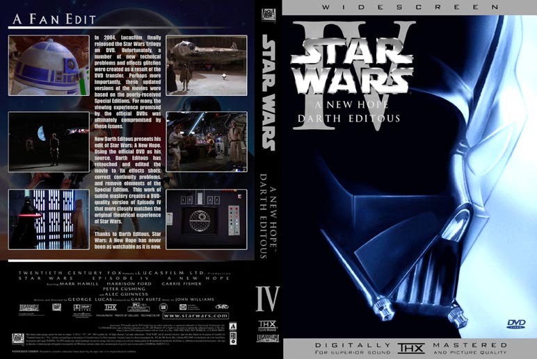
DE: "8. R2 uses the wrong tool to "access" the power outlet." Were you going to edit this but out? I quite liked it and don't see why you'd want to cut it.
Author
Time
DE: That's great. Looking forward to it .
Author
Time
Ok. Based on a few recommendations from DE and others, I've updated my cover. (My post on the previous page has been edited to reflect these updates.)

Problem: Many people liked the red-blue-green scheme, but I personally prefer the blue-red-green scheme.

Solution: Now there are two sets!

Set 1:

http://www.erikstormtrooper.com/darth_editous_set1.jpg

Set 2:

http://www.erikstormtrooper.com/darth_editous_set2.jpg

Thank God there was no debate about the color of ROTJ.

So here are the two versions of ANH. First Blue:

http://www.erikstormtrooper.com/darth_editous_anh_blue_preview.jpg

CLICK HERE for full-size BLUE cover.

Then Red:

http://www.erikstormtrooper.com/darth_editous_anh_red_preview.jpg

CLICK HERE for full-size RED cover.

The ANH cover has been changed to now include the same "modified" artwork on the back as DE's disc label, plus two screenshots have been tweaked slightly.

So yes, there will be red and blue versions of the ESB cover.

Enjoy!

You know of the rebellion against the Empire?

Author
Time
So far I have been unable to get a NTSC dvd copy of this.
Can someone please pm or email if they can send me one!
I will "reseed' and make copies for others in the group here.
thanks!
Author
Time
Originally posted by: Darth Editous

6. ...hide more of Palpatine's face.

Nice. An absolute must IMO.

War does not make one great.

Author
Time
make the emperor's hood "shadow" more convincing is a must and not to mention edit his mouth.
"A Jedi can feel the force flow through him".
Author
Time
Originally posted by: Darth Editous

15. I've edited out the wall hanging/cloak thing behind Luke to fix a continuity error (but in a weird way - more on that later).


DE,

I don't think you ever gave us a follow-up on this. I was watching your edit last night, and it seems that the cloak disappears in the frame as Luke walks in front of it to get his lightsaber. Is that what you did? Is it supposed to have fallen just as Luke walked in front of it?

Thanks,
Erik

You know of the rebellion against the Empire?

Author
Time
Is it supposed to have fallen just as Luke walked in front of it?


Yup, that's what's meant to happen, although hopefully people won't come to the conclusion that it just fell off, because with any luck they won't notice it at all.

It was another example of minimal fix. I could have removed it from the first half of the shot, but this would have introduced a (lesser) continuity problem because it was visible a shot or two before.

David
Author
Time
Originally posted by: Darth Editous
Is it supposed to have fallen just as Luke walked in front of it?


Yup, that's what's meant to happen, although hopefully people won't come to the conclusion that it just fell off, because with any luck they won't notice it at all.


Unfortunately it never worked for me, I actually find it the most distracting edit (but that is mostly because the others are sooo good!). It was the only case where I thought the problem was less of a distraction than the fix, especially since the cloak ends up back on the wall in following shots.

Actually, just looking at the original again, I guess it is pretty jarring since it is the same angle, just closer. I think it would be a case of had the edit not been mentioned here most would not have noticed it and it would have worked fine. Hehe, that's the problem with both wanting to make an invisible change and wanting people to know what you did!

In the end I guess we just have to explain it away as Ben's Magic Hut, since all his other ornaments appear, disappear and move around the room (most notibly on his centre table)!

http://www.kineticpast.com/starwars/thecheatlaserdisc.gif
Ooh, a laserdisc. The Cheat's playin' something on a laserdisc.
Everything is better on a laserdisc. Whatever happened to the laserdisc? Laserdisc!

Author
Time
Great covers. Easily some of the best I've seen. I like how you highlight the specific changes. Personal, I like the Blue, Red, Green. Red makes no sense for ANH.

Its occured to me that I never gave feedback on the edit. I've been a bit out of Star Wars at the moment. Though i doubt anyone's noticed my absence.

In a nutshell, I like it.

I found no real problem with most of the new changes. It's been awhile, but at most, I think I only didn't care for one, but I can't remember what. They're subtile, and work nicely. Really the only thing I have issue with is the remaining SE footage, and that's not something I would consider when judging the disc. The Mos Eisley approach is much improved. Amazing how much a little cropping does. Again, the only issue is with what was added in the first place. THe CGI is rather shoddy and the city too busy. The added shot of Han vs Greedo that was put in for Greedo's shot felt a tad off. I'd rather it just went the way it did in 77. THough I suppose not much could be done. It's still better than the SE take.

It's possible that I like the new change as they're unofficial. While I originally thought nothing of them, the SE changes bugged me after the theater run was over. When I was told that they were to supplant the originals, that's probably when I outright hated them. The DE version is an alternate take. I can view it as such. It's more fanfilm in that way. It makes me wonder if George had done this, what would I think. Still, it's good to see things fixed that actually needed fixing.

All in all, if I had to watch the SE, this is the one I'd watch. If the SE had been like this, I might not have had as much of a problem. Still, I'll stick to my TR47 discs, for serious viewing, but I hardly expected otherwise. Though this disc definitely pointed out how bad that disc actually looks. Definitely a good job.

As for the Emperor in ESB, if he looked more like this:

http://img.photobucket.com/albums/v252/tifaonacloud/imperator1-ep3.jpg

I think it would look worlds better.

I'd go back to Clive Revell's voice over. It was much more sinister and fitting. Chalk it up to the transmission changing how he sounds. Basically, at least lose the 'YESSSSSSSS'. I thought the original, "Yes....yes!" was more fitting. Like he was rolling it around in his mind and Vader touched upon it. The new one is too, "Why didn't I think of that".


Made for IE Forum's Episode III theme month - May 2005.

Author
Time
thanks to rebel11_38, i have a copy of the DE edit to enjoy this weekend, and to pay forward!

first 2 PMs to me get copies. dark_jedi, you're already on my list.

thanks also to DE for making the damn thing in the first place.
Pop Geek (my blog)
Entertainment Geekly
Author
Time
I'm having trouble with this pm system. I did contact someone about a copy through e-mail weeks ago, but maybe I was too late and that's why it hasn't come... Is this in a torrent? I've noticed other edits are. That would be so much easier.
He big in nothing important in good elephant.

"Miss you, I will, Original Trilogy..."

"Your midichlorians are weak, Old man." -Darth Vader 2007 super deluxe extra special dipped in chocolate sauce edition.

http://prequelsstink.ytmnd.com/
Author
Time
Originally posted by: Wesyeed
I'm having trouble with this pm system.


Wesyeed, PMs are disabled here by default so all you need to do is enable them. Simple process, just go to your profile settings and turn 'Allow Private Messages' on and click the 'Update Profile' button down the bottom of that page. From then on you can PM any user with this icon - http://www.originaltrilogy.com/forum/i/icons/toolbar_privmsg.gif, as it shows who does and does not have PMs enabled.

Hope that helps you in the future.

http://www.kineticpast.com/starwars/thecheatlaserdisc.gif
Ooh, a laserdisc. The Cheat's playin' something on a laserdisc.
Everything is better on a laserdisc. Whatever happened to the laserdisc? Laserdisc!

Author
Time
Klingon, I love the idea of that Emperor pic from ep3 and changing the whole "YESSSSSSS!!" i think it's far better and fitting and was a good idea to be put in Empire Strikes Back.
"A Jedi can feel the force flow through him".
Author
Time
could someone possibly post a link to the NTSC version of the disc art?
thanks in advance
DJ
Author
Time
Would someone be able to send me a copy - it sounds unbelievable!!.

As I am located in OZ (i.e. Australia), I am more than willing to make the edition available here for a few readers.

BTW, I love the covers done - now I just need something to put in it!

ntrprs
Author
Time
Originally posted by: ntrprs
Would someone be able to send me a copy - it sounds unbelievable!!.

As I am located in OZ (i.e. Australia), I am more than willing to make the edition available here for a few readers.


I can send you a copy ntrprs. I'll take this to PM.

http://www.kineticpast.com/starwars/thecheatlaserdisc.gif
Ooh, a laserdisc. The Cheat's playin' something on a laserdisc.
Everything is better on a laserdisc. Whatever happened to the laserdisc? Laserdisc!

Author
Time
One thing that always bothered me was the scene in Empire when Lando walks towards the millenium falcon, and you can tell that the bluescreen has no depth to it. Not sure if that one can be fixed though.

-B
Author
Time
The shot I think you're referring to was a matte painting, not a blue screen shot, but you might have a point. A bit of shading could be applied that might give it more depth.

DE
Author
Time
One question for this disc, not sure if this has been asked before or not (sorry if it has). Is this in anamorphic or letterboxed? Thanks.
Author
Time
Yes, it was a matte painting. As Lando walks into it, it just looked really bad. Shading may help, or adding some elements somewhere on the screen.

-B
Author
Time
Wasn't the shot you guys talking about in ROTJ aboard the rebel cruiser as Han and Lando were saying their goodbyes before the rebel strike? That shot has terrible matte work.
Author
Time
Is this in anamorphic or letterboxed? Thanks.

Both, strictly speaking

Wasn't the shot you guys talking about in ROTJ aboard the rebel cruiser as Han and Lando were saying their goodbyes before the rebel strike? That shot has terrible matte work.


That one is blue screen. Probably not much that can be done about that one.

DE
Author
Time
Originally posted by: Darth Editous
[quote]Is this in anamorphic or letterboxed? Thanks.[/quote]

Both, strictly speaking

...
DE

Yeah I think I asked that question wrong. What widescreen format is it in?
Author
Time
What widescreen format is it in?


It's almost (but not quite, see below) exactly 2.35:1 anamorphic, same as the official DVDs.

"Old" TV is 4:3. Widescreen TV is 16:9, which is 4^2:3^2. This DVD is 64:27, which is 4^3:3^3. Coincidence?

DE